
Today I will be discussing the latest series by Alice and the Pirates. This print is called Melty Mermaid Princess. The name is an interesting mix of Angelic Pretty print titles! This series has 2 dresses, a skirt, socks a round headdress and a necklace.
 This is the print close-up shown in Bianca (off-white and blue). The other colours are ivory x brown (Ecru), navy x navy (Madonna) and black x purple (Noir). Whilst the print is beautiful, I can't help but think that the art work looks similar to that on the wall of my local fish and chip shop. Next time I am craving battered cod, I shall be looking around the shop for co-ordination inspiration for this print! Despite reminding me of a fast food joint (and a shower curtain too), the oval design is pretty and I especially like the oval with the ship in it. I love the little bubbles rising upwards. My main dislike is the use of text. I think it would look better without the writing that says Mermaid.
 This is the OP. I thought the bodice was a little baggy and has loose material. The only way to make this dress smaller is by using the waist ties. This could make the dress appear a little shapeless and the material may hang off smaller girls. The bodice has a small bib design with some very ruffly lace. Usually I would dislike this use of lace but I think that on this dress it works. It looks frothy and bubbly which works well with the ocean theme. The neckline has a nice shape to it and has some pretty neck ties too. I thought the sleeves looked a little deflated and are a little too long. If I owned this, I would try to remove the lace finishing the sleeves. It looks too pointy and harsh. Maybe they should have used the same lace that they used on the bib. The sleeves are finished off with brightly coloured bows. They look tidy and well done. The waist bow is a little big but looks good on this dress. Or you could detach this to wear in your hair if you dislike round headdresses. The beads hanging from the bow are in 2 colours, which is a nice touch. There is no shirring, just a zip, but the zip is very well concealed. The skirt part looks like it creates a pretty shape and looks very spacious. I love the way the skirt has been constructed. There is a front bustle which only has 2 tiers so it does not look too fussy or attention grabbing. Then we have the print part which has more of the frothy looking lace running down the front. The lace helps to make the edge of the print look less harsh. The bottom hem is finished with another different type of lace. Thankfully, it looks better than the sleeve lace. The balance of frilly lace and simpler lace works well apart from the bits on the sleeve.
 This is the JSK. The first thing I noticed was the overall shape of the dress. In my opinion, it looks dreadful. It is too harsh and it looks very straight. The way the skirt starts from the waist looks strange, resulting in a bulky and awkward look. It is not the typical lolita shape. I also think the tier at the bottom of the skirt looks flat and lifeless. The skirt also has lots of gathering which leaves the print bunched up. The bottom hem is finished with the same lace used on the OP. It is the only part of the skirt I like! At least the bodice on this dress looks more fitted than the OP. The top of the skirt is hidden by a ruffle on the bodice. I dislike the OTT lace. The bodice would benefit from a simpler design, so I think it would be better if it had the ruffle or the lace, but not both together. The corset part looks pretty and nicely spaced. The ribbon looks like it is good quality and wont fray. The straps look like they have a lot of stretch in them which is a good thing because...
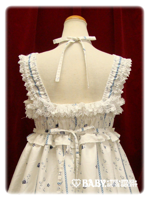 ... the back part looks very short. There is hardly any material on the back. This will not provide a great deal of support. If you have a large chest area, then invest in a good bra for this dress! The shirring has been left exposed but considering how narrow the area is, there is not a lot to hide anyway.
 This series also has a round headdress. I think it would have been a good idea to include more than one head option. The rose looks pretty and the material in the background are like a continuation of the rose. The lace is maybe just a little too spiky against the softer edges.
 This is the necklace. I can't decide if this looks classic or sweet. The gold outside rim is very classic but the glitter looks sweet. It would still be a nice addition to an outfit. I think the star fish looks cute!
So overall, the series is very hit and miss. I personally, would avoid the JSK. Thankfully the OP redeems AatP's reputation. Despite my bizarre comparisons to a fish joint, the print is lovely. I think the off-white and blue colour looks the prettiest. Would I buy from this series? Probably not. There have been a few other prints released which are similar to this one and I don't think this print stands out. However, I do think there needs to be more sailor lolita!
that JSK was pretty cute! A perfect summer dress:D
ReplyDeleteI actually really like the jsk... but I kind of like the shapeless, babydoll, I-might-be-wearing-a-nighty look XD The print does remind me of shower curtians... and now I want to have that
ReplyDeleteQwQ I want all these Fairytale themed outfits that they're coming out with!!! I love this dress!!
ReplyDeleteI am not usually an OP fan but this time I think the OP is better. The print may look like a shower curtain, but it is a very pretty shower curtain! :D
ReplyDeleteI just want to point out that it wasn't me who made the lolita secret about the JSK this week!
ReplyDelete