Monday 30 March 2015

Metamorphose Print Double

And today we have yet another print double! Today is a double Meta post with Little Ballerina and Pink Lemonade. Scroll down further to see Pink lemonade.

First up today is Little Ballerina. This series includes 3 dresses, a blouse, a cutsew, 4 hair accessories, tights and 2 necklaces.


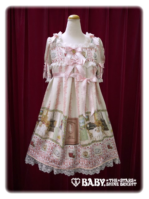
This is the High Waist Pinafore JSK. The bodice looks quite well fitted and the shape is nice, although I think the neckline shape could have been a bit softer. The straps look a good width and look quite sturdy. They are lined neatly with tulle on the outside which makes them a bit more interesting and also balances out the tulle at the bottom of the dress. The tulle has been well shaped and gives a cute shape. The waist line has been nicely shaped and I like the slight gathering of the material on the chest. It gives the fabric a bit of extra movement and stops it looking so flat. The bodice features 2 thin lines of lace running up it, which has been done very neatly. The centre has 3 small bows. The bows are a cute shape and size. I think the positioning of the bows has been done nicely as well. There is also a small pearl on top of each bow which is a cute finishing touch. The base of one of the straps features a large bow. I think this bow is a bit big and the tulle on the ends looks awful, but I do like the little ballerina shoe charm dangling from the middle. I am not overly fond of the placement of this bow and unfortunately it doesn't seem to be detachable. The back has a panel of shirring which is concealed neatly by a ribbon corset. For the waist ties on the back, Meta have added tulle at the ends and have also dangled a pearl chain from them. I feel the pearl chain looks very out of place and pointless. It is hidden away at the back anyway so nobody is really going to see it. The stock photos show that the skirt has a pretty shape which seems to have a decent amount of length to it. It flares outwards nicely and will hold plenty of petticoat too. The skirt design is kept simple and so the print is displayed beautifully. The bottom hem is then finished off with 2 ruffles of tulle which sit neatly on top of each other. 


Here we have the Side Frill Pinafore JSK. The bodice seems moderately well fitted but I am unsure I like the overall shape. To me, the neckline looks a bit weird and I dislike the way the straps attach to the main dress and point outwards. I also feel that whilst the straps look very supportive, they could do with being slightly narrower. The straps have been very neatly lined with the tulle though and it matches up with the tulle along the neckline. There is a waist bow which is a good size and nice enough shape. I don't like the little bits of tulle on the bow tails though and the gem stone used in the middle looks a bit cheap. There is also a pearl chain dangling from this bow which is a good length and also additional longer chains which drape down the skirt. I really like the skirt pearl chains but I don't think the print is OTT enough to go with this detail. The print is just too casual to properly pull it off or perhaps it should be used on a more dressy solid coloured dress. I do like that the ends of the pearl chains have been well concealed by the bows on the front and back though. The bodice features a ribbon corset with some shirring underneath it. Considering the back is fully shirred, I don't think this shirring on the front is needed and I think the shirring on the front looks very unattractive. The ribbon is nicely spaced out though. There are additional bows at the bases of the straps which are a bit big and I think makes the neckline area look too crowded. They are detachable and I definitely would detach them. The back is fully shirred which is quite exposed but does offer size flexibility. The stock photos show the skirt shape is a bit triangular and could do with being a bit more rounded. There is loads of volume and it flares outwards lots though. The skirt is divided up in to panels with the side parts of the skirt topped with additional ruffles. The ruffles on the side are layered well and sit well on top of each other. I like the use of gold braid to line the panels and give it a smarter appearance. There are also additional bows on the skirt, but I don't feel they are needed. Whilst the skirt design is very interesting to look at, I don't feel it fully shows off the print to its full potential. The skirt is reasonably well displayed in the front centre but not so much elsewhere. The bottom hem is then finished off with a neat tulle ruffle. 


And here is the Prima Ballerina Dress. The bodice looks quite well fitted and the shape is lovely. There are 2 sets of straps and I think the halter neck straps are not needed. Individually, both sets of straps are a good width but with both pairs together they look too wide. There is also the addition of wide tulle straps and also some arm bands (not pictured). The tulle parts look quite pretty when placed on the shoulder area but when worn off the shoulders it looks a bit strange on top of a blouse. Everything apart from the regular straps is detachable, which I think is a bonus because there is too much on offer here. I would detach everything apart from the tulle straps. The waist area features 2 ruffles of tulle, which are layered neatly on top of each other and sits nicely on the dress. However, I don't feel the bows on top of the tulle waist part are really needed. It is too OTT and I don't feel the waist bows are a nice shape either. Thankfully, these bows are detachable. The bodice features a triangle shaped ribbon corset. The ribbon is well spaced out and the corset looks quite pretty. I like that the edges are lined neatly with thin gold braid as well, which gives it a tidier appearance. The neckline has yet another tulle ruffle which softens the neckline nicely. There is also a pair of bows at the bases of the straps with a pearl chain between. The bows are a nice size and shape and I like the pearl chain, but I am not sure I like it teamed with the corset on the bodice. These details are detachable and I think I would detach them. If this wasn't enough detail, there is also an additional bow brooch with a little veil and a feather. I am not a fan of the brooch at all and I am glad this is also detachable. I just don't feel like the veil on the brooch is well shaped and the feather looks out of place. There is so much going on with the bodice that I feel a bit overwhelmed! The back features a panel of shirring which is concealed well by a ribbon corset. The stock photos show the skirt has plenty of flare and volume to it. The tiers of the skirt sit fairly well on top of each other, but I dislike how much the fabric has been gathered as it obscures the print a bit. The bottom of both tiers is finished off with a wide tulle ruffle, but to be honest I think it looks a bit messy.


And here we can see the print close up. This series is available in antique white, powder blue and lavender. As much as I want to love the lavender, it looks a bit too grey in my opinion so my favourite by far, is the powder blue. I would probably like the antique white more if it hadn't been paired with the blue ribbon. As for the print itself, it is pretty basic looking. The dresses are cute but they look a bit like clip-art. The positioning of everything in the print is also super basic. I do get why you would put swans in a ballet print but I think in this instance the swans look a bit out of place. The print is far too simple for the OTT dress designs.

So overall, it feels like there is a massive contrast between the busy dress designs and the basic looking print. It just doesn't work for me and it doesn't surprise me that my favourite dress design also happens to be the most simple. There are some very interesting ideas used with the dress designs but I don't feel Meta have successfully pulled them off. So this is not a series that I would personally buy. If I did I would go for the High Waist Pinafore JSK in powder blue.

Next up is Pink Lemonade, also by Metamorphose. This series includes 4 dresses (the Shirred Pinafore JSK comes in 2 lengths), 2 skirts, 4 hair accessories, a blouse, socks and wrist cuffs.


This is the Puff Sleeve OP. The bodice looks well fitted. The overall shape of the bodice looks simple, but cute. My only complaint is it seems to make the shoulder area look a bit wide. The short sleeves are a good length and considering how short they are, I think the amount of puff they have is reasonable. The sleeves are finished off very neatly with some simple lace. The waist area features a belt which helps bring in the waist area brilliantly. I love the heart buckle design too. Perhaps the belt could have been white instead though, to match the lace and break up the colour a bit. There is lace running up the bodice, which gives it a nice panelled appearance and has been done very neatly. There is a line of buttons running up the centre which have been well positioned and nicely spaced out. I think the shaped buttons are so cute! I especially like the honeycomb shaped button. The collar also features a bee shaped button. I think the collar of the dress is okay, but could have been a better shape and size. I think the neckline shape it creates is too straight and it needs a more rounded shape. Also, the collar reaches the shoulder area, which only seems to make the shoulder area look even wider. The back has a panel of shirring which hasn't been concealed by a ribbon corset or anything. I don't think the shirring looks too bad on this particular dress but it is a shame there isn't some attempt to conceal it, considering there is room to do so. The stock photos show that the skirt has loads of volume and it flares outwards well. After looking at the model photos though, I do wonder if the skirt length could do with being a bit longer. The skirt design is kept very simple so the print is displayed beautifully. The bottom hem is then finished off with some simple, but reasonably good quality lace.


This is the Low Waist Pinafore JSK. The bodice seems well fitted. I am a bit unsure about the overall bodice shape though. I think these low waist dresses can look a bit awkward sometimes and also I think the neckline shape needs to be a bit softer. The straps are a suitable width and look quite supportive. They are a bit basic in design though. Some thin lace could have added a nice finishing touch without being too distracting. The low waist is topped with a bow to one side. The bow is quite a cute shape and the edges have been lined neatly with lace. I don't think it sits well on the dress though and the fake flower used to top off the bow looks of average quality. The bodice is broken up in to neat panels. In the centre panel there are 3 rows of ribbon running across, each one topped off with a ribbon bow. The ribbon lines have been well spread out. I think the bows are all a good size and shape. The bows are very simple in design but look very cute. The neckline is lined with lace which helps soften it a little bit, but I still think the shape looks harsh. The back has a panel of shirring which has been concealed very neatly with a ribbon corset. Despite the low waist being quite awkward, I think the skirt shape looks okay. There is plenty of volume and the skirt flares out well. I probably wouldn't use quite as much petticoat as Meta have for the stock photos though. The skirt design is again kept simple and the print is displayed very well. The bottom hem is then finished off with a cute little ruffle.


This is the Shirred Pinafore JSK which comes in 2 lengths. Pictured is the mini length. The bodice looks quite messy and I am not fond of the shape. The straps are quite wide and look very supportive but I think they could have been a little bit narrower. They are lined neatly with lace though. There is also another set of halter neck straps but I don't think they are really needed and thankfully they are detachable. The bodice is split up in to panels with each panel lined with lace and a further 3 ruffles of lace going across the chest area. I feel it is the lace that gives the bodice such a messy appearance. The lace is too wide. Also the lace may be of a reasonably good quality, but looks-wise it is not the prettiest lace. The lace on the chest is layered neatly and I think if it wasn't for the rest of the lace the bodice could have looked a lot better. The bodice also features 3 bows. The bows are quite large but add a nice bit of interest. The bows are a cute shape and sit nicely on the dress. These bows are also detachable, although I feel the bodice looks worse with them detached. The back is fully shirred which offers plenty of size flexibility but doesn't look that attractive. The stock photos show that the skirt is very full and it flares outwards loads. It will hold plenty of petticoat. Despite being the shorter length, I think the mini length version of this dress still has a reasonable amount of length. The skirt features a line of ribbon near the top of the skirt and lace which blends in quite nicely with the skirt. It sits very nicely on the skirt and has been done very neatly. The ribbon line is also topped with ribbon bows. The bows are a cute shape and size. They are detachable but I think they look quite cute attached. The ribbon detail is placed high enough on the skirt that the print is still displayed perfectly. The bottom hem is then finished off neatly with a thin line of lace.


Here we have the Tiered Pinafore JSK. The bodice is well fitted and the overall bodice shape is quite pretty. The straps look a good width and quite supportive. I like how the insides of the straps and neckline are lined neatly with lace to give them a bit of extra detail and soften the neckline. There is a waist bow which is a good size and shape. It sits on the dress very well too. The only thing I am not sure is the use of lace on the bow as I don't think the wide lace looks that attractive here. This bow is detachable but I feel the dress looks too plain with it detached. The bodice features several lines of lace and a ribbon corset. The ribbon for the corset is well spaced out and the ribbon only has a slight shine to it. The edges of the ribbon corset have been well hidden with the lace as well. There are 3 bows at the bases of the straps, which I really dislike. The bows are topped with shiny metallic lace, which looks very out of place and I think the odd number of bows looks strange. The plastic bead chain dangling between the bows also looks quite cheap. I also feel the bows are a bit too big in size. Thankfully, the bows and the chain are detachable and I love how the dress looks with them detached. The back of the dress is fully shirred, which means there is good size flexibility but the shirring is also quite exposed and not so attractive to look at. The stock photos show the skirt has a cute, very rounded shape to it. There is lots of volume and it flares outwards lots. The skirt is divided up in to 3 tiers which are layered on top of each other. I feel the layers are layered very neatly on top of each other and it creates a very pretty shape. The tiers are all finished off neatly with lace. My only complaint is I feel the print is a little overshadowed by the skirt details and the gathering obscures the print a little bit.


And finally, here we have the print close up. This series is available in mint, lavender and antique white (which actually looks quite pink on my monitor). I think all 3 colours work well with the print but the mint stands out as the most complimentary. As for the print itself, it is a very cute idea and it has been well executed. Lemons are not something we have seen a great deal of in lolita prints before and it turns out a lemonade print can look quite cute. The jars and lemons are well drawn. My favourite part of the print though, is the honey pots and the bees. The bee holding the honey dipper is so cute! The only thing I am a little unsure of is the menu board, as the colour of the board sticks out because it is nowhere else in the print. The stripy non-border background is quite simple but nicely balanced. I love the heart shaped lemons and daisies. It is a shame the cute bees were not more of a feature on the non-border part.

So I think this series has been a nice surprise. I wasn't expecting much from it but the print is very cute and the dress designs go well with the print. I like that there is a bit of variety with the dress designs with some being more casual and others having more detailed designs. Would I buy this series? Possibly, but it wont be on my wishlist. If I had to go for this series I would choose the OP in mint because I like the retro feel of the dress design teamed with the print. It works so well. I think this is a very interesting series with plenty of choices for the sweet lolita.


Thursday 26 March 2015

Challenge Your Wardrobe... Again!

After my last Challenge Your Wardrobe post, I have thought up a few more challenges for a lolita's wardrobe. A few of these may be a bit harder for some, but hopefully there is a challenge here to suit everybody.

Tone down a usually OTT piece to wear in a simpler, more casual everyday outfit- I find that I have pieces in my wardrobe that I only ever wear to lolita meets because they are generally too OTT to wear as casual, day-wear. If you are able to tone down an OTT piece successfully, then you will probably get more wear out of it.

Try 3 new hair styles- They could be hair styles that work around a certain hair accessory, or just something a bit different to what you usually do with your hair or wigs.

Co-ordinate a widely hated print well- Extra points if it is AP's Whipped Magic (sorry, WM fans). There are a couple of prints out there which are hated by a large proportion of the lolita community. So I am always impressed when I see somebody co-ordinate these hated prints in a way that works well and is generally liked by the online community. This is a bit of a tricky challenge but who knows... you may change somebody's mind about that print!

Ban prints for 5 outfits- This one is especially difficult for a print fan like me! Sometimes it is good to take a break from what you know. By removing prints it gives you the chance to either come up with some cute solid coloured outfits or by trying to find a way to make the outfit interesting without resorting to prints.

Learn a new craft and then make your own accessories to match your wardrobe pieces- Knitting, crochet, trying to sew something using a pattern from the Gothic Lolita Bible... there are lots of different new crafts to try out there. If you are new to crafting then even creating something simple can be rewarding.

Wear an accessory in a way you wouldn't usually- For example, who says that a necklace has to always be worn around the neck? Maybe you could drape it in your hair between some hair accessories. I have seen many sweet lolitas wearing wrist cuffs around their ankles. These are just 2 suggestions and the only limit is your imagination.

Monday 23 March 2015

Angelic Pretty Marine Double!

Seeing as there are 2 new marine themed Angelic Pretty prints out right now I decided to put the 2 together for this post. So scroll down further to see my opinions on Marine Kingdom.

First up today is Dream Marine. This series includes an 2 dresses, a skirt, a head bow, socks and tights.


This is the OP. The bodice is a bit baggy but with chiffon material you don't want it skin tight anyway. I think the bodice shape is quite nice and the sleeves have a very pretty shape to them. The sleeves are super puffy and soft looking. I wouldn't normally like this sleeve length but I think it works here. The sleeves are finished off neatly and then topped with ribbon bows. I think the bows here could have been a little bit smaller but they are a cute shape. The waist area is topped with a large bow which is made from some very shiny material. I don't like the size and to be honest, I think the bow looks completely out of place. It sits really awkwardly on the dress. The dress could have worked really well without the waist bow there at all. I also feel the lace running vertically up the bodice isn't needed but it doesn't look too bad and the lace does suit the dress. I do however, love the neckline. The lace along the neckline is beautiful and it has been layered well. It sits so well too. The neckline is then finished off with a ribbon bow with long tails. The main bow part is cute, but I think it looks a bit small in size compared to the ribbon tails. The ribbon is also a little shiny but otherwise the bow is quite cute. It also sits nicely on the dress. The back of the dress offers no shirring, so the size flexibility is a bit limited. There is a zip running up the back which is a bit exposed near the top because there is a small sheer panel. I don't think the exposed zip goes with the soft floaty dress style but thankfully it isn't too noticeable. The stock photos show the skirt shape has lots of potential and suits the rest of the dress. There is lots of volume and it has plenty of flare to it. The skirt design is kept simple and the print is displayed beautifully. The bottom hem features a sheer ruffle with a lot of gathering. It creates a floaty bottom with lots of movement to it, which is quite a good match for the dress theme.


Here we have the JSK. The bodice is a very pretty shape although I think the neckline shape could have been a little softer. There are 2 sets of straps. The halter neck straps look a decent width and fit well with the shape of the rest of the dress. I think the other set of straps are a bit pointless though. The halter neck straps are detachable but I think they look better when they are used. Perhaps I would tuck the other straps in and not use them. The bodice design is kept very simple because it is dominated by a large bow at the neckline. It reminds me a lot of the Dream Sky JSK. The bow may be big but I think it works very well with the dress. The bow has a cute shape and I like the drop charms hanging from the bow. The material used is again a bit shiny though. The back is fully shirred which means that the shirring isn't covered by anything. The back is quite short though, so the shirring doesn't stand out too much. The back of the halter straps finish off with a generous amount of fabric to tie a big bow. The stock photos show the skirt has plenty of volume and flares outwards generously. The overall shape is quite cute and the skirt has lots of potential. The skirt is made up of many tiers but with an all-over print, you still get to see the print fairly well. The tiers are well spaced out and sit nicely on top of each other. The tiers don't affect the overall silhouette too much either, so it doesn't look too lumpy. The bottom of each tier is finished off neatly with thin lace.


And finally, here is the print close up. This series is available in white, sax blue, lavender and navy blue. The white version is a little unusual, but I think all 4 colours work very well with the print. As for the print itself, it is definitely growing on me. At first I thought it was a bit peculiar looking and was basically a shell version of Dream Sky. But the shells are well drawn with plenty of detail to them. I love the use of colour on the shells too and the multiple colours give the shells extra depth. The bubbles, fish and coral fit in nicely around the shells. Everything in the print really works together and nothing really stands out as being out of place.

So I have to admit that I like this series a lot more than I initially thought I would. The dress designs are cute and the floaty chiffon is such a good combination with the shell themed print. Nothing in the series, down to the dress details and colour options, looks out of place and everything compliments each other. Would I buy this series? After taking the time to properly look at it, I would definitely consider buying it. It wont be going on the wishlist just yet but I wouldn't mind owning it. I would choose the JSK in navy. I think the colours on the navy are absolutely gorgeous. It does not surprise me that this series was a 'made to order' after it sold out so quickly.

Next up today is Marine Kingdom. This series includes 3 dresses, a skirt, a head bow, socks and a bag. 


First up is the OP. The bodice looks well fitted and the overall bodice shape is quite cute. I love the sleeves. I think they are the perfect length and the shimmery overlaid fabric gives them a cute amount of puff. I am not usually a fan of scalloping, but the neckline scallops have been well shaped and are kept fairly subtle. The scallops really match up with the print theme anyway. The thin neck ties help to pull things together, although I don't feel they are really needed. They are detachable if you don't like them.


In this picture we can see the bodice details better. You can see just how much of a difference the overlaid fabric on the sleeves makes to the shape of the sleeves. The sleeves are finished off neatly with pretty lace and topped with bows. I don't think the bows are really needed but they have been kept fairly small. There is a large waist bow which has been made from slightly shiny fabric. The bow is a cute shape and holds its shape well and I like the little pearl details on it too. But looking at the bodice in its entirety, I don't think the waist bow is really needed either. The bodice has plenty of detail without it and I actually think the waist bow looks a little out of place. The bodice is divided in to panels, which has been done neatly with lace. My only complaint here is that the line cutting across the chest area needs to be a bit lower down as that is going to cut awkwardly across the chest of any larger chested wearer. The centre of the bodice has some generous ruffles of lace. I think the amount of gathering and shape that the lace creates here is perfect for the dress theme. It sort of mimics frothy water. The top of this lace where it meets the chest panel is topped with a small ribbon bow. Again, the bow material is quite shiny. Otherwise, the bow is a cute shape and size. I like the pearls that top the chest area. I feel they are nicely spaced out and not too overdone. If there had been more pearls than this I think it would be too OTT for the already heavily detailed bodice. 

The back is fully shirred which means there is a good amount of size flexibility, but the shirring doesn't look too attractive and is very exposed. The stock photos show the skirt has a lovely full shape to it. It has loads of volume and flares outwards well. The skirt design is kept simple and so, the print is displayed beautifully. With all that bodice detail it is good the skirt is kept simple too, as it would look very overdone if the skirt has too much detail. The bottom hem is then finished off with the most beautiful shell themed lace. The shell shaped lace is one of my favourite bits of this series!


Next up is the Tiered JSK. The bodice looks fairly well fitted but not very bust friendly. Perhaps the scoop neckline sits low enough that it wont be an issue. The straps are a decent width and suit the style of the dress. Both the straps and neckline are topped with lace, which sits nicely on the dress. There is an added extra bit of lace around the shoulder area which gives it a nice bit of extra shape. There is a ruffle on the inside of the neckline as well which gives an extra added bit of detail, although I don't feel this was entirely necessary. The main part of the bodice is kept simple with just some lines of lace breaking up the empty areas and giving a panelled appearance. The neckline is topped with a large solid coloured bow. The bow material still has a slight sheen to it, although it doesn't look as bad as the bows on the OP. The shape of the bow is quite nice and it doesn't droop much. The lace along the edges of the bow is a nice touch and I like the raindrop shaped pearls hanging from the bow tails. The bow is finished off with further pearls, although in the stock photos the pearls look quite poorly placed. The back is fully shirred again, which means the shirring is very exposed. The stock photos show the skirt has a beautiful rounded and full shape to it. There is loads of volume and it flares out excellently. Although the skirt is tiered, the join has been done so smoothly that there are no obvious bumps. The join has been covered with a line of pretty lace, which also sits very flatly on the dress and again looks very smoothly done. The join is then topped further with some small bows which are a cute shape and size. The thing that bothers me about the skirt design is the random large printed bow which appears near the top of the skirt. The bow may be well made but I think it looks very out of place and it isn't needed at all. Thankfully, it is detachable and I would definitely take it off. Despite the skirt detail, the print is still displayed very well. The bottom hem is then finished off with the pretty shell shaped lace again.


This is the Standard JSK. The bodice seems well fitted and the overall shape is quite nice. The straps look a bit thin and flimsy but the thinner straps suit the style of dress. The straps are lined neatly with lace on the outsides. They are also topped with bows, but I think this is a little too OTT and fussy. The waist line is lined neatly with pretty lace. The lace is very soft and sits well on the dress, so it doesn't really add any bulk to the waist area, which is a bonus. The waist area is also topped with a ribbon bow to one side. The bow is a cute shape and size and decorated with a couple of pearls. However, unlike the other JSK, this bow is not detachable. I think this bow works a lot better than the bow on the other JSK though. The bodice features a ribbon corset. The ribbon is well spaced out and the edges are topped neatly with some pretty lace which helps to conceal everything. The chest area switches to a solid coloured part. Again, it might possibly cut across the chest or sit awkwardly on some wearers. The chest part has a ruffle at the bottom which works fairly well. I feel the bows are a bit too OTT though. There is one larger one with 2 smaller bows above it. The bows are cute but I would have preferred either just the bottom bigger bow or just the smaller very top bow. The neckline is finished off neatly with lace, which gives it a softer edge. The back features a panel of shirring which has been topped very neatly with a ribbon corset (finally!). The stock photos show that once again, the skirt has loads of volume and flares out well. It will hold more than enough petticoat. The skirt design is quite simple and the print is displayed very well. The bottom hem is then finished off with the shell lace again.


And finally, here we can see the print close up. This series is available in pink. lavender, sax blue and navy blue. The colour choices are not really that surprising and all 4 colours work well with the print. As for the print itself, I feel it is beautifully drawn, but perhaps there is a bit too much going on. I don't feel the non-border part of the print with the rows of gems, rows of pearls and bubbles needed quite so many big details. I would have been happier with just the bubbles and some of the pearls. The border part is also quite overwhelming. I love the mermaids and the seahorses and the frames around them are well shaped. I love all the shells. Perhaps the castles were not really needed though? Or maybe the castles could have been smaller. The pearls and bows at the bottom of the print are beautiful and it is such a neat way to finish things off. 

So overall, this series is quite a contrast to the much simpler Dream Marine above. I actually feel there is too much going on. Everything looks so beautiful but there is just too much of it. I would have preferred a simpler print and I also feel there is too much going on with the dress details too. Would I buy this series? Probably not, especially with the Dream Marine release. I can see why this series would be popular though. If I had to go for something I would choose the Regular JSK in sax blue. I would have possibly gone for the OP if it wasn't for the waist bow. 


Thursday 19 March 2015

Maiden Clothing Review- Positive

I recently placed an order with Maiden Clothing for a bag and so today I shall be reviewing my experience. They had a bag that I had really been wanting for ages so now seemed a better time than any to give it a go.

Ordering Process

As is quite common with similar sites, the overseas ordering process is a little bit different to how people in Japan order. However, the details of how to place an overseas order are quite straightforward. There is a button right at the top of the page which takes you to the instructions to place your order. Instead of using the cart system you have to fill out a form and send them an email with the items you wish to order. The form was very easy to fill in. I was able to simply copy and paste the form from their page in to my email and fill it in. Then they will get back to you with the shipping cost. Maiden Clothing take your payment via NICOS. We did have a little issue with the NICOS page because some of the Japanese text was a picture, so it didn't translate. But it was quite a simple form so it didn't cause too many issues. The emails went through reasonably quickly and my item was shipped out not long afterwards.

Shipping

My bag was sent out via EMS on the 7th and arrived on the 16th. To be fair, a lot of that time it was actually sat in UK customs. The bag only actually took a day or 2 to make it from Japan to UK customs. 9 days is still quite a fast time considering that included a weekend and I opted not to go for Parcelforce's Saturday delivery (£12 for Saturday delivery? I don't think so!).


The bag was shipped inside a paper parcel bag and was sealed up properly. I have to admit the bag used to ship the bag in was a little bit flimsy. As I was ripping off my address like I usually do when I upload photos on here, the parcel paper actually ripped open and came away with the address label. So perhaps some sturdier shipping bags are needed. The contents inside were absolutely fine and there was a further plastic bag covering my bag inside. It is more the fact that with a simple rip could expose the contents to anybody who is handling my parcel.


As mentioned, the bag was further wrapped with plastic inside. I do feel an extra layer of bubble wrap would have been a nice touch but my bag did arrive safely.

Was the condition as described as on the website?

Because Maiden Clothing is a second hand store, the condition of the items is ranked and any flaws are mentioned in the listing. I felt Maiden Clothing gave quite an accurate description of what I should expect from the bag. They have multiple photos on the item page. You have to click on the photos to go to them and you can't open them in a new tab, but that is just a minor inconvenience.


The listing for my bag mentioned there was a bit of a dent on the back. When the bag arrived I double checked this and I can confirm it was indeed the only damage on the bag. In fact, I think the bag actually looks better in person than it did on the Maiden Clothing website. They took a lot of precautions and I got a bag in better condition than I was expecting. So I am very happy. As for the dent, it is really small and superficial and I am not worried about it at all.


Furthering on the packaging details, I found that the inside of the bag had been padded out with a bag stuffed with newspaper. This is good as it meant the bag held its shape and didn't get squished in the post. The shoulder strap was neatly folded and taped up with a bit of cardboard.

So overall I am very pleased with my new bag. I felt Maiden Clothing gave very in depth information about the bag condition and was presented very well. If I am being honest, I think there are a few minor things that could be improved here and there but overall this was a positive experience. I would recommend Maiden Clothing to my friends and I would use them again.

Monday 16 March 2015

Sweet Shooting Star by Metamorphose

Today's series is Sweet Shooting Star by Metamorphose. This series includes 3 dresses, 2 skirts (one with the print and one non-border print), tights, socks, bloomers, gloves and 3 hair accessories.


First up is the Shirring Pinafore JSK. Despite being fully shirred, the bodice shape is surprisingly good. I still don't think the overall appearance of the shirring looks very appealing though. There are 2 sets of straps. They look a reasonably good width but I feel only one set of straps is really needed. The straps are also quite basic looking, although with double straps this is probably for the best because they would look too fussy with lots of extra details. The waist area has a large solid coloured bow. The shape of the bow is a bit basic and it looks a bit plain, but it sits quite nicely on the dress. The good thing is, this bow is detachable so there is always the option to remove it or reposition it. The front centre of the bodice features a ruffle topped with many small bows. The ruffle is lined with lace, but it is kept quite subtle and is a good match for the subtle bits of colour in the print. For example, the pink version above uses gold lace which matches up with the gold in the print. The bows and buttons on top of the ruffle have been well spaced out and avoids looking too overcrowded. I think the bows have been shaped quite cutely and the buttons have an interesting design to them. The neckline is topped with 2 bows at the bases of the straps. I think the bows could have done with being a bit smaller in size but otherwise, they are a very cute shape. These 2 bows are detachable. Although the bodice already has a lot of bows, I think I would leave these 2 bows attached, as the straight neckline looks too plain without them there. As the name suggests, the back of the dress is fully shirred as well. I still dislike the look of the shirring but I admit I am surprised at how well fitted the bodice appears to be. The waist ties will help to pull the dress in further for smaller wearers, so there is a good amount of size flexibility. The stock photos show there is a lot of potential to create a very cute shape with the skirt. It has lots of volume and it flares outwards beautifully. The skirt design is kept simple and so the print is displayed excellently as well. The bottom hem is finished off neatly with a chiffon ruffle, which compliments the solid coloured chiffon bows on the dress very well.


This is the A-Line JSK. The bodice is a very peculiar shape and there is no defined waist line. The straps are a good width and look quite supportive. They are lined neatly with lace both on the inside and outside. The bodice features 2 thin lines of lace running vertically which gives the dress a more panelled look and fills in the empty areas with a bit of subtle detail. The chest area features a solid coloured chiffon bow. The bow is quite a cute shape and although a bit large, I don't think it looks too bad. It has a sweet little star charm in the centre as well. This bow is detachable and although I like the bow, I think I would position it differently to how Meta have chosen to place it. The neckline is very straight and lacks any real shape. The double chiffon ruffle helps to soften the straight neckline, but I think the ruffles give the area a very messy appearance. The chiffon sticks up oddly and I don't particularly like the placement either. The bases of the straps feature 2 detachable bows. The bows are a cute shape and size but I really dislike the way they look teamed with the chiffon ruffle and also the detachable chest bow. So I would definitely detach the strap bows. There are not that many pictures of this dress available but the sketches suggest the back has a shirring panel which hasn't been covered with anything, so is quite exposed. I really dislike the skirt shape. I appreciate the dress is meant to be A-Line, but in this case it looks like the skirt flares out too low down. When the skirt eventually does flare outwards, the skirt shape is then too rounded for an A-Line dress. The end result is quite awkward and reminds me a bit of a lampshade. The ruffle halfway down the skirt only emphasises the strange skirt shape and I really dislike it. This ruffle is topped with some detachable bows. I think the bows are a little bit big, but otherwise I think they look okay. Despite a bit of weirdness going on with the skirt, the print is still displayed quite well. The bottom hem is then finished off with lurex lace.


This is the Bustle Pinafore JSK. The bodice looks fairly well fitted and I really love the overall bodice shape. The heart shaped neckline could have been a little bit softer though. The straps are very thick and look very supportive. Meta could have maybe gotten away with making them a little bit thinner. The outside of the straps are finished off with a chiffon ruffle, which has been well shaped and I think looks very cute. It matches the chiffon on the bottom hem. The thin crossed halter neck straps are a nice little finishing touch too. The waist area is topped with a big bow. The bow size isn't too bad for the style of dress. The shape of the bow is simple but well formed and the bow looks so perky. It doesn't appear to droop at all and it holds its shape well. However, despite liking the waist bow, I sort of don't feel it is really needed with the rest of the bodice details. Sadly it doesn't appear as though this bow is detachable so there is no option to try the dress without it. The bodice is split in to panels by some thin lace, which has been used quite neatly. The front middle panel has been topped with a different kind of material. I don't think this change in material looks bad, but I think I would have preferred it if this extra material wasn't here. This middle panel is topped with cute buttons and bows. The bows and buttons are well spaced out, although I still feel it could have looked better without the waist bow. The 2 identical bows are a cute shape. They could have possibly been a little bit smaller, but I think they look quite good. These bows are in a colour which appears a little bit in the print. Although this works with the blue and purple colour ways, I think on the pink version the bow colour looks a bit off. The top bow is a bit bigger and has a more intricate design to it. It is nicely shaped and I love how it has been done. There is even a cute star charm dangling from the centre of it. The neckline is also lined neatly with some thin lace which keeps things very tidy. The back is filly shirred, which means the shirring is quite exposed. It would have been nice to have one option where the shirring panel is a bit smaller and topped with a ribbon corset for smaller wearers. The stock photos show the skirt has a very plump shape to it. It has lots of volume and flares outwards well. I think it could have been slightly longer in length though. The front of the skirt is kept very simple with just a thin line of lace and 2 small bows. The lace blends in and doesn't affect the skirt shape at all. So the print is displayed very well. The back of the skirt has a bustle which has a good shape to it. The tiers are well spaced out and layered on top of each other brilliantly. The material used is lovely and soft too, so it shouldn't add too much bulk at the back. The bottom hem is then finished off neatly with a chiffon ruffle, which blends in nicely with the bustle at the back.


And finally, here is the print. This series comes in purple (which looks dark blue to me), powder blue and pink. I think the pink has a slightly odd colour combination, but the other 2 colours work quite well. As for the print itself, it is very cute. I do feel the animals in the print are a bit simply drawn, but are still very sweet and have a nice bit of shading on them to give them a bit of extra depth. The clouds are suitably fluffy. The pots of candy are cute. It sort of reminds me of a slightly more dreamy version of Candy Star Rabbit. It is good there is a sax blue colour, as it offers a different colour to CSR. The print is split up neatly with smooth lines but overall the layout of the print is quite simple. I do love the stars and moons in the stripy non border part of the print though.

So overall the print is nice enough but I am not sold on the dress designs. To be fair, I feel the Shirred JSK turned out quite well considering it is fully shirred but it isn't my sort of thing. I can't stand the A-Line JSK at all. Would I buy this series? Probably not, although there are some decent options. If I were to go for this series I would pick the Bustle Pinafore JSK in purple. I feel this dress design is the most well thought out and it looks quite pretty. I really like the hair accessories and the socks from this series. It is definitely worth having a look at this series but for me personally, it isn't wishlist worthy.

Thursday 12 March 2015

Chilling Out in Reading

It was time for another long overdue catch-up with Sammi and Shalisa, so we decided to meet up in Reading for a day of casual fun. The great thing is, this day was timed perfectly, as the weather suddenly decided to warm up a bit. I am so looking forward to wearing some Spring time themed outfits very soon!


I went with my Metamorphose Apple print skirt as I hadn't had the chance to wear it out and it is also a good piece for a nice, casual outfit. It is also quite a retro and cute looking piece, so it is quite a fun skirt to wear. You can't really see it, but I am wearing polka dot tights to match one of the apples in the print. I think polka dots and the heart shaped bag add to the retro theme, as does the sailor collar on my Cherie Cerise cutsew. My only regret is not adding more pink to balance that colour out a little bit, but anybody who owns this skirt will tell you it is a very awkward shade of pink. It is almost a lavender colour.


I felt the white cutsew looked a bit too plain by itself and the necklace I wanted to wear didn't look right with the outfit. So in the end, I did a quick 30 minute craft and made this little apple brooch. Sadly, it was hidden by my bolero most of the day. Perhaps I should have pinned it to my very casual looking beret instead.


The great news is that we think we may have found our Reading equivalent of the Mitre in Oxford! The Outlook had really nice food (my burger tasted amazing and I know the others enjoyed theirs too), a nice atmosphere and a great location. My only criticism is I think they need to improve and widen their choice of ciders!


We also had a quick look around the shops in town. Sammi managed to find some cute macaron fabric in Fabric Land, although the queue in there seemed to take forever! Afterwards we decided to go to Mr Chips for bubble tea. I think I had too much ice though, as I ran out of juice long before the ice started melting. I was struggling to get the juice bubbles up the straw because all this ice was in the way and one almost choked me because it suddenly became un-lodged and fired in to my mouth! You can just imagine that... my gravestone could have read "choked to death on bubble tea". At least it would have been different!


In the late afternoon we decided we were a bit bored of shopping and headed back to the pub. This time we sat at the other end of the pub and got the window seats by the river. There was a really lovely view and I got to watch the ducks outside. We all ordered the fudge cake and it tasted better than the one at the Mitre. I feel very disloyal saying that, but it is the truth!


Finally, a little group photo of us. Shalisa nicked my photo to edit and brighten it, so I am stealing it back for this post! What amuses me about this photo is how well matched Shalisa and I are! We are both wearing the same bolero and shoes and both of us went for fruit prints. The funny thing is, Sammi had said she was going to wear her Milky Berry skirt, so we almost had a trio of fruity outfits.

So overall, this was a very fun and relaxed day. I am so relieved we have finally found a pub we can relax in. We haven't had the best of luck with venues in Reading in the past. Aside from the odd look here and there, we were mostly left alone as well. I don't think this day could have really gone any better. Although almost dying whilst drinking my bubble tea is not an experience I wish to repeat...


Monday 9 March 2015

Salon de the Rose by Angelic Pretty

Today I shall be taking a look at Salon de the Rose by Angelic Pretty. This series includes 2 dresses, a skirt, a bonnet, gloves, wrist cuffs, socks and umbrella.


This is the OP. The bodice material looks a little bit baggy and loose in places. The overall bodice shape is quite pretty, although maybe a bit fussy looking. The sleeves have a pretty shape to them, although the length could be a little awkward on some wearers. The bell part of the sleeves flares out beautifully and the material is layered well. The lace used on the sleeves is absolutely beautiful, although there is perhaps a little bit too much of it. I think the lace on the sleeves sticks out a little too far at the bottom and the lace around the start of the bell part isn't needed. I also feel the bows on the sleeves are too big and the ribbon used for the bows is far too shiny. The waist area has a large solid coloured bow, which in my opinion sticks out quite a lot. It is a pretty shape and sits reasonably well on the dress but I just don't feel this bow is really needed as the dress is already very OTT. The bodice features multiple layers of lace. The lace has a pretty design and is layered well. The lace is then topped with a bow on the neckline, which again is quite large. The shape is lovely though and I like how neatly the edges have been lined with lace. The pearl chain dangling from the bow is a nice finishing touch. I just feel it needs to be smaller as it is quite dominant. The choker included with the dress is made up of good quality lace but I feel the ribbon bow makes it look cheap. I don't feel the bow is really needed here either. The back of the dress has a panel of shirring which is concealed neatly by a ribbon corset. However, the ribbon used for this part is once again very shiny and I feel it sticks out. The stock photos show the skirt has plenty of volume and will hold plenty of petticoat. It flares out beautifully and creates a pretty shape. The skirt is kept very simple, which given the OTT bodice is a bit of a blessing. It also means the print is displayed brilliantly. The bottom hem is then finished off with cute bow themed lace, although I think rose themed lace would have fitted better.


Here we have the JSK. The bodice looks very well fitted and the shape is quite pretty. The strap width really suits the style of the dress and I love how the straps and neckline have this pretty frilly appearance to them. The lace and ruffles create a fluffy appearance which also is a good match for the details on the rest of the dress. The straps do look a bit flimsy though. The waist area has a large bow which is a pretty shape, but looks a bit big in size. The bow is also lined with lace which doesn't help its large size but does blend in well with the lacy over-skirt. The bodice features multiple lines of lace and a ribbon corset. At first, I thought all the lace was a little too much and thought it would be better to take some of it away, but it has since grown on me. The lace is very pretty and it also provides nice continuity with the lacy straps and edge of the over-skirt. The ribbon for the ribbon corset is well spaced out and doesn't look too bunched together. The edges of the ribbon corset are well concealed by the lace too. It is a shame that the ribbon used for the corset and the bow on the neckline are once again very shiny though. The neckline bow is a cute shape and is a nice size as well. It sits well on the dress and looks quite perky. The back of the dress features a panel of shirring which is concealed by a ribbon corset. Again, the ribbon is shiny. The stock photos show the skirt is very plump with loads of volume. It flares out beautifully and there is the potential to create a lovely shape. The skirt features a lacy over-skirt which really fits in with the rest of the dress design. The over-skirt is a pretty shape and lined neatly with lace along the edge. It sits really well on top of the skirt as well. The over-skirt is detachable but I think it looks really good and I personally would leave it attached. Despite the over-skirt, the print is displayed very well. The bottom hem is then finished off with floral themed lace, although I don't think the lace is the prettiest and the line of lace is a bit too wide.


And here we have a part of the print close up. This series is available in pink, blue, mint and lavender. All four colours work really well with the print. I especially love the use of light and dark pinks on the pink colour way. As for the print itself, it really feels like this is an updated version of AP's Memorial Cake print. The cakes in the print are drawn beautifully and have lots of lovely little details to them. I love how the cakes are framed with ruffles. The cakes and the roses compliment each other very well and I really like the combination. I also like how the background has the diamond pattern made up of ribbons topped with roses. The roses have some lovely detail to them too. The only bit of the print I am not sure of is the gathered table cloth part right at the bottom of the print. I feel it looks a little flat and empty in comparison to the rest of the print. This part hasn't been drawn that well either.

So overall this is quite a pretty series. It is very dressy and perfectly OTT for a nice fancy event. The details on the dresses compliment the print really nicely. The only thing I really dislike is the shiny ribbon as I feel it looks cheap. I also feel the dresses would look too extravagant for a smaller event. Perhaps Memorial Cake would be a good option if this series is too OTT. Would I buy this series? Possibly, but it wont be going on my wishlist. If I had to pick a dress I would go for the JSK in pink. I love the use of colour on the pink version. I really love the JSK design too and I am not surprised to see it is so popular.


Thursday 5 March 2015

Model Application Advice

I had a reader send in a request, asking for a post about applying to be a lolita model at events. I am very fortunate to have been selected by both Haenuli and Metamorphose to model at the Tea Party Club events in the past but to be honest, I am not really sure how much advice I can offer. To really understand why I was picked on those occasions I would have to ask the designers themselves. I think there are a lot of attractive lolitas out there so perhaps the way I submitted my form did have an influence. I can't say for certain. I had a fun time modelling. Would I do it again? Possibly, if I got the chance to model for one of my favourite brands again. I have to admit, I felt I missed out on a lot of the Revelry event because I was backstage quite a bit. But I don't regret modelling at all. 


Even though I can't say for sure that my application form influenced me getting picked, I did put a lot of time and effort in to it. In the past I have been a bit lazy with my forms and as a result, I haven't been picked for things. So here I will go in to detail about what I did with my form and if it works for you, then that is great. But be aware that even if you do follow every bit of advice out there, you may still not get picked. If this is something you feel passionate about, then just keep going. My general attitude is that if I don't submit a form then my chances of getting picked are instantly zero. You never know what is going to happen.

Firstly, if you can, you should try to wear the clothing of the brand you are aiming to get picked by. At the very least, you should try to make sure your outfit is in the style of your chosen brand. With Meta, all of the people who got selected had worn Metamorphose in their applications. I am not suggesting that the people got selected just because they owned items from Meta, but it doesn't hurt to show a little bit of brand loyalty. Also, because some of my favourite dresses are by Metamorphose, I felt quite confident in the outfit I wore and I feel this showed in my application. Show your passion for lolita fashion and the clothing and it will show you in a more positive light.

You should consider the time of year this event is being held. Depending on how many models are picked, the brands will often want to showcase dresses that are coming out a few months after the event. If the event is being held in the Spring, then the brands may be wanting to show off their Summer lines. So there is not much point wearing a heavy Winter themed outfit in your application. Also, certain brands re-release the same series every year. For example, Angelic Pretty usually does a Royal Chocolate series every year and Meta puts out a Summery sailor series and a kimono print in the Winter. 

When choosing a pose for your application photos, try to think about the outfit you are wearing and how you can show it off to its best potential. For example, if you are wearing a wide princess sleeved blouse, make sure your arms are not by your sides. Show those sleeves off! This is important because the brands will want to see that you can show off their clothing as best as you possibly can. I don't mean to sound harsh, but during fashion shows the focus should be on the clothing and not you. You are just there to help sell their clothing.

It is also worth choosing your a time and location for your application photos carefully. Don't go for a location which has lots of distracting features, such as plants, because it takes away attention from you. You should also be careful to pick a time where the sunlight is not too harsh. Squinting in the harsh light does not look attractive! And whilst on the subject of distractions, try not to go too overboard with the make up. The brands will want to be able to see your face, no matter how cute your new eye shadow and stick on gems look! It may also be worth putting down the props, such as sceptres. On stage you might not be allowed to use props, so you need to be confident with your posing.

When you are taking your photos, it is also worth taking your time to make sure you get shots you are happy with. If you settle for a photograph that you don't think is that good, then it will show. If you don't think the photograph looks that good then the brands will probably think the same. Make sure you are 100% happy that the photo doesn't look blurry. Try a few different poses, as sometimes poses can seem like a good idea, but when you see the photographs afterwards they don't look as good. It can get a little bit frustrating standing there for a while and having to go through loads of photographs afterwards, but it is worth it if you can get a shot you are happy with.

Finally, never EVER lie on your form about your measurements and do not photoshop your photographs. This may sound really obvious, but I once knew somebody who lied about their measurements and then on the day had an embarrassing moment when they realised the clothing didn't fit them properly. The clothing was too tight for them and unfortunately, it showed. Is it really worth having an embarrassing situation like this happen to you?

Well, I hope this post was helpful to the reader who requested it and also for those who are curious about being a model at these big events. I can't guarantee it will help but you never know, a bit of extra time and effort might make a difference. I feel I should point out that you should only apply to model if you are 100% confident that you can get up on stage and pose as instructed. Remember to enjoy yourselves.

Monday 2 March 2015

Print Discussion Double

Today is going to be another print double. Once again, I am getting behind with all of these! Scroll down further to see my verdict on L'ecrin deVotre Gauche by Alice and the Pirates.

First up today I shall be taking a look at Re.ci.pe by Baby the Stars Shine Bright. This series includes 4 dresses (one non-print), a skirt, a lace apron dress, 8 hair accessories, a necklace, a bracelet, 2 blouses, a handkerchief and a pair of tights.


First up is the Shirly JSK. I feel the bodice shape could do with being a bit more interesting but it seems fairly well fitted. The neckline seems to be halfway between being a straight line and heart shaped and I think it needs a more defined shape to it. The straps are a bit thin but look like quite a suitable width for the style of dress. The straps are lined on the outside with a thin line of gold braid and then a line of some very pretty lace. The lace sits really nicely and makes the straps a lot more interesting. The gold braid keeps things neat too. I am not so fond of the way the gold braid and lace has been used at the waist area though. It sits quite awkwardly on the dress and I think it makes the waist area look wider than it actually is. There is also a waist bow, which I think is far too big. The shape of the bow also isn't that appealing and the bow appears to be really droopy. It sits really badly on the dress and just seems to sag. The bodice is kept quite plain, although there is enough detail elsewhere to keep the dress looking interesting. The neckline has a very pretty solid coloured bow. The ribbon used is a little bit shiny but has an interesting textured design to it. The bow is a good size and shape and sits nicely on the dress. In the centre of this bow there is a gold coin charm which looks quite pretty (although I am trying to work out how the gold coin fits in with the dress theme. I feel like I may have missed something here). I really like this neckline bow and I think the dress would have worked just fine without the waist bow and lace on the waist area. My only criticism is that I wish they have made more of a feature out of this neckline bow by using the same ribbon elsewhere on the dress. Perhaps 2 very small bows placed somewhere along the bottom hem could have looked cute. The neckline is finished off with a line of gold braid and lace, which is a nice bit of continuity. I would have liked it if the lace thinned out and finished before the armpits though, as the lace sticks out a bit weirdly here and is probably only going to get crushed by the wearer's arms anyway. The back is fully shirred, which means it is quite exposed and doesn't look too appealing. The stock photos seem to show that the skirt has a reasonable amount of volume which would be suitable for a more classic shape. It flares out a decent amount for the style of dress. I feel the details at the waist area make the overall silhouette of the dress look a bit awkward though. The skirt design is kept quite simple and so the print is displayed very well. The bottom hem is then finished off with a line of gold braid and a line of wide lace. The lace is pretty but I think it is a bit too wide.


Here we have the Diana JSK. The bodice of this dress feels a little awkward. You have the bottom of the bodice which is well fitted and the gathered part of the chest, which is quite pretty. The problem is that the ribbon between these 2 parts of the bodice cuts across the chest area. It looks like it will sit awkwardly on some wearers. I think the ribbon could do with being a bit lower down, which would also make the overall bodice shape more attractive. Either that, or they shouldn't have the ribbon line there at all. The straps are a suitable width and look quite supportive. I like how the straps are lined neatly with thin lace on the outside to liven them up a little. But I do feel that the bows on the straps are too much and are not needed at all. If Baby insist on putting these bows on the straps then I think they need to make them a lot smaller as they look very bulky. The waist area is topped with 2 solid coloured ribbon bows on either side of the waist. They are a cute shape and sit on the dress nicely. I think the ribbon tails could do with being a bit shorter though, as it starts to cover up the print and also looks a bit messy. The bodice features 2 bows. One of these bows is placed on top of the line of ribbon and the other is at the neckline. Both bows are a cute shape and size but I don't feel that they both work together. I think either bow could look good by itself but together it looks a bit much. The neckline bow again features that gold coin charm and gives the bow a more decorative appearance. The neckline is topped with a line of pretty lace which I think sits a lot nicer than it does on the neckline of the other JSK. The back of the dress has a panel of shirring which is concealed neatly with a ribbon corset. The stock photos show that the skirt has a good amount of volume and flares out quite well. Overall, I think the skirt shape is quite pretty. However, because of the way it has been gathered, it means the print sits in quite a wonky way and it looks a bit messy. The bottom hem features a raised edge at either side which has been topped neatly with ribbon bows. The bottom hem is then finished off with a line of gold braid which keeps things looking tidy, and then a wide line of lace with the addition of a sparkly tulle layer underneath. 


This is the OP. The bodice doesn't have a real defined shape to it and it just looks like such a mess. The sleeves are shapeless and I am unsure about the length too. I also think the cuff part of the sleeves is too wide and doesn't suit the length of the sleeves. The cuff part of the sleeves is decorated with pearly buttons and ribbon bows and then finished off with lace. The end result is quite fussy looking. There are also these random ribbon bows on the shoulders, which look very out of place. The actual waist line on this dress is around the chest area, and this has been lined with a line of lace, which looks quite pretty. The thing I don't understand is the ribbon belt, which in the stock photos has been placed a bit more where the wearer's actual waist would be. It creates a lumpy silhouette and looks dreadful. I don't think this ribbon belt looks good at all and thankfully, it is detachable. The dress looks a whole lot better without it. The lines of lace around the neckline are pretty, but have been strangely positioned and it adds to the messy appearance. The neckline and lacy waistline have been topped with ribbon bows. The bows are a cute shape and size. I absolutely love the ribbon they have used. It does feel as though the dress is very overloaded with bows though. Perhaps these 2 bows on the bodice would look better if it wasn't for the shoulder and sleeve bows. The back doesn't offer any shirring so the size flexibility is very limited. The ribbon belt may help to pull it in a little bit, but as I mentioned, I hate the way the ribbon belt looks with the dress. The stock photos show that the skirt has a good amount of length to it. When the ribbon belt is detached the overall skirt shape looks quite nice. There isn't a massive amount of volume here but you don't want too much with this style of dress anyway. The skirt design is kept simple and so the print is displayed fairly well. The bottom hem is then finished very neatly with gold braid and pretty lace.


And finally, here we can see the print close up. This series is available in ivory, pink, sax blue and green. All four colours work really well with the print. I think the pink is my favourite though, especially with the contrasting red ribbon they have used for the bows on this colour way. As for the print itself, I am not really feeling the square box design, as it looks a bit too simplistic. The design inside the boxes is pretty and drawn well. I don't think it looks very exciting though. The floral border around the boxes livens up the straight edges a little bit. I really hate the tiled look at the bottom of the print though, which has also been used on the bodice of 2 of the dresses. For some reason, I just don't feel the tiles look that appealing. Also, after looking at how the print looks on the actual dresses, I am not sure the print is that balanced. The tiled part of the print looks too wide and I think it need to take up much less space. I see the tiled part as more of a border than the main feature of the print and it is too attention grabbing.

So overall I can't say I am really that impressed with the dress designs and I think the print is a bit underwhelming. I can find faults with every dress design and none of them really stand out as being that appealing to me. So this is not a series I would buy. If I had to, I would choose the Diana JSK in pink, but that is mostly because I think I am small enough that the bodice ribbon wouldn't be an issue for me. I also think Baby need to accept that these longer skirt designs, like that on the OP, don't necessarily work with every series.

Next up today I shall be looking at L'ecrin de Votre Gauche by Alice and the Pirates. This series includes 2 dresses, a skirt, 2 hair accessories and socks.


This is JSK I. The bodice seems fairly well fitted. I think the bodice shape is a bit basic though. Perhaps the neckline is a bit too straight. The straps seem to be a good width and very supportive, although it is a bit hard to tell with all that lace obscuring them! The lace used is of a good quality but is quite a basic looking design. It has been layered beautifully though and sits really nicely. It gives the straps a really frilly appearance. The bodice features a thin chiffon ruffle line, which breaks up the bodice and creates the appearance of a yoke. The chiffon ruffle also continues along the neckline, which helps to soften it a little bit. The inside of the yoke features lines of lace and sparkly buttons. The lace sits really well on the dress and the buttons are quite well spaced out. The yoke and neckline are then topped with a large bow. The bow looks a little bit droopy so could do with being a bit smaller or attached to the dress a bit better. The bow also seems to blend in with the design quite a bit and overall, the bodice feels very simple in design. It feels like it is lacking something. The back has a panel of shirring which has been concealed very neatly by a ribbon corset. The stock photos show the skirt has lots of volume and it flares outwards beautifully. The overall skirt shape is very pretty. The front of the skirt is kept very simple and the print is displayed beautifully. The bottom hem is then finished off neatly with the same lace used on the straps.


What is interesting about this dress is what is going on with the bustle on the back of the skirt. The bustle is a good size and shape. The chiffon layers are layered neatly on top of each other and well spaced out. What I really like though, is how if you look closely, each tier is a slightly different colour. The colours blend very well together and the end result is quite interesting. The colours used are a good match for the print as well. I really like the end result and it makes the dress much more interesting. It is a shame it is hiding away at the back though!


Here we have JSK II. The bodice is well fitted, although the shape is a bit weird. I think the waist line which arches upwards gives the illusion of a larger stomach. The dress has 2 sets of very thin straps. They look quite flimsy and not very supportive. I would have preferred one set of slightly thicker straps. The straps are also quite basic looking. The waist line is lined very subtly with very thin lace. It isn't very noticeable but it does give the waist a bit of a neater appearance. The bodice is very plain in design, but it is so short it is a bit difficult to fit a lot of detail on it anyway. The neckline is topped with a line of lace. The lace used is of a good quality but is a bit basic looking. I don't think it is maybe the best of choices and I think it sticks out a bit. The bases of the straps are topped with 2 ribbon bows. The ribbon used is quite shiny, but apart from that the bows are pretty decent. The size and shape is good and they sit really nicely on the dress. The back is fully shirred, which means the shirring isn't concealed by anything. The shirring isn't that noticeable with the dark colours this series comes in anyway. The stock photos show that the skirt has lots of volume and it flares out brilliantly. I am still not convinced by the waist line, but overall the skirt shape looks quite attractive. The skirt is again kept simple in design and the print is displayed excellently. The bottom hem is then finished off neatly with 3 chiffon ruffles. The ruffles are a good width and layered well. Like the other dress, these chiffon ruffles are different colours. The colours compliment each other very well and I really like this detail. 


And finally, here is the print close up. This series is available in sepia (which looks more like grey to me), navy, green and black. I really dislike the sepia colour way, but the other 3 colour choices look very pretty. The navy looks beautiful. As for the print, I think it looks very pretty. The window design reminds me a little bit of AatP's Midsummer Night's Dream print. The window frames are drawn beautifully. I like the use of black shadowy figures and objects which contrast nicely against the softer colours. I especially love the pretty singing bird in the print. The grassy bottom with the flowers looks pretty too. My only real criticism is the background of the non-border part of the print is a bit cluttered. 

So overall, I think this series has a lot of potential. The dress designs are a little bit simple, but there are also some really interesting features too. I really love the use of multi-coloured chiffon on both dresses. The print is lovely too. Would I buy this series? Possibly, yes. I am a little bit torn by which dress design I would go buy. I like the bustle on JSK I but I think the colourful chiffon is more noticeable on JSK II. Also, whilst I love the navy colour way, I really like the colours of the chiffon on the green version. If I were to go ahead and buy this series, I would need to think of some sort of compromise between my favourite details!


Related Posts Plugin for WordPress, Blogger...