Friday 29 April 2011

Outfit post- Meta ducky love

I have been very ill recently so I felt like wearing my favourite lolita skirt.

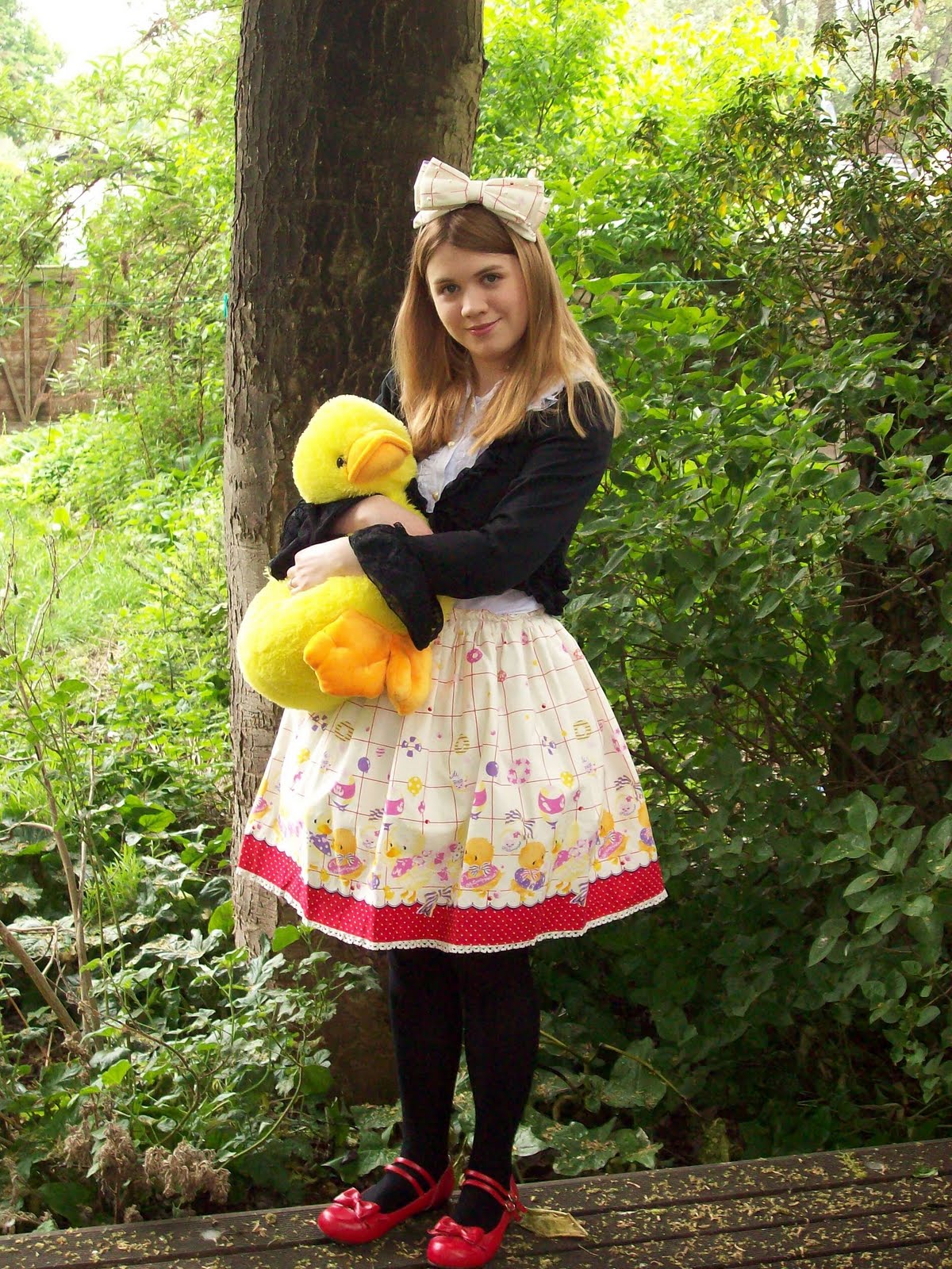
I adore March of the Ducks and nothing anybody says will change my mind! It worked as a great pick-me-up. I am considering making a new banner soon because my current one leaves a lot to be desired. I thought about using this picture but my poor duck is being squeezed to death! Poor Ahiru-chan... I feel that Ahiru-chan is an essential part of the banner so regardless of whatever I do, Ahiru will be featured somewhere.

I felt like coming back inside so I decided to quickly pop on Old Emblem too. I didn't intend to make this a Meta love post but I prefer Meta to Angelic Pretty.


As I have said many times, I admire Meta's more experimental approach even though they sometimes make mistakes. Although I own stuff from other brands and adore my AP Wonder Cookie dress, I always come back to Meta. I would like to get hold of Meta's Nostalgic Chess/Chess Party soon so I can do a 'proper' review.

Sorry if today's post seems a little random. I will be giving a 'review' of Meta's Fruit Soda Punch soon but it has been a hectic week!

Thursday 28 April 2011

Items of Desire- lace stickers

I was looking on a website called Pretty and Cute http://prettyandcute.com/ and I found these lace stickers in the nail sticker section-

Sadly, these are currently out of stock but hopefully they will come back some day.

I have chosen these as an Item of Desire because of how easy they are to use. I have attempted to use real lace on nails and you have to put the lace on at the right time or it goes funny. Sometimes it can be very fiddly and a pain to get right. These stickers are far more convenient and because they are strips, you can cut them to your ideal size. These lace stickers would make a lovely decoration to nails or you could use them in the background and place something else on top. Of course, there is no reason why you would have to limit these stickers to your nails. I am sure people can come up with some more inventive uses!

Tuesday 26 April 2011

More peach please!

I saw that somebody was asking about 'Orange Lolita' online today. It is a colour which seems to be rare for lolita. We are bombarded with yellow, blue, pink, mint pastel shades and deep gothic colours and for some reason, orange does not fit in as well. I personally am not a fan of bright shades of orange. I have nothing against the colour, it has just never appealed to me and I worry it wont suit me. However, for a long time now I have wanted there to be more peach coloured items. Peach is a lot less harsh than full blown orange and I think it will suit more people.

Pretty roses! I have always thought that certain classic outfits would benefit from some peach. The easiest way to do this would be with a simple corsage made from a fake or real flower. I chose roses because I think peach coloured roses have this delicate romantic feel. My mother used to have loads of peach coloured roses in her garden and they smelled amazing.


In the first rose picture the roses have a very orange hue but this second rose shows that peach can be pink and even yellow tones can be present. The colours blend in well together. I think this rose demonstrates how good peach can look with yellow and pink. I have been thinking of other colours peach could go with. Creamy colours would probably go well and certain shades of green could contrast nicely. I think pink and peach would work best.

So, after randomly googling images what peach lolita items did I find? Not a lot.

This dress looks very delicate and pretty. It is more pink than peach but the colour has a peach undertone to it. I don't remember who made this dress so I have no idea how good it is in real life.


I also found this skirt which was commissioned by an Etsy shop. If you want to get peach lolita items, then getting pieces specially made might be the best route. At least then you can specify what you want. I thought this skirt was very floaty and light. It makes me think of Spring time but I would use it during the Summer too.


After searching for dresses and skirts, I tried to find a peach blouse (please be careful when searching because for some reason, 'peach blouse' brought up a load of naked women!). I think I want a peach blouse most of all and then I would like to thread matching flowers in my hair. I was unable to find a blouse I liked but this bolero. It was from a cosplay shop but I would not let that put me off buying it.

Peach is a popular wedding colour and wedding websites appear to have a lot of peach items. I found this rose bag on a wedding site. A bag like this would make a huge impact to an outfit.


The same website also brought up this wrist corsage. Personally, I would remove the bright pink gems.


I recently purchased this flower headband from Primark. In real life, the roses are more peach than pink. I want to find a way to add this to a lolita co-ordinate. I am thinking of doing something '60's hippy' with my hair and possibly adding more flowers. As for the dress, I am thinking of using my Meta lucky pack dress which has yellow roses in the print. I want a long sleeve peach blouse to finish off the outfit!

So I definitely think that there needs to be more peach lolita! I am surprised that peach and orange are not more popular. Peach would look gorgeous with classic but would also suit sweet. Orange is a bit more difficult but maybe it would look great on certain skin tones. I hope that lolita brands take more notice of these underused colours in the future!


Friday 22 April 2011

Sheep Garden by Angelic Pretty

If I don't get a chance over the weekend then I just want to say Happy Easter everybody!

Today I am reviewing Sheep Garden by Angelic Pretty. The set is made up of 3 dresses, a skirt, a head bow and socks. Here is the official AP picture-

As you can see this print features 2 cute lambs, one wearing a bonnet and one wearing a bell. Whilst these are cute, I really like the little blue bird! I want to see more of the cute bird. I was initially confused by the inclusion of strawberries in this print but I don't think they look too bad. Some people will say this is just another typical Angelic Pretty print. However, I did not think this print was as crowded. The lambs were a bit bigger than I was expecting but generally I thought the print was cute. My main complaint is the colours look a little washed out in places so the print does not stand out that much.


This is the tiered JSK. It is very casual and looks more like a sun dress than an AP creation. I am enjoying this more relaxed approach because I think it is easier to wear. The bodice part looks like it will fit well. The heart neckline is very cute and the crossing straps work well with the relaxed design. There is a second set of straps but they are not very noticeable. The second straps will help give a bit of support and hold up the dress better. There is a small simple bow on the front. I think it is a good size. The back has a large panel of shirring which is very obvious. I also felt the waist tie was a little messy. The skirt has 3 tiers. It looks as though there is not a lot of gathering so it does not have that lumpy look that you get with some tiered dresses. I did think that the shape of the skirt was a little too triangular but the advert above makes it look more rounded. It also looks more spacious in the advert so it will be interesting to see how the actual dress turns out. Along the lines where the tiers meet, there are some very small bows. If the rest of the dress had more bows then it would probably look too much but these bows are small and blend in. The bottom hem has some lace with strawberries on it. It is not the cutest strawberry lace I have seen but it is still pretty. I think it would have been interesting if AP had some sheep shaped lace made but maybe AP thought this would not work well.


This is the other JSK. This time the bodice does not as well fitted as the first dress. It will probably suit a smaller bust. The bodice has a fake bow detail. If you read my recent Alice and the Pirates Time of the Rose review, you may remember I was a little hesitant about these fake bows. I was worried they would sit strangely on the chest area. This fake bow is a lot smaller and less obvious than the AatP one. With this dress, I don't think it will look too bad. The straps are a good width but are angled outwards. This could cause problems if you have narrow shoulders. I think it is a little unnecessary having 3 bows around the waist. One would be enough! At least they are fairly small. Unlike the other 2 dresses, the shirring in the back has a corset part covering it so it looks less obvious. The skirt area is pretty plain so you can see the print better. The skirt is rounder than the first JSK and I think it looks better. Again, it looks very voluminous in the advert so hopefully it will create a nice silhouette. The bottom hem is almost identical to the first dress and features the same strawberry lace.


This is the OP. The bodice looks as though it will fit well. I thought the use of stripes was very clever on this dress. The vertical and diagonal lines make the waist look smaller and the horizontal lines make the chest area look bigger. It sort of tricks the eye in to thinking the waist line is more defined and smaller. The sleeves are slightly puffy and appear to be finished off simply with what looks like some very thin lace. I got a little confused by the random lace panel. In the close-ups it looked like a square of lace which had ribbon criss-crossing over it like a corset. This dress also has a triple bow detail. This time it is along the neckline. I admit it looks better than the triple waist bows on the JSK. Thankfully, there are no other bows on the dress and the bows are small so AP just about manages to pull it off. On the back there is a large panel of shirring which takes up almost all of the back. It looks quite obvious because there is nothing there to hide it. I thought it looked a bit cheap. The skirt on the OP is generous so most petticoats will fit under it. The bottom hem is finished off in the exact same way as the JSKs.


This is the head bow from the set. At some point I would love to get a bow like this. The folding makes it more interesting and it gives it more movement. Hopefully the shape will stay that way and wont get flattened. It is a different way to finish off an outfit. It makes me think of presents finished off with a fancy ribbon!


These are the socks. The sheep are absent so you can't immediately tell they are related to this series. These are a little different from your usual strawberry socks because of the inclusion of the fake ballet shoe. There are also some polka dots included. I think I would have liked either polka dots or strawberries but maybe not together. I don't think the 2 patterns work well together.

I think my favourite is the tiered JSK but I wish they had concealed the shirring on the back better. Out of the colour options, I think black looks the best because you can see the print more clearly. With the other colours, parts of the print blur in to the background. I think if you are buying a dress for the print, you want to show it off as best you can! I usually dislike seasonal prints but this print is cute. However, I wont be buying anything from this series any time soon.

Wednesday 20 April 2011

Bodyline order April 2011

I did another Bodyline order last week and today I will be doing another review. I think I have reviewed Bodyline's website and ordering process enough times now so I will skip over this part. The only difference is that this time I got sent an email saying that my items were in stock and next time I can ask before I order to check the stock. I have been getting emails about once a week over the past 2 months from Bodyline saying to check with item availability with them. I did not bother to ask ahead as generally, the Bodyline website is fairly up to date. However, I have heard that if one item is out of stock on your order, Bodyline will cancel your entire order. So those emails I have been getting may be more helpful than I first thought.

This is the first time I have ordered something from Japan since the tsunami disaster last month. I was not at all worried about radiation but I was aware that DHL may have been slower than usual. I placed the order on Monday the 11th. There was a notice on Bodyline's site saying DHL will be held up between the 11th and 14th. I got my tracking email on the 13th. I got a little worried on Thursday the 14th because my parcel stopped moving for about 24 hours. I thought it was going to be held at Japanese customs. Thankfully, it went through the checks and I had no nasty fees to pay. The really strange thing is that my parcel left Japan on the Thursday and I got my package on Friday! It must have zoomed through Germany and the UK customs. I don't think I have ever seen DHL parcels move that fast before. Usually, I would have expected the parcel to arrive on Saturday if it left Japan on Thursday. I was very impressed!

Here is what I got through the door-

I have an issue ordering shoes from Bodyline because they are not sent in boxes. They stuff the toes with tissue paper and put in these bendy supports. Then the outside is just wrapped in more tissue paper. This can cause issues because the shoes can get scuffed and can damage other items. I was lucky because this time none of my items were damaged.


The first item is a pair of red rocking horse shoes (SHOES194 on their site). These are the ones with leather straps and velcro fastenings. I was very happy with these shoes but I would not recommend wearing these to the park! I was fine walking in these up until I went on the grass. Once I started wobbling, I kept wobbling throughout the day! The most important thing is to not lean too far forward. You would think with the little bit cut out at the back, it would be bad to put pressure on the back too but you can put some pressure on the back part. The base felt quite firm. My feet are very wide so I usually buy a size larger than I need. I found out that this is vital with these rocking horse shoes because they are narrow. My only other complaint is that no matter how hard I tied the leather straps, they kept falling down. If anybody has any tips to keep these up (preferably without damaging my socks), please let me know. The shoes with the ribbon leg ties might be easier.


I also ordered SHOES178 in sax blue. The colour is not as bright as you would expect for sax blue. The colour is cooler and is more duck egg blue. I don't think I know many Bodyline shoes which are proper sax blue so be careful. Although I was after sax blue shoes, I was happy I got these. The bows are cute and I like the white scalloping. I only tried these one for a few minutes so I don't know how good they are for long amounts of time yet. They felt quite comfortable.


My next purchase was these socks (SOCKS423) which sadly, only come in one colour. I really like these because they are tighter than normal Bodyline socks. Hopefully this means they wont slip down. They are not that long in length so they ended a bit below my knees. I mainly got these because I am currently obsessed with diamond patterned socks. These socks have a really cute design but I still want to get my hands on some white/black diamond tights.


Possibly the least surprising purchase is this bag. Well, I did mention it on this blog a few weeks ago! This is BAG115 in black. I was unsure which colour to get but in the end I decided on black (after almost getting red or pink!). What I like about this bag is that unlike some other Bodyline bags, it comes with a zip. I like having a bit of security. The size is also quite generous. I dislike the lace but I think the rest of the bag makes up for the disappointment.

A close up of the bows and pearls. The print is very beautiful in real life. This is possibly my favourite recent Bodyline print (please release a dress but use nicer lace!). The roses are a pretty colour and I love all the little jewellery details.


Hiding underneath the pearls is a birdcage. So cute! Well done to Bodyline for putting more effort in to this print. I really love it.

So overall, I think this has been a positive order. I think Bodyline needs to rethink their shoe packaging but using boxes will probably increase the shipping fee. You get what you pay for. Considering the shoe weight, a $20 shipping cost for this order is reasonable.

Saturday 16 April 2011

I hope this is real

A girl who is allegedly a Bodyline model has been posting some very interesting items on Poupee Girl. Apparently they may appear on Bodyline soon. It appears the items are genuine.


I really like the look of the skirt labelled Skarto. It has this diamond pattern on it and I thought it looked really cute.

I think I am going to try adding this girl on Poupee!

Friday 15 April 2011

Time of the Roses by Alice and the Pirates

Yay! Print review time! Today I am looking at Time of the Roses by Alice and the Pirates. This series includes a lot of different items. There are 3 dresses, a skirt, a barrette, a hair scrunchie (amusingly called a chou chou), socks and 3 bits of jewellery (2 necklaces and a ring). So this is quite a large series with various different items. Are Alice and the Pirates expecting this to be a big seller?

I am starting with JSK version 1. The first thing I spotted was the waist detail. This dress appears to have a ribbon belt on it. It is a little see-through so you can still see the print underneath it. I was not too keen on the lace used along the ribbon. It is fairly wide and because of the angle it sits on the dress, it may stick out at a strange angle. Using an iron on it may help but I think it will always stick out a little. However, I do like the bow with the rose on it. The bow is done in the same style as the waist so it blends in well but only has a tiny bit of the same lace running along the top part. This dress is quite mature and the rose helps to add interest. The skirt has a lovely shape to it which I think will appeal to classic fans but still has plenty of room if you like your skirts puffed out more. At the bottom we have a line of the lace which matches the waist but in the photos it does not look as bad as the waist did. Then there is a ruffle which is not gathered too much so it retains a more classical shape. The bottom hem is finished off with some wide lace. Usually I dislike wide lace but I think it suits this dress. I thought the lace used was a little dull.

The bodice has a very different detail. Instead of an actual bow, the bodice has been gathered and there are lines of lace to create the illusion of a bow being there.


I have a word of warning- I once owned a dress with a very similar detail to this and it sat on my chest very awkwardly. This dress is more subtle than mine was so hopefully it will look better. But it will probably suit small busted girls better.

The straps have been kept simple. They are a little thin but it fits the shape of the dress. The back of the bodice has a corset which looks fairly tidy and hides the shirring well. There is a wide line of lace running above the corset which I would probably remove.


This is JSK version 2. This print is very classical and whilst the simple waist ribbon fits it well, I felt the 2 bows on the bodice were too sweet looking. Also, I felt the overall shape of the bodice was less appealing than the first dress. It has got a square shape to it and the neckline is not that flattering. It is very hard to view the bodice lace in this colourway but it is very frilly. Again, I don't think this fits the print that well. The straps are thin so not good if you need a bit of support. They are finished off simply with some thin lace. On the back of the bodice, the corset looks very tidy but the lace running along the top looked very messy in the photos.

The skirt part looks like it flares out quite a lot. I have not shown the back of this dress but it has a bustle. The bustle part looks very pretty. I found it a little strange that despite the bustle back, the dress looks very flat when viewed sideways. The skirt is very wide so I think I was expecting some more volume. I think a good quality petticoat will be needed to show off this dress as best as possible. The bottom of the skirt has been kept very simple. There is just one line of material that breaks up the pattern a couple of inches from the bottom. It was probably designed this way because of the details on the bodice and the bustle back.


The OP is probably the boldest dress in the series. The deep blue parts really pop out. It is not as bright as the Moitie blue but it grabs your attention. I imagine the blue parts are going to divide opinions. Personally, I don't like it that much. It makes me wonder what colour combinations will be used with the other colour options. This dress is trying to grab your attention and it succeeds. The bodice has a pretty shape and the sleeves are puffy but not OTT. The print part is finished off with a small ruffle and a bow. I don't think the bow is needed because the blue part has a big enough bow. The blue part has a nice shape. The neck part is slightly ruffled but not too much. I would probably find the lace too ticklish on my neck and chin. The back part has a similar strong line and the print ends with a small ruffle again. The skirt on this dress is narrower and has a strong A-line shape. The bottom of the skirt has a line of lace and some more bows. It is finished off with 2 ruffles of the blue material. This dress is not for the shy or faint-hearted.


The skirt has the same lace details at the waist as the first dress. This might also stick out strangely but in my opinion, I think it is better than the dress. The back has a small corset which is laced with some nice complimenting ribbon. I was a little disappointed because it looks like the length is a little short.


And here is the print close-up (shown in mint). It looks similar to previous Alice and the Pirates prints so it will probably be popular. The roses are very classical. I adore the little clocks and the circles with the crowns inside them. This print is available in ivory, mint, navy and black.


This is one of the necklaces from the series. I think I would have preferred the square part to be oval shaped. I think this necklace would have looked lovely with the OP if the bow was not in the way. It suits that sort of blouse shape.

Despite the fake bow, I think my favourite is JSK version 1. I don't think I am brave enough to wear the OP! It is a beautiful print and I wouldn't mind owning the skirt. Personally, I think I would rather get AatP's Queen Coach. This is a very bold series, especially in the darker colours. I prefer the more sedate ivory and mint but the dark colours stand out and make a big impression. I will be interested to see what the OP looks like in the different colours. I would probably buy from this series because there is a lot of options. So you can go as bold as you like!

Wednesday 13 April 2011

Youtube latest- Hyper Japan and ducklings!

I have now uploaded all of the videos I took at Hyper Japan to Youtube. If you saw my videos on Photobucket, these are the same videos but if you missed my Hyper Japan post last October this is your chance to view the fashion show. I have videos of Misako Aoki (who is very cute in real life!), Tania Tanzil, this guy from Kera magazine (forgotten his name! Sorry!) and the models that were there on the Saturday. There is some Moi Meme Moitie, Black Peace Now and Baby the Stars Shine Bright.

All are available on my youtube channel here-


If you have already seen my Hyper Japan videos, maybe you would like to see some ducklings I saw in Oxford last Sunday! I have uploaded a short video we managed to take whilst peddle boating. The ducklings are very cute.


Monday 11 April 2011

Primark Sailor Skirt

Last week was absolutely horrible but after a hiccup with our router, I am back! I am still feeling gloomy about my granddad dying but I really wanted to post today because I want to distract myself. Due to not having internet for most of today, it will only be a short post tonight,

I have been on another trip to Primark. I was very happy with my last Primark find- the stripy floral dress, so I was looking out for any other potential loli-able items. In the end I decided to purchase this skirt for £12-

Originally, I was intending to buy this just for casual wear as it is a nice basic piece but I think this skirt could work for sailor lolita too. It is very simple and the shape is a lot nicer than it is in this photo. As far as I could tell, it only comes in navy blue. The belt was included but I think I will be replacing it because it looks a bit flimsy.

Unfortunately I do not have any worn pictures this time but do keep an eye out in the future! I briefly tried it on. I deliberately wore it slightly lower than my actual waist line and the skirt ended a little above my knees. However compared to how short some Angelic Pretty skirts are now, this skirt is probably around the same length. Bear in mind I am about 5'4''. I guess you could layer a longer skirt underneath if you were worried about length. I managed to fit a petticoat underneath the skirt quite well. I managed to get a decent shape so I was really happy I got this.

It is interesting that all these fuller skirts have been appearing not just in Primark but all over the high street. Sometimes I see skirts which do not immediately make me think of lolita but could have a lot of potential. If you were looking for a cheap new dress or skirt, now may be the right time to have a look in your local shops. I have a huge expo coming up in May so this skirt was ideal for my current budget.

Tuesday 5 April 2011

Sadness

Yesterday I found out that my granddad has died. I knew it was coming but it was still a bit of a shock. It is a highly stressful time so I wont be able to post on here for a little while. I don't expect to be away for too long. I just need to sort a few things out and take a mini break. I expect I will be back posting on here next week sometime. A massive thank you to my followers and visitors for your on-going support.

Monday 4 April 2011

Sugary Carnival aftermath

Saturday the 26th of March 2011- I was preparing for a frilly day of fun with my local lolita group. I was all dressed up in my dream print and had such a great time. I was completely oblivious to the increasingly frenzied activity happening online. I came back home roughly 7 and a half hours later. What do I find? Yes, you guessed it- Angelic Pretty had re-released Sugary Carnival and had already almost completely sold out.

I think this just shows how immensely popular Sugary Carnival is. It only took just over 7 hours for the news to spread and for Sugary Carnival to come and go. Why do these things always happen when I go out?

But what exactly has this re-release done?

I guess the people affected the most by this event would be those who paid an excruciatingly high amount to get hold of this print. Suddenly, people were buying Sugary Carnival at retail price again. My sympathy goes out to you if you are one of these people. A re-release usually affects the re-sell price as well. So has the value of Sugary Carnival lowered?

The answer is probably no. I had a quick look online and I found a Sugary Carnival set (JSK, bow and socks) being sold on a Japanese auction site. The starting price for this auction is 80,000yen. That works out roughly at £590 or $952. Of course, we would need to consider that the seller may not be able to sell the set for this price. Another seller was selling just the OP with bids starting at 33,000yen. It is currently at 33,500yen with 2 bids on it but it still has a lot of time to go. The retail price for the OP was 27,090yen. So the OP seller is still selling above retail price and already has bids on it. It will be interesting to see how much higher the OP auction will go.

Although some people may be annoyed that they spent a lot of money only for the print to come out again, it is worth noting that you may have missed out on getting the print cheaply anyway. I don't know the exact quantities that were available for the re-release but there are still lots of lolitas out there who have been left empty-handed. These people will probably end up spending a much larger price anyway. The most important thing to do is look around. Some people may have purchased this dress intending to sell it straight away at a marked up price. Just look at the 2 auctions I mentioned above- the prices are very different (I should point out I am not suggesting that the sellers from these 2 auctions are marking up their prices deliberately).

Another interesting part about Sugary Carnival is the recent replica released by Dream of Lolita. I feel it is important to mention to any replica haters out there, that despite this replica being made, Angelic Pretty still managed to sell out of this print for a 2nd time. I am not going to go in to the replica debate right now but if this event has proved anything, it is that Angelic Pretty is a strong enough brand to withstand some replicas being made. Angelic Pretty has many loyal fans. I am NOT trying to justify replicas but Angelic Pretty's sales have not been dented by the replica. If we were talking about a different brand, the outcome could have been different.

So if Angelic Pretty have managed to sell well, what about the replica sales? For starters, there was a group order event held for the Dream of Lolita version. Whether you like it or not, some people are never going to pay for the original regardless of the retail price. Dream of Lolita's version has had some mixed reviews but I know there has been some positive response. Due to how quickly AP's version sold, Sugary Carnival fans could start considering the replica. It depends how many Sugary Carnivals become available on the sales community. Sugary Carnival is so popular that I doubt Dream of Lolita will be affected either.

So Angelic Pretty have been successful with their print re-release, the demand for the print will probably only decrease slightly and Dream of Lolita is also likely to make a lot of sales. It is far too early to see the long term effects but in my opinion, it doesn't look as though much has changed. You will probably end up paying a similar amount if you wanted to buy 2nd hand Sugary Carnival now than you did before the re-release. AP and the people lucky enough to buy Sugary Carnival last weekend are the winners here. If you would like to own Sugary Carnival too then have a look on the EGL Sales community for people offering Shopping Services. AP is holding a party soon and Sugary Carnival will be available there. After that party, who knows what will happen? I will be keeping my eye on Sugary Carnival in the upcoming months.

Finally, I mentioned the Dream of Lolita replica above. Whilst I am a bit impartial to replicas, I disagree with replicas which still have the original brand logo printed on them. DoL's Sugary Carnival has Angelic Pretty written all over it. Most people can probably tell the difference between originals and replicas anyway but I can't help but feel this is very dishonest. I think it is a shame that DoL have done this.

Saturday 2 April 2011

More Valentine thank yous!

I got 2 loli valentines this week and I am part of a group valentine too!


Check out numbers 10,15 and 18!!!

I can guess who made 2 of them but one of them remains a mystery. A huge thank you for the support. You are all so amazing and lovely!

Friday 1 April 2011

Chocolate Fascinate Fairytale by Baby

I got a little distracted by that Bodyline bag yesterday so I shall be doing the Baby print review today. Baby have a new series out called Chocolate Fascinate Fairytale. The set comprises of 2 dresses, a head bow, socks and a skirt and bag (pictures currently not available for skirt and bag at time of posting). Both the dresses are JSKs so there are no OPs this time.

I am starting with the Chocolita JSK (interesting name!). At first I thought the dress looked a little plain but it is good that there is more focus on the print. I quite like the shape of this dress. Please note that there is a waist tie poking out on the right hand side in the picture. At first I thought the skirt was wonky! The skirt looks as though it is a decent size. It looks as though it can hold a decent amount of petticoat underneath. The bottom of the skirt has a line of cute heart lace which I felt blended in with the print very well. The bottom hem is finished with a simple ruffle. The waist bow has also been kept simple and is removable.

The main details on this dress are on the bodice. Firstly, I will start with a small dislike I have on the back.


After seeing how the front of the bodice looked (see below) I was a little disappointed by the back. On the front the lace looks quite tidy but when that line of lace reaches the back it gets a little more messy. At least the corset part looks quite tidy and the edges are finished off with more simple lace.


Thankfully, I like the front a whole lot more. The bodice looks a little spacious on this dummy but hopefully a real person would be able to fill it a bit better. Most of the bodice is kept plain so the focus is kept on the details on the neck line. I was a little unsure about the straps but considering the chocolate theme, I guess it does fit. Whenever I picture boxes of chocolate, I always imagine them finished off with a pretty ribbon. I am hoping that the straps are quite sturdy because they look a little flimsy in the photos. We have 2 more ribbon bows which livens up what would otherwise be a very plain dress. I also like the line of removable pearls. Overall, this dress is more focused on the print. I tend to think that if you are a print fan, you want a dress that shows off the print. This dress does this well and you are not too distracted by other details.


And this is the Chocolierre JSK (again, interesting name!). This dress has more details than the first dress but still manages to show off the print quite well. One of the first things I noticed was the front corset. The bold brown ribbon used stands out quite a lot. Whilst it is pretty, it is a deeper colour than the browns used in the print. Personally, I found it a little distracting. However, the ribbon used looks like it is good quality and the corset does look tidy. It helps that there is also 2 small bows at the bottom of the straps. If those bows were not there then the corset ribbon would look very out of place. The lace running along the sides of the corset is thick. Whilst I don't dislike it, I don't think it is as pretty as the lace used on the first dress. The straps on this dress appear stronger and thicker than on the first dress. These are finished off with some very thin lace. The back of the bodice has another corset hiding the shirring well. I am still very unsure if I like the double corset look but I kind of like it on this dress. The skirt part does not looks as puffy as the first dress but it looks a bit longer in length. And I am sure this dress will still be able to accommodate a lot of petticoat pouf. The bottom hem is finished off with some lace. To me, it just doesn't look as appealing as the first dress.


This is the print close-up. I think it has a European feel to it. All the different houses are pretty and very detailed. I love the scalloping at the bottom with the flowers and hearts. I also like the little bows running along the squiggly line part in the top half of the print.


And finally, here are the socks. I adore these! I love the simple bows and the cute little chocolates, which look very 3D.

I think I would like to own part of this series. I would probably go for the first dress despite the fragile looking straps. Or I would wait to see what the skirt looks like. I also think the bag could be very cute. I like Baby's take on the chocolate theme. I doubt this will be the next Melty Chocolate but for a chocolate themed dress I think Baby's design is more mature. I think Chocolate Fascinate Fairytale is an interesting series but as far as recent Baby goes, I still want to get Twinkle Dreaming Princess the most!
Related Posts Plugin for WordPress, Blogger...