Tuesday 29 November 2011

Japonica Market review- positive

So, I have purchased my Christmas treat for myself and it has arrived! This was my first time buying something off Yahoo Japan Auctions and I used the Japonica Market shipping service. I found an auction that I liked the look of, and I felt the Buy It Now price was reasonable enough, so I decided to ask Japonica market to buy the item straight away instead of bidding. I first contacted Japonica on the 14th of November and my package arrived on the 28th, so overall, the process is quite quick.

Communication

I found the Japonica website very easy to read and I fully understood every message that was sent to me. Yoshiyuki (the name of the person I dealt with) spoke very good English. Yoshiyuki kept sending me emails so that I knew what was going on at every stage and I felt very informed. Yoshiyuki was very polite and friendly.

Ease of use

The reason I chose Japonica is because I had read that Japonica were known "to hold your hand" during every step. The website is very informative, especially when paired with the email updates as well. I found all the answers to any questions I had on the website. There are lots of easy to read pictures and the website gives example transactions. In fact, I was able to work out the final cost of my order because the website explains the charges very well. All I had to do was fill in the order form and the rest was easy!

Charges

All charges were clearly explained on the website, so there were no nasty surprises. Considering the service I received, I think Japonica's charges are very reasonable. I was willing to pay for 'peace of mind', knowing that my order was going to be stress-free.

Shipping

As I mentioned above, the entire process from first email to receiving my package took 2 weeks. That included the time it took the auction seller to send it to the Japonica office and then to here in the UK. All things considered, I think 14 days is very quick. I put a note on my order form to mark the package as a gift, so I didn't need to worry about a nasty custom fee.

This photo shows the box that my items arrived in (minus my address, of course!). The box was very sturdy and all the edges were well taped up. There was definitely no danger of my items getting damaged. As you can see, there was also a 'fragile' sticker placed on top of the box!


Inside there was a generous amount of bubble wrap.

So overall, I would give Japonica Market 5/5 and I would highly recommend them. In fact, I have already used the service again! (more on that when the item arrives).

And so, on to the dress, head bow and socks I ordered...


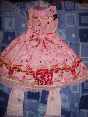
Yes, I got Angelic Pretty's Starry Night Theater! I know a few people will be surprised, because I told people I was saving up for Melty Chocolate! I have wanted SNT for a long time and the price was good. All the items were like new and I think they could have only been worn once or twice. The original owner was obviously very gentle and takes great care of their wardrobe. The dress was just as described, although I did have to look up the dress on Hello Lace for the measurements. I would have loved to get SNT in blue but I know how popular that colour is and that doesn't mean I wont ever get it in the future. The dress is a little short on me (I am 5'4'') but as this is AP, I was expecting this. The items smelt fresh and looked like they had been cleaned. It does need a bit of an iron, but that is to be expected. I would definitely buy from this seller. The seller ID was Nabechan_Yo in case you were wondering.

And so, on to some close-up photos! I know there are loads of SNT photos out there, but I could never get sick to death of SNT photos...


The bodice with card suit and star buttons and the gold trim. The brooch was included, which was in good condition and not fuzzy or damaged.


The print. Marionette Girl and the bunny.


Horse and bear.

The gold trim and AP lace on the bottom hem. I forgot to take more photos, but the dress is fully lined. I have fallen in love with this dress. I can't wait to wear it out somewhere nice!

I got a little surprise when I found a strange lumpy bit on the dress. It turned out that the seller had put the fabric swatch and spare button in the dress pocket! It was wonderful that the seller included this.

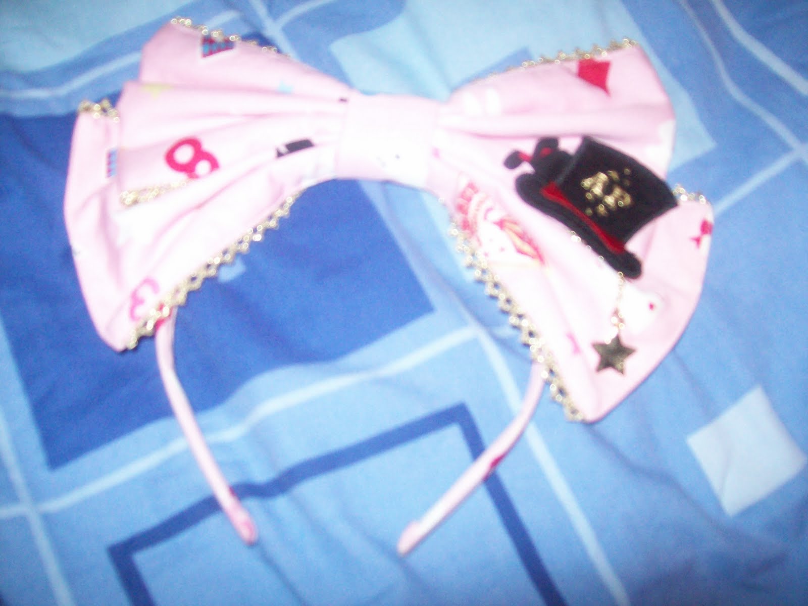
The headbow (sorry about the poor photo). The brooch and little star charm are perfect.


Finally, here are the socks. I don't think these had been worn at all. They still had the little clips that AP put on to keep the socks neat and tidy.


The logo on the sock.

I would give the seller 5/5 as well.

And so, this has been a very successful order and I am very ecstatic right now. I am already planning what outfits I can make with these items.

Sunday 27 November 2011

Items of Desire- Pout Paints by Sleek

With all the different skin tones out there, sometimes it can be hard to find a lip shade that really suits you. And some days you want a look suitable for the day, and something a bit more bold for the evening. Or maybe you just want to try something completely new.

So I think Sleek's Pout Paints are ideal. Sleek is a make-up brand which is available in Superdrug, but I am sure there are other products on the market which do a similar task.


The idea is that you can mix pout paints together to make your very own unique lip colour. It is an interesting idea. Luckily, the Sleek ones are not too expensive (around £4.99) and you only need a very tiny amount because the colour is quite intense. If you got just a couple of paints, you could come up with lots of different shades. Peek-a-bloo (the blue shade) adds depth and warmth and blue tones are also useful if your teeth are not a pearly white shade and want to make them appear brighter. Use Cloud9 (the white shade) to lighten the colour.

Pout paints are great if you want your own personalised shade and it is definitely something I have considered. Being able to play with make-up is brilliant and I can see myself spending an afternoon having a bit of fun with these!

Saturday 26 November 2011

Bittersweet Valentine Thank You

My local group got another Valentine today, but this time it made me feel a little sad inside. But thank you to the maker of number 14.

Friday 25 November 2011

Creepy Bear!

From now, up until Christmas Day, BABY are offering a free bear with every order over 30,000yen (subject to availability). This bear is called "Gentle Bear" and it comes in 2 colours. But...

... I have to say that I think the black teddy with the red eyes is incredibly creepy looking! I think I would get a shock if I opened a BABY parcel and saw those red eyes staring back at me! The brown one is okay, but you can't guarantee you will get that one. I am actually a little relieved that I don't want to place an order with BABY right now!

Thursday 24 November 2011

Classic Melody by Angelic Pretty

Today I will be having a look at Classic Melody by AP. This is a small series with 2 JSKs, a headbow, socks and a bag.

This is the first JSK. The bodice is a nice shape and looks like it will fit well. The neckline also has an interesting shape to it. I like how thin lace is used along the neckline to emphasise the shape. That little chest panel actually has 2 line of lace but because the lace used is so thin, it works quite well. This panel is finished with a soft satin bow. The bow is a good shape and I like the size. There is another, much larger, satin bow on the waist. Usually, I wouldn't like my waist bow being that big, but if you consider how simple the print looks compared to your typical AP pastel OTT print, the large bow is not that overwhelming. However, the waist bow is detachable and I think the dress looks pretty with and without the bow. There are 2 lines of lace running vertically up the bodice, which blend in on the black and pink version, but is more noticable on the ivory version. The straps are a decent width and are finished with thin semi-circle lace, which is pretty but also nice and simple. The back has a panel of shirring, concealed by a tidy-looking ribbon corset. The back part has a bustle. Judging by a side view of the dress, the tiers are well spaced out. Unlike some back bustles, I don't think this one would emphasise a large bottom (which has always been a major issue for me when it comes to bustle skirts) because it doesn't flare out too much. Despite not flaring out much, the bustle does not look flat and limp. The skirt part is your typical AP shape, round and full. It would hold a lot of petticoat underneath and will create a lovely sweet lolita silhouette. The skirt is fairly plain, which helps show off the print better. There are vertical lines of lace running down the skirt, which connect with the bows near the bottom hem, which I would have left off because it doesn't add much to the design. The bottom hem has 2 overlapping lines of lace. As you can see, the pink colourway has contrasting black lace, which I think works well. Then the wider lace underneath has a cute musical note design. The lace is cute and the quality is lovely.


This is the other JSK. The bodice on this dress also looks well fitted and I simply adore the sailor collar. The shape of the sailor collar is interesting and I am surprised by how well it works with the music themed print. The collar is finished with a satin bow, which I think is the perfect size to finish off the collar. As you would expect from satin, the bow is slightly shiny but it is not that bad. The ribbon is a nice shape and it is not floppy looking. The sailor collar is detachable, but I think the dress looks too plain without it. The bodice also has folds, which give it a bit of extra depth. My only dislike with the bodice is the ribbon criss-crossed down the front. It looks like the ribbon used is good quality and it is well spaced out, but it ends very abruptly at the waist. I think a nice black belt would look good with this dress. The back of the dress is very plain and there is no shirring. The skirt part seems to have a more exaggerated roundness to it when compared to the other dress. It is an OTT shape, but given the plainer looking print, it doesn't look too bad. This dress would also hold a lot of petticoat underneath. The skirt part on this dress is even plainer than the other dress in this series, so you can see the print in its full glory. The bottom hem is finished off with some good quality lace. As well as the musical notes, the lace on this dress also features tiny crowns, which looks very pretty.

Today, there is no print close-up because there wasn't a picture of one, but the print is very clear in the photos anyway. The dress comes in black, ivory and pink. I think that both the ivory and the pink look the best, but the ivory would probably be my absolute favourite because I like the idea of doing monotone lolita. I always thought that violins works best with a classic print, but AP have done a good job of making them this print look sweet. I don't quite understand why some of the violins are stripy. It doesn't look bad but I think it would be pretty if all the violins were solid instead of having the stripy ones alternating between the solid ones. I also like the floating musical notes. The print is a bit plain, but I think that was the intention.


This is the headbow. The stripes fit in nicely with the sailor themed dress, but still suits the musical theme too. I absolutely love the 3D music note. I like where it has been placed and also, the size. But I do wish it was slightly more visible.


The only part of the series I am unsure of is the bag. I love the book part, but the metal parts are not really my style. I don't like the way it has been made to look like a folder with the metal rings running along the top.


I think the socks are very cute. From the distance the musical lines make the socks look like stripes. Despite the music notes running and the violin on the side, I think these socks could be very versatile and would suit a lot of outfits.

So overall, I do like this series. I think I prefer the sailor dress and the ivory is the best colour, in my opinion. I think it would appeal to a wider audience rather than just the lolitas who love the typical AP stuff. However, despite this, I don't think this series is going to be that popular. I think it will have its fans but will not be that widely sought after. Would I buy from this series? Well, I do like it, but not enough to put it on my wishlist. It is something I would add to my wardrobe, but it is certainly not a top priority of mine to get this series.

Monday 21 November 2011

A Day Without Lolita

I came to a realisation recently. As much as I love lolita, it takes over my day to day life. Every single day I check the EGL sales community, I watch discussions going on in lolita Facebook groups and I will use the word 'lolita' multiple times in conversations. I know the days that 2nd hand sellers put new stock on their websites, Saturday is Lolita Valentines day and the secrets come out on Sunday. But it is also creeping in to things that have absolutely nothing to do with lolita. I will be looking at clothes whilst out shopping and I will think 'the lace looks cheap on that', and the clothing will have absolutely nothing to do with lolita! It is like something automatically clicks in my brain and makes me look at everything as lolita shopping.

I can't actually remember the last time I had a day where I have not thought about lolita at all. Is this healthy? It sounds harder than people may think. When I went on holiday during the Summer, the internet connection was dodgy and I had none of my lolita clothes with me and at first, I will admit it was difficult to not think about what was going on online. However, by the end of the week I was able to fully relax and I had a great time. I was having fun with people close to me and I did a lot of fun things.

And now, I am absolutely convinced that imposing a lolita ban on myself every now and then is a good idea. It gives me the chance to spend quality time with the people I love outside of lolita rather than getting distracted. Also it is nice to not worry about my appearance! I wouldn't go for too long without lolita because then it would feel as if I was punishing myself for having something I am passionate about. But from time to time, I will have a day without lolita and I will learn to enjoy those days as well.

Saturday 19 November 2011

A sweet valentine thank you

A huge thank you to whoever posted the Oxfordshire Lolitas on Lolita Valentines today. The picture does not have any text, but it still means a lot to see us on there. That picture was taken at the first Oxfordshire Lolita meet (we don't count the smaller meeting we had the September before then) back in January this year. We will be holding our first anniversary meet in February and guess who is hosting it... me! (no pressure!)


It is quite strange looking at that picture. Although a few of us look the same, some of us have changed radically in style since January! I would like to think that is because as time has gone on, some of us have become more confident with our style or have found a lolita style to fit our personalities.

I am so sad I am missing the Christmas meet this year! I hope my fellow Ox lolis have fun!

Friday 18 November 2011

Chiffon Dream

Have you ever sold an item, only to regret it later on? I am suffering the after effects of selling an item right now. Last year when I got my Winter lucky pack from Meta, I got a very nice chiffon blouse but I was absolutely CONVINCED that I would never use it. But back then, I had no idea I would suddenly fall in love with chiffon, or more specifically, chiffon blouses. I love the floaty appearance so much and came up with several outfits that could use a chiffon blouse. And now, I am seriously regretting selling that Meta blouse! I was even told by other lolitas to keep it. Instead of dwelling on the past, I need to focus on getting myself a new blouse. Luckily for me, chiffon blouses have been very popular recently, so there is a lot of choice out there.

I have been very choosy about which chiffon blouse I want to go for. I can't stand fussy collars or cheap looking jewels stuck all over it. In fact, I have seen some very horrible looking blouses over the past few months and only a few which I feel have potential. I saw a nice looking blouse in Primark but I forgot to buy it and it is probably gone by now.

Then, I went to London and completely by chance, I stumbled inside a shop called JSK London. I saw some very cute clothing but sadly, at the time I had no money to buy anything! Now I am going to make it my goal to get the chiffon blouse of my dreams! I WILL complete that outfit I planned! Luckily, the shop has a website, so I can buy the blouse any time. Or I could always return to Primark.

So hopefully, I will soon be part of the chiffon blouse army. I am fed up with being envious of my friends wearing nicer blouses than me! And when you sell anything, do think about it carefully. Your feelings may change and then later on, you may regret it.

Wednesday 16 November 2011

Angel's Gentle Whisper of the Heavenly Holy Night melody by BABY

Today I shall be discussing the latest series by BABY. The full name is in this post's title but to save time, I shall be calling it Angel's Whisper from now on! This series has 2 dresses, a skirt, a bonnet, a headbow, socks, a top and several bits of jewellery.

This is the Gabriel JSK. The bodice looks well fitted, but the lines look a little straight. It gives the bodice a bit of a box-like appearance. It doesn't really flatter a curvy girl's figure. The "belted" appearance helps a little bit by making the waist look a bit smaller. However, the colour of the belt looks a little dull and it almost looks like the printed side has been turned inside out. The large bow uses the same style of material. The bow is very large, but despite this it manages to maintain a good shape. The bow is lined with lace, which looks good quality, but the shape is not that attractive. I also feel the lace adds unnecessary bulk to the already large bow. The rose is a nice touch, but because it is facing downwards it makes it look a bit droopy. My favourite part of the bow is the 2 lines of pearls, which feature cute little star and cross charms. However, I think overall the bow is a bit OTT, but when the bow is detached, the dress is too plain. There is no "happy medium" between the two. The lace on the neckline and running along the sleeves looks good quality but I think it looks a bit like one of those doilies a granny would use. The straps are a little thin and could be a little thicker, maybe without the lace.


The back of the dress has very confusing straps. I think the use of 2 bows is a bit too OTT. There is a panel of shirring, which is concealed by a ribbon corset nicely, and also hidden underneath the bows. The back bustle matches the colour of the belt and bow perfectly. The bustle has a lovely floaty appearance and the tiers are spaced out well.

The skirt flares outwards quite far but the lines are straight, giving the skirt a triangular appearance. You could a lot of petticoat underneath, but the skirt could do with being a bit rounder in shape. I like the bottom of the printed part. The ruffle gives the harsh straight lines, a more frilly edge. The use of bows really works, but they are a bit shiny in appearance. However, there is another appearance of the doily lace underneath the bows. The bottom hem is a continuation of the bustle, but from the front view, the bustle looks a bit droopy as if it is sagging.

This is the Michael JSK. Thankfully, this dress flatters a curvy figure a bit better than the other dress. However, I think the waist looks very wonky in the picture above, with the left hand side appearing higher up. The double lines of ribbon are very cute. I especially like how the lower line has a slight heart shape to it. The ribbon is stripy, which works well with the music lines in the print. The ribbon looks like it is good quality and only has a slight shine to it. The bows finish off both lines well, because they are about the right size. There are also vertical lines of lace, but they blend in quite a bit, so don't add much to the overall appearance. The lace on the neckline and sleeves is pretty, but I think the lace on the sleeves sticks outwards at an odd angle. The straps are still thin, but look more supportive than the straps on the other JSK.


I like the use of chains and charms, which is draped nicely and effortlessly around the waist. I think it looks very cute!


I definitely prefer the back style on this JSK compared to the back on the other one. The bustle is narrower but has more shape. The spacing looks better. However, it might make a large bum look bigger! The shirring panel is concealed by a well-spaced ribbon corset. The ribbon used matches the bustle colour well.

The shape of the skirt still looks a little too straight and is not helped by the wonky waist. The double layer of chiffon at the bottom helps to give the skirt a nicer shape. The bustle looks lovely and soft. it gives the dress a very dreamy feel. The edge of the printed part of the dress is finished off with small bows, which look very pretty.

This is the print close-up, here shown in Holy Night (lavender x navy). The other colours available are Carol (ivory), Blue Angel (sax blue) and Noel (black). I have chosen the navy as my favourite colour because it gives off a dreamy feel. The angels on the print are very cute. I like the way that they are sat on large music notes, carrying flowers and in mid-flight. It makes the angels look more lively. The wavy music lines add a bit of interest and look a lot better wavy instead of straight lines. I also like the candles. I am a little unsure about the crosses in the print because I think the holy theme is a little strong.
I quite like the socks. The little golden angel is very cute. I like all the floating musical notes, which compliment the print well.


This is one of the bits of jewellery from this series- the bow ring. Although the design is simple, the bow is very pretty and I love the star dangler. I also like the little musical notes on the bow.

Although this is not a series I will be adding to my wishlist, I do still think the series has potential. I think the 2nd JSK is very beautiful, but I am hoping that the waist is not as wonky as it is in the stock photos. I think all the colours this comes in work well with the print, but the navy is my favourite. I actually don't know how well this print will sell. It could go either way. I would actually prefer to get the jewellery and socks instead of the dresses. Pretty, but not overwhelming.

Monday 14 November 2011

Outfit post (simple classic) and a few London snaps

Today I am doing a quick post because after an stressful Sunday, I am not really in the greatest of moods and the last thing I feel like doing is writing a long post. So instead I thought I would share my outfit from Saturday. I went to London to celebrate my friend's birthday.

Just so you know, the leather jacket was not intended to be a part of my outfit! I decided to do some toned down classic because the friends I was meeting with were not lolitas. Although they have seen me in lolita before, I didn't want to take the attention away from my friend. And it worked! I had one person come up to me and one person took a sneaky photo without my permission but apart from that, I was left alone. I wore my Meta lucky pack floral JSK and matching barrette (attached to a black bow), with my black Bodyline blouse, bolero and plain black offbrand accessories. It is not a particularly exciting lolita outfit, but it worked for my personal needs.


We went to Hamleys which is a huge toy shop. I managed to find some breathing space on the stairs, which looked amazing. They were all painted and had 3D flowers coming off the walls and wrapped around the stairs.


A completely random book we food! Carrying on with the theme, there is another wall in the background covered in foliage! This time the leaves were real and the shop calls this the "living wall".


We are fans of Angry Birds, so Jo had a face-off with the largest Angry Bird in Hamleys. I would have loved to get one of these but I doubt there is enough room in my house.


A random plug we found!


We went to the Hummingbird Bakery. I thought the display cupcakes were really cute! I had a chocolate cupcake with chocolate frosting. It tasted amazing. This is my 2nd time going there and it is fun going to the actual bakery, rather than just using the cookbook at home.


The Olympic count-down clock in Trafalgar Square. London is going to go absolutely mental next Summer! Maybe I should have an Olympics party.


And when I was having a bad Sunday, I was really craving this children's book. It is one of the most amusing books I have ever had the pleasure of reading.

I should be back to normal on Wednesday and I am very sorry for the odd post today.

Friday 11 November 2011

Garnier BB Cream Review

I have got to be honest- I am not the most knowledgeable person when it comes to make-up and I never really write reviews for beauty products. But BB Cream is something I have been curious about for a long time so I thought I should at least try.


As you can see, I was too tight to actually go and buy the product! This is the sample I got in the post after filling out a form on the Garnier BB website. You get 3 generous sachets and a coupon to get some money off your next BB buy (provided you like it, of course).


I went for light because I am incredibly pale skinned. This BB cream only comes in 2 shades, which I find disappointing. As I was predicting, this product was too dark for my skin so I would need to mix in a little moisturiser to make a shade closer to my natural colouring. However, some Asian BB creams appear very grey when you first put them on your skin so I suppose the colour for this one was better than I was expecting. Somehow, I have managed to lose the picture of what the actual product looks like but when I put some on my fingers, it felt just like a liquid foundation. I was a little concerned because it also felt a bit greasy and my skin can get very oily.


This first picture is part of my face before I applied BB cream or anything else. Sorry for not showing my full face but I was having a bad skin day and I was too self-conscious to show the rest of my face! As you can see I have some dark patches and blemishes. I also get very red in the face around my nose and cheeks and some of my pores are visible.


This is how my skin looked after applying the Garnier BB Cream and absolutely nothing else. Just as I predicted, the cream felt very greasy on my skin. A lot of BB creams are meant to give a dewy complexion but my skin just appeared more shiny than usual. I had to apply more powder than usual afterwards and my make-up felt as though it would slide off my face at any moment. I would probably use primer first if I were to use this BB cream again. My pores did not feel as clogged as usual. My blemishes were still visible but not as noticeable as they were in the previous picture. Despite this, my skin tone did appear more even.


This is how I looked after adding foundation, concealer and powder (yes, I wear a lot of make-up). I could not use the BB cream in place of foundation because you could still see some flaws. However, I found that I could apply a lot less foundation than I usually do. I still needed a similar amount of concealer just to make sure my blemishes were well and truly covered. My make-up stayed in place for a few hours, after which I just had to top up my powder because my skin became shiny again.

At £10 a tube, I think I would spend a little bit more to import an Asian BB Cream or I would try a different one on the Western market. The Garnier BB Cream does do some of the tasks it promises but I don't think the difference is majorly noticable. I probably would not buy this particular BB cream unless I was on a very limited budget.

I have not been converted to BB creams yet. My next task will be to try another BB cream when I get the chance. I am looking in to getting one by Missha next. I am thinking of getting this one in shade 13, Milky Beige- http://www.thebbcreamshop.com/index.php?main_page=product_info&cPath=13&products_id=153&zenid=v5kjihl6faac14lkt5pcp2f0s3
Hopefully I will get to try it in the near future.

Tuesday 8 November 2011

An AP print discussion double post!

To make up for the fact that I got a bit behind with the print discussions, I will today be discussing 2 Angelic pretty prints! Today I am looking at Moon Night Theatre and Sugar Hearts. I will be doing MNT first, so scroll down if you want to skip to Sugar Hearts. Brace yourselves, this will be a very long post!

Firstly, here is Moon Night Theatre. The series is comprised of 3 dresses, a skirt, head bow, socks and some accessories. This series has already been released.

This is the OP. The bodice looks very well fitted. I like how this dress is divided in to 2 parts so the print is not totally dominant. The front corset looks very neat and well spaced out and the ribbon looks good quality. Although the lace running vertically alongside the corset looks neat and well presented, I didn't like the shape and type of lace used. The neck ties help to give the dress a good shape and are a good length. The sleeves look cute and I like the slight puffy appearance. They also look nicely elasticated for various sizes and the lace used is good quality and cute. There are 2 small bows on each sleeve, which looks a little fussy, so I would have preferred just one pair of bows here. The back has a panel of shirring, which is concealed by a ribbon corset. The waist ties are also very well concealed and not that visible from the front. The skirt has a cute round shape to it. Although the skirt is a pretty shape, maybe it is a little too sweet compared to the print. Despite the large number of pleats, it doesn't appear to conceal the print that badly. The lace on the bottom hem is very pretty and features 'A' and 'P' on it.


This is the pleated JSK. The overall shape of the bodice looks well fitted, but in a few of the pictures the dress material looked a bit loose in places. Unlike the OP, this JSK features the print all over so I think the belt around the waist is a good idea to help break it up a bit. The waist bow looks very cute and if you like, you can detach the belt. There are another 2 lines of black material topped with bows, which stop the dress from looking too plain. These bits are surrounded by pretty lace, but the lace blends in a bit so it is not instantly noticeable. There is thin lace along the neckline and along the sleeves, which looks nice and soft. The straps are a bit thin, but the lace helps to thicken them a little. I would have liked wider straps for more support and to stop them falling down. The back does not have any shirring in it, so not good for larger wearers. The back has been kept plain apart from some ribbon crossing over between the straps. The skirt looks a very generous size and with the pleats as well, it will fit a lot of petticoat underneath. The overall shape is not as rounded as the OP, but I prefer the slightly more A-line shape. The pleats on this dress are a bit deeper so the print is a bit more obscured and not displayed as well. But at least the print is not covered with too many details such as extra ribbons. The bottom hem is finished with the same lace as the OP.


This is the tiered JSK. The bodice looks a good shape, but it doesn't look that well fitted. Thankfully, the detachable belt has been used on this JSK as well to help break up the print. Going on first impressions, the dress looks a bit plain, but the bodice does have a raised section, which has folds in it to give it added volume and texture. I think the ribbon on the front looks a little strange and maybe would have looked nicer if it was in a zigzag shape. The straps are a bit thin, but they do match the belt very well. The straps are topped with nicely shaped bows, which adds interest. There is a large panel of shirring on the back which has been left open, so it looks very exposed. I also thought that when the ribbon waist ties were removed, the shirring was more obvious because you could see the difference in the print spacing. The skirt shape is a bit lumpy, but you tend to expect that at least a little bit with tiered designs. The skirt flares outwards nicely, so it will fit a lot of petticoat. There is a ribbon line running along the bottom hem, which is then finished with more of the same lace. For some reason the lace appears wider and more noticable on this dress, compared to the other 2 dresses.


And this is the print close-up. In all honesty, when I saw the title Moon Night Theatre, I was expecting something very different to the actual print. I thought it would be similar to Starry Night Theatre (a series I would love to own) and that I would instantly fall in love with this new series. But as you can see, this print is not what I was expecting and because I set my hopes highly, I was disappointed! I do like the gold parts on the print such as the chandeliers, castle, curtains and top hat. What I can't get over is why AP have chosen to obscure what could have been a beautiful print with ANGELIC PRETTY written in massive letters over the top. Are AP, trying to hammer home the message about where you got your dress from? With the letters being so dominant, this print was a huge let-down for me. However, it is interesting to see AP using more muted colours. Despite this, I think my favourite is the black colour, simply because the gold stands out the best on the darker background.

So overall, I think the dress designs suit the print, but the print is just not that exciting. I was very disappointed with this series and I was hoping for a lot more. However, I did like the necklace that was released as part of this series, but sadly I forgot to get a picture! I would recommend looking up the necklace.

And now, we will move on to Sugar Hearts, which is a slightly newer series but is already available on AP's website. This series has 2 dresses, a skirt, a headbow, a cutsew, and there are still socks to come. A few pieces from the Candy Treat series have also been made available again because Sugar Hearts is a bit like a continuation of the Candy Treat series, as you will see below.

This is the OP. As you can see, this series is made with chiffon, giving it a soft floaty feel. The bodice looks well fitted, considering the material used (you don't really want tight chiffon!). The belt helps to make the dress smart, stopping it from looking like frilly nightwear. The sleeves look a bit droopy and could have had a bit more shape to them. The sleeves and neckline have lines of thin lace, which has heart shape details. The lace is a good width, because the dress is frilly enough.


The bodice has a raised panel, lined with more heart lace and topped with very cute buttons. I absolutely love the buttons! They are so sweet and look just like the actual sweets. There is a floaty bow just above the buttons, but I think it looks a bit cheap and I would take it off.


The back has a panel of shirring, which is concealed well by a ribbon corset. I quite like the waist ties (shown) because unlike a lot of waist ties, they are not completely boring! I like the rounded ruffle edge, topped with bows.

The skirt part flares out nicely, so it is prefect for a sweet look. The tiers are spaced nicely. I think tiers look really pretty when used with chiffon. It looks so frothy and girly, and surprisingly for me, I love it! Each tier is finished nicely with some thin lace, just to make the edges look prettier.


This is the JSK. I like the babydoll high waist design, although it does look a bit like a nightie. I think this is one of those dresses that you could wear casually, but with the right accessories, you could make a beautiful OTT outfit with it too. I think the heart shaped neckline is pretty and the bows at the bottom of the straps compliment the design. The bows are not too big, shaped nicely and placed well. I also think that the straps are the right width for the dress style.


However, I do think that the JSK does have too many buttons on the front. They look overcrowded. Sometimes, less is more! The chest area also has quite a bit of gathering. It will help add a bit of volume to a smaller bust.

The skirt part is not as flared as the OP and doesn't flow as nicely. But it is still very cute, and you will be able to use a lot of petticoat with it. The edges of the tiers have different lace, which is wider and more noticeable and topped with bows. It looks more fancy, but I prefer the OP.


Finally, here is the print close-up. It is not exactly original, but it does take my favourite part of the Candy Treat print and makes it the main feature. I loved the candy hearts on Candy Treat and I love them here as well. The colours are the typical range of pastels, white and black. I would happily wear any of the pastel shades or the white version. I didn't think the black version looked as pretty. I figured with such a cute print, I would go the whole way and pick the sweetest colours too!

So whilst this series does not seem that special, I am not dismissing it. Although it doesn't appear to be selling that quickly, I think it would be a great addition to a sweet wardrobe. I would definitely buy from this series. I think I would go for the OP because I think the design works better. As for the colour? I am not fussy. I like all the colours. Sugar Hearts does not live up to its 'mother print' (I just randomly came up with the term 'mother print' right now!) Candy Treat but it is still super cute.

And so, if you are reading this sentence, it means you got to the end of my mammoth post. Give yourself a pat on the back. You deserve it!
Related Posts Plugin for WordPress, Blogger...