Woohoo! It is Christmas in 5 days! I would like to wish all of my readers a very Merry Christmas and a Happy New Year! I hope you all have a good time and stay safe. I had to sign for a Bodyline parcel on James' behalf a few weeks back, so I know I am getting something lolita related under the Christmas tree. It has been driving me mad ever since!
Over the holiday period I will be taking a bit of a break. I think it is important to spend this time with family and friends. At the moment I am intending to be back around Thursday the 3rd of January or somewhere around then.
I didn't allow myself enough time to make a Christmas card for this blog this year, so as an alternative I present a link to a video of Milanoo doing a Gangnam Style parody whilst wearing zentai suits- http://www.youtube.com/watch?v=0mC6O8Z7gug Ever wondered what Milanoo get up to when they are not making awful dresses and ripping people off? Well, now we all know. I didn't find the video particularly good but eyebrows were definitely raised...
I hope to see you all again in the new year! Merry Christmas!

Thursday, 20 December 2012
Monday, 17 December 2012
Fancy Egg by Metamorphose
Today I am taking a look at Fancy Egg by Meta. This series includes 4 dresses, shorts, 3 skirts, 2 blouses, a vest, socks and 5 different hair accessories.

This is the Bustle Pinafore JSK. The bodice looks very well fitted and it has an interesting shape. I think some may find the shape a bit too sharp, but I personally think it suits the dress quite well. The straps are a nice width. The ruffle along the straps does remind me a little of a maid's apron but again, it seems to suit the dress well and does soften the edges of the straps nicely. The neck straps look good too and add a bit of interest. I really like the use of gold lace running up the bodice as I think it really suits the print and the gold colour gives it a bit of a luxurious feel. There is also gold lace running along the neckline and along the inside of the straps, which is good because it stops the dress looking too plain. The bodice has 3 bows- 2 on the chest area and one at the waist. The waist bow is a good size for the dress. It has a lovely shape and looks very firm. Although I have no issues with the waist bow, I can take or leave it. I would have been satisfied with just the 2 bows on the chest. I think the chest bows are a good size and are spaced nicely. They do blend in a bit, but I think they work quite well.

The back has a panel of shirring, which is concealed by a ribbon corset. It looks fairly neatly done, although it would have been nice if the ribbon colour matched a bit better. The back also has a bustle made of chiffon. I like the use of chiffon because it is a soft, floaty material. So although it does add volume, it isn't too much and hopefully it wouldn't emphasise a larger backside as much. The bustle is a nice width and the layers are spaced out nicely.
The skirt has a very rounded and plump shape to it. I think it looks good teamed with the fitted bodice. It flares out beautifully and will hold a lot of petticoat. There is a line of gold lace running horizontally along the skirt, just a little bit below the waist. It doesn't distract too much and the focus is still on the print, which is good. It makes things look a bit smart and it ties in with the use of gold on the bodice. The print is displayed very well. The bottom is finished with more gold lace. Although this doesn't look bad, I think it would have looked nice with a ruffle at the bottom, to match the ruffles on the straps.

This is the Pleated Pinafore JSK. This dress comes in 2 different lengths and the length is the only difference between the two. The one in this photo is the mini length. The bodice looks well fitted and a good shape. I am a huge chiffon fan usually, but I am a little unsure with the way it has been used for the belt. I have no issue with the bow, but I think the bit running around the dress looks a bit untidy. The loops for the belt seem to be very obvious as well and stick out. I would have been happy to just have the chiffon bow part as a brooch and forget about the belt part. On the bodice there is a line of dull satin ribbon with a pleat of chiffon underneath it. I think the pleated chiffon here looks very pretty. It looks a bit different to the sort of bodice details we are used to seeing and it has been done quite neatly. The straps are a suitable width for the dress. I like how the base of the strap has a bow on one side and a brooch on the other. The brooch is pretty, but I think it would have been nice to have a bit of gold colour on it, to tie in with the gold used in the print. The back has a panel of shirring which is concealed by a ribbon corset. This keep it looking neat and tidy. The skirt shape is also very rounded and full on this dress. I love how plump it is. It will hold a decent amount of petticoat too. Apart from where the chiffon waist bow ends, the skirt is kept free of clutter and so, the print is displayed very well. I am unsure about the use of pleated chiffon on the bottom hem. Whilst I thought it looked okay on the bodice, I don't think it works as well here. I think the chiffon is too wide here and the pleats are slightly too harsh. It maybe would have looked better if it was just lightly gathered instead of pleated.

This is the High Waist JSK. The bodice looks well fitted. I am unsure if I like the shape of the bodice though. The shape of the waist line could potentially make the waist area look wider and I simply don't think it looks as appealing.

The bodice is interesting. It has a couple of different trims. I do like the fringe trim which can be seen running under the arm because it is a bit different, but has been kept narrow, so it is also not too distracting. The trim running along the waist line and vertically up the bodice is nice too. It helps to hide where the bodice and skirt join and also stops the bodice looking too flat. Even the straps have trim running along them, which makes them look a bit more interesting and gives additional texture. I also think it has all been done very neatly. The straps have a ruffle too, which I still think looks a bit too maid-like. There are also 2 lines of satin ribbon running across the bodice and topped with bows. This has also been done neatly and the bows are kept suitably small. However, I am unsure I like these 2 lines of satin ribbon. I was a bit unsure if it really suited the overall theme of the dress and I thought it looked too plain. Overall, I think this is probably my least favourite bodice of the 3 dresses in the series.
The back has a panel of shirring which is concealed by a ribbon corset. I again feel like Meta could have used a ribbon colour which blends in a bit better. But it still looks very neat and tidy. As this is a high waisted JSK, the skirt is very long. I do think it would probably suit some body shapes better than others. Although it does flare outwards quite well, I would be tempted to use a petticoat with a bit less volume. I don't think this dress would look as attractive if it had lots of petticoat stuffed underneath. I do think it is a pretty skirt shape, but maybe this style of dress is not for everybody. The skirt has a line of the fringe trim running horizontally, about halfway down the skirt. This is not too distracting and doesn't affect the skirt shape at all. It also doesn't distract from the print, which is displayed really well. The bottom hem is finished off with a pretty ruffle, which I think matches the strap ruffles perfectly.

And here is the print. This print is available in black, sax blue, pink and pea green. I am very undecided about which is my favourite colour. I think a lot of it depends on your opinion of harlequin print. The harlequin background on black colour way is very bold, whereas the diamonds on the other 3 colours blends in a lot and is much more subtle. At first I really liked the black version, then I moved on to the sax blue and now my favourite is the pink! I think the reason why I am currently favouring the pink is because I like the mint colour in the background, behind the eggs. As for the print itself, I think is is stunning. The Faberge style eggs are drawn beautifully with lots of luxurious details to them. I adore the egg with the carousel in the middle. I also really love the egg which is a carriage. It is a very interesting idea for a print and a bit different to the usual prints we are used to seeing. That just makes me love it even more! The swan lace at the bottom is a nice finishing touch too. I don't think there is a single part of this print I don't like!
So overall, I think this series has a lot of potential. Would I buy this print? Yes! I think this series may be appearing on my wishlist very soon. I really like the idea behind the print and how it has been executed. Although I would have to settle on a colour first! I would go for the Bustle Pinafore JSK, as I think it is interesting. However, I do think all 3 dresses have a lot of potential. I think this could be a very strong series and it is one of the best prints that Meta have released in a while.
Thursday, 13 December 2012
MUA Nail Constellation Nail Kit
So back in July I made a post about a Caviar Nail kit by Ciate- http://luna-rain.blogspot.co.uk/2012/07/ciate-caviar-manicure-set.html
In the end, I never got around to buying the Ciate kit. Since then, there have been cheaper versions made. So I decided to buy one from MUA. If you live in the UK, you can find MUA in Superdrug. Since buying this kit, I have also discovered that Primark have released their own version. The colours don't look as varied in the Primark kit, but I will try and get one to see how it compares to the MUA one.

These kits cost £3 and you would probably get a couple of uses out of a bottle. MUA have 5 different colours as part of their Constellation collection. I decided to go for Libra, which is black with some green mixed in.

I did a bit of a test run, painting just one of my thumbs. Whilst my nail polish was still wet, I poured the balls over. I managed to get a very decent coverage and you could only spot my lavender nail polish around the edges, where I missed. I will spend more time focusing on the edges next time. The instructions suggested to press the balls on the nails, so that it what I did. The finishing result was a nail that looked like it had been dipped in caviar! It gave a nice 3D effect but at the same time, the balls were not too bulky. This makes it quite easy to wear and it didn't catch my nail on anything as I went about my daily business. I did wonder just how secure the balls would be so I decided to see how well it would last after I had been to bed. The following morning I had only lost a few balls at the very tip of my nail. When I say a few, it really was only a few balls and the majority of my nail was not affected at all. I couldn't even find any bits that had fallen off lying about anywhere. My nail also survived the shower. So I would say that the kit is quite strong. You could probably get away with wearing it for a couple of days and you would only need to top up the edges.

My only complaint is the packaging. The plastic top was so stiff, that when I first opened it, I managed to spill beads all over me. I understand that this is so that the kit wont spill out while being stored, but it was very frustrating. The lid doubles up as a funnel to get the leftover beads back in to the pot once you are done. I found that the funnel didn't work that well because it had a thick rim that the beads kept getting caught on. Most of the beads ended up clinging to the funnel instead of going back in the pot. I found it quicker to put the beads back in by hand.
But despite some problems I had with the packaging, I think the kit is definitely worth £3. It is incredibly cheap compared to the Ciate kit. The Constellation Collection colours are also very interesting, with loads of different metallic coloured beads. I only got the Libra kit, but I was very tempted by the Gemini kit which is a mix of pink, blue and silver. I would definitely recommend the MUA kit and would buy it again.
In the end, I never got around to buying the Ciate kit. Since then, there have been cheaper versions made. So I decided to buy one from MUA. If you live in the UK, you can find MUA in Superdrug. Since buying this kit, I have also discovered that Primark have released their own version. The colours don't look as varied in the Primark kit, but I will try and get one to see how it compares to the MUA one.

These kits cost £3 and you would probably get a couple of uses out of a bottle. MUA have 5 different colours as part of their Constellation collection. I decided to go for Libra, which is black with some green mixed in.


But despite some problems I had with the packaging, I think the kit is definitely worth £3. It is incredibly cheap compared to the Ciate kit. The Constellation Collection colours are also very interesting, with loads of different metallic coloured beads. I only got the Libra kit, but I was very tempted by the Gemini kit which is a mix of pink, blue and silver. I would definitely recommend the MUA kit and would buy it again.
Monday, 10 December 2012
Gloria by Alice and the Pirates
Firstly, I apologise for doing 2 print discussion posts in a row. I really want to get these out of the way before my Christmas break. So today I will take a look at Gloria by Alice and the Pirates. This series includes 3 dresses, a skirt, socks, a blouse, a headdress, a headband and a few accessories.

This is the Therese OP. There isn't much of a bodice to this dress but it is a good shape for what it is. The long sleeves look very pretty and are finished well with pretty ribbon bows. The bows are kept fairly small, which is good as it doesn't look that bulky or too fussy. There is a waist bow which is kept suitably small. However, for some reason I think it looks a bit out of place. I actually think that it could look better if it was on the neckline, where the collar meets in the middle.

As for the collar, I do think it is a bit too wide. It will emphasise how wide the wearer's shoulders are. The lace around the edges just emphasises it further. Overall, I think the collar needs to sit nearer to the neck instead of on the shoulders. It all looks a bit awkward. The collar does have some pretty embroidery though, as shown in the picture. I just wish it was shaped differently so it is a bit more flattering.
The back has no shirring and is kept plain. I absolutely hate the shape of the skirt on this dress. It looks so frumpy and reminds me of a Victorian style nightie. I think that maybe the skirt is a bit too long. But maybe instead of making the overall dress length shorter, it would look a bit better if the bodice was a bit longer and the skirt started a bit lower down. As it is, I think it looks a bit shapeless and it would take a specific body shape to really pull this dress off well. On a more positive note, at least the print is displayed well, as the skirt is kept free of distracting details. The bottom hem is finished off neatly with some good quality lace. Overall though, I personally think this dress is hideous.

This is the Maria JSK. The bodice is a very pretty shape. There are a few spots where the material looks a bit baggy so maybe it wont be as well fitted, but overall it looks good. I do like the idea of using lacey looking material on the waist bow, as it is a bit different and contrasts nicely. However, the waist bow is far too big for my liking. It's so huge! I actually find it a bit too distracting. Despite its size, it has got a nice shape to it and it doesn't sag or look droopy. The pearls on the waist bow are a nice touch too. I just wish it was a bit smaller. Although, I also feel the dress would look fine without it there at all. The yoke is a nice shape and I think it is a good size for the bodice. It is done neatly and it does compliment the rest of the dress. The edges are lined really well with a thin ruffle. The yoke is topped with a bow. The shape of the bow is a bit simple but I think a more elaborate bow here would look too OTT. The straps are a nice width and are topped with layers of lace. I think it has been done well and doesn't look out of place. The back has a panel of shirring, which is concealed very neatly by a ribbon corset. The back also has a bustle which uses the same material as the yoke and the waist bow. The bustle tiers are spaced out well and layered nicely. The skirt is a good shape. It is full and rounded but without looking too OTT. It will hold a decent amount of petticoat too. The skirt is kept free of cluttering details. This means the print is displayed beautifully. I am not too keen on the lace used on the bottom hem though, as I think it is a bit too wide.

This is the Mary Jeanne JSK. The bodice is a very interesting shape. The corset styling really defines the waist area well. The straps are a bit thin and I would have preferred them to be a tiny little bit wider.

I adore the pearl chain details on the bodice. It looks so pretty and I think it adds a lot of interest. I would really love to see more bodice details like this in the future. As for the corset detailing on the front, it has been done neatly and the ribbon blends in well. The edges are also finished neatly with lace, which is a nice touch. I think it is a good idea to have a ribbon above the corset part, but I think I would have chosen different ribbon to the one AatP used. I don't think there is anything wrong with it, I just don't think is the best choice. I wouldn't have bothered with the ribbon bow in the middle. It looks too cute in comparison to the style on the rest of the dress. I also don't think it is really needed as there is already enough detail on the bodice.
The back has a panel of shirring which is concealed by a ribbon corset. This shirring panel is so narrow though, and I was very surprised that the size listed on the website was more flexible than I first thought. The skirt has a very lovely shape to it. It has a nice, full bell shape. There are no distracting details on the skirt, so once again the print is displayed beautifully. The bottom hem is then finished off nicely with some good quality lace.

And here is the print close up. The print is available in ivory, bordeaux, navy and black. This print is absolutely stunning. What first drew me in was all the different colours in the print. It's very vibrant and eye catching. And the glass windows are drawn so beautifully. They are full of lots of detail. It reminds me of real stained glass windows. I think my favourite part is is the cherubs frolicking amongst the roses (shown on the right set of windows in the picture). Yes, it is a theme we have seen before, but I think this print outshines previous efforts. I think my favourite colour is the black version because all the vibrant colours of the glass windows really stand out against the dark background.

I really like the barrette for this series. It is very different and has an interesting shape to it. I like how unusual it is. I like the roses and I think it matches well with the print. The dangling charm is a nice touch too.
So overall I do think this could be a very strong series. The print is gorgeous. From time to time the dress designs maybe let the print down a little, but I think there are some good options available. I would probably pick the Mary Jeanne JSK in black, or maybe navy as a compromise. I would definitely avoid the OP though. I think this is a series I would buy from. It might not be going on my wishlist but it is something I wouldn't mind owning. I do have very high hopes for this print and I am very interested to see how people co-ordinate it.
Thursday, 6 December 2012
AP's Marshmallow Bunny

This is the OP. The bodice is a nice shape. It is not that well fitted but I suppose that is due to how flexible the sizing is on the OP. It may look a bit too baggy on smaller wearers. The waist ties on this dress have pom poms on the end of them, which is a nice touch. It fits in very well with the rabbit theme. They may get a bit squished if you sit down a lot though! The sleeves are very cute and I think they have the right amount of puff to them. The neck ties add a bit of interest and look smart. I think the waist bow is the correct sort of size for this dress. It has a nice solid shape to it too and it doesn't droop. However, I am not really sure the waist bow is needed, what with the other bows down the bodice. I think the ones on the bodice are enough and the dress would look fine without the waist one.

I didn't realise just how detailed the bodice bow ribbons were until I saw this close-up picture. The bows are a decent size and are spaced out quite well. I do like the effort that has gone in to the bows. AP have used polka dot ribbon and also topped the bows with some heart shaped lace. It makes things a bit more interesting. I think it is very cute. The lace around the neckline is a good choice. It makes the neckline look softer but it is not too distracting. The folds in the fabric add a bit of interest and stop the material looking too flat and plain. I am not too fussed by the semi-circle lace. What I like about the bodice is that despite it being quite heavily detailed, your eyes are still drawn to the bows. Overall, I think it works quite well.
The back has a panel of shirring which runs the whole way across. It is very open and exposed so it doesn't look that pretty, but it does give the dress a more flexible size range. The skirt has that typical full AP shape to it. I love how rounded and plump it looks. It flares out well and will hold a lot of petticoat. The skirt is kept clutter-free and so, the print is displayed very well. The bottom hem is finished off with some cute polka dot lace. I was a bit surprised that there wasn't some special bunny themed lace here, as AP usually comes out with some very elaborate lace, but I guess the polka dot lace is still nice.

This is the Ribbon JSK. The bodice is a good shape and it looks like it is well fitted too. In some ways, this JSK is very similar to the OP. It has the exact same colourful ribbon bows on the front and it also has the semi-circle lace running up the sides of the bodice. The waist bow is quite a bit smaller on this JSK, but I still don't think it is that necessary. The ribbon bows are enough by themselves. On this JSK there is a line of wide lace running behind the ribbon bows, which is only really stands out if you get the black colour. I don't particularly like this detail and I don't think it adds anything to the dress by being there. The neckline has a line of ladder lace with ribbon threaded through it, which looks pretty. The straps are a bit thin in width, but I think the width suits the style of dress. The straps have 2 tiny bows at the bottom, which makes it look neater. However, these 2 additional bows brings the bow count on the bodice up to 6. I think that having 6 bows, which are all in close proximity to each other, is probably a bit too OTT. However, it does look very cute and I suppose the 2 strap bows are quite small. The back has a panel of shirring which is concealed very well by a ribbon corset. The shirring panel is quite narrow though, and it doesn't look like it is going to be very forgiving size-wise. This JSK also has the same waist ties with the pom poms on the end. The skirt again has a very full and rounded shape to it. It is not as rounded as the skirt on the OP, but it is still very pretty. It flares out well and will hold a decent amount of petticoat. The skirt is kept free of distracting details and so, the print is displayed well. The bottom hem is finished off with the same polka dot lace which is cute, but I still think it is a bit dull considering this is AP.

This is the collar JSK. The bodice material looked a bit loose in some of the stock photos and I think the shape of the bodice is a bit boring too. The waist has a line of ribbon around the waist with a tiny little bow in the front centre. This detail is not that noticeable and blends in a lot (unless you get this in black). It is not really that interesting, but I think the main point of this is to make the waist area neat and tidy. It just gives a smarter appearance. The bodice is very dull, mainly because all of the focus is on the collar. The bodice has a pleated section in the middle and 2 lines of lace running up the sides, which then continue on up the straps. But that aside, there is nothing there. And so, the entire focus of this dress (and I think the only real selling point of this particular JSK) is on the soft furry collar. The collar is adorable. It is a nice shape and I like how the ends of the ribbon ties have the pom poms. I do think the idea is a bit conflicting though, as this is quite an Easter sort of print and you probably wouldn't want to be wearing a fur collar around that time of year. The collar is detachable, but the dress is so boring and plain without it, that I don't think I would want to detach it. The back doesn't have any shirring. It has the same waist ties with pom poms on the end if you need to make it smaller. Otherwise, the size of this dress is not that flexible. The skirt doesn't look as flared or as rounded when compared to the other 2 dresses. It still looks nice, just not as good. But it will still hold a lot of petticoat underneath. The skirt is free from details and the print is displayed very well. The bottom hem is finished off with some good quality, but plain looking lace. I think that the polka dot lace on the bottom of the other 2 dresses would have been an improvement here.


This is the brooch from the series. It looks like it would be simple to make, but I have fallen for its charms anyway! I think it is simply adorable. It looks so soft and fluffy and I love the pearl chain and bow with its little gold charm. The design is simple enough that you could use it with other sweet prints as well. The international site hasn't got this brooch in yet though and we may not even get it, which is a shame because I would definitely buy one.
So I do think that this is quite a cute series. I wouldn't say it was Angelic Pretty's best work and I wouldn't go out of my way to own it. But it is still very sweet for what it is. If I did have to pick a dress I would go for the Ribbon JSK in either pink or sax. I do know that there are rabbit fans out there who are going to love this series, but I can't see it being a huge hit.
Monday, 3 December 2012
My Experience of Wearing "Lolita" to a Wedding
I hope everybody had a good International Lolita Day on Saturday! I intended to write today's post a lot sooner, but I have only just found the opportunity to fit it in.
Back in October I was having a bit of a dilemma. My husband James and I had been invited to a wedding and I had absolutely nothing to wear. I had set a little money aside but... I ended up buying AatP's Midsummer's Night Dream instead (there was no way I was going to pass this dress up AGAIN). The trouble is, I had been so focused on my lolita wardrobe that the rest of my wardrobe was severely lacking as a result. I had a few non-lolita dresses and some smart trousers, but none of them looked right for a wedding. I absolutely agonised over what to wear but in the end, I decided I would wear a lolita dress. I did feel incredibly guilty, as I have always felt that it would be a bad idea to wear lolita to a wedding. Do I dare risk upsetting the bride? I was scared I was being selfish but I really couldn't think of anything else to wear.

So I ended up wearing the very dress that had eaten up my wedding outfit fund! To make it "Wedding Friendly" I deliberately didn't put together a typically lolita outfit. I was quite lucky because the couple in question are what you would call stereotypical western style goths. I knew that a lot of their gothic wearing friends would be attending and so I thought the best route would be to wear black. I think that using black really toned down the dress. By thinking about what the other guests would be wearing, I was able to "blend in" a bit better. I wore a very deflated Bodyline petticoat as the dress looked a bit strange on me without any poof, but it didn't flare outwards too much. I didn't use any hair accessories either. Overall, my outfit was very paired-down and basic, but at the same time it looked smart enough for a wedding.
And it worked. Nobody at the wedding felt that I was out of place and I didn't attract much attention at all. Sure, I was a bit more covered up in comparison to the other girls in their shorter dresses, but that aside there was not much difference. I started to relax a lot more. The bride looked stunning and she was the most beautiful girl in the room.
But despite my positive experience, this is not something I think I would do again. I think that just because this time the bride was understanding, it doesn't mean that every wedding would be the same. A lot of it does depend on the couple. I know nobody likes a "Bridezilla" but after being in that position I can understand the amount of time, money and effort that goes in to weddings. You have an idea in your head of how you want everything to be. As frustrating as it may be sometimes, I believe you should respect the wishes of the couple. If they outright tell you that you can not wear lolita to their wedding, then as far as I am concerned, that is game over.
If I were to give advice to anybody who did want to wear lolita to a wedding, it would to keep things simple. I would choose solid coloured pieces over prints and if I did go for a print, I think classic would go down better. I would keep petticoats to a minimum as it not only grabs attention, but there is also a risk of it mimicking the shape of the bride's dress. I would keep the AP plastic jewellery at home and go for more traditional looking accessories. If in doubt, show somebody what you intend to wear and get their opinion.
Thursday, 29 November 2012
The Secret Garden by BABY
Today I will be taking a look at The Secret Garden series by BABY. This is quite a large series with 2 dresses, a skirt, 2 blouses, a bolero, a bag, socks, tights, a few pieces of jewellery, a hat and 6 different hair accessories. Considering the amount of items in this series, I get the impression that Baby are expecting this series to be a huge hit...

This is the Rosette Rose JSK. The bodice looks quite well fitted. The overall shape of the bodice could maybe be a bit more interesting, but looks okay. The straps are a good width for the style of dress. I like the soft looking ruffle running along the straps. It stops the straps looking too plain and softens the harsh edge of the strap.

The size of the waist bow suits the dress well. It also has a nice shape to it and doesn't droop much. The ruffle along the bow edges add a bit of interest without making it look too OTT. I am a little unsure about the use of ribbon across the bodice. Whilst I don't think it looks bad, I don't think the ribbon line halfway down the bodice is really needed. With the waist bow and the ribbon bow on the neckline, I don't think the dress really needs another ribbon bow here. It maybe makes the bodice look a bit too cluttered. However, I think the neckline details are gorgeous. The neckline has a good shape to it and the soft ruffle compliments it well. But my favourite part is the rose corsage. I think it looks beautiful. The roses have a lovely deep colour to them and the corsage size is just about right. I also think it gives the dress a more decorative and luxurious feel, but at the same time it doesn't look too much.
The back has a panel of shirring. It is concealed very well by a ribbon corset and it is all kept very neat and tidy. The skirt has a very pretty and full shape to it. It flares out nicely and the print is displayed well. The bottom hem is finished off with 3 ruffles. The ruffles are layered softly. I think the ruffles are a good width and the ruffles on the bodice tie in well with the bottom hem. The bottom hem ruffles are then topped with matching ribbon bows.

This is the Elise JSK. The bodice looks well fitted and I think the bodice shape is beautiful. The straps are a decent width too. I love how the waist has the ribbons on the side. They are placed so well and I love the way they sit on the dress. The ribbon used is soft and floaty looking and I love the use of deep colours too. The bodice is split in to panels. The panel at the middle front has a line of pearls running down the front. It is a nice idea and the pearls are spaced out well. My only complaint is that I wished this panel stopped where the side ribbons are. I don't think it looks good continuing below the waist. The lace running along the neckline and continuing along the straps looks beautiful. On some dresses this kind of detail would be too OTT, but I think it really suits this series. The neckline is finished with a pretty ribbon bow, which matches the other ribbon bows on the dress. This bow is topped with a fake rose. I think it was right to just have one single rose on this dress. This dress has enough detail elsewhere and if it had a 3 rose corsage like the other dress then I think that would be too much. The back has a panel of shirring. It is covered by a ribbon corset, with the ribbon matching the colour of the deep coloured ribbon on the rest of the dress. Although this stands out more, it does still neaten the area and the back of this dress does look quite tidy. The skirt has a lovely rounded shape to it. It looks very full and plump. My only criticism is that I wish the skirt had a bit more length to it as I think in some of the photos it looks a bit too short.

The skirt is gathered a little on the sides and finished with more of the same ribbon bows. Some people may say this reminds them a bit too much of curtains, but I think it looks stunning! I really love this detail. Also, it is nice that it doesn't disrupt the way the print is displayed on the skirt too much. The print is still displayed beautifully, despite the gathering. The panel of lace underneath is a nice touch too, and makes the area look so tidy. The bottom hem is then finished off with 2 lines of ruffles. It maybe doesn't look as neat as the bottom hem of the other dress, but it has still been executed well and gives the bottom a softer edge. I think some people are going to find this dress a bit too OTT with all the ribbon bows and details. I personally think it works really well and has quite a decadent and indulgent appearance.

And this is part of the print close-up. This print comes in ivory, pink, mint, beige and black colours. It is hard to pick just one favourite colour, as I think they all work so well with the print! I would probably go for the ivory colour, but I would be happy with any colour. The print is so beautiful too. I love the arches adorned with roses. It is so pretty. And so much detail has gone in to the pictures inside the arches as well. I really love how it has all been done and it is drawn so well. I think my favourite picture has to be the one with the deer and rabbit with the door. It is just so pretty!

I think one of the weaker items in this series is the bag. I don't think it really suits the rest of the series. Also, the bag is essentially a flat rabbit shaped part and then has a purse stuck on the back. Whilst it looks cute from the front, the same can't really be said for the back. I am also not a fan of the chain strap, although the necklace around the rabbit's neck is a nice touch.
So overall, I think this series is quite a strong one. Both of the dresses are stunning and I really like how there are so many different hair accessory options. I think there is something here to keep every classic lolita happy. Would I buy from this series? Yes, I would. I would choose the Elise JSK because I love the skirt details. Choosing a colour would be a bit tricky though! I think this is the best series that BABY have released recently and hopefully it will be a success.
Tuesday, 27 November 2012
Hyper Japan Christmas November 2012
Apologies for the late post. Despite only being able to attend Hyper Japan on the Saturday, I had a very packed weekend in London. I was so tired and when I woke up yesterday, the last thing I felt like doing was sitting on my laptop all day!
So, as the title suggests, I attended Hyper Japan Christmas on Saturday! I would have loved to attended on the Sunday, when the kawaii fashion show was being held, but I wrongly predicted that most of the fashion stuff would be held on the Saturday. Also, it was a friend's birthday as well, so I was too busy eating Thanksgiving Biscuit flavour ice cream with cranberry sauce (I love you, Chin Chin Labs!) and admiring dinosaurs. I am very sorry for the upcoming rant, but I was not impressed by the organisation of the fashion events this time around. I understand that there were some lolitas out there who were doing their best behind the scenes to make sure that we at least had something going on at the event. I am not blaming those people at all and I am grateful for all your hard work. But I felt that one of my favourite parts of the last HJ back in February was the Bring and Buy stall, which wasn't here this time. I heard that there had been some complaints because this stall didn't pay the stall fee. I do feel it was a real shame. I think that with a bit more time to organise, we could have all grouped together to get the stall fee and got people to help run the stall throughout the weekend. UK lolitas, I say that when the next HJ gets announced, we make it our mission to get the Bring and Buy stall back! To make things worse, BABY were not there this time either. I did think that some of the BABY stall items were a bit overpriced last time, but I think they still made a lot of sales. And they had lucky packs there too. Thankfully, about 6 weeks ago, a kawaii fashion show was announced (for the Sunday only). But overall, it did feel that a lot of the fashion stuff got pushed aside. Considering the amount of publicity the lolitas gave HJ back in February (UK lolitas even got featured in Marie Claire!) I think this was a mistake. When I was walking about on Saturday there was a significant drop in the number of lolitas in attendance. A lot of people were trying to sell their Saturday tickets and I felt like there was less excitement about the event. I really hope that Hyper Japan listens to these complaints, as it could affect future attendance. Okay, rant over!

I think I will start with my outfit! I have been more drawn to dark colours lately and I decided to wear Nostalgic Chess by Meta. A lot of my outfit is similar to an outfit I wore earlier in the year, with a few little additions. I was wearing my new Secret Shop crown shoes, I had additional accessories on and I made a chess piece headpiece. Compared to my last HJ outfit, this one is pretty understated. Although, that could be due to the fact that I didn't fully carry out all of my plans. Let's just say I did have something a bit more interesting planned but I was unable to locate some materials. If I am able to get all the stuff I need together, it may be part of a future outfit...

This was the best photo on my camera of my chess headpiece. The original idea was to wear my Lockshop hime wig with this headpiece on top. Unfortunately, the hime bump sits quite close to the front of my head and when I put the headpiece on, the chess pieces all tilted forwards. I couldn't quite get it to work. So I just loosely curled my hair and fluffed it out a little bit. My hair got a little bit messy towards the end of the day so it was a shame I couldn't have worn my wig. As you can see, I picked up a bottle of peach flavoured Ramune soda from the Tofu Cute stand. I had only previously tried the original flavour, but I think I prefer the peach one now.

A jewellery close-up picture. Kyra was very pleased to see me wearing her book ring! I made myself a gold pawn ring to match my headpiece. The rest of the jewellery is from Angelic Pretty and Paris Kids. The bow clip attached to my bolero is off-brand.

There were lots of very interesting stalls this time. I think my favourite has to be the Tofu Cute stall though. Look at those giant alpaca plushies!!! I really wanted to get one but then I would have had to carry it around and I don't think it would have fitted in my luggage. In the end, I got a smaller alpaca instead. I can't get enough of these cute alpacas. The Tofu Cute stall was also stocking lots of other cute things, including loads of Chocomint accessories, more alpacas and even some Loris bags. I already have a Loris shooting star bag, so I know what to expect quality-wise. I was going to buy one, but decided against it. I am currently having storage issues and the last thing I needed was yet another bag! Maybe next time...

My favourite stage performance was the Kamui samurai sword artists. It was a really exciting and fun performance. The group leader had appeared in the first Kill Bill movie. It was an action packed show and there was even a Q&A with the group leader.

I was very pleased to see my favourite macaron makers were back again! I prefer On's macarons to Laduree (and that is a huge deal, because I love Laduree). I loved the 'Valentine' macaron, which was raspberry with a chocolate ganache. My favourite is still the peach champagne flavour, so I was glad they still had that flavour available.

So with the kawaii fashion show being on the Sunday, us Saturday fashion attendees got to see the Marble Collection. Now, if I am being brutally honest, I was not impressed. For a large chunk of the hour, all we got to see was a video. The video basically explained what the collection was about and went behind the scenes of their most recent show. I do feel that a video was not really enough. This is the sort of thing that you could probably find online pretty easily. It lacked the 'wow' factor. After the video, the people who run the collection got to come on stage, along with some familiar faces from the UK J-fashion scene. This part was a bit more interesting as we got an insight in to the ideas behind the Marble Collection. But overall, I think this offering was bland. I did see a few people around me walking off as they lost interest. I think what was wrong with it, was that there wasn't much for the audience to interact with. I didn't feel like I was gaining any inspiration or really 'connecting' with what I was being shown. Perhaps it would have been better if we actually saw some more fashion on the stage instead of watching the video.

I thought this stall was very cute. They were offering a Christmas present wrapping service. I love the traditional looking Japanese feel the examples had.

The Wii U console was also at Hyper Japan. When we finally got our hands on it, it stopped working! FAIL! And by the time it was working again, a bigger queue had formed. So we didn't get the chance to have a proper play with it. But from what I saw, it does look very exciting. I am not sure I really want to buy another new console though.
So I would say that this is probably the weakest of the 3 Hyper Japan events that I have attended. There were a lot of stalls to keep me occupied. I felt the fashion side of things was disappointing and I ended up enjoying the swords display a whole lot more. I picked up a load of sweets. I finally got my hands on a box of Melty Kiss chocolates and some KitKat flavours I haven't tried yet. And obviously I loved the alpaca plushies and Chocomint stuff. But I really hope that next time, there is some more exciting fashion stuff going on. I think there are still some issues with the organisation that needs tweaking. I also think that the organisers need to give their ticket buyers more of what they want. What I love about Hyper Japan is that it offers something a bit different to a lot of the anime conventions we have here. It is more focused on Japanese culture. But if it carries on like this, it will eventually become an MCM Expo clone. I do enjoy the MCM Expo, but do we really need Hyper Japan to become more like it? I would hate for HJ to lose its identity. Here is hoping that next time, there is much more excitement!
Thursday, 22 November 2012
Cock Robin by Alice and the Pirates
Notice about Monday- Due to a very hectic weekend, there is a chance that Monday's post may be late.
Today I will be taking a look at Cock Robin by Alice and the Pirates. This series includes 2 dresses, a skirt, a barrette, a headpiece, a vest, pants, 2 blouses, tights and accessories.

This is JSK I. The bodice looks very well fitted. Overall, the bodice shape is nice, although I think it could have been a bit more imaginative. The bodice has this strange piping running vertically up it. It is not immediately obvious, as it blends in quite a bit. I don't think it looks particularly pretty or really adds anything to the dress. It's just sitting there, not doing much. I wouldn't have bothered with this detail, to be honest. The lace along the neckline looks pretty and of a good quality. It is a nice width and doesn't look too itchy. The neckline is finished off with a ribbon bow, placed to one side. I think the bow is a nice shape and size. It compliments the dress well and is placed nicely. The ribbon is a bit on the shiny side, but not too bad. I think the straps are a bit on the thin side. Maybe if they were a tiny bit wider it would help, although I don't think they should be too much wider, as that wouldn't suit the style of dress. The back has a panel of shirring which is concealed by a ribbon corset. The ribbon corset is spaced out very well and looks very neat. Because of the style of print, the shirring doesn't stick out too much either, and sort of blends in a bit. I am not a fan of the skirt shape for this dress. In my opinion, it looks a bit too rounded and I don't think it would look that flattering. I understand that the shape is probably affected by the gathering on the skirt, but I think the execution could have been done a lot better. There have been other dresses by AatP which have done this sort of gathering a lot better and the skirt shape has been prettier. Another complaint I have is how the layers hiding beneath the gathering look very bunched up together. This just makes the overall shape look much worse.

I was also a bit surprised by the material used for the bottom hem. I wasn't expecting it to be all sparkly and glittery. I guess what I don't understand is why such a glitzy looking material has been paired with such a dull print? I don't think this series really works with added glitter and it all seems a bit mismatched.


And here is part of the print close-up. This print is available in bordeaux, navy and black. To be honest, I don't see much difference between the three colours. They are all dark and deep colours. When the colours are so similar, it is difficult to pick out a favourite. I guess I like the black the best, but I am not too fussed. The print itself is nice enough. When I first saw it, I thought it looked a bit like one of those generic, typical Alice and the Pirates prints. It is pretty enough, but it looks like a lot of other AatP prints. There is nothing about this print that really makes it stand out. It is drawn beautifully though. I do like the frames surrounding the pieces of text. The frames are very ornate with a lot of detail to them. I think my favourite is the one with the griffin heads and the crown. But overall, this print doesn't amaze me.

One item I do like from the series is this headdress. It does look similar to a lot of other AatP headdresses, but it looks so beautiful. I love the combination of roses and feathers. The pearls are lovely and I love the veil part too. It all comes together well and it executed brilliantly. This is definitely my top pick from this series.
So overall, I am hugely underwhelmed by this series. It looks very dull in comparison to a lot of other AatP prints and nothing about it really stands out. I also have my doubts about both of the dress designs. Unfortunately the skirt design (not shown here) is not much better, in my opinion. I get the impression that this is a bit of a 'filler' series before AatP bring out a really beautiful, must-have series. And having seen the next AatP series (Called Gloria. I am really looking forward to discussing this series!), it looks like I may be right.
Monday, 19 November 2012
Nov 2012 Ox Loli Meet- Lolita Scavenger Assassins!
On Saturday the lovely Michelle hosted the Nov 2012 Oxfordshire Lolita meet. The theme was Lolita Scavenger Assassins and the plan was for Michelle to send us out around Oxford whilst trying to solve clues. Eventually, we would be able to find the secret base. So for this meet I decided to give Military Lolita a go.

I should point out that I didn't have much time to plan my outfit. In the end, I threw this ensemble together after raiding Primark and using a lot of what was already in my wardrobe. I think this is the shortest time I have ever thrown an outfit together! In the end, I used some basic black Bodyline items. The hat, most of the jewellery and the boots came from Primark. The bag is my beloved IW crown bag. The idea for this outfit was to combine black, wine and gold.

It gave me the perfect excuse to wear my Juliette et Justine tights! I think this picture is a good example of what they look like worn. When I review these tights on here I did say the colour looks a bit faded when worn. I wore a solid coloured pair of wine tights underneath, which did help a tiny bit. Obviously when you compare the colour to the wine bits on my blouse and bag, you can see the tights are quite a bit lighter, but I still adore the tights. I don't think they looked out of place in my outfit at all.

So, I didn't get many pictures of any actual clue solving or us rushing about Oxford. In the end, we all sort of came together and worked as one big force. This was the group going downstairs inside the Museum of History of Science to find one of the clues. Michelle had put a LOT of thought in to the clues. Some were more obvious than others. There were one or two clues that just completely baffled me! I was kicking myself when Michelle explained all the clues at the secret base location. It turned out that James had earlier guessed the secret base location! The secret base ended up being the Debenhams Cafe. It is somewhere our group ends up going to frequently because it is the only cafe that can hold our group! Oxford has so many beautiful boutique style cafes and we can never get in to them...

This was my favourite of the group photos we took. So enjoy us being creeps!

There were owls outside the Westgate Centre again! I have seen the owls here a couple of times and they were there again when we did a bit of shopping at the end of the day. They are so adorable. I really love how this little owl has such a grumpy face! I wish I could take you home with me, little owl...
It was a very fun and energetic meet. I was impressed by how well Michelle planned the scavenger hunt. It was a really great day. I think everybody enjoyed themselves. I am just glad I wore sensible boots for all that walking we did!
Thursday, 15 November 2012
The Sainsbury's Macaron Kit
So at the weekend I managed to get hold of a macaron kit from Sainsbury's. I had a few people enquiring and asking me what the kit was like, so here is my post on the kit. I apologise to my international readers as this post probably isn't relevant to you, unless Sainsbury's have extended outside the UK.
Sainsbury's have just brought this kit in. I can't remember the exact price, but it costs around £2 and is meant to make about 12 macarons. The kit is available in raspberry and chocolate. I chose the raspberry.

I found the box was very easy to locate down the home baking aisle, but this is what you are looking for. To make the macarons you will need this kit, 2 egg whites, a tablespoon of milk and 50g butter. Don't worry about buying a piping bag, because it is included in the kit.

The instructions on the box were written out very clearly. I found them very easy to follow. Unfortunately, we don't have an electric whisk, so we had to whisk the egg whites by hand. It took us forever to make it go stiff and form peaks. If you have ever made meringue before, you will know what I am talking about! Then after whisking the egg whites you add the macaron mix. The macaron mix is the bigger of the 2 bags inside the kit, which wasn't clearly marked, but with a bit of common sense I knew which one was which. As you can see from the picture, the mix goes a very florescent pink!
Next came the piping...
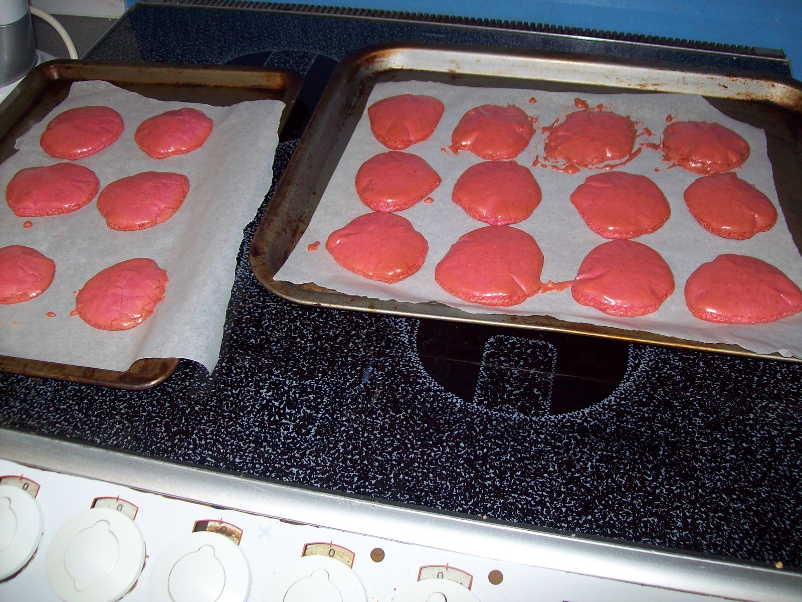
I had a bit of trouble with this stage! When I cut the corner off the piping bag, I wasn't expecting the mixture to come out as quickly as it did. As you can see, some of my macarons turned out very messy. The piping takes a bit of practice and at least next time I will know how quickly the mixture comes out. In the end I made 9 macarons instead of the 12 stated on the box, but that was mainly because the mix came out too fast and some macarons ended up bigger.

I followed the cooking instructions, exactly as they are written on the box. A few of the shells did get a bit burnt around the edges. The majority of the shells came out fine, albeit a bit strangely shaped. The kit also comes with instructions to make a filling. You use the milk, soft butter and the other mix bag to make the filling. In my opinion, the filling really lets this kit down. I found that the filling mix kept curdling and splitting. I was expecting a soft, creamy filling but the end result was quite runny and slightly grainy. If I were to use this kit again I would make my own filling instead of using the packet one. I know I can make a nicer filling from scratch.
So how did they taste? The raspberry flavour is very strong. I don't mind having a very sweet macaron, but I definitely ate too much at once and felt a bit sick afterwards! Both the shells and filling are raspberry flavoured. I think the shell is flavoured strongly enough by itself and the filling didn't need to be so strongly flavoured. The texture was a bit too chewy. It tasted like a macaron but the texture is not quite right. Whether this is down to my baking skills or the kit, I am unsure. It was just a bit too heavy. Maybe I needed a bit more air in my whipped up egg whites.
I would give this kit a rating of 3.5/5. I think this kit is a good purchase if you are new to macaron making, as it eases you in gently. However, the texture is not quite right. The filling that comes with this kit is awful. It tastes very nice, but I would expect nicer. But despite this, the end product was still very enjoyable. I had no complaints from my husband or mother-in-law when they sampled them. The raspberry flavour really comes out well. So whilst my macarons may not look as pretty as Laduree ones, I don't think this has been a total failure. I would try the kit again but I think in the future I would like to try and make my own ones from scratch. But for about £2 for 12 macarons, this kit is worth trying at least once.
Subscribe to:
Posts (Atom)