Friday 29 June 2012

Holley Tea Time Review- Positive!

Today I will be reviewing my new tights from Holley Tea Time! Holley's website is here- http://holleyteatime.com/ and she has lots of cute designs! Don't worry about products being sold out, because she does restock a fair bit. I recommend following Holley Tea Time on Twitter and Facebook to keep updated on stock. Holley Tea Time is getting a bit of a following in the J-Fashion community. Her designs are perfect for Fairy-kei and sweet lolita. Overall, with shipping included, I paid about £30 for one pair of tights. It is worth baring in mind that a lot of the big Fairy-kei brands sell out of their tights quite fast, and I believe that Holley has found a nice gap in the market.

Ordering Process

Holley's website is pretty straight forward. I had to reserve the tights I wanted (sold out again!) but all I had to do was put the tights I wanted in the cart and I was sorted. No issues at all. It was all very easy to do. You can pay with Paypal, so I was reassured that my order was secure.

Communication

The main issue I had was with the communication. I got my Paypal email confirming I had paid and then I heard nothing. There was an estimated date for the tights to become available and that date passed. I wasn't worried, but then I started hearing stories from friends saying their tights had been shipped and Holley said that she was sending out invoices over the next few days. Then she said the rest would be shipped out the following day and I still hadn't heard anything. I sent Holley a message via her website and she responded to me once my tights had been shipped (which was not long afterwards). Her message put my mind at ease but I think there is something lacking in her communication. You see, when you order from her you have to keep an eye on your Paypal payment because she will update the status to say that your order is shipped. Apparently, this is normal. Because this was my first order I did get a bit concerned when I heard nothing for a while and I thought I had done my order wrong. But it is worth remembering that Holley Tea Time is run by Holley alone and from my understanding, she sometimes gets help from her mum. Considering how many orders she must get, she must be busy, especially when she runs stalls at conventions too. It is not too big a criticism but perhaps this is an area that could be worked on in the future.

Shipping

Once my order was marked as shipped, my tights arrived quickly. I was expecting the tights to take about 2 weeks to arrive (average time between America and England) but they took significantly less time than that to arrive. I was pleasantly surprised by that.


My tights were very securely wrapped in a bubble envelope. It was all sealed tightly, so I knew my tights were very safe inside. My parcel was sent by air mail and I didn't need to sign for it. I also noticed that the value appeared to be marked down, so I didn't get hit by customs. Brilliant!


You get given a free gift with every order. I love the cute little kitty badge and postcard I got! Holley also provides some washing details for the tights, so you know how to care for them.


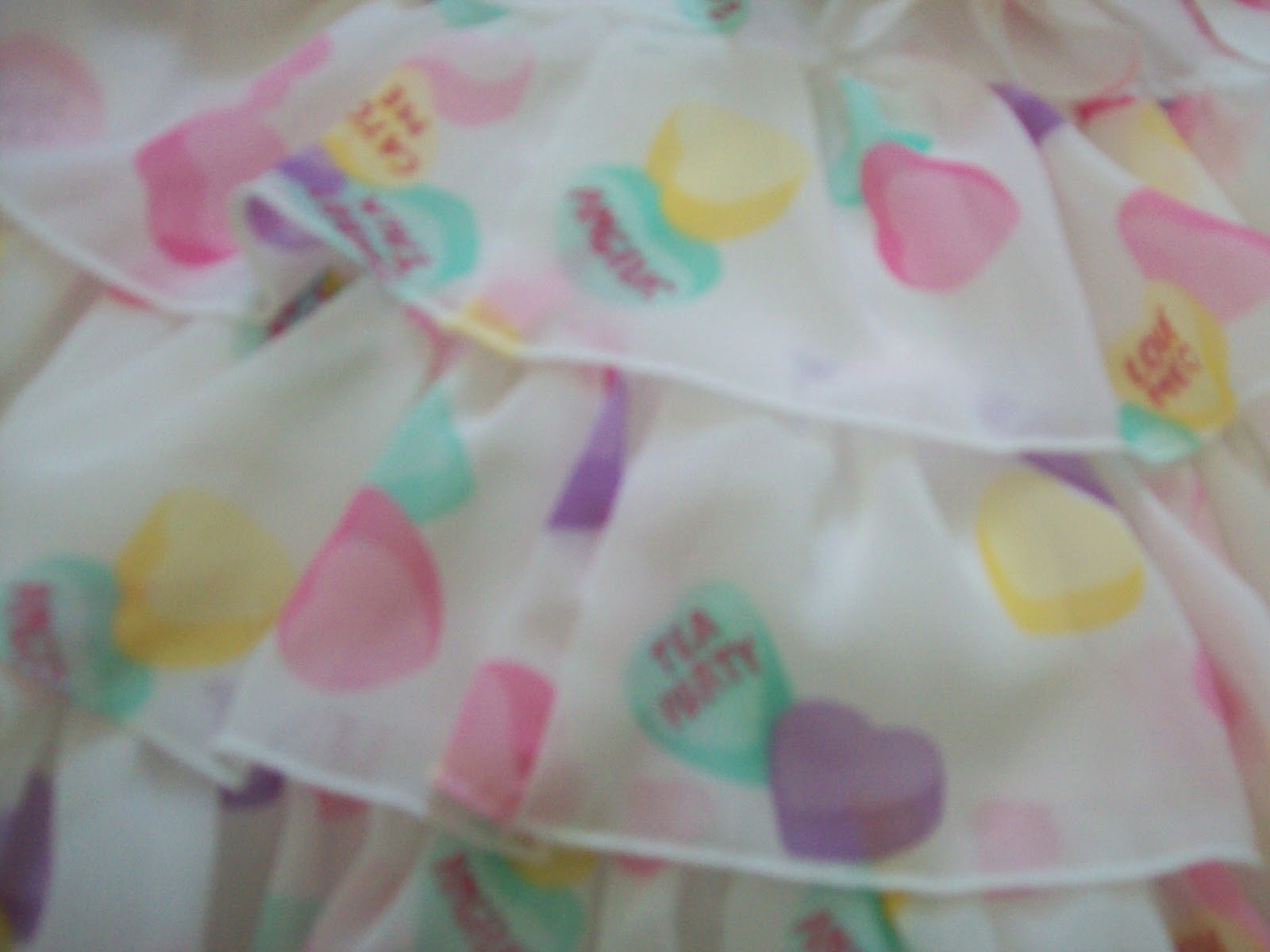
Here they are! My Pastel Party tights. When Michelle showed me her tights a while back, we talked about how thick the tights are and how they don't really ladder. On closer inspection, I stand by my initial feelings. The material is very thick for tights and they are almost like leggings.


The pattern is very clear. Whilst the print is not anything new design-wise, it is very cute.


I love all the balloons! My favourite is the moon one. I actually got these with Dream Sky in mind. I think these tights are going to look really pretty when I finally get around to finishing a Dream Sky outfit.


Holley Tea Time uses tights from We Love Colours, which have a good reputation. After getting these tights I am seriously considering getting some We Love Colours tights in the future. They are very stretchy.


The colours of the tights are not as vibrant when worn, but that is to be expected. You can still see the pattern really well (sorry, I rushed the photos). The tights also appear to remain opaque when worn.

I am really happy with my tights and I will definitely be keeping my eye out for future Holley Tea Time designs. The tights are good quality and the designs are cute and fun. The communication was a bit of a let-down, but that has not put me off ordering again, especially when I have the security of Paypal. So overall, this was a positive experience!

Wednesday 27 June 2012

Kitty Kitty Rhapsody by BABY

Today I will be taking a look at a new series by Baby (hopefully I will catch up with the print discussions soon). This series is called Kitty Kitty Rhapsody. The series includes 2 dresses, an apron style skirt, a blouse, a head bow, cat ears, a hair scrunchie and socks.


This is the Paris JSK. The bodice is a nice shape. There appears to be some loose baggy material, but I do like how the waist appears very nipped in. I dislike the raised panel on the bodice because I think the shape doesn't look that nice. However, the lace around the edge of the panel is cute and I think the bow is really needed here to stop the panel looking too dull. The bow here is a nice size. It is also a cute shape. There is also the waist bow and belt, both in leopard print. I know the print is cat themed, but I was surprised to see Baby using leopard print. This is normally Metamorphose territory! The waist bow is a good size, not too big or too small. I like the shape of the waist bow too. However, I do dislike the use of leopard print on the straps. The straps are a bit wide and whilst I think it is important to keep the leopard print balanced, for some reason the straps stand out more than the other areas that use this print. I think it could be because the other leopard print parts of the dress are either gathered or ruffled and the straps are flat, and so they stick out. Perhaps Baby could have used the main print material for the straps and then added a leopard print ruffle on the top? I also think the dress would look better if the 2 bows were switched, so the waist bow had the normal print on it and the smaller bow on the panel was leopard print. That is just my personal preference  though! The back has a panel of shirring, which is concealed very neatly by a ribbon corset. The skirt has a very beautiful bell shape to it, and the cinched in waist definitely helps to emphasise the skirt shape. The skirt also appears to have a decent amount of volume to it and will hold a lot of petticoat underneath. The skirt is kept simple, so the print is displayed well. The bottom hem is finished off with a leopard print ruffle. I don't think I am convinced by the use of leopard print on this particular dress...


For those of you who are unsure on the leopard print, here is the Dyna JSK. It has that more recognisable Baby style to it. The bodice is a pretty shape. It is a shame the waist here doesn't looked as fitted as the other JSK, but I don't think it looks bad. I dislike the waist bow because it is a bit big and is so rounded it starts to look a bit bulky. The neckline detail on the other hand, I really like. The bow which trails the whole way across the dress is really pretty. The folds give it extra movement, making it look floaty and giving extra depth. There is a simple line of pearls hanging from the central part of the bow, which is a cute elegant touch. The lace along this bow is good quality, and is also kept thin so it doesn't look too bulky. However, I do feel that the use of the neck detail and the waist bow is too much when used together. I would chose to lose the waist bow. The straps are a nice width and decorated with soft looking lace, making the edges look more interesting. The back has a panel of shirring concealed very well by a ribbon corset. The skirt has a pretty bell shape, although I think the skirt shape on the other JSK looks better. But despite this, I think you could put a decent amount of petticoat underneath and it will create a lovely shape. The skirt on this dress is again kept plain, so the print is displayed well. Whilst the lace on the bottom hem looks very neat and tidy, I feel it is a little too wide.


And here is part of the print close-up! This print comes in ivory, pink, mint, brown and black. I don't know which colour is my favourite, as they do look a bit similar. I am a bit unsure about the brown colourway though. I think that the ivory, pink and mint colours look the prettiest. As for the print itself, it is adorable. At first I thought the square part was meant to be like film reel! The cats in the print are very cute, although at times they look a bit strange and unlike any cat I have ever seen! The cats are all playing affectionately and it will make cat lovers everywhere go "Aww!". The print is very playful and fun. However, my favourite cat has got to be the one playing with the ball of yarn (you can see it in the picture provided, near the top). It is so cute! It was also a nice idea to use yarn to spell out the brand name as it fits the cat theme nicely.


I was a little surprised by the blouse. It is the sort of blouse that would probably only match items from the same series, which is a little disappointing. I normally really like Baby's blouses, but with this one, I know it would sit in the back of my wardrobe and I would never wear it. Although it is interesting to see Baby using leopard print, I think the blouse would be really cute without the use of leopard print.


And here are the cat ears. I am sure most of you are already aware of the reputation cat ears have in lolita. They are generally considered a bit 'ita' and I know there are lolitas out there who recoil in horror when they see them used in an outfit. So when Baby released the photos for this item, a few eyebrows were raised but at the same time, some people admitted they really wanted them. Whilst I am not a cat ear wearer, I don't think these ears are that offensive. They have been done in a very cute way and I am pleased to see they have not fallen in to the trap of adding bells and other stereotypical cat things. However, I still wouldn't wear these!

I am actually a bit underwhelmed by this series. I do like the print, but I am not in love with it. It doesn't strike me as something I would be desperate to own. I also think that there have been other Baby and Alice and the Pirates prints which have been a bit more desirable. In my opinion, the dress designs are not that exciting. The Dyna JSK gets my vote though. I have nothing against leopard print, but I am unsure with the way is has been used. I don't think this is going to be a huge hit, but I do know some cat fans out there, so maybe they will buy it!

Monday 25 June 2012

Meet the Juliette et Justine Designers! And more! Come to London!

In September, there will be a MASSIVE event here in the UK. Kyra of the Tea Party Club has done an absolutely amazing job so far, but we need to get as many people to come as possible! So I am trying to raise a bit of awareness in the hope that more people will come. I appreciate that a lot of my readers might not be UK-based or have the money to come, but there is no harm in trying!

This event is a huge deal, because it is a chance to show Japan just how popular lolita is in the West. You never know, if this event is a success, it may lead to even bigger things in the future! This is the first time Juliette and Justine have done an event like this (not even Japan has had a JetJ event like this) and the editor of the Gothic Lolita Bible will also be present. At the time of publishing, 124 lolitas are attending.

A short video here- http://www.youtube.com/watch?v=E2LzRov9LCw&feature=youtu.be

Facebook event here- https://www.facebook.com/events/246701262106339/

Tickets can be purchased here- http://teapartyclub.shops.pipfrog.com/

Hopefully that is all the information you will need! Seriously, this event is going to be AMAZING!!!!

Friday 22 June 2012

It's All In The Elbow?

It all started with the V&A meet to see the Kitty and Bulldog exhibit in May...


I was looking at this outfit by Innocent World. I can't say that this outfit as a whole really stood out to me. It did however, awaken something inside of me. I now have an obsession with elbow details!


I really adore the lace around the elbow area of this outfit. By the looks of it, the lace is a part of the OP (do correct me if that is wrong!). EDIT- Yep, it is indeed part of the shawl you can see draped over the other shoulder! I am just being incredibly blind! And yet my blindness did give me some inspiration, so in a way it helped me in the end.

I noticed that the elbow area is not somewhere I would normally think of decorating. I usually wear skirts or JSKs and I only have one OP in my wardrobe (and that is only because Bodyline never released a JSK of their cosmetic print). This means that I wear a lot of blouses. But having a look at the current blouses in my wardrobe, I realised that they all seem to lack detail on the arms. Considering these areas are quite exposed usually, I am surprised that I hadn't noticed this before.


I recently purchased this blouse from Primark and I am hoping to use it with my lolita wardrobe in the future. In fact, I already have an idea for it! I love the blush colour (which is like a peachy pink) and the neck detail. I mainly brought this for the colour, but as you can see, the sleeves are quite basic. The sleeves don't quite reach my wrists, which I believe is how it is meant to be. I am always being told I have short arms!

But this leaves me wondering if I should do something to the ends of the sleeves to liven up the blouse. The problem with where the blouse ends is that any details could potentially stick out at a funny angle. So the detailing would have to be soft and delicate. I feel this is a lot different to full length sleeves. It is hardly going to look elegant if I have bulky elbows!

Whatever I do, I know I will be taking inspiration from the Innocent World outfit that opened my eyes. Any elbow detailing I add will be soft and not over-loaded. And in the future, I will be taking a closer look at any blouses I purchase!

Wednesday 20 June 2012

Handmade Playing Card Bow

I am having a bit of an outfit crisis at the moment. July is just around the corner and that means that the Oxfordshire Lolitas will be invading Alice Day once again. Despite Alice Day last year being my hosting debut, I had a great time (and hopefully the other attendees did too) and we even made it in to our local paper. In fact, our photo was used again this year to advertise this year's Alice Day and there are still pictures of us floating around on some of the Alice Day web pages.

The only problem is, for ages I couldn't think of anything to wear this year. Normally, I just go with the flow but with Alice Day, it is one of those events where you ideally want to be on theme. Only, I went and sold my Bodyline Alice Skirt! Whilst I don't regret selling it, it left me wondering what I should wear to Alice Day this year. I could have worn Wonder Cookie or even Starry Night Theatre, but I just wasn't "feeling it". Thankfully, I now have a basic outfit idea planned and now I am trying to build on that. It is not going to be OTT crazy, but at least I will be on theme!

I decided that I would try making some matching accessories for my outfit and this is where this bow comes in-


I have gone for an outfit based around playing cards and card suits. So I took a playing card and turned it in to a bow by folding it like a fan. I gathered the middle part and then fanned the card out to a basic bow shape. The middle looked a bit ugly, so I sewed a bell charm on to the middle. The bell looks loose in the photo, but it is in fact gently sewn on and hopefully it will stay in place. I deliberately chose the Joker card!

This is not an original idea. I actually saw something similar online last year, but there was no way I was going to buy one of those for a stupid amount when I could make one at home. The only thing is, it feels as though there is something missing on my bow. It looks very simple. I don't want the bow to look too over-done, but maybe there is something I can do to make it look a bit neater maybe? I thought about getting some thin ribbon and then tying a tiny bow around the middle. I wonder if that would work?

Hopefully I will be able to figure out a way to finish off this bow and also complete my outfit. Any suggestions about the bow would be greatly appreciated. It was just a very cheap and simple craft idea. The good thing is, if I need to make more, I only need a spare 5 minutes and I already have a supply of playing cards!

Monday 18 June 2012

Grimoir of the Moonlight Forest by AatP

I am getting really behind with the print discussions! Today I will be discussing a new print by Alice and the Pirates called Grimoir of the Moonlight Forest. This series has 2 dresses, a skirt, a blouse, socks, a head bow, a headdress and a necklace.


This is JSK I. The bodice is very well fitted. This is quite understandable because on close inspection, it appears this has been designed to look a bit like a corset. I am a bit unsure about the curvy neckline and whilst the lace on the neckline is pretty, I am not sure it is really needed. The straps look very elasticated and gathered. Hopefully this means that it will suit different torso lengths well, although I dislike the overall look of the straps.


I can't quite put my finger on it, but there is something about the bodice which seems a bit off. At a guess, I would say it is the spacing of the bodice. This picture shows that the dress is made to look as if there is a matching corset sat on top (I really hope I am making sense!). I do like how it makes the bodice looks less flat and the bow at the top of the "corset" part is a lovely shape. Yes, the bow looks as though it may be a bit floppy, but the way the material falls beautifully. I just hope it doesn't end up sagging too much! Back to my fears on the spacing, the bottom of the corset part is lined with lace, but this line of lace sits a bit below the waist. I wonder if it draws too much attention to this area and also whether it tricks the eye in to thinking the waist is wider. I also think the shape of the material above the corset part is a strange part. This is just me trying to guess what I think is off about it. All I really know is I dislike the bodice and I think it looks awkward.

The back has a panel of shirring which is concealed by a ribbon corset. The print seems to make the shirring blend in well. Despite the lace cutting across the top of the skirt, the overall skirt shape is a lovely subtle bell. It suits the style of print and it looks like it will still hold a decent amount of petticoat. Near the bottom, the skirt is broken up by a line of thin lace and then the material below it is slightly more gathered. This has been carried out well and the skirt shape is not too affected by it. The bottom hem is then finished off with some simple but good quality lace.


This is JSK II. The bodice is a really pretty shape. It does look as though there is a bit of a gap under the arms, but hopefully that is just the way the dress is sat on the dummy! I think the straps are just the right width for the style of the dress. At first glance, the bodice does look plain but this means they can add more detail to the skirt. And I feel this choice pays off. The 2 lines of lace which run down the bodice and continue down the skirt, give the effect that the dress is made of panels. I didn't think I would like this but actually, it looks fine.


The lace along the neckline is so decorative that I had to include a picture! The bottom part almost looks like 3D beads. It gives this edge of the lace an interesting shape. The roses blend in well to the middle and the lace looks like it is really nice quality. I really like this lace because it feels a bit special.

The back has a panel of shirring which is concealed by a ribbon corset. In the stock photos, I thought that the skirt shape looked very straight and triangular. I think that with the right petticoat, it will look a lot better. It still works well for classic and gothic anyway.


 I adore the details on the bottom of this skirt! I am not normally a fan of scalloped edges, but it works well here. It is spaced nicely as well. I love how underneath there is some soft chiffon exposed. The bows are a pretty finishing touch. It is not exactly a brand new idea, but it works so well, especially with this kind of series. And if it worked so well before, why not use it again?


And here is the print close-up. It is available in ivory, bordeaux, navy and black. I am a huge navy fan normally, but my favourite colour here is the black. The black colour is so deep and it makes the print details really stand out. However, all 4 colours of the print work really well. I adore the picture frames! They are so decorative with all the rococo style swirls. The crosses are also decorated beautifully and match the frames well. The flowers are beautiful and add a much needed hint of bolder colour. I love the butterflies. They have been drawn so well! The words and circles in the background help to fill in the gaps, although these details are lost on the ivory print. They blend in so well that they are barely visible. But this has not put me off the ivory colourway because I think the print still works well! In some respects, this series feels like the Alice and the Pirates version of Baby's Fragrant Rose Memories. It is as if they have taken that print as a starting point and then made it in their own more gothic style. That is fine by me because I liked Fragrant Rose Memories!


I am looking for an excuse to buy the socks in black! I think this is the only colour of the socks I really like. The other 2 colours (off-white with sax blue roses and ivory with pink roses) almost look a bit too sweet for this series. I found the colour choices available to be a bit strange. I also feel the sock colours are a bit vibrant compared to the colours used on the dress print. However, I think the black ones are gorgeous! I am sure I would find a use for them.


The necklace is pretty, but I don't think it is anything special. I have to admit though, that it does match the series perfectly, and I appreciate the detail that has gone in to the frame part.

Overall, I really like this series. I have held off adding this to my wishlist for the moment, but it is a series I would be very happy to own. It is so beautiful. I would definitely go for the black, but the navy and ivory are so pretty too. I do like the bordeaux too, but not as much! For me, this series is all about JSK II because the design is stronger. It feels like that design has been thought out a lot better than JSK I, which I am not convinced about. I really want the black socks too. I reckon this series will be a hit with the die-hard AatP fans and I think it will be a success.

Friday 15 June 2012

AP Sugar Hearts Review

If you saw my last post, you will probably know that I have now obtained a Sugar Hearts set. I found an auction for the white skirt, head bow and socks. I am actually still on the look-out for the pink Sugar Hearts socks (or lavender as a compromise) and the lavender pochette (pink as compromise) so if you see them, let me know!


So here it is! My lovely new skirt! Now obviously, it is a mini skirt and it was never going to reach my knees but it was actually longer in length than I was expecting. It still comes a few inches above my knees but it is not ridiculously short. However, part of this is probably due to the fact that the skirt sits on my hips and not my waist. The waist on the skirt has no shirring and no options to make it smaller, so my waist is actually too small to hold it up. Luckily, the skirt doesn't look too bad sitting on my hips and so it wont affect my wearing of it too much. Also, once I am wearing a tucked-in blouse etc. it wont be as loose.

It is also worth mentioning that this skirt does not have a pocket- something which I normally love about AP! I suppose there was nowhere to put one and it would have altered the skirt design too drastically.


One of my favourite parts of the dress is the little cluster of ribbon bows on the front. Trust me, they are very adorable in real life! It is a nice little addition because it stops the skirt looking too dull and flat.


As usual, the lace is amazing. I love the candies on the lace. It fits the theme of Sugar Hearts very well.


The material is so light and fluffy, just as you would expect with chiffon. When I put the skirt on, it felt so light it was as if I wasn't wearing anything at all. With all the layers, lolita can sometimes feel a little heavy, so this skirt is very refreshing. The tiers also stop the skirt looking too flat as well. Thankfully, the material is not that see-through, although you wouldn't see anything anyway because of the multiple linings. The skirt has 2 linings. Both of these linings are soft but the outer lining is very gathered and it acts like a petticoat. Both the linings are very soft and are a delight to wear. My only complaint is that with these linings, there is not much room left for me to add an additional petticoat underneath if I desired. It is not really designed to have extra petticoat underneath but I am going to experiment with layering to see what works best for me.


The print is adorable. I think the soft colours are brilliant because bolder colours would look too harsh. I also think it is a very versatile print which could be combined with many different colours.


The head bow is very floppy but it matches the skirt well. I actually think the bow looks a lot better when it is worn. It is quite casual as well so I think it is easy to wear.


I really love the socks! I like how the ribbons at the top have been placed differently. When you wear them, the ribbon sits on the front of your leg instead of to one side. Very clever!


I also had a Dream Star ring hiding away in the photo I posted the other day! I won this in a separate auction from the same seller, so Japonica bundled my orders together. I love this ring and I keep picking it up and trying it on again. I actually thought that the star was going to be a bit bigger and chunkier. In a way I am relieved it is not too bulky. The writing on the ring is quite small and looks bunched up though, so you can only really read that it says Angelic Pretty on it when you are close up. I got this to go with Dream Sky, which I am going to start finding more accessories for after I have finished collecting Sugar Hearts stuff.

I was very happy with my purchases, despite having a bit of a hard time with Japonica. I am really looking forward to wearing my new items!

Wednesday 13 June 2012

Japonica- A Cautionary Tale

PLEASE NOTE! I understand I may sound a bit bitter in today's post, but that is not my intention. My aim is to just make people aware of this situation so that anybody reading this can make a more informed choice. I know that some of my readers have taken an interest in my shopping experiences, I have even had messages from some of you, so hopefully you will find this information useful!

Some of you will already be familiar with the information in this post so bear with me while I explain what is going on to those who don't know!


This story starts a few weeks ago when, to my delight, I found an auction for a series I wanted to get (picture very related). So as usual, I used my normal shopping service- Japonica Market. Everything was good and Japonica put the bid on for me.

Japonica used an ID which I had seen before. They had bidded under the name Mecha, which is the ID they have always used for my orders. Then a few days before the item ended, I noticed a new bid had been put on. The ID was HelloWorld. It is an ID that I had come across before and I immediately came to the conclusion that it had to be another shopping service. As it was an ID I had come across many times, I figured the service must be popular and so I Googled the ID to find out what this popular service was. I was directed to a page on EGL, and that is when I found out...

HelloWorld is ALSO Japonica. So Japonica had put 2 bids on the same item using different IDs. At first, I was confused. Could they do that? Well, apparently they can.

What surprised me, is that this other bid matched my maximum bid. It was also placed after mine, which meant I was winning the auction. This meant that unless the other bidder asked Japonica to raise their max bid, they had no chance of winning the auction. And Japonica KNEW this. My question is, did Japonica warn the other bidder about this? Apparently, Japonica did use to warn people about this situation but I heard nothing, and I am assuming the other bidder didn't hear anything either.

So why did they put the bid on if they knew I would still be winning? Of course, Japonica is not allowed to disclose information about other bids. So whilst they could have warned the other bidder that they were going to lose the auction, they would not be able to tell them how high my bid was. Otherwise, that would have been unfair to me.

At the end of the day, Japonica is only there to place bids for you. All they can do is place the bids that they receive, regardless of whether they have already bidded on the item. If this had been an English auction where no shopping services were needed by either bidder, then both bids would have been put on the item anyway. And this is basically the same situation, just with a Japanese shopping service involved as the middle person.

Eventually, I won the auction (hooray!) but I have to be honest, this has made me feel uncomfortable using Japonica. It is important to mention that Japonica have NOT done anything illegal. But it turns out that there are other shopping services out there which have some policies in place to stop this situation. This means that once they have placed a bid on for one person, they will not bid on the same item for another person. And this sounds very appealing to me. It means I wont get caught in another Japonica vs. Japonica bidding war and I think I will feel more valued as a customer. Once I try out these different shopping services, I will review them on this blog!

P.S- If the other bidder on my item is reading this, I hope you are able to find the item you want soon!

Tuesday 12 June 2012

100,000 Page Views!!!

Thank you, thank you, THANK YOU!!!!!!!!

At some stage last night, my little blog reached 100k page views! You have all made me so incredibly happy! I would love to express my gratitude and thank you all for reading, whether you are a regular or just a casual browser. I am going to celebrate by eating lots of sweets and thinking up some future posts, so I can reach 200k views!

Thank you all!

Monday 11 June 2012

Dreamy Horoscope by Angelic Pretty

Today I will be taking a look at the other new horoscope print. You can see the print discussion for the BABY print here- http://luna-rain.blogspot.co.uk/2012/05/twinkle-constellation-and-stars-by-baby.html

But today's print is from Angelic Pretty. It is called Dreamy Horoscope. This series contains 2 dresses, a salopette, a skirt, 3 different hair accessories, 2 pairs of socks, a blouse, a unicorn plush bag, a star shaped bag and various bits of jewellery. Does this series rival Baby's print? Let's find out!


This is the OP. I think the bodice shape looks fine, but I would definitely use the waist ties to help it look more fitted. I like the gathering on the front because it gives the front more texture and depth. It would look worse if it was totally flat and hopefully it will mean it fits the bust a bit better. The neckline is decorated with cute star lace. Whilst the lace does blend in to the design a lot, I think it is needed because otherwise this dress would be so plain and boring. The sleeves look very stretchy. I like how they are not too puffy, because I don't think very puffy sleeves would suit the shape of this dress. They are finished off with cute thin ribbon bows. I really like the ribbon bow on the front and the cross-neck straps (not visible in this picture) because they have star charms on the end! Just like Dream Sky! The shirring runs the whole way across the back, and that means it is very exposed. I don't think that looks particularly nice, but the great thing is that it makes the dress size really flexible. I can imagine this dress being very comfortable to wear. The baby-doll shape is very appealing and the skirt shape is lovely. It is not your typical lolita shape, but that has hardly affected sales of other similar series. The skirt part has been kept quite plain, so the print is displayed better. The bottom is finished with a ruffle and 2 lines of lace, which works really well. It makes the dress look more interesting, but at the same time it fits the style of dress. My main complaint is that the material used is very shiny.


This is the JSK. I have been pondering the kindest way to talk about this JSK... but to be honest, it looks like a sack. It is so shapeless and unflattering! There is no real bodice to the dress, so it probably wont provide much support to those who are large in the bust area. If it wasn't for the print, I wouldn't even notice it was AP.


The neckline also doesn't appeal to me. The round neckline and ruffle don't seem to match up well with the main shape of the dress. I think the ruffle part is a bit too wide and sticks outwards too much. The lace however, is up to AP's usual standard and looks cute. The straps are also finished with more star charms on the back, which is cute.

As there is no real bodice, it means there is no shirring on the back. Smaller lolitas will be grateful for the waist ties, although I would be interested to see how this affects the overall shape of the dress. The bottom hem is finished off with a nice ruffle, topped with more AP logo lace. Again, the material used is very shiny.


And here we have the print close-up. AP have gone very cutesy here (Did we really expect them to do anything else?) and I had no idea there was a cupcake constellation! I am pretty sure AP made that one up...  Whilst I do like the floating stars in the background, I don't really like the floating constellations in this print. It just doesn't look that special. It almost looks as though somebody just doodled some cute things on a notepad and thought they would stick them all together in a print. As you can see, the print comes in 5 colours- white, pink, sax, con blue and black. The dress material is so shiny, the print is almost non-existant on the pink and sax colour ways because it blends in way too much. I also think the white colour-way is absolutely hideous and cheap looking. I personally would only go for the con blue or black, because at least the print stands out on these 2 darker colours.


For me, the jewellery is also a bit of a let-down. Whilst I appreciate it has been done to match the print, I really dislike the lines on the jewellery. They look really scratchy and it just doesn't appeal to me. There are 2 items shaped like bows and I felt they both looked awkward.


I do feel that the unicorn jewellery is the saving grace of the series, BUT only in certain colours. I think the blue (the colour is called con) is the strongest colour for this jewellery. Unlike the bows, I feel the unicorn jewellery does need the lines on it to help the unicorn design stand out. Other colours, such as the pink and sax blue ones, don't work as well because the lines blend in and don't stand out. Unfortunately, it makes these colours look as though you are wearing a randomly shaped lump of plastic around your neck, instead of a cute unicorn.


I am at least happy that AP have released more star shaped bags. I really love this blue colour!

So overall, I am hugely disappointed with the series. I think AP was trying to catch the magic of Dream Sky and in my personal opinion, they failed! As somebody who is a star print fan, I think I was expecting something a bit more special. I prefer the OP over the JSK (which is unusual for me!). I would only go for black or con. Would I buy this series? No. Although I have added the con blue star bag to my wishlist, because that is too cute for me to resist.

Friday 8 June 2012

A Nice Little Surprise For Me!

I have not been having a great time! I have been unwell, my new brand has been hit by customs and work has been slow. So when I saw a random pink letter in the post, it caught my eye. Then I saw that it had been sent by one of my Facebook friends. I opened it to find... she had sent me some lovely jewellery! It was totally unexpected!


I got a bracelet with cute moon/star beads.


I also got a matching ring!

Some of my really long-term readers may remember I got sent a jewellery package a while ago, and these items came from the same person. They wouldn't have known I was having a bad day, but the jewellery came at just the right time! It is really lovely to see such an act of kindness and generosity. Thank you so much Saija for my new items. I love them!

Wednesday 6 June 2012

Luna On Twitter!

I finally got around to joining Twitter! Sadly, LunaRain and Luna_Rain were already taken, so I had to add a stupid number on the end!

If you would like to follow me, or just want to know what I am doing/moaning about/having for dinner, then you can find me here- http://twitter.com/Luna_Rain88

You can also see the link on the right hand menu with my handy button!

I promise I will stop posting this link everywhere soon. Everything is still new and exciting, so bear with me. I am looking forward to making lots of new Twitter friends!

Monday 4 June 2012

June 2012 Ox Loli Meet- New College Picnic!

So on Saturday we had the June Oxfordshire Lolita meet. This was my first time going to a meet which was held on International Lolita Day. Before I went rushing off bring a mad woman, I completely forgot to wish you all a Happy International Lolita Day so I will do it now- happy belated I.L.D everybody!


Roxy was our wonderful host for this meet. It was her first time hosting and she did a really amazing job. We had a picnic inside New College, Oxford. Roxy's dad works there so we had very special access. It helps to have insiders! We were given wine and really posh canapes. I feel very sorry for the person hosting the July meet, who is going to have to follow on from such an amazing meet!


The soup shots were especially popular with certain people!

I thought I would share some of my favourite pictures I took of the college. You might recognise some of the areas because they were used in the film Harry Potter and the Goblet of Fire. That is how awesome Oxford is!


I really like this wall covered in wysteria. 


You have no idea just how much I would love to live here!


This was my favourite area. I wish I took more photos.


Here is our group! I really loved everybody's outfits.


We also had a cake decorating contest! It was seriously fun and I thought it was a great idea. I wouldn't have come up with something like that. I think it is fair to say that some of us took it more seriously than others!


Here was my 2 offerings. Can you believe my cake on the far right actually won Most Creative? I was so surprised, but also very happy. Thank you to everybody who voted for my strawberry guzzling cake! I got a ring, lip balm and a bracelet. You can see Sammi's winning Best Sweet cupcake in the background (the one with the rose). The rose she made looked so professional. Sammi, you should work in a cake shop! Amber's winning gothic cake is near the front in the previous picture. It had a spider design on it.


My outfit for the day! I was wearing Nostalgic Chess by Meta with my Innocent World crown bag. I have gradually been collecting accessories for this dress. The bolero was not meant to be a part of this outfit, but it was a bit cold outside! I was also wearing a chiffon blouse, my AP Chess Knight necklace and my gold Paris Kids beads (as both a necklace and a bracelet). I just wanted to point that out in case people didn't notice the gold/royal/chess theme I was aiming for here! I don't have a suitable head bow for this dress yet, so I improvised with a detachable bow from the dress and a plain black bow. I do have more bolder ideas planned for this dress but that will have to wait for another time.

So a huge thank you to Roxy for being such an amazing host. I think everybody was stunned by how beautiful the setting was and I know I had a brilliant time!
Related Posts Plugin for WordPress, Blogger...