Thursday 23 April 2015

I Am Off On Holiday!

This is just a small post to say that I am off on holiday and I shall be back in 2 weeks time on Thursday the 7th of May. There wont be any posts during these 2 weeks as I made a promise to myself that I would give myself a mini blogging break. I really want to focus on enjoying myself and getting away from my day-to-day life.


I am really excited to be going away on this adventure. I am staying in a haunted castle, which is going to be a lot of fun! 

So I hope to see you all again in 2 weeks time. I apologise for not updating during these 2 weeks but I will be back soon.

Monday 20 April 2015

A Mixed Brand Print Double

Today I am doing yet another print double. First up is the latest from Baby but scroll down further to see Cherry Marguerite by Angelic Pretty.

So first up is Celestial Harmonia by Baby the Stars Shine Bright. This series includes 6 dresses (2 non-print), a skirt, 4 blouses, a petticoat, 5 hair accessories, socks, a re-released sceptre and several items of jewellery.


First up is the Spica JSK. The bodice material looks a bit loose in places and I think the shape is quite messy. I think the neckline looks really uneven in some of the stock photos. The straps are a good width for the dress but I think they could have been just a little bit thicker. The straps are lined neatly with a gathering of lace on the outsides but it is spoilt a bit by the additional bows on the shoulders. Despite being made of soft material, the bows add extra bulk to the shoulders and also look very messy. There is a large waist bow. I don't feel the material of the bow is the right choice and the bow is so poorly formed. The bow has been tied so casually and the shape is too simple. Also, the bow sits really strangely on the dress. Unfortunately, the bow doesn't seem to be detachable (or at least isn't shown to be on the dress listing). The bodice features some gathering around the chest area. There is also some random lace underneath the chest area and also creating a sharp heart shaped neckline. It looks confusing and messy. It just feels really disorganised and chaotic. There is a little triangle of material which creates a straight neckline, and this is topped with a bow. The ribbon used for the bow has a very pretty design to it, but the bow looks too big and again the bow doesn't seem to have been shaped well. The star charm dangling from the centre of this bow is cute, but the bow lets it down. This bow is detachable, which is good because it looks a bit too much with the waist bow. However, I would much rather get rid of the waist bow. The back of the dress is fully shirred, which means the shirring is quite exposed and not that attractive to look at. The stock photos show the skirt has a good amount of length to it and it has a suitable amount of volume to it. I am not overly fond of how the skirt shape looks in the stock photos though. The skirt is quite simple in design so the print is displayed beautifully. The bottom hem features multiple ruffles of tulle. This could have looked pretty but in my opinion it sticks out at an odd angle. It flares out in a weird way towards the bottom. The tulle is also over-stitched instead of under-stitched which I don't think looks that appealing.


Next we have the Polaris JSK. The bodice looks well fitted. The shape is quite simple but looks nice enough. The only thing I am a little unsure of is the pointed waistline, as it looks a bit wonky in some of the stock photos. The straps are a bit thin and I think they could have gotten away with them being a bit thicker. The straps are also very plain with no detail to them. The bodice and waistline feature gold lace. The gold lace is pretty and it helps break up the bodice in to neat panels. Overall I find the bodice a bit plain, although the detailed neckline makes up for it a little bit. The neckline features a ruffle of tulle which looks a bit squished flat by the details on top of it. I also feel the line of tulle needs to taper off at the sides instead of having a fussy looking armpit area. The tulle is topped with 3 bows. The bows are a cute shape but again, quite simple in design. I feel the 2 bows at the bases of the straps need to be a little smaller and the bow in the centre needs to be slightly bigger. The ribbon used for the centre bow has a pretty design and I do like the star charm in the centre of this bow. The back has a panel of shirring which is topped neatly with a ribbon corset. The stock photos show the skirt has plenty of volume and it flares outwards plenty enough. I am a bit unsure if I like the shape of the skirt though. There is something about how it looks in the stock photos that puts me off. The skirt design is kept simple and the print is displayed excellently. The bottom hem has then been finished off with a thin line of gold lace and a ruffle of tulle, which looks very neatly done.


This is the Vega JSK. I feel the bodice looks quite shapeless and is lacking something. The neckline is a cute shape though. The straps are a suitable width and look very supportive. The thin ruffle of the printed material going along the outside of the straps is nicely shaped and adds a bit of interest. I am a little unsure if I like how this ruffle looks when it reaches the armpit area though. The neckline also features a ruffle of the printed fabric and unlike the ruffle on the straps, I feel this neckline ruffle has been well shaped. At least there is a bit of continuity with the design. There is a waist bow which I suppose is an okay size for the dress. The shape of the bow is a bit simple but well formed. I don't think the waist bow really works with this dress design though, and it feels like it has been placed there just for the sake of having some detail on the waist area. I think a gold tulle belt which ties in to a bow to one side could have been an interesting idea for this dress instead. This waist bow is detachable, and I probably would detach it and add my own belt if I owned this dress. The bodice is kept quite simple and I feel this only adds to the dull and flat look that the bodice seems to have. The neckline is at least topped with a cute bow with star charm. I also like how the neckline is lined with a thin line of gold lace which continues along the straps, as it looks very neat and adds a little bit of interest. The back has a generous looking panel of shirring which is again topped with a ribbon corset. The stock photos show the skirt has enough volume and flares outwards plenty. Despite the dodgy editing in the stock photo, I feel the skirt is quite a cute shape. The skirt is once again kept simple, so the print is displayed well. The bottom hem is then finished off neatly with lace, which is of a good quality, but doesn't really fit in with the design of the rest of the dress. 


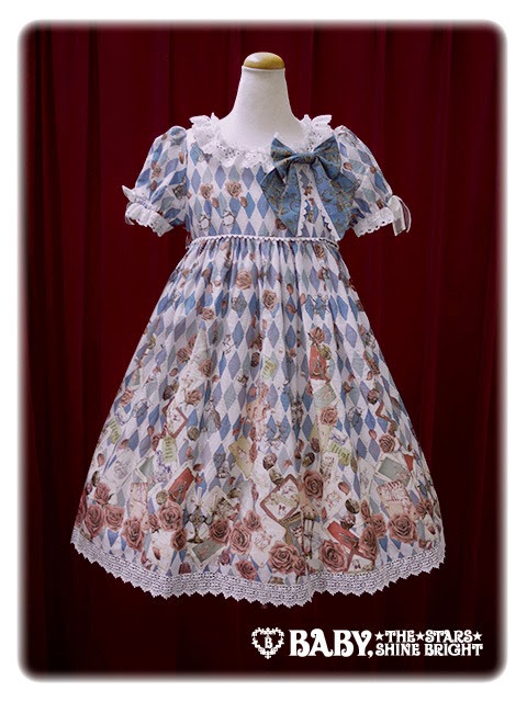
And this is the OP. The bodice underneath the built-in cape is quite well fitted. I really dislike the shape the cape creates though. The cape drapes down nicely and the collar on the cape is cute, but I think the cape is far too bulky looking. The edges of the cape are lined very neatly with gold lace and I think if the cape had been solid coloured instead it may have looked a bit less OTT. Overall though, I am very unimpressed that you can't detach the cape. The organza bow in the middle front of the cape is also very big and the bow looks very poorly shaped. The back offers no shirring, so size flexibility is a bit limited. The zip is well concealed but the print lines up along the zip line very poorly. The stock photos show the skirt has enough volume and it flares outwards a fair bit. If it wasn't for the bulky bodice, the skirt shape would look quite pretty. The skirt is again kept simple and the print is displayed beautifully. The bottom hem is then finished off in the same way as the Spica JSK, although the layers don't appear to stick outwards quite as harshly and the layers sit well on top of each other. I still think it is a pity that the tulle is over-stitched though.


And here we can see one bit of the print close up...


... and here is another bit. I feel these 2 pictures give a good idea of what the print is like. This series is available in pink, sax blue, emerald and navy blue. The emerald is quite a peculiar shade of green, but the other 3 shades seem nice enough. Some of the print details look a bit radioactive in colour in some of the colour ways and it looks a bit bizarre. As for the print itself, I can't make any sense of it. The circles in the print are placed haphazardly and some areas of the print look more cluttered than other parts. Some of the items included in the print also feel a bit random. The style of the artwork also seems to be different in some places. The constellation and space themed background is really pretty though. It is a shame that this print is too busy, as that background could have worked as part of another print. I also felt some of the drawings in the print looked a bit blurry and are not as crisp as some bits of the print. Overall, it is cluttered and chaotic.

I get the impression Baby are expecting this to be a big hit, but I am not that impressed. I really dislike the print and there are parts of the dress designs which are dreadful. I don't think there is a single dress design I like. So this is not a series I would personally go for. If I was forced to, I would go for the Spica JSK in navy and the first thing I would do is get rid of that waist bow and the shoulder bows. I do like 2 of the blouses though.

Next up today is Cherry Marguerite by Angelic Pretty. This series includes 2 dresses, a skirt, 2 hair accessories, 2 pairs of socks, a bag and wrist cuffs.


Here we have the OP. The bodice looks well fitted and the shape looks okay. I think the sleeves could have been shorter though and I am not that keen on the square neckline. The sleeves are lined neatly with some pretty cherry themed lace and then further topped with some small gingham bows. Although the bows are an okay size, I am not overly fond of the use of gingham. With the print, the bold check fabric and so much lace, I feel adding gingham on top of that is too much. The waist bow is a cute shape and sits really nicely but I think it could have been just slightly smaller. I do think it is otherwise well executed though, and the lace lining the bow adds a bit of interest. The bodice features multiple lines of tulle ruffles, lace and gingham. These lines are all neatly set out and sit well on the dress. I think there may be a bit too much going on and the bodice looks a bit crowded. Again, I wouldn't have used gingham here. The gingham is also used for some small bows on the shoulders, which I don't feel are needed. There is also a little line of lace along the neckline using the cherry lace again, and further topped by a small gingham bow. The bow is a cute shape and nice size. If all the gingham bits had just been solid coloured instead, I probably would like this bodice a lot more. The back has a generous looking panel of shirring which is topped neatly by a ribbon corset. However, I feel the lace that is on the shoulders and continues on to the back of the dress draws attention to the shirring panel. The stock photos show the skirt flares outwards loads and there is plenty of petticoat room underneath. I love the full, rounded shape. The skirt design is kept simple, so the print is well displayed. The bottom hem is then finished off with more of the adorable looking cherry lace. The lace has such a lovely design. The cherries on the lace almost look like hearts when you glance quickly at it.


This is the JSK. The bodice looks very well fitted. The shape of the bodice is quite simple but also cute. I think the straps are a bit too thin and don't look that supportive. However, the ruffle on the straps is very cute and this ruffle matches up perfectly with the neckline, so perhaps thicker straps would have looked too bulky. The ruffle is well gathered and shaped. This ruffle is then topped with a further line of lace, which sits really neatly on top of the ruffle and doesn't look too distracting. The lace is a nice finishing touch. There is no waist bow or other waist detail but with this dress I don't feel much detail is needed here anyway. The bodice features 2 lines of lace with ribbon threaded through it. The ribbon used is slightly shiny, but is barely noticeable unless you are really looking up close. The lace used is pretty and sits well on the dress. The neckline features a ruffle that matches the ruffles on the straps. It gives the neckline a softer, frillier appearance and stops the neckline looking too straight. The neckline is then topped with a bow which has a lace jabot underneath. The bow is quite big for this area, but because there is no waist bow it doesn't look too OTT. The bow is a nice shape and neatly lined. I am a little unsure about the way the bow sits on the dress though. I also feel that the lace underneath the bow is not really needed. The back has a panel of shirring which is well concealed with a ribbon corset. The stock photos show that again, the skirt is very full  and rounded. It will hold more than enough petticoat and it has plenty of flare to it. The skirt is kept simple in design so once again the print is displayed brilliantly. The bottom hem is then finished off with the cute cherry lace.


And finally, here we can see the print. This series comes in pink, lavender, mint and red. These are pretty standard berry print colours. The lavender perhaps offers a slightly more quirky option. At first I was a little surprised AP didn't do a black version, but on further reflection I don't think it would have worked as well. As for the print itself, those fruit look good enough to eat! If I would change one thing it would be to make the cherries and strawberries alternating instead of just having the odd strawberry bunch here and there. Strawberries and cherries have both been used quite frequently for prints, but we rarely see them together, so I think this is a nice touch. The daisy hearts are also a cute addition and work quite well with the berries. At first I was really unsure about the check background, as I thought it was overdoing it a bit. However, I feel the squares are big enough that it sort of works. The only thing I would remove from the print would be the daisy shaped crosses. I don't understand AP's current obsession with adding crosses to everything. They are really not needed with everything else going on in the print already. However, I do accept this is just a small part of the print and your attention is not drawn to the crosses straight away.

So overall I would say this is quite a nice berry print with some lovely colour options. The dress designs are both quite pleasant to look at. Would I buy this series? Possibly, although there are a lot of berry prints out there to choose from! I personally would go for the JSK in either mint or red. The bodice on the OP is just slightly too fussy for me and I hate the use of gingham. I think I could put up with the daisy crosses in the print, even though I don't like them. This is the sort of print that looks fantastic worn on a sunny day and I am not surprised this series sold out so quickly.


Thursday 16 April 2015

Double Aliexpress Review- Negative

Today I shall be reviewing my first and last experience ordering from Aliexpress. I ordered 2 pairs of shoes from 2 different Aliexpress stores. I will review both pairs of shoes separately. The negative experience mainly stems from the pink shoes but the purple shoe order was not a great deal better (although the shoes were much better than I expected). If I was being generous, I would say the purple shoes order was more of a neutral than a negative experience but I still feel it deserves a negative rating.

My general opinions of Aliexpress themselves is that I didn't feel that my money was ever as "secure" as they made it out to be. With Alixexpress you pay by credit card, not Paypal which means you are relying on Aliexpress if things go wrong (which they did). You can open disputes but the seller can simply refuse your dispute and then you are stuck until you can reach an agreement. If the seller doesn't respond then eventually the dispute will be escalated directly to Aliexpress. I didn't have the opportunity to do this because both of the sellers responded to their disputes right at the last minute. The general feeling I got was that both shoe sellers were not willing to put the effort in to providing good service but were very determined to do whatever possible to hold on to your money.

First up, I shall review the pink shoes I ordered from here- Pink shoes 

I placed this order on the 4th of March and I was given a processing time of 3-5 days. The first thing I noticed is that the shoe chart given on the listing seemed incorrect. I literally had to guess which size I would be and thankfully I did guess right. It didn't exactly fill me with confidence though. So I waited for the order processing time to finish and Aliexpress give a little countdown clock to say when the processing time finishes. If the processing time clock reaches zero then the order is automatically cancelled. The seller was taking their time processing the order so I decided to open a dispute just as a sort of prompt to get things moving. Right at the very last moment, the seller "shipped out" (the quotation marks will become apparent in a moment) the shoes and then refused my dispute, saying the shoes had already been sent out. So I had no option but to accept that the shoes were coming and I couldn't seem to cancel this order no matter what I said in my dispute to Aliexpress. I paid a bit extra for EMS shipping because I wanted the shoes quicker and the waiting time for this shipping option is 5-10 working days. I trust EMS and I was given a tracking number for my order. Immediately I was suspicious because my tracking number did not work at all on either the Chinese EMS website or the UK Parcelforce website. Then, out of the blue on the 23rd of march, I got a message from the shoe seller saying they had given me the wrong tracking number and here was my correct tracking number. So I put this new tracking number in and discovered my package (which was supposed to have been shipped when they refused my dispute) had only been posted on the morning of the 23rd! So the seller had lied about shipping my shoes to me to get around the Aliexpress processing time. I was so angry at this dishonesty. If they can't abide by the terms that Aliexpress puts in place then they shouldn't have a store on there and it amazes me how easily the sellers can get around these rules. My shoes eventually arrived on the 27th- 15 working days after I placed my order and much longer than stated on the website. But what upset me the most was the dishonesty of the seller.


My shoes arrived wrapped in a plastic bag which was very well sealed up. I gave the parcel a gentle shake and the shoes didn't seem to move inside.


Inside I found the shoe box and the shoes inside were wrapped up in little fabric pouches. I think they should have stuffed the toes with tissue paper to help maintain the shape.


And here are the pink shoes. At first glance they look quite cute. The colour is not quite what I was expecting from the listing. The listing gives the impression they are a bit more pastel pink (at least that is how they appeared on my monitor). The shoes were a bit narrow but I had managed to get the correct size. I like that the straps had a bit of elastic to offer more size flexibility, although the elastic isn't that attractive looking.


And after examining the shoes I spotted this big chip where the colour has come off. You can also see a slight tinge along the sole line where the glue is visible. I was very angry about this because I felt that after everything the seller had put me through, I should at least have received damage free shoes. It just made me feel like the seller didn't care about my order at all and was determined to drag it out as long as they could. I put in a second dispute, this time to get a partial refund. As most of the cost was shipping and not the shoes themselves, I felt I could only put in a refund request for about $6. I received an email saying the seller refused my dispute but later found that they had in fact offered to refund me. But it is alarming to think that the seller can simply refuse a dispute and get away with sending damaged shoes. There was no way I was sending the shoes back because I would have to pay for the shipping.

So I decided to test the shoes and after a few hours of wear I found the shoes to be quite comfortable. This was just walking around my house though. I dread to think how they will handle a downpour so that will be interesting to find out.

Next up is the purple shoes which I got from here- Purple shoes 

This order was also placed on the 4th of march. Unlike the pink shoes, the purple shoe seller marked the shoes as dispatched long before the Aliexpress processing time had ended. I was given the tracking number but once again, it would not work. I waited 10 business days after the shoes had been supposedly been shipped and when they didn't arrive, I opened a dispute. The seller refused the dispute and asked me to give the shoes a bit more time. Out of the blue, I decided to give the non-working tracking number another go and I was surprised to find out that it was now working... and the shoes had only been sent out that morning. So once again, the seller had lied about sending the shoes out. The seller was clearly in a panic and stalling for time so I wouldn't escalate the claim directly to Aliexpress. The shoes did eventually turn up on the 30th of March. I was really unimpressed.


Again the shoes were quite well wrapped up when they arrived and the package was well sealed. The shoes had no room to move inside either.


I opened up the shoe box and strangely, only one shoe was wrapped in a bag. This picture is literally how I found the shoes when I opened them up. I was pleasantly surprised that the colour was exactly what I was expecting. And this time, the colour was not chipped or damaged in any way. In fact, the shoes were in perfect condition.


The only issue was that the shoes fasten in a weird way and I couldn't quite figure them out. Again, the strap was elasticated but the elastic is well hidden, as the photo shows.


I wore the shoes around my house for a couple of hours again and they were quite comfortable. They seem quite sturdy. I wanted to do a side-by-side comparison with my Bodyline purple shoes to compare the colours. I discovered the lavender colour of my Aliexpress shoes is a good match for Sugary Carnival. The shoe design is a bit more attractive than the Bodyline ones too.

So I have to say, I have been put off putting in any more orders with Aliexpress. I know this is only 2 sellers but I thought I was going to get better service than I did. And the dispute progress that Aliexpress use does not fill me with confidence. I would be really concerned if my demands were not met because there is a possibility that your money is not as protected as they claim. The pink shoes are not what I was expecting but I was pleasantly surprised by the quality of the purple shoes. So I wont be recommending Aliexpress to any of my friends. It is not worth the stress.

Monday 13 April 2015

Alice and the Pirates Print Double

Today I shall be taking a look at 2 prints by Alice and the Pirates. Scroll down further to see Starry Moonlit Night of Sirens.

But first up is My Tiny Musical Box. This series includes 2 dresses, a skirt, 2 hair accessories, a blouse, a necklace and socks.


First up is the OP. The bodice looks fairly well fitted. It has got a simple shape but fairly well executed. The sleeves are an okay shape but I wish they were a little bit shorter in length. I like how the sleeves are finished neatly with ribbon, as it keeps things looking sharp and tidy. It also matches up perfectly with the ribbon along the neckline and the ribbon at the bottom of the dress. In addition to the ribbon, the neckline is also finished off with a line of lace on the inside. I like the way the lace sits and it is kept simple and fuss free. The neckline also features a small ribbon bow which is cute, but not distracting. The bodice is otherwise kept plain and simple. Usually I would say the bodice was a bit too simple here but I suppose with the all-over print you don't want too many distracting details. The back offers no shirring and the waist ties look very thin and flimsy, so the size flexibility is very limited. The zip is concealed quite well. The stock photos show the skirt has a reasonable amount of flare. It is enough for a typical classic lolita shape. The skirt is also kept simple so the print is displayed very well. The bottom hem is then finished off neatly with a line of ribbon and a line of thin lace. 


Here we have the JSK. The bodice material looks a bit loose and baggy in some of the stock photos. The bodice also has a lot of straight lines which look quite harsh and don't look too attractive. The straps are a suitable width for the dress. Despite being topped with ribbon, I feel the straps look a little plain. At the waist area there is a ribbon belt, which at least helps to break up the print a bit and helps bring in the waist area. The ribbon bow in the centre has a very pretty shape and is a suitable size. My only issue with the ribbon is that is is quite shiny. The bodice also features a large yoke made up of gathered wide lace. The lace used has a lovely design and the gathering has been done well. However, the yoke is simply too large. It dominates the entire bodice and gets in the way of the waist details. This gives the illusion of a very crowded bodice. The neckline is then topped with another shiny ribbon bow, which is a cute shape but I feel needs to be just a tiny bit smaller. Underneath the bow there is also a gold rose charm, but it gets covered up by the lace too much, so the placement is not ideal. The back is fully shirred which means the shirring is quite exposed and there is nothing to hide it. The stock photos show the skirt has plenty of length to it. There is more than enough volume for a typical classic lolita shape and it flares out just enough. The skirt is once again kept quite plain so the print is displayed beautifully. The bottom hem is then finished off neatly with lace. I think the lace is quite pretty but I am not overly fond of how it looks with this particular dress.


And here is the print close up. This series is available in pink, green, bordeaux and black. All 4 colours look lovely with the print. The bordeaux especially stands out in my opinion. As for the print itself, the furniture and trinkets are drawn very well and has plenty of details to them. I am a little put off by the fairy lights which feature draped over some items in the print though. I feel this print has a very nostalgic, old-timey feel to it and the fairy lights seem a bit at odds with that. I personally feel the print looks a bit sparse but perhaps that is because I have been bombarded with OTT for too long! I love the diamond background and how each diamond is decorated with gold swirls. The colours used for the diamonds are my favourite bit of the print. The roses floating around the print are lovely too. However, I do have an issue with this being an all-over print instead of a border print. If you look at both dresses, you will see the furniture part of the print repeats near the waist area, and I feel this makes the print spacing look off. I would have rather just had the furniture bit running along the bottom and just had the diamond part for the rest of the dress.

So overall, I think this is quite a nice series but it seems to be lacking something. I wouldn't say this series stands out as being anything special. The dress designs are very basic. Despite liking the print, I don't like the placement of the print on the dress at all. Would I buy this series? No, I would not. If I had to I would choose the OP in bordeaux. I am surprised to see that the JSK has sold out completely on the online store as I wouldn't expect this to be a big seller. It is a nice enough series but nothing to write home about.

Next up today is Starry Moonlit Night of Sirens. This series includes 3 dresses, a skirt, a blouse, 2 hair accessories, a pairs of wrist cuffs, a necklace and socks. 


Here we can see JSK I. The bodice looks well fitted but the shape of the bodice looks a bit weird to me. The neckline looks too straight and the straps are very peculiar. I really hate how there is a circle of lace which makes a ring on the inside of the straps and around the armpit area. It is such an odd way to place the lace and I can't stand the way it looks. At least the straps look a suitable width though, and they seem quite supportive. The waist area features this sort of built-in cummerbund, whereas the rest of the bodice is slightly gathered so the material doesn't sit flat. I feel this creates a weird divide on the bodice. There is an obvious break in the print where the bodice meets the cummerbund. It also looks a bit odd having the gathered bit in the centre, but the material for the straps and the cummerbund looking so flat. I guess what I am saying is I find the bodice very confusing in design and not that appealing to look at. The design doesn't 'flow' that well and the proportions look a bit off (if that makes sense). On a more positive note, the cummerbund has a corset in the centre and the edges are lined neatly with lace and the ribbon is spaced out quite well. The pearl chain is beautiful and I love the way it has been shaped, but I think it needs to be placed a bit higher. I love the tear drop shaped pearls and the AatP logo charm fits in nicely with the design. This pearl chain is detachable but I personally feel the pearl chain is the best thing about the bodice. The neckline is finished off with some rose shaped lace which looks quite pretty. However, despite there being roses in the print, I think the rose lace looks a bit out of place. I don't feel the roses are prominent enough in the print for there to be rose themed lace. Perhaps I am nit-picking a bit too much... The back features no shirring so size flexibility is limited and the back is quite plain. The zip is very well concealed though. The stock photos show that the skirt has plenty of volume and flares out well. The slightly rounded shape is very pretty. There is the potential to create a really nice shape here. The skirt also appears to have a decent amount of length to it. The skirt design is kept simple and so, the print is displayed beautifully. The bottom hem is then finished off with some more rose themed lace. The lace is quite pretty, although I think the line of lace is just a bit too wide.


This is JSK II. The bodice looks well fitted in the stock pictures but despite the amount of shirring, I wonder if this cut is really all that flattering. I personally think the shape is quite cute but the proof is in the wearing. I dislike the way the neckline is pulled down by a thin strip of material lined with pearls in the middle. I think the pearls are cute, but otherwise it makes the neckline shape less attractive. The straps are quite thin and a bit flimsy looking but wider straps wouldn't suit this style of dress anyway. The lace topping the straps is of a good quality and I like the cute shape it creates. I just feel there is too much of the lace. It is a bit domineering. The high waistline is lined with lace which creates a pretty shape and sits very well on the dress. If there was just a bit less lace on the straps, the waist and straps could have looked quite balanced. In the centre, the lace on the waistline stops and there is a chain with tear drop charm dangling from it. I don't feel the charm really adds anything here as the lace takes the attention away from it. This little chain is detachable and I think in this case I would detach it. The back is fully shirred which means the shirring is very exposed. It would be a bit pointless putting quarter shirring and a ribbon corset here though, as the back is very short anyway. The main thing I dislike about the back is the how the waistline lace looks on the back. It goes across in a straight line and I think it really sticks out. Perhaps the lace should have ended towards the sides. Either way, it could have been shaped better. The stock photos show the skirt has a reasonable amount of volume and flare to it but I think it could have had a bit more. The skirt seems a decent length to compensate for the very high waist. The skirt design is kept basic so the print is displayed excellently. The bottom hem is then finished off with some cute lace, which I think goes better with the print than the lace on the other JSK.


This is the OP. The main part of the bodice looks well fitted but what on earth is going on with those sleeves!? These sort of puffy sleeves have worked for some blouses but the 'puffs' didn't start so high up and also the sleeves on these blouses were full length. Having the puffiness around the shoulders on this OP makes the shoulder area look massive and also looks really frumpy. It gives the illusion that the sleeves have bunched up. Also, the length of the sleeves doesn't work with this gathered side. I don't have a single positive thing to say about the sleeves. I despise them. The front of the bodice features a shirring panel, which is also topped and lined with many lines of lace. Whilst the shirring matches up with the look of the sleeves, I don't think it is that attractive to have shirring on the front like this. I much prefer to have any shirring hidden away at the back. The lace used is of a good quality although the rose shaped lace has been used again (and I still don't feel this fits in that well with the overall theme). The wide lace along the top of the shirring panel at least hides some of the shirring. The lace running across on top of the shirring has cute ribbon threaded through it, which is tied in to bows in the middle. I still think the entire bodice looks dreadful though. The back has no shirring and is very plain in design. The waist straps are very thin too and don't look like they will hold up that well. The stock photos show there is the potential to create a lovely skirt shape. There is lots of volume and the skirt flares outwards well. The skirt design is kept simple and so, the print is displayed well. The bottom hem is then finished off neatly with lace, which has a pretty design but it could do with being a bit narrower.


And finally, here we can see the print close up. This series comes in pink, mint, navy blue and black. As I looked at the colour ways for the first time I found myself being really torn between the mint and the navy. I think both of those colours look gorgeous with the print. The other 2 colours work nicely as well. As for the print itself, I think the mermaids look beautiful! I love how the images are framed with roses and shells. It is nice the way each image is connected with ribbons and lines of pearls. The jewels go really well with the boats and mermaids. I like that the sea at the bottom has been kept relatively simple, as I think the bottom of the print would otherwise look too crowded. In fact, I think the line of pearls and smaller image frames above the big pictures are maybe not needed. The background is also quite busy, although the golden colours are quite faint so it isn't too distracting. I think the constellation theme works quite well with the sea and mermaid theme. I think the random French text in the background may be too much though!

So I feel a bit disappointed by this series because even though I adore the print, I hate all 3 of the dress designs. I guess there is the skirt, but I think it is a shame about the dresses. I really feel that the print is let down by the dress designs. So unfortunately this is not a series I will be going for, unless I want to alter one of the dresses. I suppose if I had to pick, I would choose JSK II in mint or navy blue. I think I might be able to get away with that dress cut with my figure. Overall though, I feel my initial excitement about the print has been diminished somewhat by the disappointing offerings.


Thursday 9 April 2015

R.I.P Poupee Girl

So Poupee Girl is gone... I have to say, I genuinely feel sad about this. Of course Poupee Girl was just a game but there was also a sense of community. I know that there are a lot of people out there who, like me, had a Poupee Girl and dressed up their Poupees religiously every single day. It was a really fun way to waste a little time in the afternoon and also, the virtual clothes were actually quite cute! There is clothing on there that I could actually picture wearing in real life. In fact, brands such as Angelic Pretty collaborated with PG in the past. I have to admit that on a few occasions I have been a little jealous of my Poupee Girl's wardrobe. If only you could leave comments on stuff and be rewarded with clothes in real life! 


I decided to mark the end of an era by dressing up my Poupee Girl in some of her most used items. I always loved this navy hat with pretty pink floral details. In fact, I think I found out about my gloves obsession because I was constantly using these gloves for my Poupee Girl. My Poupee Girl knew what I liked to wear in real life before I did! 


But it isn't just the dressing up part I will miss. I will never forget when I first got a Poupee Girl account and spent hours taking photos of my entire wardrobe. It got incredibly frustrating (and I really do appreciate the effort that goes in to the wardrobe posts for the EGL January theme now) but it was also handy to have these photos in one place. Instead of opening up my wardrobe and dragging out piles of clothing, I could just log in to my PG account and see everything in an instant. It was also interesting to see how my wardrobe has evolved and how my tastes changed. You are supposed to delete items that you sell on or get rid of (I never knew anybody who actually stuck to this rule though. It meant you lost items from your virtual Poupee closet!) but I never did. It is sometimes good to go and take a look down memory lane, no matter how embarrassing it is! At one point almost all of my lolita friends had a Poupee Girl account and I loved snooping through their closets.


I wouldn't say I was a popular PG player, but I made a lot of friends there. I loved getting comments on my items and quite often I would message people and ask where they got something from. I would also return the favour when people would ask me where all my Taobao finds came from. I also loved the messages people left for me. I am so gutted that a lot of them have been automatically deleted now because it was a real confidence boost to read them.

I guess in a way I can see why the owners have decided to close PG down but at the same time I think PG was still relatively popular enough to keep it going. There hasn't been any new clothing released in over a year but I know a lot of people who continued to use their accounts. It is a shame they couldn't have just left it running like they have been doing for the past year. I am sure the owners must have their reasons, but it is still a bit sad. Bye bye old friend.

Monday 6 April 2015

A Baby Print Double

Today we have yet another print double, as the brands are releasing prints faster than I can talk about them *cough*AngelicPretty*cough*. Today's post will be about the latest 2 Baby the Stars Shine Bright prints. Scroll down further to see my thoughts on Bitter Was Confined to the Trump Sweet Memories.

But first up today I am looking at Kumya Chan's Sugar Sugar Sugar Sugar Icing Cookies (that is a lot of sugar...). This series includes 2 dresses, a skirt, socks, a ring, a barrette, 4 other hair accessories, a blouse, a bag, wrist cuffs, a necklace and a mini set for an Usakumya.


This is JSK I. The bodice looks quite well fitted and the shape is cute. The straps are a suitable width for the dress and also look supportive. I like how the straps have been very neatly lined with thin lace on both the insides and outsides. There is a large waist bow. I think it could have been just a tiny bit smaller. The shape of the bow is quite simple but well formed and lined neatly with lace. It sits well on the dress well too. The bodice features 2 lines of lace running up it which matches up well with the use of lace on the rest of the dress. There are 6 buttons on the bodice which are well spaced out and positioned. I love the cute icing shape of the buttons too. The neckline features a line of lace, topped with wide ribbon and 3 bows. I think the ribbon used has a pretty design to it. The bows are a cute shape too. I am a little unsure about the proportions though and I think the bows could be a bit smaller. The back has a panel of shirring which is concealed very neatly by a ribbon corset. The stock photos show the skirt has loads of volume and flares outwards very well. The skirt shape is very cute. The skirt design is kept simple which means the print is displayed brilliantly. Given how busy the print is, it is probably a good thing the skirt design is so simple. The bottom hem is then finished off neatly with a line of lace. The lace is of a good quality but I think the lace chosen is a bit boring.


Here we have JSK II. The bodice seems fairly well fitted but I think the shape is lacking something. The bodice is a cute shape but very simple. The straps look a bit thin but the width suits the style of dress very well. I like the lace on the outside of the straps, as it has been well gathered and creates a cute shape. There is a very large waist bow and I am really not keen on the rounded edge shape of the bow. The lace really emphasises the size of the bow too. Thankfully this bow is detachable and although the dress looks a bit simple without it, I think it is a huge improvement. There is a yoke on the bodice which features neatly placed lace and a line of ribbon threaded lace around the edge. It has been done so neatly and the textured look of the yoke stops is looking too flat and boring. The yoke is topped with 3 small bows and one larger bow at the top. That is a lot of bows, but the 3 smaller bows are so small that it doesn't feel too overdone. The larger bow is a cute shape and sits nicely on the dress. The neckline is lined with lace which gives it a cuter, softer appearance and also matches up nicely with the strap lace. The back of the dress is fully shirred which means there is a good amount of size flexibility but doesn't look that attractive. However, the back is quite short so I don't think the shirring appearance is that big an issue. The stock photos show that the skirt has a good amount of length to it. It is a bit more subtle than the other JSK but has a fair bit of volume to it still. The skirt design is again kept simple and the print is displayed excellently. The bottom hem is then finished off neatly with a line of lace.


And here we can see the print. This series is available in lemon, lavender, pink and brown. I think all 4 colours work with the print but in my opinion the pink is the most pleasing on the eye and looks the most complimentary. As for the print itself, the characters are very cute and the cookies are well drawn. It just isn't my sort of thing. I don't really like brand prints where the brand name is so obviously everywhere in the print. I also think the layout of the print is quite simple and there are a lot of straight lines in the print with no real variation. Overall it looks nice, but it is playing it a bit too safe.

So I feel this series is cute but perhaps a bit too cute for me personally. At least it delivers on all that sugar in the print title! There are some very cute details to the dress, like the icing shaped buttons, but overall the dress designs are quite simple. I suppose with such a loud print you do need to have simpler dresses though. Would I buy this series? No, as I think I would find it far too cutesy. I think if I did have to pick something I would go for JSK I in pink. One thing I did really like about this series though, was the bow cookie shaped barrette. It looks just like a real cookie!

Next up today is Bitter Was Confined to the Trump Sweet Memories. This series includes 3 dresses, a skirt, a head bow, a blouse, 2 pairs of socks, wrist cuffs and a necklace.


First up is JSK I. The bodice seems quite well fitted. I feel the bodice shape is quite simple but has been well executed. The straps are a bit on the thin side and look a bit flimsy, but the thinner straps do suit the style of dress. The waist area is belted which helps to define the area better and nips the waist in. There is a large waist bow which is quite simple in design but the simpler design suits the busy print better. The bow is well shaped and seems to sit well on the dress. The ribbon used has got a slight sheen to it but I don't feel it looks overly shiny. The bodice design looks quite simple. You can see on the bodice that it is broken up in to panels because there is a break in the print along the lines where the panels meet. Thankfully, this isn't too obvious though. The neckline features a couple of lines of lace. The lace used is of a good quality. I like how the lines of lace are layered on top of each other as I think it creates a nice shape. There are 2 ribbon bows at the bases of the straps. I feel these bows could do with being a bit smaller and need shorter tails so that they look a bit neater. The back has a panel of shirring which is topped neatly by a ribbon corset. The stock photos show that the skirt has a pretty A-line shape to it. It has enough volume for a more classic shape and it flares out well. The skirt is kept simple and the print is displayed beautifully. The bottom hem is then finished off neatly with a thin line of lace and then a ruffle of tulle. My only issue is the colour of the tulle, as I feel it stands out too much. Perhaps the line of tulle isn't needed at all. 


This is JSK II. The bit bodice looks fairly well fitted, although the material looks a baggy in some areas. The bodice shape is simple but generally quite pretty looking. I think the wide straps look very supportive but I personally wish they were slightly narrower. They are lined neatly with lace both on the inside and outside though. There is a belt made up of an Alice print different to the border print (this same print appears on JSK I underneath the main print) which helps bring in the waist area and also breaks up the print really nicely. I feel the belt could do with being a bit narrower though and although done neatly, I dislike the lace used to line the edges of the belt. The belt is topped with a very large bow which I think is far too big. It has a nice shape though and considering its size, it really sits quite nicely with hardly any drooping. This bow is detachable but after seeing the picture of the dress with it detached, I think I would actually leave the bow on. The bodice features 2 lines of lace running up it. The lace is a good quality and sits very well on the dress but overall I feel the bodice looks a bit flat. I feel like it needs some more small details to it. The neckline features a ruffle of wide lace. It looks quite pretty but I feel it looks messy in comparison to the neckline in JSK I. The neckline is then topped with another printed bow which I feel is again a bit too big but has a nice enough looking shape. The back features a panel of shirring which is topped neatly by a ribbon corset. The stock photos show the skirt has plenty of volume and flares out well. I really like the slightly rounded shape. The skirt design is again kept simple and the print is displayed very well. The bottom hem is then finished off with some slightly boring, but good quality lace.


Here we have the OP. I feel the high waisted bodice could do with having a bit more shape to it as it looks a bit frumpy. It just feels a bit flat and I don't think the cut is going to be that flattering. The sleeves are a good length and have a suitable amount of puff to them (although I noticed in the stock photos that one sleeve looked a lot puffier than the other. I am hoping this is just an error and they will in fact both be puffy like the sleeve on the left of the picture). The sleeves are lined very neatly with lace although I feel the lace could have been a bit narrower. There are also some ribbon bows topping the sleeves but I think they are far too big and are not really needed. The bows kind of stick out and look a bit out of place. The high waist is lined neatly with a thin line of lace but I am not a fan. I feel the high waist needs a bit more definition. The short bodice is kept quite simple but there is enough detail at the neck to make up for it. The lace along the neckline is quite pretty. It has plenty of gathering to it which makes it sit on the dress in a really nice way. The neckline is then topped with a large printed bow which I think looks very big but it does at least liven up the bodice a bit. The shape is quite interesting and it is lined neatly with lace. This bow is detachable and I am undecided whether I like it better attached or detached. The back offers no shirring so the sizing is a bit limited, especially when there doesn't appear to be any waist ties. The stock photos show the skirt has a pretty shape which goes fairly well with the bodice. There is a reasonable amount of flare and volume to it. The skirt is again kept simple, so the print really has a chance to shine. The bottom hem is then finished off neatly with lace.


And finally, here we have a part of the print close up. This series is available pink, red, sax blue and black. The colours are pretty standard choices for this sort of print. I hear the pink was very popular but I think the pink looks quite peach in colour, and I personally really love the black. I love the use of colour throughout the print as all the colours are quite dusky and soft, which gives the print a very nostalgic feel. As for the print itself, I am pleasantly surprised. I was getting so bored of all the Alice prints but I actually really like this one. I think it is perhaps because of the nostalgic feel I mentioned and the slightly more mature feel that the print has. The roses are drawn beautifully. I love how the rose petals are positioned flying carelessly through the air and the detail on the petals is amazing. The sepia toned Alice postcards mean the Alice theme is present but not overpowering. The cards have been well placed amongst the roses too. The diamond background is bold and striking. I like that little gold detailing has been added to the diamonds as well.

So overall I am actually quite impressed by this series. I thought I was never going to like another Alice print again but this one has a good balance to it. The print is drawn beautifully and I love the roses. The dress designs are a bit simple but that helps to bring more focus to the print. Would I buy this series? Yes I would. I would go for JSK I in black. Although I don't like the tulle at the bottom I think I could put up with it and I like the rest of that dress design. This series has been a pleasant surprise.


Thursday 2 April 2015

Mini Outfit Post- Oxford "Crafting" Meet

Last weekend we attempted to have an Oxfordshire Lolita meet in Oxford. The idea was to walk up to Hobbycraft, get supplies and then spend the afternoon crafting in the pub. To be fair, we did do the first bit but when it came to the actual crafting... we sort of didn't feel in the mood for it! So we got some drinks and had a bit of a catch-up instead. 


Unfortunately the weather was not on our side for this meet. The weather and gale force winds were such a contrast to the gathering I went to a few weeks ago where it felt like a Summer's day. Due to the weather, I had to wear something that I wouldn't mind getting splashed with rain water. This meant wearing a lot of black! But I haven't completely withdrawn from the more colourful part of my wardrobe and I managed to get some red in to my outfit. I got to use the Baby bag I got from Maiden Clothing and I can confirm it held up quite nicely in the wet weather. I thought my outfit was fairly subdued for lolita but for the first time in ages we did get a bit of hassle from a group of blokes in the pub. Luckily we managed to handle it fairly well though and we could have a bit of a laugh about it.


My umbrella broke whilst we were walking up to Hobbycraft so I had to pop in to Dunelm Mill to get myself an emergency umbrella. With Easter around the corner, there were a lot of pastels and cute little critters about in the shops. We found this mutated duck and duckling whilst I was buying my new umbrella. Since when have ducks had arms and legs like that!


We were unable to get in the Chequers so we went off to our usual pub the Mitre again. They have a new menu out, so we tried the Eton Mess sundae. It tasted amazing! I still think the fudge cake is my favourite though. But the sundae did have a good ratio of ice cream, sauce and meringue. Sammi, James and I are all fans.


And finally, a picture of my Hobbycraft purchases. I swear, I did have good intentions going in to this meet! I am going to make some rosettes so the felt is for the centre bit and I got some ribbon and thread too. I've just got to find the time to make them now.

Sadly, I didn't get any group pictures as I forgot to take any. But everybody looked lovely! Yes, things didn't go to plan but I am glad I made the effort to get dressed up and see people. I just can't wait for this awful weather to pass so we can have more outside meets soon.

Related Posts Plugin for WordPress, Blogger...