Thursday 27 September 2012

Teufel von Hameln by Alice and the Pirates

Posting a day early, because James is off work tomorrow and I find it hard to concentrate when he is playing  on the PS3 in the background!

Today I will be taking a look at Teufel von Hameln by AatP. This series has 2 dresses, a skirt, a vest, shorts,  a blouse, socks, a barrette, a beret, socks, 2 pouches and various accessories.


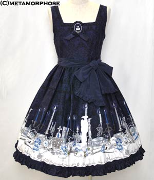
This is the JSK I. The bodice is a really pretty shape and looks really well fitted. It looks like it would be very figure-hugging. The straight neckline is maybe a bit dull, but looks decent enough. The straps are a good width. The waist bow is a really good shape. I think the size suits the dress quite well. Also, it has a good shape to it and it doesn't look floppy. The ribbon used has a slight shine to it, but I don't think it is that noticeable. The front has criss-crossed ribbon. I think the spacing of the ribbon has been done well and the ribbon is the right width. The ribbon doesn't look too clumped together. The back has a panel of shirring, which is covered by a ribbon corset. This helps to neaten the area and also helps to control how well the dress fits. I really like the shape of the skirt. It is really rounded and has a pretty, plump bell shape to it. I especially like how the waist area looks small but the bottom part of the skirt really plumps outwards. It shows that with the right petticoat, you can get a really lovely figure with this dress. The skirt is clutter free, so the print is displayed beautifully. The bottom hem is finished off with polka dot lace. This probably wouldn't have been my first choice as it looks quite sweet in comparison to the print and I don't think it is the prettiest looking lace either. Perhaps something which fits the musical theme of the print would have looked better.


This is JSK II. The bodice is again very well fitted and a pretty shape. It really nips the actual waist area in. However, I am not impressed by the 2 lines of horizontal lines of braid around the waist. I feel that the way the 2 line have been placed elongates the bodice. Also, I think it makes the skirt part look shorter than it actually is. I really don't think it suits the dress. I also don't think there needs to be 2 lines and one would have been enough. I am not saying that the braid was a bad idea, I just feel the placement of the braid could have been executed a lot better. The bodice is very plain, but the collar does help to liven things up a bit. I wonder if I am the only one who thinks some military style gold buttons would have looked good on the bodice? The collar is a pretty shape and makes the neckline a lot more interesting. The ribbon ruffle around the edge is absolutely gorgeous. The gathering has been done so neatly and it really makes the collar stand out. It gives the area more depth. However, I felt that from certain angles the collar looked big, so if you have wide shoulders then maybe proceed with caution.


It is nice to see that the collar looks neat even when viewed from the back. It looks so tidy and free of messy clutter. The back has a panel of shirring which is topped with a ribbon corset. The area looks very neat and tidy. However, I am not too keen on the bustle. I think maybe it is because it blends in a lot and gives the illusion of a bigger backside? If you glance quickly, you don't automatically see it is a bustle. I suppose it does add a bit of interest and it is spaced out nicely. It is a bit dull though.

The skirt shape on this dress looks a lot less attractive than the other JSK in my opinion. It doesn't flow as nicely, if that makes sense. The braid at the waist makes it look very awkward too. On the plus side, it looks like it would still hold a good amount of petticoat. If it was me, I would probably want to puff this dress out as far as it would go, just to hopefully get a better shape. I do however, like the bottom hem, which has gathered ribbon. It matches the collar and pulls the dress design together. It is also good to see something a bit different like this, as it keeps things interesting. I love the collar and the bottom hem, so it is a shame I don't like much of the rest of the dress.


This is part of the print close up...


... and another part, as I felt the first one didn't show enough of the print. The print is available in blue, green, bordeaux and black. The colours combinations are very interesting, especially the colours used for the stripes in the print (Which are a bit different to how they appear in the print close-ups. The stripes on the blue are more of a bright yellow). It is a bit quirky and different. As for the print itself, there seems to be a lot of random items thrown together. Maybe there is some story behind the print that I am unaware of! I really like the stamps. I think stamps need to be used more in lolita. They can be very pretty and decorative, as we can see here. The postal marks on top of the stamps are a nice touch too. I also really like the gold AatP emblem (visible in the first print picture) as it is so ornate and filled with detail. It has all been drawn beautifully. And yet, I am not too fussed by it. It looks okay, but I don't feel that excited by it.


The jewellery for this series uses very simple musical notes. It suits the series well, but maybe it is a bit too plain? Whilst I like it, I don't feel I could justify paying brand prices for a piece of jewellery this simple, especially when music note themed jewellery can be very easy to find. It just doesn't stand out as being a must-have accessory.


On a little side note, I would really be interested to see somebody pair this series with these Jane Marple stamp tights! I am sure somebody out there could make this idea work. Link- http://www.janemarple-stmm.co.jp/shop/jmr/0337.html

I am very underwhelmed by this series. It is pretty enough, but it doesn't appeal to me. I wouldn't buy this series. If I did though, I would go for JSK I in black or bordeaux. I love the collar on the JSK II but I don't like the rest of the dress. However, I do appreciate the use of different colours in this series and the print is nice enough, if you like that kind of thing.


Wednesday 26 September 2012

VIVID VI.VRANT Eye Lashes

I decided to re-read the Gothic Lolita Bible I brought at the TPC anniversary event the other day (volume 45). Seeing as I had a bit more time, I was reading a bit more thoroughly and I couldn't help but notice these lashes by VIVID VI.VRANT. 


At first I thought this was just random stuff being stuck on as decoration...


But I looked at the bottom of the page and it turns out the roses were indeed part of the lashes. It really took me by surprise. These are so decorative and indulgent. I realise deep down that these lashes are a bit too OTT and costumey for me to actually wear them. To be honest, I think the stock photos look better than when you see them being worn. Is it bad that a part of me still thinks they look really cool? 


After some digging, I found a website which had more of their lash designs. And they keep getting more and more impractical! How would you even go about wearing these ones? Even the simpler ones don't look that comfortable to wear.


I think my favourite lashes are these playing card inspired ones. I would love to see a harlequin themed outfit using these.

It wont come as much of a surprise that these lashes are expensive, but for those of you who are curious I found quite a few of their designs here- http://tetragrammaton.shop-pro.jp/?mode=cate&cbid=1113422&csid=0

I would never buy these lashes and I don't think they are the sort of lashes you would wear to a regular lolita meet. But I am still fascinated by them. I wish I could find some more pictures of these lashes being worn. The lashes are very indulgent. I wonder though, how simple it would be to recreate them using charms, beads and a bit of lash glue? I can't imagine that I would get a professional looking finish, but maybe somebody else out there could do a better job than I could!

I am not sure what I make of these lashes. Perhaps they verge too close to costume territory, but I could see somebody doing a photoshoot with these. For me, they are far too indulgent to wear normally. Ignoring the price for a moment, would anybody out there wear these?

Monday 24 September 2012

Angelic Pretty Paris Order (Facebook Store) September 2012- Neutral

Today I will be reviewing an order I did with the AP Paris Facebook store this month. As I have ordered from this store before, I thought it was going to be simple. But I was wrong. 

Ordering Process

I fully intended to order these items way back near the start of August. I was waiting for some money to clear and I was stalking the AP Paris Facebook every day, just to check the items I wanted were still there. Unfortunately, 2 days before I got my money, AP Paris decided to do some sort of update on their page. I didn't really think anything of it and I placed my items in the cart. Only when I put my address in, it kept saying that it didn't ship to my country. I thought this was a bit strange seeing as I had previously ordered from here and I knew they did ship to the UK. I tried to do different addresses, under different names and nothing worked. So I tried to email AP Paris to explain the problem I was having. They never bothered to reply to me, and I did wait a couple of weeks as I thought that maybe they didn't have English speaking staff available to answer me. But I got absolutely nothing. So I couldn't place my order and I couldn't contact AP Paris. I was essentially 'locked out' and unable to place an order. I was not impressed!

If you have ever brought anything over Facebook then chances are, you may have heard of Payvment. Well Payvment are now connected to lish.com which is a website that requires you to be invited. So we contacted Lish just to double check that it wasn't anything to do with them, and it wasn't, but we got given an invitation anyway. So AP Paris was at fault. Eventually, I randomly decided to try ordering again about 2 weeks ago, only to discover it now worked. So I placed my order.

We paid using Paypal via Lish and this time I remembered to pay in Euros. We were not too happy with using Lish as although it was secure, it publishes what items you have brought. It would be nice to have a bit of privacy. What if I had been ordering a present? And sometimes you simply don't want anybody knowing what you are buying as it is not really their business.

Shipping

I had to track my order through Lish. I noticed it took AP Paris a week just to process my order, which seemed longer than last time. They did remove the items off their page right away though, so I knew my order was safe. I wasn't really happy tracking my order through Lish as it was a bit vague and although I had a number, we couldn't find anywhere to track it. I knew AP Paris used La Poste, but we couldn't track it there and that stops working when the package leaves France anyway. So again, it was a case of waiting and seeing what day my parcel turned up. This is really frustrating, as I like to know where my parcel is. Once AP Paris had finally processed my order it took 2 days to get to me. My husband James answered the door but we were surprised to find we didn't need to sign for the package. Even the postman remarked it was a bit odd.


I couldn't help but smile when I saw the box because it is not the usual bright pink packaging that I was expecting! I read on the side that it had previously been used to hold risotto packets so it is good to know AP Paris recycle and the box was clean anyway. The box was very sturdy and sealed well with parcel tape, so it was quite secure. I thought it was a bit big considering how little I ordered, but I think getting a box is better than just using a postal bag or something.


 I opened the box and was greeted by loads of pink! The items inside had a bit of room to move around, but they were well padded. I didn't order anything too fragile anyway. AP Paris used quite a few sheets of tissue paper.


My order! It was wrapped up inside an AP shopping bag. I was glad to see that my points card had been updated (but there is no way I am going to fill that book up in time!). I also got given a Milk and an AP postcard, plus a leaflet about the Maki AP Collection. 


I ordered the Dreamy Horoscope barrette in navy to go with my Dream Sky skirt because I couldn't find the DS one anywhere and when I finally did, it was out of my price range. The navy is a bit darker than Dream sky but not noticeably. I am may finally be able to make an outfit for Dream Sky soon! The barrette was a bit bigger than I was expecting, but I actually prefer it this way. The fabric used is lovely and soft. I really like the star studs on it. The barrette looks a bit wonky in my photo but it is not wonky in person.


Oops! Blurry photo! The back has your standard barrette clip.


I also got the Glass Bottle of Tears necklace in pink. I had a really hard time deciding between pink and blue, but thought pink would match more of my wardrobe. It was on my wishlist and I figured I should get it before it sold out! I really love this necklace. All the parts feel strong and secure and I don't think it is going to break any time soon. It is quite see-through and I had problems photographing it, but in person you can see the pink colour quite well. I think the bow detail is really sweet. My favourite part though, is the crown. It is so pretty and detailed! I kind of wish I brought the matching ring as well. Maybe next time (if there is a next time). The chain is a really good long length. The chain is also decorated with beads near the perfume bottle which is a nice finishing touch and I think it is better than a standard gold chain.


I was also pleased with the thickness of the necklace. You get a good thick chunk of plastic. I was expecting the plastic part to be really thin, so this was a nice surprise.

So I have to give this order a neutral feedback. I am totally in love with the items I ordered, but the whole ordeal with ordering it was a nightmare. I am not saying I wouldn't order from their Facebook store again, but it did leave a bitter taste in the mouth. I tend to view AP Paris as a last resort option when the other stores have sold out of items anyway. But seeing as AP Paris appear to have fixed their initial problem with locking people out of ordering, maybe next time things wont be so bad. Just watch out for any updates!

Saturday 22 September 2012

Oxford Valentine Thank You!

Thank you very much to whoever made the Valentine for the Oxford Lolis this week! I think I know who you are! ;)

We are number 13 this week-

http://loli-valentines.livejournal.com/131532.html?view=3593420#t3593420

Thank you! xxx

Friday 21 September 2012

Sweet Cream House by AP

Today I will be taking a look at a new series by Angelic Pretty called Sweet Cream House. This set is already available. The series includes 2 dresses, a salopette, an apron style skirt, a head bow, hair ties, lots of biscuit themed accessories and tights.


This is the high waist JSK. The bodice is an okay overall shape, albeit slightly dull. But perhaps this style will appeal to the more casual AP fan. I like the use of thin semi-circle lace running vertically up the bodice, as it looks like whipped cream. Very print appropriate. However, I am unsure I like the use of velvet. There is an obvious difference in textures and I think it stands out a bit too much. Perhaps it would be best to team it with other velvet themed items when making an outfit. The velvet "belt" design is quite cute though. It defines the waist area, even though it doesn't really act like an actual belt. I like the lace running along the neckline. It softens the edge well. I don't really like the big velvet ribbon which tops it off though. This is just my personal taste, but I prefer smaller velvet bows (like that on the other JSK) because I think smaller velvet bows look smarter. The dress straps look a bit flimsy and I can't imagine them offering a lot of support. The back has a panel of shirring running the whole way across. It is not concealed and doesn't look that attractive, but I suppose it gives a wider sizing range. Although I would have preferred a ribbon corset over it. The skirt has a pretty flared shape to it. I like the slightly rounded shape and it will hold a lot of petticoat. The skirt is free from detail, so the print is shown off really well. The bottom hem is finished off with cute cake lace.


This is the JSK with collar. The bodice looks fairly well fitting. The bodice shape is nice, but I think it could have been a bit less boxy in shape. However, the collar does perk it up considerably. The waist ribbon is cute and about the right size for the dress. It is very shapely too. It does blend in a lot though, and I don't think I would miss it if it wasn't there. The 3 velvet ribbons are very cute. I like the size of the bows and I prefer the use of velvet on this JSK compared to the other JSK. But I still think there could be more velvet used throughout the dress design so it ties in a bit better. The velvet really stands out as it is.


I really like the use of thin lace running vertically up the bodice. The semi-circle shape mimics whipped cream and really suits the print. The collar is also really pretty. It is a nice shape and it gives the JSK a smarter look.  The collar is detachable, but I prefer this dress with the collar left on. I think it gives the dress a nice finish. The lace used on the collar is lovely. The lace around the edge looks like little blobs of cream. The bow lace is very cute and is shaped nicely around the collar. I think AP have got the balance of lace right. The only thing I would change would be to use thinner ribbon to tie the collar at the back because it looks a bit bulky.

The back has a panel of shirring which is concealed by a ribbon corset. Maybe in places the ribbon colour used doesn't match up exactly to the print, but it still keep the area looking neater. The skirt is a lovely full cupcake shape. It flares out nicely and has a pretty rounded shape. It will also hold a lot of petticoat. The skirt is clutter-free so the print is displayed really well. AP have used some very cute cake themed lace on the bottom hem.


And this is the print close-up. For some reason, Blogger is not liking this picture, so I apologise if the size is a bit off when I publish this. This print comes in caramel, strawberry milk, mint milk and cocoa. All the colours work really well. The caramel and cocoa colours really compliment the print. The strawberry and mint colours offer an interesting contrast but work brilliantly. I think my favourite colours are the caramel and mint ones. The print itself is very sweet. I bet some people are groaning at the thought of yet another food print, done in a very similar style to previous prints. But it has been drawn very well. You can tell it is AP, but I get a slight feel of Emily Temple Cute from it as well. The biscuits are drawn so well that they almost look real. It is certainly making me very hungry looking at this print! The houses really do look like they have been made from cream and chocolate. It is quite inventive. I especially like the chocolate doors, framed with whipped cream. The gingerbread men and bears are another favourite part of mine. I do think the inclusion of woodland animals is a bit random and I kind of wonder what they are doing there. But they look cute enough and I really like the squirrel. So it is not that original, but the print is very good for what it is.

I couldn't find a decent picture, but the tights for this series are very cute! If you look on the Japanese AP site's page for this series, you should be able to find them. Unfortunately, the bottom features the biscuit part of the print, which may restrict how many different series you could pair them with. It looks like they have been made with this specific print in mind. But despite this, I hope that AP release more tights in the future. I was gutted when the AP inspired Merry Go Round tights GO on Facebook fell through, and if AP were to make more tights, it would be amazing.

So I think this is a nice enough print. I don't like it enough to put it on my wishlist, but then again, this is more down to my personal tastes. It is still very cute though! I think I would go for the JSK with collar, as I think the design is better than the high waist JSK. If I had to pick a colour I would go for mint. It is very unusual for me to pick mint, but I thought the colours worked well on that colour way. Maybe it is because it contrasts with the brown chocolate parts of the print. I can imagine this series being quite popular, despite it being familiar to previous prints.

Wednesday 19 September 2012

The Element of Competition

Everybody has their different reasons for getting in to and wearing lolita. For me, I really enjoy putting outfits together and even if I don't always like the end result, I have a lot of fun. I don't see lolita as a lifestyle, I see it as a hobby. I gradually decided not to be a lone lolita and attend meets and stuff. I am now part of a local community, I attend cons and bigger lolita meets in London and I am a member of many different online groups on Facebook and Livejournal. And I am happy. I enjoy myself and I have made many friends.

However, because I am part of so many different groups, I also get bombarded with posts. Contests, model applications, photo shoots... these are all fairly common. And I do enter these contests. I tend to view them as a bit of fun. I never expect to win, but I join in anyway just in case. And generally, I think a lot of lolitas feel the same way.

But sadly, not everybody feels the same way. I have read posts about people getting upset about not getting picked to model or slating the people who did win. And this is not the only thing I have seen. There are lolitas out there who compete to get the most Lolita Valentines or brag online about how they were the best dressed at a meet. Suddenly, lolita is not about dressing up and meeting friends, but a contest to be the prettiest, most popular and to get the most attention.


I have been thinking about this a lot lately. In the end, I came to the conclusion that lolita is only a competition if you make it a competition.

When you are next making an outfit for a meet, ask yourself this- are you designing this outfit with the intention of being the best dressed there? Are you trying to compete with your fellow lolitas? I am not saying that trying to dress up a bit more is necessarily a bad thing. There are situations (brand tea parties, for example) where maybe it is a good idea to put a bit of extra effort. And I understand the desire to look good, because if you think you look good, you tend to feel confident. I know how this feels. I will sometimes get a random idea in my head and will run with it, even if it is not necessarily within the norm for lolita. But it is never my intention to deliberately upstage people. I never say to myself "I am going to look a lot better than ______ will". I do what I do because I love lolita and I enjoy what I do. Besides, just because you think something looks good or bad, it doesn't mean that everybody is going to agree with you.

My opinion on contests such as modelling ones, is that if you don't win, it doesn't necessarily mean that you are worse than the people who win. It is just a matter of opinion. It could be that you simply didn't fit the judge's particular vision of what they were looking for. If members of the general public take more photos of one particular lolita in your group, it doesn't mean that they are the best lolita. In fact, with the general public it could easily be interpreted the other way and they think that lolita looks the strangest!

I feel that as lolitas, we should all just try our best to be the best lolitas we can and enjoy lolita as much as possible. Competitions are not a bad thing and can be quite fun, but for me, this is not why I got in to lolita. I just don't think that winning contests should affect our experience. I personally find that I enjoy lolita the most when I am not worrying about comparing myself to other lolitas. Try not to put too much pressure on yourself. Lolita is not a chore, it is meant to be enjoyed!

Monday 17 September 2012

Dim Light by Metamorphose

Today I shall be looking at Dim Light by Metamorphose. This series has already been released. The Dim Light series includes 3 dresses (one available in 2 lengths), 2 skirts, socks and accessories.


This is the OP. The bodice looks really well fitted. I like the neckline and how the waist line has a slight 'V' shape to it. The contrast of the printed fabric and the solid coloured de chine fabric works well too. It has a very "period costume" feel to it, but I feel it has a very romantic look to it. The waist has a ruffle of solid coloured fabric, which stops the area looking flat and dull. It also helps to hide where the bodice and skirt material join. The bodice has 3 dull satin bows on it. I think the spacing of the bows could have been executed better, with the top and bottom bow moved a tiny bit closer to the middle bow. But the bows themselves look very pretty and I like the use of dull satin, which hopefully wont be too shiny. The neckline with the braiding is a lovely shape and it looks very elegant. Inside the gold braid, there is a ruffle of the solid coloured fabric. It doesn't look bad, but the dress works with or without it, so I am not too fussed by it. The crossing neck straps are a nice finishing touch.


This picture shows that the sleeves do flare out nicely, but it is not too OTT. I really like the de chine fabric used as it gives the sleeves a very soft, floaty appearance. This gives the sleeves a very romantic feel and I think it really suits the dress. This dress also comes with matching wrist cuffs, which match perfectly and use the same material as the sleeves.


This is the back of the bodice. I am not too keen with how the back has been set out. I think the shirring panel could have ended higher up, nearer the neck. I also wish that the shirring didn't look so exposed and had a ribbon corset to conceal it a bit better. However, I do think the rest of the back looks very neat. The silver braiding conceals the edges of the shirring panel and just makes it look tidier.

The back of the skirt also has a bustle on it (not shown here). The bustle is a good width and the layers are spread out really well. I like how it doesn't look too droopy, but at the same time it doesn't stick outwards too much. The skirt has a very well flared bell shape. It will hold a very decent amount of petticoat underneath. The material also looks very plumped out and because of this the print is displayed really well. The skirt has also been kept clutter free and so the print really is displayed as best as it possibly can. The bottom hem is finished off with a very pretty ruffle, which ties in well with the bustle and the rest of the dress.


This is the pinafore JSK, which comes in 2 different lengths. The one in the photo is the medium length version, which on the model sits a bit below the knee. The mini length is knee length on the website's model. I would probably go for the medium length version of this dress, but there is not a massive amount of difference between the two dresses. The bodice is a nice shape, but possibly not as well fitted as other dresses in the series. I really love the de chine tie on the waist. It is so soft looking and delicate. It may be a bit floppy looking, but I think this works well with the style of the dress. The bodice is quite plain. The main detail is the swan logo brooch on the neckline. The brooch is very pretty. Both the brooch and the waist tie are detachable, but I personally wouldn't detach either of them. Although it is good to have a simpler design compared to the other 2 fancier dresses, I feel this dress is simply too plain with these items detached. The straps are a nice width, but I feel some thin lace would have jazzed them up a little bit. Whilst I like the simpler design of this dress, I feel this dress would be best paired with a fancy blouse, especially one with a detailed neck area. The back has a panel of shirring running the whole way across. It is very exposed as there is nothing to cover it. The skirt has a beautiful bell shape to it. Isn't it nice to see Meta not doing their usual, almost triangular skirt shape? The skirt looks like it will flare out quite well and will hold a decent amount of petticoat. The skirt, just like the rest of the dress, is clutter free, which means the print is displayed brilliantly. The bottom hem is finished off with a lovely ruffle, giving it a softer finish.


 This is the Peplum Pinafore JSK. The bodice is nicely fitted and is a very interesting shape. I absolutely love the way the braiding has been used on this bodice. It is very decorative and interesting looking. It certainly livens things up a bit. I love the way it also continues upwards and lines the edges of the de chine breast piece. The breast piece is very pretty. The de chine fabric contrasts beautifully with the print fabric and I like how this material is ruffled slightly. This gives the breast piece extra volume and texture. The breast piece is finished off with a printed fabric bow and a fake rose. I really like it. I think it is pretty. The dress straps themselves are very thin, but fit in well with the dress design. But then we get to the shoulders... and that very "interesting" detail. When I first saw the shoulder piece on the dress, I thought it looked awful. In my opinion, it just crosses the line in to costume territory and it really does look like something you would see on a cosplay. I still don't like the shoulder part now, but then I read that the shoulder part was detachable. Yay! So with the knowledge I can detach the shoulder bit I dislike, I have really warmed to this dress.


The back has a panel of shirring, which is concealed really well by a dull satin ribbon corset. It looks so much neater. Whilst I may not like the shoulder part, I don't mind the matching panels layered over the skirt. They are draped really nicely and are a pretty shape. They are also decorated well with the gold torchon lace around the edges. I also like how these panels don't conceal the print on the front of the skirt too much. The skirt shape is a beautiful full bell shape. It is a really lovely shape and the de chine fabric layers on the top sit on top well. Despite the de chine concealing the print on the back a fair bit, the print is still displayed well on the front of the dress. The bottom hem is finished off well with torchon lace and a de chine solid coloured ruffle. So whilst, I initially hated this dress, I grew to like it more when I knew just how much of the dress parts were detachable. I still wouldn't buy this particular style, but I will be very interested to see it being worn.


And here we have the print close-up. The print is available in navy, green and bordeaux. The very first thing I said when I saw this print was "At last!" It feels like ages since I last fell head over heels in love with a Meta print! There is not a single thing I dislike about this print. The candle sticks are so ornate and drawn with such detail. The roses and table decorations compliment the candle sticks really well. And I love the gorgeous baroque style pattern in the background. If you look really closely, you will see the Meta swan logo cleverly inserted in the background. My absolute favourite part is the angel candlestick. So pretty... My favourite colour is the navy (no surprises there) but all 3 colours work so well with the print. I would be happy to add any of the colours to my wardrobe.


I also really like the socks for this series. They have a bit of a Moitie feel to them. But what I really like is how the smoke of the candle forms the brand name. It is a really nice touch. The socks are then finished off with pretty stars.

So overall, I am happy to see that Meta have reminded me why I love them so much. I have said some very negative things about a lot of the most recent Meta prints, and then they go and release a beautiful series like this! Would I buy from this series? Of course I would. I put this print on my wishlist as soon as I saw it. I would probably choose the pinafore JSK in navy (medium length). Although I wouldn't wear it, I do appreciate the Peplum JSK as well. So this is a series I am really hoping to get my hands on.

Friday 14 September 2012

Bodyline Vs. Classical Puppets- Rose and Lace Fabric

I went on the Bodyline website, just to see if they had any nice new items in when I stumbled across a new skirt. I have not been that impressed with any recent Bodyline stuff, but I do like this new item.


This is skirt L514. What caught my attention straight away was the print. The roses and lace were so detailed and realistic looking. I was especially draw in by the colour scheme on the black skirt. The dusky pinks are teamed with the sweeter lavender colour on the ribbon. It doesn't sound that good when you just see those colours written down, but when I looked at the picture, I thought it was a really interesting colour combination. Dare I say it? The print almost looks like it could be mistaken for brand. Considering this is Bodyline as well, it is also fairly cheap.

A little later on, I was looking up petticoats and naturally, I visited the Classical Puppets Taobao store. Then I saw something very familiar.


The exact same fabric! Now this poses a bit of a dilemma. Do I go for cheap Bodyline or go for slightly more expensive (but potentially better quality) Classical Puppets?

I can find faults with both. I am not that keen on the waist part of the Bodyline skirt. It is not too bad, but I think it could be better. I think Bodyline's choice of lace at the bottom could have been better. The Classical Puppets dress has the beautiful panel of lavender with the gorgeous ruffle at the front. However, I am not really enjoying the bodice on this dress. I dislike the criss-crossed black ribbon and how it doesn't look as luxurious as the skirt part. But do I like the skirt part enough to ignore the top half?

I have decided to wait a little bit to see if Bodyline brings anything else out. It wouldn't be surprising if Bodyline release a dress using this fabric at a later date. They have done that in the past. I remember when that beautiful rose and jewellery themed bag came out last year and then afterwards they released a yukata (which I hated!) and then a skirt and dress a little afterwards. So it is worth waiting, just to weigh up my options.

Which one is going to win out in the end? Who knows...

Wednesday 12 September 2012

Sweet Poodle's Wonder Pocket by BABY

Today I will be taking a look at a fairly new Baby series (still lagging behind with the discussion posts!). This series is Sweet Poodle's Wonder Pocket. The series includes 2 dresses, 2 skirts, a bonnet, a head bow, 2 blouses, a stripy salopette, socks, a bag and various jewellery and accessories.


This is the Lala JSK. The bodice is a nice shape, but I noticed some of the material appeared a bit baggy and loose. It might not be that well fitted. The details on the bodice also look off-centre, but I am hoping that is just the stock photos. The straps are a good width for the style of dress. There is a huge waist bow. I think it is a bit too large, especially with the lace around the edge. Despite its size, the bow does hold its shape well and it doesn't look droopy. I would have preferred straighter lines, but it is a good shape. Thankfully, this bow is detachable and I think the dress looks better without it on. The other details on the bodice stop it looking too plain when the bow is removed.


The bodice has a yoke made up almost entirely of lace. This has the potential to look very fussy but I think the lace has been used well. It is not too bunched up or squished together, so you can see the lace details quite easily. The lace looks of a good quality too. As this picture shows, there is ribbon threaded through the lace around the edge and another line going horizontally across. The ribbon doesn't really stand out that much, but I think it works well because it helps to break up large patches of lace. It also helps to tie in the bows that top off the yoke. The yoke is topped with 2 ribbon bows. The bows are cute and a pretty shape. They are a nice size as well, but the dress looks overloaded with bows when paired with the waist bow. But as I said, I think the dress looks better with the waist bow detached anyway.

The back has a panel of shirring which is concealed well by a ribbon corset. It looks very neat and tidy. I really like the skirt shape because it is rounded and flares out well. It looks like it will hold a very decent amount of petticoat. The skirt is free of clutter, so the print is displayed well (well, what you can see of the print anyway. See the print close-up below). The bottom is finished off well with a pretty ruffle. The ruffle has a line of ribbon running along the top, which gives it a neater appearance.


This is the Coco JSK. The bodice on this dress looks a lot better fitted than the other JSK. The bodice is a nice shape too. The straps are a good width. They are also decorated well with pretty lace. The waist has a ribbon belt, which helps to define the waist a little bit and also makes the dress look neater. Again, I feel that the waist bow is too large for this sort of dress. It is too fluffed up and puffy. It conflicts with the more subtle skirt shape. I really wish it was detachable. The neckline has 3 bows. The bows are a good size and shape. The ribbon used is a bit shiny, but not too distracting. I do like the middle bow and the pearls draped carefully underneath the 2 outer bows. However, I dislike the colour used for the 2 outer bows. Because of the duller colours in the print, the 2 outer bows (here shown in sax blue) really stick out. They don't appear to properly match anything else on the dress. Although it may be seen as a bit "boring", I would have made all 3 bows the same colour as the middle bow. The back has a panel running the entire way across. The shirring is very exposed. I also dislike how smaller wearers will have to rely so heavily on the waist ties to make the dress smaller. As for the skirt shape, it is very... flat. It has got a very obvious A-line shape to it and I think it is at odds with the cute details on the bodice and also the very sweet print. It is okay if you want a more subtle sweet look, but I don't think it works on this dress. The skirt is kept clutter free, so the print is displayed well. The bottom hem is finished off with some good quality lace, which has a pretty rose design.


And this is what the print looks like. The print comes in ivory, pink. sax blue, brown and black. Although I have not seen dresses for each colour, I am instantly ruling out the ivory, pink and sax blue colour ways. Why? Because the colours are so faded that you can barely see the print. I know a lot of sweet prints suffer from this problem, but this is a particularly bad case. It has really put me off this series. As for the print itself, the poodles are very cute. I like how they look so soft and fluffy. They have been drawn very well. The vertical parts are very well decorated, which stops the rest of the dress looking boring. I love the lace, dotted with ribbons and bows. Although it looks a bit random, I also like the vertical line of biscuits attached to ribbon. I think it is a real shame that the pale colours spoil it for me.

Oh dear... There is something about the bag from this series that doesn't look right. I think the biscuit part looks too flat and it looks too cartoon-like. The bow doesn't really make it any better either. Sorry Baby, but in my opinion AP make the best biscuit bags!

So I can't say I am that impressed with this series. When it comes to printed releases, the print is obviously a huge part of the series, and the print colours really spoil it. If I absolutely had to pick a dress I would go for the Lala JSK in black. At least with the Lala JSK, I can detach the waist bow. The design of the Coco JSK is too conflicting for my liking. I wont be buying anything from this series, even if I see it being resold cheaply. It just doesn't amaze me in any way.

Monday 10 September 2012

Tea Party Club 5th Anniversary Event!

I am feeling very unwell, so I am sorry if this post doesn't live up to expectations. So... the TPC 5th Anniversary event was held this weekend! I only attended the main event on Saturday but I hope everybody had fun at the Sunday tea party as well. I apologise if I didn't get the chance to talk to everybody. I have seen some pictures that have been uploaded and I can't believe how many people I missed! Then again, this event was absolutely huge. Although this event was to celebrate the TPC 5th Anniversary, there was a lot of excitement about Juliette et Justine being invited as guests. I believe this is their first party for the brand? Head designer Mari Nakamura was there to represent the brand. GLB editor Mariko Suzuki, doll designer Koisukihime and make-up artist Akira Tanaka were also present. How exciting! Kyra, who organised this event, has been absolutely amazing. And congratulations to Kyra and Dom as well! I was so excited to witness Dom's proposal and everybody in the room was crying and screaming with happiness.


After a quick browse around the various stalls, we all moved in to the other room to meet the guests. We had a really massive Q&A session. I really hope that somebody out there managed to record what was said! I think there were loads of interesting answers from the guests. Mari hinted that she had thought about making different sizes, so that may be something to look out for in the future. We also found out some interesting facts. Did you know that international lolitas make up 40% of all of JetJ's purchases? I think this is interesting because I really got the impression that the guests wanted to be more accommodating to western lolitas. There were also really interesting questions about how Mari comes up with her ideas, Mariko's favourite parts of the GLB and lots of hair and make-up tips from Akira. Koisukihime was also really lovely and we got a lot of insight in to how she designs her dolls.


The guests up on the stage!


Urgh! Shiny face! I won 2 raffle prizes during the day. In case anybody was wondering what I won in the morning raffle, it was this pair of Baby the Stars Shine Bright socks with a berry design. Seeing as I am a fan of berries, it was quite appropriate that I got this prize. I was so ecstatic to get a prize that I literally jumped up and chucked all the stuff on my lap on to the floor! Maybe that is why my poor camera was playing up! I didn't get that many outfit shots during the day because my camera decided to be very naughty.


The venue was also a brilliant choice! We loved this mirror on the stair case, so we had to get a picture. There are so many great places in this hotel where we could have taken pictures.


We also got to watch a fashion show for JetJ. It was really fascinating seeing all of the model's outfits. They were so well put together. I have to admit that before this event, JetJ were not really a brand that I considered a favourite of mine. But for most of the fashion show I was stunned by how beautiful JetJ is. I found myself lusting after many dresses and accessories. I even brought a pair of tights after I saw how good they looked when worn.


I think that my favourite outfits were the ones worn by Chokelate, although the red Alice themed outfit was also a favourite of mine. My first thought when I saw this outfit was that I really wanted the tights. In fact, I may use my discount coupon on them. 


Yay! Chokelate! I didn't get many good shots due to all the flashes going off and I was sitting further back, so I am glad I at least got a fairly good one of this outfit. I recommend viewing the ones that Anarchy Photography took and can be viewed on their Facebook page. 


My aim for my outfit was to wear classic, but to not upstage the people wearing JetJ. I chose my Meta lucky pack dress and teamed it with blush and peach coloured items. I am so glad I finally managed to work peach in to an outfit! It has been a goal of mine for ages. Almost all of my outfit is off-brand, especially Primark. I was so scared that I was going to look cheap! The rose crown, blouse, shoes and some of the jewellery is all Primark. The tights are Dorothy Perkins, the rose attached to my chest is Bodyline and the bag was the one I got in Camden on my birthday. The hardest task I found was matching up the colours. I really struggled with the cardigan so I am glad it was hot enough to take it off for most of the day. 


We all got a postcard signed by Mari and Mariko. What I thought was a really nice touch is that instead of printed autographs, they were actually all signed by both ladies! We had to go up to a table to get the postcard and we all shook hands with Mari and Mariko. I think I made a right idiot of myself. Mariko put out her hand to shake my hand and I put out the wrong hand! I could feel my face going red. Mari said I looked pretty so I thanked her politely. 


The latest GLB was being sold at a special price of £16 and features some of the dresses we saw during the day. Normally in the UK a GLB will cost you £20-25 if you buy it from somewhere like the Japan Centre in London. We also got a poster of the cover as well. Everybody was given a JetJ Autumn/Winter catalogue with a 2000yen discount coupon.


This was the poster I won in the afternoon raffle. I really love GLB cover art, so I am thrilled to have gotten 2 GLB cover posters. 


I think this post is already picture heavy, so I wont post everything I brought during the day. But here is a worn photo of the JetJ tights I got. These were not my original choice. I wanted the pair with the crosses on them and I was heartbroken when the person directly in front of me got the very last pair! It is my own fault for not buying them earlier in the day. So I picked up this classic, floral design instead, which are still very pretty. The lady behind the stall had previously said that they would suit me and I was determined to get at least one pair. The pattern gets a little faded towards the top where they have to stretch a bit more, but I still love them.

And finally, I would love to say a huge thank you to Kyra and everybody else who made this event such a huge success! I had a fantastic day!

Related Posts Plugin for WordPress, Blogger...