
Today I shall be discussing the latest series by BABY. The full name is in this post's title but to save time, I shall be calling it Angel's Whisper from now on! This series has 2 dresses, a skirt, a bonnet, a headbow, socks, a top and several bits of jewellery.
 This is the Gabriel JSK. The bodice looks well fitted, but the lines look a little straight. It gives the bodice a bit of a box-like appearance. It doesn't really flatter a curvy girl's figure. The "belted" appearance helps a little bit by making the waist look a bit smaller. However, the colour of the belt looks a little dull and it almost looks like the printed side has been turned inside out. The large bow uses the same style of material. The bow is very large, but despite this it manages to maintain a good shape. The bow is lined with lace, which looks good quality, but the shape is not that attractive. I also feel the lace adds unnecessary bulk to the already large bow. The rose is a nice touch, but because it is facing downwards it makes it look a bit droopy. My favourite part of the bow is the 2 lines of pearls, which feature cute little star and cross charms. However, I think overall the bow is a bit OTT, but when the bow is detached, the dress is too plain. There is no "happy medium" between the two. The lace on the neckline and running along the sleeves looks good quality but I think it looks a bit like one of those doilies a granny would use. The straps are a little thin and could be a little thicker, maybe without the lace.
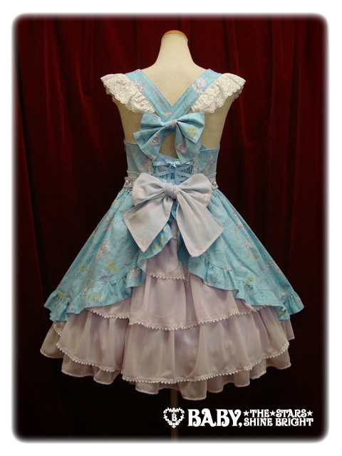 The back of the dress has very confusing straps. I think the use of 2 bows is a bit too OTT. There is a panel of shirring, which is concealed by a ribbon corset nicely, and also hidden underneath the bows. The back bustle matches the colour of the belt and bow perfectly. The bustle has a lovely floaty appearance and the tiers are spaced out well.
 The skirt flares outwards quite far but the lines are straight, giving the skirt a triangular appearance. You could a lot of petticoat underneath, but the skirt could do with being a bit rounder in shape. I like the bottom of the printed part. The ruffle gives the harsh straight lines, a more frilly edge. The use of bows really works, but they are a bit shiny in appearance. However, there is another appearance of the doily lace underneath the bows. The bottom hem is a continuation of the bustle, but from the front view, the bustle looks a bit droopy as if it is sagging.
 This is the Michael JSK. Thankfully, this dress flatters a curvy figure a bit better than the other dress. However, I think the waist looks very wonky in the picture above, with the left hand side appearing higher up. The double lines of ribbon are very cute. I especially like how the lower line has a slight heart shape to it. The ribbon is stripy, which works well with the music lines in the print. The ribbon looks like it is good quality and only has a slight shine to it. The bows finish off both lines well, because they are about the right size. There are also vertical lines of lace, but they blend in quite a bit, so don't add much to the overall appearance. The lace on the neckline and sleeves is pretty, but I think the lace on the sleeves sticks outwards at an odd angle. The straps are still thin, but look more supportive than the straps on the other JSK.
 I like the use of chains and charms, which is draped nicely and effortlessly around the waist. I think it looks very cute!
 I definitely prefer the back style on this JSK compared to the back on the other one. The bustle is narrower but has more shape. The spacing looks better. However, it might make a large bum look bigger! The shirring panel is concealed by a well-spaced ribbon corset. The ribbon used matches the bustle colour well.
The shape of the skirt still looks a little too straight and is not helped by the wonky waist. The double layer of chiffon at the bottom helps to give the skirt a nicer shape. The bustle looks lovely and soft. it gives the dress a very dreamy feel. The edge of the printed part of the dress is finished off with small bows, which look very pretty.

This is the print close-up, here shown in Holy Night (lavender x navy). The other colours available are Carol (ivory), Blue Angel (sax blue) and Noel (black). I have chosen the navy as my favourite colour because it gives off a dreamy feel. The angels on the print are very cute. I like the way that they are sat on large music notes, carrying flowers and in mid-flight. It makes the angels look more lively. The wavy music lines add a bit of interest and look a lot better wavy instead of straight lines. I also like the candles. I am a little unsure about the crosses in the print because I think the holy theme is a little strong.
 I quite like the socks. The little golden angel is very cute. I like all the floating musical notes, which compliment the print well.
 This is one of the bits of jewellery from this series- the bow ring. Although the design is simple, the bow is very pretty and I love the star dangler. I also like the little musical notes on the bow.
 Although this is not a series I will be adding to my wishlist, I do still think the series has potential. I think the 2nd JSK is very beautiful, but I am hoping that the waist is not as wonky as it is in the stock photos. I think all the colours this comes in work well with the print, but the navy is my favourite. I actually don't know how well this print will sell. It could go either way. I would actually prefer to get the jewellery and socks instead of the dresses. Pretty, but not overwhelming.
Yay, another awesome review!
ReplyDeleteThe first JSK reminds me of Sailor Moon for some odd reason...it might be the bow in the front ._.;
But the back is kind of interesting lol
I am in absolute LOVE with the Michael JSK though Dx It's so pretty! Especially with the charms!
And that ring is one of my new favorite pieces! Thanks so much for sharing this~
~ Kieli ~
Thank you! <3
ReplyDeleteI think the Michael JSK is pretty so I hope that the wonky waist is just down to a bad stock photo. I love the ring too! I rarely buy brand jewellery. Maybe I should get some more in the future!
I personally think its a cute print...but overall as a dress, head bow; etc...I don't really like it :( But I think the ring is cute !
ReplyDeleteI understand what you mean. It is very decorative. I suppose that at this time of year, Baby just wanted to do something a bit special and chose to do more to their dresses.
ReplyDelete