
First up, I am taking a look at Royal Creamy Chocolate by Angelic Pretty. This series includes 1 dress, a salopette, 2 hair accessories, tights, a cutsew, a hoody and tights.

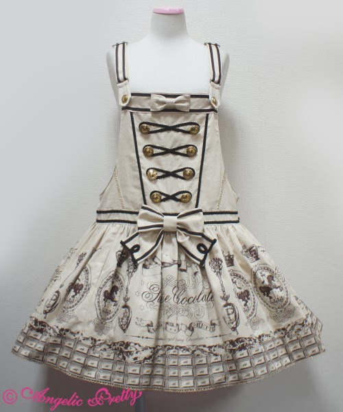
This is the JSK. The bodice seems well fitted, although the material appears bunched up in some of the stock photos. The shape is interesting though. The halter straps are quite wide set, which creates a neckline which I think is a little strange looking. I also wonder if the neckline will sit on an awkward place on some wearers. However, the neckline does at least give plenty of room to show off a blouse with a detailed front. The waist bow is a bit big, though it suits the dress. The shape is interesting and the braid helps to liven up the edges. The bow also looks perky and sits well on the dress. The front of the bodice is decorated with lots of braid swirls. I like how the braid mimics a piped icing design. It matches up well with the print theme. The bodice is finished off with well positioned. buttons. The buttons are a pretty design and a good choice.

The back of this dress is certainly different... I don't really understand why there is this random line down the middle with buttons on it. It just looks a bit odd to me. I do like the bow though. Thankfully, the random line and the bow are detachable. The back has a panel of shirring. However, it is covered randomly by shoe laces. I am not really a fan and I think ribbon would have been a much better choice.
The stock photos show the skirt has plenty of volume and flares out well. The skirt has a beautiful rounded shape to it. I would wear a fuller petticoat to properly show off the print. The skirt is left quite simple. The bottom hem is finished off with a thin line of gold lace and then some beautiful crown themed lace.
And because this series only has 1 dress, I decided to take a look at the salopette too. I like the overall shape. The straps are a good width, although I think the placement of the straps could have been better. I don't think the straps look that cute, although they do match the underlying military theme. The dropped waist is topped with a bow. The bow is a good size, but I think they could have gotten away with it being a little bit bigger. The waist bow is again a good shape and is finished off well with swirly braid. I wouldn't have bothered with the 2 horizontal lines of braid going across the waist area, because it makes the area look bigger than it actually is. The front is decorated in a similar style to the JSK. The spacing and placement of the details has been done very well. The neckline is also finished with braid and a small bow. The bow looks cute and is a lovely size. The lower back has 2 buckles, which are good for adjusting the size a bit. The skirt part has a reasonable amount of puff and flare for a salopette. The gathering means that the heavily detailed print is slightly obscured in places though. But I still think it looks cute. The bottom hem is then finished off simply with some thin, gold lace. The gold lace matches us nicely with the buttons.

This is what the print looks like. As you can see, the print comes in ivory, pink, mocha and brown. These are quite standard AP chocolate print colours and as usual, the colours all work well. The dark brown teamed with bright gold might be a bit too much for some people though. I personally am a fan of the ivory because it has a bit of a nostalgic look to it. As for the print, it doesn't surprise me at all that AP have finally teamed together carousels and chocolate (probably their 2 most popular themes). I do like the chocolate part and how the scrunched up part makes it look like a partially unwrapped chocolate bar. I adore the spoons. They are so beautifully detailed. The carousel parts are also cute. I am not as keen on the Sweetie Chocolate part. I can't put my finger on why that is though!
So overall, it is quite a pretty series. The designs are cute and it is another series for AP chocolate print fans to collect. It is a bit of an overdone theme, but the print is nice enough. Would I buy this series? Possibly, although I think I prefer other AP chocolate prints over this particular one. I would choose the JSK in ivory if I did. I am not too overwhelmed by this series, but it is pretty enough.
Next up, I am looking at Melody Toys. This series includes 2 dresses, a skirt, overalls, 2 hair accessories, tights, socks and a few pieces of jewellery.

This is the Collar JSK. The bodice material looked slightly loose in some photos, but the general bodice shape is quite pretty. The straps are a good width. The straps are topped with a detachable collar. The scallops on the collar have been done quite neatly and are spaced out well. I don't usually like scallops, but I think the neckline looks too plain when the collar is detached. The detachable bow in the centre helps to finish off the collar well, although I would have liked the bow to be a bit smaller. The waist bow looks a bit big, but doesn't look too bad on this dress. The shape is simple and I dislike the use of rik rak to line it. However, it looks very perky and sits well on the dress. The bodice features criss-crossed ribbon. The spacing of the ribbon looks okay, but the ribbon looks a bit loose and hangs off the dress. There doesn't appear to be a way to tighten this ribbon either. The ribbon is lined either side with wide lace. The lace is pretty but I think it would be better if the lace was slightly thinner. I wouldn't have bothered at all with the two thin lines of lace on either side of the bodice. The back is fully shirred, so it isn't concealed by anything. I don't think it looks very appealing but at least offers a wider size range. The stock photos show the skirt is very full with plenty of flare. It has a very OTT rounded shape to it, which goes well with the cuter print. The skirt is kept simple and the print is displayed beautifully. The bottom hem is then finished off with custom teddy bear themed lace.

This is the High Waist JSK. The bodice looks reasonably well fitted, although it is a bit hard to tell underneath all that detail. The straps look very supportive, although I am not a fan of the ruffles. The ruffles look very OTT and give an exaggerated cutesy look. If I am being honest, I think it looks a bit too 'young'. I also think that the ruffled straps mean that you could only wear a certain type of blouse with this dress, as puffy style sleeves wouldn't work with the straps. The waist area is topped with 3 gingham (for some reason, the gingham really bugs me) bow brooches. The bows make the waist area look bulky and too OTT. I also don't think it looks very flattering. Thankfully, these bows are detachable. I would definitely detach them if I was wearing this dress. The bodice has a line of buttons with lace ruffles either side. The buttons are very cute and the lace looks pretty enough, but something about the design doesn't appeal to me. The neckline is finished off with lace and topped with a cute small bow. I just feel like AP has gone a bit too OTT and 'childlike' with the bodice here. The back has a panel of shirring which is concealed neatly by a ribbon corset. The stock photos show the skirt has a reasonable amount of volume to it and flares out well. It has a decent amount of length to it to compliment the higher waist line. I like the slightly more subtle bell shape of this skirt, although you could still create a very OTT look with the right petticoats. The skirt is again kept simple and the print is displayed fairly well. The bottom hem is then finished off with the teddy bear lace again.

And here we have the print close up. As we can see, the print comes in pink, sax blue, mint and black. All 4 colours seem pretty standard choices for this print, but I think sax blue is the best. Now I know my regular readers will remember I was very excited to see AP finally use a duck in their print, but that is literally about the only thing I like about the print. The toys are all drawn well but it is very similar to a lot of other AP toy prints. What really bugs me about this print is the random gingham at the bottom and the line of fake pom poms. I usually can't stand that pom pom trim when it is used on dresses, so I was hardly going to like a printed version! I also feel like the diagonal ribbon background it a bit too OTT teamed with this busy print.
So as much as I wanted to love this AP print which features a duck, I am afraid I can't. I was very excited when I first saw the picture of the duck on Tumblr, but as the dress design pictures came out and I saw the entire print, I found my enthusiasm disappeared. I hope that AP will do another print with a duck (maybe something a bit more like Happy Garden?) but I certainly wont be buying this one. If I had to, I would choose the Collar JSK in blue because it looks a bit more mature than the other dress. I feel this series pushes the OTT and cutesy too far.
No comments:
Post a Comment