

This is the Camelot JSK. The bodice is really well fitted and will hug the wearer's figure well. The straps are a little thin, but the soft looking lace help to stop the straps looking to plain. Using the lace here also helps to balance out the bottom of this dress. The top bit of the bodice is ruched and I think it looks very pretty. The ruffle along the neckline also stops it looking to straight and boring. The bottom of the ruched area has a line of ribbon, which is shiny but still works well with the design. Then there is just a small ribbon bow in the middle. I don't think this dress would have looked so good if it had a waist ribbon as well. It would be too OTT with the other details on top of the dress as well.

The back has a shirring panel concealed by a ribbon corset. The skirt has a pretty rounded shape, but not so round that it is too sweet for classic lolita. In fact, the rounded shape would probably be good for anybody who wanted to do a rococo or OTT classic outfit with this series. However... the way the printed part meets the tulle is dreadful. It gives the printed part and awkward shape. It looks odd, as if the printed part ends too soon or has been hitched up, exposing the tulle part. I love the idea of using tulle for this series but not how it has been used here.


I thought that the criss-crossed ribbon running down the front was a bit too clumped together. Maybe it could have been spaced out a bit more to give it a less bulky appearance. I am unsure about the chest bow. Whilst I adore the gold trim and beautiful lace (despite it looking a bit floppy on the top bit), I think the shape of the bow is a little strange. The top part of the bow looks a little squished and the overall shape is a little odd. I also would have liked the gold charm to be dangling underneath the middle instead of just placed on top.
The back of the bodice has a panel of shirring which is concealed well by a ribbon corset. The waist ties are attached by these very pretty pearl buttons lined with a golden edge. The skirt part on this JSK is not as rounded as the Camelot JSK but despite this, it still has a good shape for classic lolita. It looks as though it will flare outwards well and hold a lot of petticoat. The tulle part at the bottom looks nicely shaped and well spaced out.
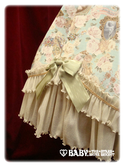
Although some will say that the bottom of this dress reminds them of curtains, I think the soft layers work beautifully with the print. It has been presented well and the materials look good. Little touches like the gold trim and the well shaped bows help to finish it off perfectly. The ribbon used on the bows may have a very slight shine to it, but it looks like the ribbon is good quality and the bow is not too floppy. Quite frankly, I think the skirt part of this dress looks a great deal prettier than the skirt part of the Camelot JSK.


This choker is just one of many pieces of jewellery that have been released for this series. You really are spoilt for choice! I think the reason BABY have released so many different bits is because they believe the pieces will be quite versatile and easy to wear. Most of the jewellery has a very ornate and luxury appearance to them. The designs are very decorative and rich and have a regal feel to them. These really work with the dress designs but I think they could also work well with hime style.
Overall, I really like this series. My only issue is that I love the bodice on the Camelot JSK but I love the skirt part on the Vivienne JSK! Personally, I would go for the Vivienne JSK but I think it is a shame it doesn't have the bodice from the other JSK. The skirt on the Camelot JSK just puts me off too much. Whilst I like all the colours, I think for me the best colour is either the ivory or sepia brown. I think this series has a lot of potential because it has a luxurious appearance and is full of lavish details. I certainly wouldn't mind owning it.
I love the top on the first JSK and the skirt on the second (and the print is divine!) why couldn't they just pair that first bodice with the second skirt?
ReplyDeleteI love these pieces o.o They remind me of classic/steampunk. And because of how the ribbons are done and how they are against the pattern, the ribbons don't bother me much and actually add to it. I love the layers too!
ReplyDelete~ Kieli ~
Yeah, with the right styling I guess you could team these with steampunk! Actually, I would really like to see that!
Delete