
Today I am taking a look at Castle Mirage by Angelic Pretty. This series includes 3 dresses, 2 hair accessories and tights.
First up is the Dress OP. The bodice looks well fitted but I think the shape of the sleeves makes it look a bit slouchy. I think perhaps the sleeves could have been a little bit shorter. The sleeves are finished off with some pretty lace, but I feel the bows on the sleeves are far too large. The bows are just too OTT and also, I think they look a bit too cutesy for the print. These sleeve bows then have the addition of large teardrop beads dangling from the tails, which only adds to the clutter. The lace on the bodice is done beautifully, especially the thin lines of gold lace running up it and also the lace along the waist line. The gold lace is done so neatly. The waist area also has a small chiffon over-skirt. I think the shape of the over-skirt could have been prettier, but I suppose the print does take up a lot of the skirt area, so it makes sense to scale it back a bit. The edges of the over-skirt are finished off well and the over-skirt sits neatly on top of the skirt. As well as the bodice lace already mentioned, there is also 2 generously gathered lines of lace running up the centre, which is topped with a series of bows. The lace used has a pretty design and it creates an interesting textured appearance peeking out from behind the bows. However, I am not overly fond of the 3 very shiny ribbon bows on top of the lace. I think the bows are very poorly formed and they just look a bit cheap. They need to be smaller in size and a more matte ribbon would have been nice. The neckline is lined neatly with pretty lace, which helps give it a softer appearance. I like the little chiffon ruffle layered behind it too. The neckline is then topped with large chiffon bow. The bow shape is simple, but cute. It is well shaped and if it wasn't for the large ribbon bows, the large size of the chiffon bow would work really well. I like the teardrop beads used on this bow too. The back has a panel of shirring which is topped neatly with a ribbon corset. The skirt has a beautiful full bell shape to it. The stock photos show there is plenty of room for petticoat and the skirt flares out well. As mentioned, the over-skirt is quite short, so this detail doesn't conceal the print that much. There are also 2 lines of ruffle going down the skirt which are topped with bows. Because of the layout of the print, the ruffles sort of fit in with the design and doesn't affect the print that much. The bows on top of the ruffles are a cute shape but perhaps a bit big. The bottom hem is then finished off neatly with some gorgeous fleur de lis themed lace and a chiffon ruffle. It creates a nice layered effect at the bottom.

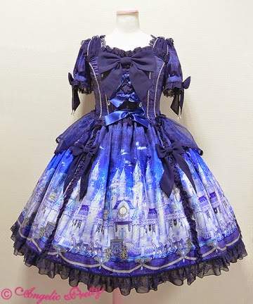
This is the OP. I think the fit of the bodice could have been a bit better. Overall I think the bodice shape is quite nice, but again I feel the sleeves need some changes. I think they could be just a tiny bit shorter and also have a slight bit more puff to them. At least this time the bows on the sleeves are not too OTT. They could still do with being a bit smaller, and I still don't like how shiny the ribbon used for the bows is, but I think it is an improvement. Some parts of the bodice are laid out in a similar way to the other OP. Again we see the neat lines of gold lace breaking up the bodice in to panels and a line of bows running up the centre. This time however, the bows are sat on 3 small chiffon ruffles, which are okay, but I think they need a bit more gathering. The ruffles look a bit flat in places. The other big difference is the big bow is this time at the waist area. The big bow has a cute shape and is an alright size. I think I would like the waist bow more though, if the other bows were smaller and there were less of them. I think 4 ribbon bows is a bit much and I am not keen on how they have been spaced out either. And once again, the ribbon used is too shiny! The neckline is lined neatly with lace, which gives a soft frothy finish. I like the use of gold braid along the neckline too, as it continues on the use of gold on the bodice. The neck straps add a further bit of interest to the neckline too. The back of the dress is fully shirred, which is great for size flexibility, but it doesn't look that attractive. I really dislike how obvious the shirring is on the back of this dress. The stock photos show the skirt has lots of volume and there is the potential to create a really pretty shape. The skirt is well rounded and flares outwards generously. The skirt design is kept simple, so apart from the tails of the waist bow, the print is displayed perfectly. The bottom hem is then finished off with a line of lace on top of a chiffon ruffle. I think the proportions of these details look a bit off and the lace needs to be a bit wider. That would help make the bottom hem look a bit better balanced.

Next up is the JSK. The bodice looks well fitted, although the overall bodice shape is a bit dull. It looks quite square with lots of straight lines. The straps look a good width and fairly supportive. The straps are topped with a chiffon ruffle, which continue down the bodice and create a triangle shape. This detail has been very neatly executed. There is a generous amount of ruffle near the straps, which creates a cute, frilly appearance. The ruffle is so well gathered. I like how there is a line of lace inside this ruffle which keeps things looking neat and tidy. The lace used has a very pretty design and it sits well on the dress. There is then a line of gold braid inside the lace which further neatens the design and gives a tidy appearance. My only real complaint about all this lace is the use of the line of lace running along the neckline. Maybe it's just me, but I think the lace on the neckline is too much and it could have done with just a subtle thin line of lace instead to stop the neckline from looking too plain. The bodice ruffle meets the large waist bow at the waist area. The bow looks so cute. The shape is simple but the bow is very well formed and holds it shape really well. There is no sign of drooping either. The bow tails are a little long but actually, I quite like that. I think the long tails help balance out the bodice. The little triangle of material on the bodice is pleated, and the pleats have been done so neatly. It adds a nice little bit of extra depth and texture, as I think this little triangle would look odd if it was just left completely flat. The pleats are a good way of adding depth without overloading the bodice, as the bodice already has a lot of detail with the ruffle. The neckline is finished off with a ribbon bow. The bow is a good size and goes well with the waist bow. I am so glad at least one of the dresses isn't completely bombarded with bows, especially when they are so shiny. The back is fully shirred so again, the shirring is quite obvious and exposed. The stock photos show the skirt has a reasonable amount of volume and it flares outwards well. The bell shape is very pretty. The skirt is again kept simple so the print is displayed beautifully. The bottom hem is then finished off with the pretty fleur de lis lace.

And finally, here is the print. This series is available in white, sax blue, lavender and navy blue. The colours are good choices for the style of the print. As expected, the navy blue is my favourite! I am quite fond of the lavender colour too though. As for the print itself, the castle is very well drawn. There is plenty of detail to the castle. I especially love the carousel themed turrets! It is such a cute idea and it is a cute way to include a popular AP theme. The fairground rides in the background help to fill in the empty spaces between the turrets. I am a little unsure about the moons in the print though, as they look a bit basic. I really love the carriages and horses at the front of the print. It sort of reminds me of the Disney castle, but the mature colours chosen stop it from looking too sugary sweet. The chandelier background is kept subtle which adds just the right amount of detail to stop the non-border part from looking too plain.
So I feel this is quite a pretty series and I can understand why it has been so popular. There are some lovely details to the dress designs and they vary in how elaborate they are, so you can go as OTT as you like, depending on the dress you pick. I really love the mature colours chosen for this series too. It is great to have a magical castle themed print that isn't overly sweet. I feel the print has a nice balance to it. Would I buy this series? Possibly. I do like the look of the JSK. For me, it would definitely have to be the navy blue colour! I am keeping my eye out for the navy headdress as well.
No comments:
Post a Comment