Thursday, 16 October 2014

September 2014 Taobao Haul- Picture Heavy!

I placed another Taobao order last month and today I shall be reviewing my order! It was quite a big order, although I wont be able to show some of the items to you all because I am hoping to do a give-away if I reach 300 followers. When I last checked I think I had about 12 followers left to go. I don't want to push people to follow me but if you know anybody who might be interested in following me, then maybe we can get this give-away started a bit sooner!

I wont be reviewing Taobao Spree as by now, I am sure you all know that I really like their service. I did have a different agent this time though. His name is Ray and I think he is a new employee. He was very friendly and his English was very good. He seems to know what he is doing as well so I was quite comfortable to have him assigned to me instead of Cici (Cici is still my favourite agent though!). We even talked about how much to declare the value of the order to customs. Taobao Spree usually mark down the value on their packages to avoid customs but as my order was a bit big, Ray gave me advice on how much I could realistically get away with. In the end, my order made it through customs without a charge, despite the higher declaration.


My order was packaged so well that I really struggled to get the box open! In the end I really had to tear the box apart. But at least I know that my package was very secure. The items inside were quite tightly packed so there was no danger of the items getting damaged by moving about.

And just to pre-warn people, this order does include a few replica items. I usually try to avoid replicas as much as possible but I sometimes make the odd exception. I don't wish to get in an argument about replicas. 


I caved in and got the replica gold Milk heart bag. It arrived wrapped in thin protective fabric and then wrapped again in plastic to help protect it.


The gold colour is lovely and the finish is quite smooth. I love how big the bag is too. There is plenty of room inside. I think the 2 hearts may be slightly mis-aligned though. It looks fine when the bag has stuff in it but when you lay it flat you can see it is a bit wonky.


The fake logo is painted on neatly, although since getting the bag I have attempted to remove the logo. You can see how I got on in an upcoming post. I was amazed at how well the original bag has been replicated. You wouldn't be able to spot the difference without some close inspection.


The inside of the bag is lined neatly. It also has 2 pockets inside, which is very useful. I did find the lining smelt quite bad though. I suppose that is because of the cheap materials used. 


The stitching is quite neat. I like the little heart charms used for the zip tag as well.


I think this picture shows just how big the bag is. It is a lot of depth to it.

Overall I am impressed that the bag turned out as well as it did. It could definitely pass for the original bag, although that wasn't really my aim. I just wanted a generic gold heart shaped bag. The bag feels quite sturdy and the price was good. I can tell I am going to get a lot of uses out of it.

And the rest of my order is all from Mu Fish- http://mu-fish.taobao.com/


First up are these sheer ankle socks I got in lavender and white. The lavender ones are quite a warm shade and I found they match quite a few of the lavenders I have in my wardrobe. The white colour is quite bright and stark but it still matches quite well with some items in my wardrobe. The bow design is very cute.


I did spot one loose thread but apart from that I found no other flaws.


And here is a worn photo of the lavender socks. The socks have a soft, silky feel to them and feel very pleasant to wear. I do worry they are going to slip down when worn though. They also feel as if they could be easy to snag. As you can see the sheer parts do have a slight shine to them but it isn't too noticeable unless you are taking photos with the flash on. The socks fit my feet fine. For reference, I usually wear a 25cm shoe (I go up a size for my wide feet). My only complaint with the size is that I wish they were a bit longer. I wish they ended higher up my leg instead of right above my ankle.


Next up is 3 pairs of ankle socks. I noticed the purple ones have a Tutu Anna label on them and I didn't realise they were replicas when I brought them. Weirdly, it is only the purple ones that have this Tutu Anna label on them. The white and purple ones are exactly the colours I was expecting. The pink are maybe a bit more peach coloured than I was expecting. They looked a bit pinker in the listing. They are still a pretty shade though.


Unlike the other socks in my order, these ones came with washing instructions, which is quite handy.


The lace is lovely and soft. It doesn't feel itchy and the ankles are nicely elasticated for a nice fit. The lace is a good quality for the cheap price and quite pretty looking.


The sock material feels soft and they sit nicely just above my ankle. At first I thought the socks had a good thickness to them, although I have noticed I can see my ankle through the sock in this photo. Overall though, I think the quality is fairly good and acceptable.


Next up are these lace patterned socks. I believe they might be a replica of the ones Baby did. I don't know how these socks compare, but it would be good to try and find out.


The socks felt quite smooth. The sheer parts are again a bit shiny. I think the pattern is quite pretty.


The thing that I dislike about these socks is that they have very little stretch to them. I wouldn't recommend these for people who have large legs as I found these clung to my legs quite a bit. The socks end quite awkwardly at my knee. If they had been just a little bit longer I would have been able to wear them as over-the-knee socks but instead I have to roll them down a bit and wear them as under-the-knee. I hear that a lot of people have had issues with the tights being too small but the socks being okay, but I found the opposite to be true. I really think the socks could do with having a bit more stretch to them.


And this is what the pattern looks like when worn. I think some of the lines could have been done a bit neater but they still look pretty good.


Next up are these trainer socks. These were a bit of an impulse buy because I thought the macaron design was so cute! These are a bit tight fitting on my feet (the packaging recommends 24cm feet maximum) but I was able to get them on okay. This is definitely the absolute maximum size though. When worn, you can still see the cute design really nicely. I love the colours. However, there was an issue I had with the product listing. When translated, the listing gives odd colour descriptions for each sock. You can see little pictures of the socks on the listing but the socks I ordered were described as "chocolate" for the colour. As you can see from my photo, there is nothing remotely chocolate coloured or themed on these socks! When I placed my order I put that I wanted the "chocolate" colour on my form, and thankfully I got the correct socks. It is just very confusing.


Finally, I got a pair of tights. I am really happy with how crisp the feather print is. And even when worn the pattern is still very clear. Even the feathers near the top of my legs were still clear.


I found the tights fitted me very well. I wouldn't recommend these for anybody taller than about 5'5''. I am around 5'4'' and am bottom heavy with fairly chunky thighs. I found the tights fitted me just right but I wouldn't want them to be any smaller. The material felt nice. The tights have a slight sheen to them.


I did spot that the tights were not entirely opaque where they stretched over the knees though.

Overall I was impressed with the quality of the bag and all of my Mu Fish items. I was a bit surprised that I had the opposite issue to some other Mu Fish customers. I found the socks needed more stretch and the tights fitted really well. I was half expecting to have to cut up the tights and turn them in to socks, so I am glad this is not the case. I would definitely order from Mu Fish again. I am really excited about the give-away items as well and hope I will be able to host this soon.

Monday, 13 October 2014

Salon de the Minette by Baby the Stars Shine Bright

Today I shall be taking a look at the latest series from Baby. This series is called Salon de the Minette. The series includes 6 dresses (1 is leopard print and another is non-printed), 2 skirt, 2 blouses, a bolero, 8 hair accessories, tights and a few items of jewellery.


This is the Caline JSK. The bodice seems reasonably well fitted. I am not fond of the neckline and general bodice though. There are 2 pairs of thin straps, which overlap each other. I personally would have preferred just one pair of thin straps. The straps look a bit flimsy though and maybe could do with being slightly thicker. The outer set of straps are lined with wide lace, which is maybe not the best choice seeing as it will make the shoulder area look wider. I am also not a fan of the lace used as it reminds me of doilies. I suppose the doily look suits the print, but I still dislike it.


The waist area has a sheer belt which doesn't really contribute much to the design and doesn't do much to nip in the waist area. There is also a waist bow which is an okay size, although could maybe have been smaller. The bow shape is interesting and it sits well on the dress. The bow is a bit wonky in the stock photos, but hopefully it wont be like this in reality. The neckline is lined with a line of gold braid. I dislike the shape of the gold braid line, as I think it looks a bit strange. The gold braid line has a bow in the centre. The bow is made of pretty sheer material and is a good size and shape. The pearl button centre is a lovely touch. I am not sure I like it teamed with the waist bow though. Thankfully both this bow and the waist bow are detachable. I think I would definitely detach the waist bow on this dress. I don't really like the rest of the chest area. Hidden away at the back, there is a panel of diamond tulle which fills in the area between the straps and neckline. But for the most part, this tulle panel is obscured by the wide doily style lace running along the neckline. The lace looks messy and a bit too OTT. The tulle panel underneath is finished off with a line of the solid printed fabric along the top, lace and 3 mini bows. The mini bows are cute, but I don't understand why the bows have little fluffy bits in their centres. I am not saying I dislike it, I just don't understand it! Overall, I feel the chest area on this dress is too overcrowded to truly appreciate all the details going on.

The back has a panel of shirring which is concealed neatly by a ribbon corset. The stock photos show the skirt has a good amount of volume to it and the length seems decent too. I feel the overall skirt shape is a bit lacking though. Perhaps with a better petticoat it will look nicer. The skirt is kept simple and the print is displayed beautifully. The bottom hem is then finished off with matching lace.


Here we have the Macaron JSK. The bodice looks well fitted and the overall shape is quite pretty. The straps are a decent width and look very supportive. The straps and neckline are topped with diamond tulle with wide lace and gold braid layered over the top. Whilst the lace and gold braid look pretty good, I am not a fan of the diamond tulle. I think the tulle ruffles are a bit cheap looking. On the other hand, it does give the straps a really cute fluffy appearance and I suppose the lace does help to cover it up a bit if, like me, you dislike the tulle. The neckline is also topped with a sheer ribbon bow. The ribbon and pearl button used is very pretty. The shape and size is good too. I think on this purple colour way the ribbon could have done with being a lighter shade though. There is also a waist bow, which is an okay size for the dress. The shape is a bit basic but it sits quite well on the dress. Both this bow and the neckline bow are detachable, but because of the large area of bodice which is plain, I don't think I would detach either of them. The back has a panel of shirring which is concealed neatly by a ribbon corset. The stock photos show the skirt is quite full with plenty of volume. It flares outwards well. The skirt has a lovely, slightly rounded shape to it as well. The skirt design is kept quite simple and the print is displayed brilliantly. However, I find the bottom hem disappointing. Baby have chosen to over-stitch 2 ruffles of the diamond tulle here. Not only do I think that under-stitching looks nicer, I also dislike the way the tulle looks here. I think this could have been improved if a nicer tulle had been used.


This is the Creme JSK. The bodice fit seems all-right but I think the overall shape is lacking something. The neckline is a bit more interesting though. It is scalloped and although I don't like it myself, I guess it does make the bodice a bit more interesting. It sort of reminds me of cream so goes well with the patisserie theme. The straps are a bit too thin in my opinion. They could do with being just the slightest bit thicker. The straps are decorated very neatly with pleats on the outside, which is a bit different to what we are used to seeing. The pleats have been done very neatly and sit nicely. The waist features a belt design and the material used is pretty and matches up with the neckline bow. It doesn't really nip in the waist area that much, but it does break up the bodice and skirt quite neatly. I also feel the waist needs it there to keep things tidy and add a bit of extra detail. The bodice features 2 lines of vertical lace. I don't think the lace is that attractive, although it blends in to the background a bit anyway and doesn't stand out much. If nothing else, it does help fill in the empty area of the bodice. The bodice features a raised yoke-like panel. The yoke has a neatly scalloped edge. All the scallops are very even and although I personally dislike it, I feel it suits the overall theme. The lines of lace are done neatly and help to fill in the yoke with interesting details. The main focus of the yoke is the bows though. There is a larger sheer, pearl button centred bow at the top which looks pretty. It is a nice shape and size. Underneath this bow, there are 4 smaller bows and the random fluffy centres make another appearance. But the tiny bows are very colourful and spaced quite nicely considering how many there are. The main thing I dislike about the bodice is the line of pleats running along the neckline. Whilst it matches the strap pleats well, I think the neckline pleats is a bit overkill. The back has a panel of shirring which is concealed neatly with a ribbon corset. The stock photos show the skirt flares out well and has plenty of volume. It will hold a good amount of petticoat and there is the potential to create a really pretty shape. The skirt is kept quite simple and the print is again displayed very well. The bottom hem is finished off in the same way as the Macaron JSK, but with the addition of extra bows on top. My feelings about this bottom hem is the same as the Macaron JSK, but I do feel the bows are a nice added touch.


Here we have the OP. The bodice seems a bit baggy although the overall shape is quite nice. I think the top of the sleeves have a nice amount of puff. However, I really dislike the long cuffs on this dress. I don't think it looks very appealing and would have preferred longer sleeves with short cuffs. The cuffs are decorated in a very pretty way with lots of pearl buttons and the lace has been used well. I just feel the long cuffs are far too much and I don't think it looks attractive with the cute print. The waist area is decorated with 2 ribbon bows on either side. Again the ribbon used is very pretty and although the design is simple, the bows are nicely shaped. However, I am not so fond of where the bows are placed. It makes the waist look a bit bulky and could have been placed better. The OP features a wide collar design made up of a solid part to start with and then a layer of wide lace. The first part of the collar is decorated neatly with the diamond tulle and gold braid. Despite the lace sitting quite nicely on the dress, I think it makes the collar too big. The join between the bodice and sleeves also features more of the doily looking lace which just makes the shoulders look wider. The top of the bodice features a diamond tulle panel and then joins up with a scalloped neckline topped with further lace along the join. The lace doesn't really contribute much here and just seems too fussy. In the middle there is a large bow made up of the diamond tulle material. Not only is the material not the nicest choice looks-wise, but the bow is also a odd shape. Above this bow there are 3 of those mini fuzzy middle bows that appear on some of the other dresses. I don't think the dress really needs anything there at all. The back doesn't have any shirring, so the size flexibility is limited to just the waist ties. The lace on the back also doesn't look too attractive. The stock photos show the skirt is a reasonable length and the volume seems okay too. The overall shape doesn't look too bad, but I think it could do with being a bit cuter seeing as the print is quite sweet. The skirt design is kept quite simple so the print is displayed beautifully. The bottom hem is then finished off with a line of braid and a very subtle ruffle of the diamond tulle. Although it is not as dramatic as some of the other dresses, I think it looks a lot neater.


And finally here we have one part of the print close up...


... and another part. This series is available in ivory, pink, mint, lavender and sax blue. The colours are all very soft and quite demure looking. But all the colours do seem to work with the print. The dresses feature a different part of the print on the bodice to the skirts, with the exception of the Creme JSK, which features the bodice print on the skirt. The close ups shown here are the border part of the print which features on most of the skirts. I am really not a fan of it. There is a massive contrast between the really pretty stacked cups and the rest of the print. The cups are really beautiful with fancy designs on them. Even the cat peeking out of some of the cups is cute. However, the rest of the print is too basic looking. The cakes are far too simple and the background features large empty areas of solid colour. The more detailed parts of the print contrast too much with the simplistic parts. I could draw a better cake than the peach coloured one in this print, and I am dreadful at drawing! The print on the bodice is a bit better. The plates and jars are pretty and nicely decorated. The floral background is more interesting too.

So overall, I am really unimpressed with this series. The print is a bit of a let-down and some of the materials used are a bit questionable. I feel the print on the Creme JSK looks better but it is not my favourite of the dress designs. Some of the dress designs maybe wouldn't look so flattering too. This is not a series I would personally buy. If I was made to I would want the Macaron JSK but the print set up like the Creme JSK. As for the colour, I suppose the dusky pink colour is quite nice. I don't think there is a single part of this series that I find desirable. It is a shame because the cups in the print are really pretty and could have been brilliant in another series.

Thursday, 9 October 2014

Game Board Fun In Oxford

Last Saturday a few of the Oxfordshire Lolitas group decided we should go to the game board cafe in Oxford. We had been discussing having a little meeting after Revelry, and it certainly helped with my post-Revelry blues! 


I knew straight away which dress I should wear for a game board themed meet! The trouble was, the cafe is very small and it was also raining very heavily. So I had to break out the smaller petticoats and keep things casual. Despite my end outfit being quite casual, I think it turned out okay in the end. It was comfortable and I think everything worked fine together. My curled hair even lasted for most of the day! 


Thirsty Meeples (meeple is the technical term for a game piece used to represent the player apparently) is a really cool cafe that opened a year or 2 ago, quite near to the town centre. Their website brags that they have over 1000 board games in their cafe and they are not exaggerating! The staff suggested a few games to ease us in and get us started. We gave this game called Concept but I think we were all a bit underwhelmed by it.


We got the food we ordered pretty quickly. I ordered the pecan pie and it was heavenly! I really wanted another piece but I decided not to be greedy. I will definitely be coming back and having it again sometime. The others were similarly happy with their food as well.


Next up we played Articulate, which is a much better version of Concept. Unfortunately there were not enough game pieces! So Sammi and I stepped in and used our rings as extra game pieces. In the end, Shalisa won the game. I was just happy to not come in last place!


We also played this card game called Marrying Mr Darcy. It is based on Pride and Prejudice and you have to score points by marrying as best as you can. Each player scored different points depending on who their character was best suited to and who they were able to marry. I was Elizabeth Bennet so to score the highest points I had to marry Mr Darcy.


I personally didn't enjoy the game but the cards were very pretty. The text on the cards was funny too. It was written in a way that felt like it had come right out of the novel. After a while we decided to wrap this game up and play Cards Against Humanity. Although I feel bad admitting this, I did win CAH! You really have to throw any political correctness out of the window when you play that game.


Afterwards we took solo and group photos. The staff at the Fudge Kitchen said we were looking very "Parisian" because 3 of us were wearing berets! I love the staff in that shop.


Afterwards we went for dinner and Sammi gave me a cute macaron charm that matches the one Shalisa got in the Revelry raffle! Sammi knew how much I liked Shalisa's macaron and made me one especially. I was so happy! Sammi also made herself a purple one.

I hope we get to go back to Thirsty Meeples some time. It is a shame the tables are so small in there, otherwise we would have invited more of the Oxford group along with us. But the cafe is a great place to take small groups and I think we all had fun. We all enjoyed at least one of the games we played and the time slot was 3 hours long so we got a generous amount of time. The food is amazing too. I hope the Halloween meet we are having is just as fun!


Monday, 6 October 2014

Vintage Cameo by Metamorphose

Today I shall be taking a look at Vintage Cameo by Metamorphose. This series includes 3 dresses, a blouse, wrist cuffs, tights, socks and 4 hair accessories.


This is the Princess Pinafore Dress. The bodice is an interesting shape, although the bodice looks a bit baggy. The main set of straps are a good width. They are covered neatly with a ruffle of tulle and gold braid, which continues along the neckline as well. The tulle is gathered well and sits nicely on the straps and neckline. The gold braid is a really nice touch too. However, the actual tulle material itself looks a bit cheap and not of a good quality. This dress also has a second set of tulle off-the-shoulder straps. It is an interesting idea, but I worry it looks a bit awkward and will make the shoulder/arm area look a lot wider. It also looks like it could be a bit restrictive and I think if I was wearing this dress the arm straps would get in the way. Thankfully, these off-the-shoulder straps are detachable and that is definitely what I would do if I had this dress. The straps are finished off with 2 big bows at the bases of the main straps. I do feel they could do with being a bit smaller but the shape is very cute. There are 2 lines of pearls dangling between the 2 bows. The pearl chains are a bit long, but they do fill in the plain space on the bodice quite nicely. I'm not sure I like how Meta have placed the bows and pearls in the stock photos, but because they are detachable it is simply a case of adjusting them to the wearer's personal taste. I would definitely leave the bows attached though, as the dress looks a bit plain without them. The bodice has 2 ruffles of tulle running vertically down which helps to make this area look a bit more interesting. I don't know what to make of the waist area of this dress. The detachable waist bow is an okay size and the shape is simple, but nice looking enough. The tulle on the waist bow matches up nicely with the rest of the dress, although it is starting to feel like this dress is overloaded with tulle. But there is something about the waist bow which looks a bit awkward to me and I can't put my finger on what it is. However, when it is detached, I dislike how the tulle ruffle around the waist looks. The tulle creates this awkward panelled look and I feel it looks better with the waist bow attached. It is really good that Meta have made so much of this dress detachable but maybe sometimes there is such a thing as too much choice.


The back is fully shirred, which means the shirring isn't topped with a ribbon corset. With the dark colours used though, you don't really notice the shirring too much. The thing that bugs me about this dress is that random tulle butt flap. I call it a butt flap for lack of a better way to describe it! It is not an apron and it barely counts as a bustle. It just looks really weird! Luckily this is yet another part of the dress which is detachable. Meta, please don't make a habit of making strange butt flaps!

The stock photos show the skirt has a reasonable amount of volume and length to it. The shape is quite pretty considering it is made of 3 tiers. The tiers are layered quite neatly, although it bugs me how the middle tier is over-stitched instead of under-stitched to the top tier. The tiers are nicely proportioned and spaced out well. On the front of the skirt there is a solid coloured bustle. The fabric used looks really lovely. I am assuming this is the Japanese "koshibo chirimen" fabric that Metamorphose mention on the dress listing on the site. The bustle tiers line up very neatly with the tiers of the main part of the skirt, so the spacing looks quite good. The sides of the bustle are lined with yet more tulle, although it does line up very neatly with the tulle on the bodice. The sides of the bodice are also topped with 4 large bows. I find the bows are a bit too OTT here and are not necessary. The bottom hem is then finished off with (you guessed it!) yet more tulle. I honestly can't decide if I love or hate this very heavily detailed OTT dress.


This is the Collared Pinafore JSK. The bodice seems well fitted, although there are a few random little creases in the fabric. The bodice shape is quite pretty and gives off a bit more of a mature vibe. The straps are wide but suit the style of dress. The solid coloured collar has been done neatly and the lace used to line it looks pretty. I feel the collar could do with being just a tiny bit bigger in size though. The front of the bodice has a neat line of 3 pearl buttons. The buttons are quite small and fairly simple in design but they have been spaced out nicely. There is a tidy little ruffle going around the buttons. The ruffle has been gathered well and the fabric used looks of a good quality. I am not personally a fan of the ruffle around the buttons. Thankfully it is detachable. The waist area has a solid coloured belt which nips in the waist area brilliantly. There is also a waist bow, which is a suitable size for the dress. The bow shape is quite simple but looks quite pretty and the bow also sits quite nicely on the dress. The collar on this dress is detachable but I feel the neckline looks too plain with it detached. However, at the same time, I dislike how the collar looks on the back of the dress. I think with collared dresses like this it is nicer to have a full back that goes right up to the collar. But the back of this dress ends halfway down the back and it just looks really strange having this large gap between the back of the dress and the collar. The back of this dress is fully shirred again which means it isn't concealed by anything. The stock photos show there is the potential to create a very pretty shape with the skirt. It has loads of volume and flares outwards beautifully. I love the plump, rounded shape in the stock photos. I think the fuller shape works really nicely teamed with the nipped in waist area. The skirt design is kept quite simple and so the print is displayed very well. The bottom hem is then finished off with a simple solid coloured ruffle, using the same fabric as elsewhere on the dress.


And here we have the High Waist Pinafore JSK. The bodice shape is simple, but quite pretty. The straps are a good width and suit the dress. You wouldn't want them to be any wider with this style of dress. The straps feature a ruffle of tulle on the outside. The tulle here has been shaped brilliantly and it sits really nicely. The subtle hint of gold on the edge of the tulle finishes the tulle off beautifully. The waist area has a wide belt which helps nip in the waist area quite well. I do wish the belt was slightly narrower though. The waist area is finished off with a double layered waist bow. The bow is quite big in size but I suppose it does suit the dress. The bow shapes have been kept simple, but anything too complicated would have looked strange with this double layered design. At first I was really unsure about the waist bow but after seeing the pictures of this dress on the model I have grown to like it. The bodice is completely gathered which gives it a bit of added texture and depth. It stops it looking too plain as well. If the bodice material had been done completely flat with no gathering, I don't think it would have looked so good. The neckline has a line of gold braid and is finished off with a simple ruffle. It helps to make the neckline look a bit softer and the braid helps to keep things looking neat. The back has a panel of shirring but once again, there is no ribbon corset there to help conceal it and give that extra bit of size flexibility for smaller wearers. But the bodice is quite short, so perhaps a ribbon corset wouldn't have achieved that much in this case. The high waisted skirt has a very good amount of length to it. It flares outwards beautifully and has a lovely A-line shape to it. It has plenty of volume too. The main part of the skirt is kept very simple and the print is displayed beautifully. The bottom hem is then finished off with a thin line of ribbon and 2 wide tiers of tulle. The ribbon used is shiny, but because the ribbon is quite thin it isn't that noticeable unless you are purposely looking. The ribbon line is also topped off with some small ribbon bows which add a nice little touch of detail without being too distracting. As for the tulle, I feel Meta could have made more of a feature of the double layer of tulle by making the top layer a bit shorter. You can't immediately spot the second layer of tulle underneath. But I actually do like the bottom hem of this dress. It reminds me slightly of the dramatic tulle bottom hems that Baby like to do. I don't think this bottom hem design is perfect, but it is a good start.


Finally, here we have the print close up. This series is available in black, blue and purple. The black and navy blue look absolutely beautiful. The purple offers a slightly different alternative, but I think I would have preferred something like a nice shade of green instead. As for the print itself, I think it is a really beautiful design for an all-over print. The cameos in the print are very pretty. I love all the little details in the cameo frames such as the pearls and bows. The pictures inside the cameos have been chosen well too. My favourite is of course the Metamorphose swan logo cameo! I love how they have managed to fit that logo in without it being too obvious. The crown and angel cameos are also really nice. The subtle background is a good way to fill in the empty space between the cameos. Nothing really stands out as being "out of place" in the print and everything seems to compliment each other. I do feel the cameos could do with being a bit bigger though, as it feels like there is a lot of background and not enough cameos.

Despite the odd little thing I would change here and there, I think this is quite a good series. The dress designs are varied and interesting, so there is something there for every classic lolita fan. The print itself is very pretty, even though I don't feel there are enough of the cameos. Would I buy this series? Yes, although it wont be going on my wishlist. I would choose the High Waist Pinafore JSK in black. I really like the design of this particular JSK. The Princess dress is a bit too OTT for me!

Thursday, 2 October 2014

Revelry Purchases Reviewed

Now that Revelry is well and truly over, I have had time to sit down and have a proper look at the items I purchased during the event. So today I will be doing a review of the items I got.


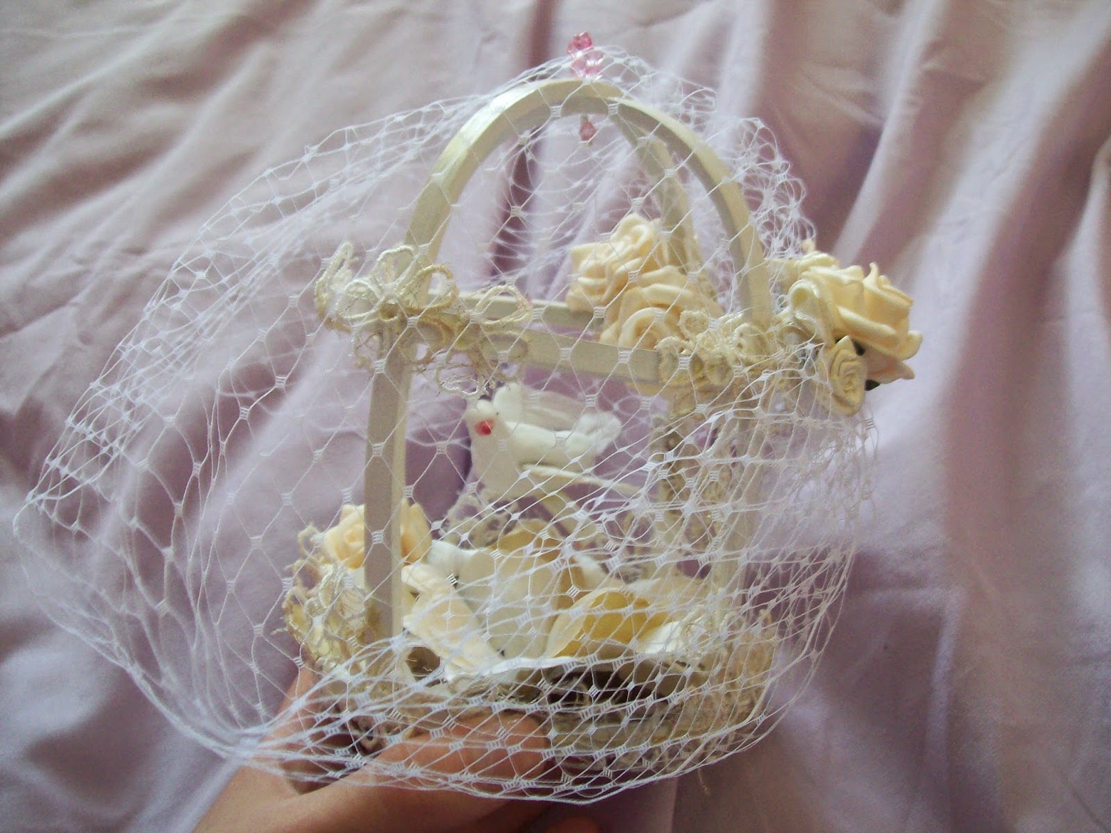
First up is this birdcage headdress that I got from Shinku Rose. I have to admit, this was a bit of an impulse buy and I wasn't too fond of the price tag. I was a bit concerned about how I was going to transport it home though! It was wrapped up in one of those cardboard cupcake boxes and it didn't fit in my suitcase. Somehow, I managed to get it home without damaging any of the fragile parts. The birdcage part itself feels very firm. Despite being made out of some sturdy wood, it still feels very light when worn. It feels good to know that it has this solid frame, although I think the wood could have been lined up a bit neater. I'm also not a fan of the random pink beads used to attach the veil, as they stick out quite a bit with the ivory and cream colour scheme.


The veil itself is made from standard netting. It is no better or worse than what you find on a lot of vintage hats. The veil is nicely shaped. I really like the lace used to fill in the birdcage gaps. It has got a pretty design to it. The lace also seems to be of a good quality. The fake roses remind me of the ones you can get quite cheaply in Hobbycraft. But aside from the roses feeling a bit cheap to the touch, they look quite pretty. I like how the bottom of the cage has been filled with rose petals so the base doesn't look too plain or boring. There is a random brown petal in there. Whilst it does match the colour scheme, it does sort of stand out a bit. Luckily, the sole brown petal is hidden a bit.


Inside the cage there is a bird perched on a swing. The swing actually moves. On the one hand, I like that it moves because I personally think it looks more interesting. On the other hand, it could prove a bit annoying when worn as it may randomly get caught on the lace or rose petals.


My main issue with the headdress is the clip that is used to attach it to the head. To be fair, the clip has been neatly concealed with ribbon. However, the actual metal clip is smooth with no rough grips. It means there isn't very much to "grip on" to the hair and hold it in place. I found the birdcage moves around quite a lot and slips downwards. I am definitely going to have to replace the clips as I found it near impossible to keep the headdress on my head when I tried it out (hence why there are no worn photos. It would not stay in place long enough for me to take one).

If I am being honest I do regret buying this headdress. It is a bit expensive for what you get and there are some things that do need improving. I am still going to use it once I have replaced the clips. I have heard some very mixed reviews about Shinku Rose's quality and I can understand why some people may be a bit put off by their designs. I don't feel this headdress is a complete disaster but I don't think I will be buying from Shinku Rose again unless some improvements were made.

Next up is Sweet and Tiny!


Sweet and Tiny is a store run by Mini Mo, who many of you in the UK Lolita Community may be familiar with. She used to make stuff a while ago but then went a bit quiet for a bit. But she is now back and I am so glad she has returned! I seriously could have brought everything at her stall. In the end, I limited myself to a ring and a necklace. I got this macaron ring which is quite big in size, but I like it! I love how crisp the Sweet and Tiny logo is. It is a very classy looking logo as well and it definitely reminds me of a French Patisserie. The whipped cream has been piped so neatly and everything has been placed so well.


The filling inside has also been piped with care. I love the little pearl details inside the filling too! Mo makes some of the nicest looking sweet jewellery I have ever seen. It also looks quite realistic and even as I am typing this post I am getting hungry looking at these photos!


I like how Mo has also chosen a slightly fancier looking ring base as well. The gold design is a bit fancier than your standard cheap ring bases. Also, with a wider ring base it really helps to balance the heavy design on top.


I also got a matching necklace. I love the little Eiffel Tower charm! You can maybe see that the filling is spilling out slightly but overall, I am very impressed.

Last up is the butterfly tights that I purchased from Himitsu by Syrup. I was very excited about these tights and the £17 price tag was a nice surprise too. These printed brand tights can go for a lot more than that.


So here is a worn photo. The material is a nice thickness and feels lovely when worn. I think the size is quite standard for Japanese "one-size" tights. I am about 5'4'' and even with my bottom-heavy thighs I found I was able to wear these tights quite comfortably. I think these are just a slight bit more comfortable to wear than my Juliette et Justine tights. I wouldn't want to stretch them much further though, so if you are tall then these maybe are not the tights for you.


I was worried that when I put the tights on it would stretch the print and make the pattern look strange. However, as you can see the print is still very crisp when worn and the colour is still bold. This definitely makes these tights better than my JetJ ones. They do start to look a bit faded when they reach my thigh area but not enough that it is that noticeable. And I will be wearing these tights with knee-length stuff anyway! 


They even have a cute bow design on the ankle. Apologies for the dodgy photo angle!


And finally, it just wouldn't be brand tights without some random stuff going on at the crotch area! This lovely little slogan is displayed on my bottom when I wear these. And now that you know the slogan is there, you wont ever be able to forget about it whenever you see anybody wearing them!

So overall I am quite pleased with my small haul. I strongly recommend Sweet and Tiny and Syrup. I really regret not buying more from these stalls when I had the chance. The Shinku Rose birdcage was a bit disappointing though. I really hope that Syrup come over for another Tea Party Club event in the future. Next time I am determined to save up even more money so I can truly splurge on their stuff! It is definitely worth it.

Related Posts Plugin for WordPress, Blogger...