Wednesday, 22 February 2012

Pas de Deux in the Blue Moon by BABY

Please note, there will be NO FRIDAY POST this week because I am going to be very busy gearing up for Hyper Japan. It has come around so quickly! If you see me there on the Saturday then do feel free to come and say hello. I may ask you for a photograph too! I will be wearing my Starry Night Theater JSK.

Today I will be discussing the new print by BABY. It is called Pas de Deux in the Blue Moon. This series has 2 dresses, a skirt, a shirt, socks, a head bow and a feathery headdress.


This is the Odette JSK. The bodice has a very well fitted shape to it, but you would expect that with a dress that has boning in it. The neckline is a very pretty shape, although it is a bit open and exposed. Still, that is the perfect excuse to pick a blouse with some pretty chest detailing! There is a large waist bow and maybe it could have been a bit smaller. Considering the size, the bow shape is very sturdy. In other recent Baby releases, the bows have looked a bit saggy, but this one is a lot more perky. The front has a ribbon corset. The ribbon is very neatly spaced out and looks soft, without being too shiny. The corset is lined either side by pretty rose lace. The neckline is also lined with lace, but whilst it looks good quality, I thought the lace used here was a bit dull. The straps are a bit thin, but wider straps would have looked bulky with this sort of design. The back has a panel of shirring which is neatly concealed with a ribbon corset. The skirt shape looks a bit straight, rather than rounded, but doesn't look as harsh as some other skirt shapes we have seen. The shape is probably more suited to classic than sweet. It flares out well and will hold a lot of petticoat. The bottom of the skirt is heavily detailed but you still get a good view of the print on the rest of the skirt.

This picture perfectly shows the detailing at the bottom. I like the inclusion of soft chiffon which helps break up the more solid material. The rose lace on top of the ruffle also shows that Baby have paid attention to detail, but without looking too OTT. I personally would have ended the dress with the chiffon instead of having another layer of the printed material because it would have given a soft floaty edge. But the design still works well.

This is the Odile JSK (hmm.. 2 very similar names. Try not to get them mixed up!). The bodice has a bit of a square appearance to it, but it still dips in at the waist. I don't believe this one has boning in it so perhaps it is not as well-fitted as the other JSK. I dislike the line of lace which runs a bit below the waist. Because it runs below the thinnest part of the waist on the dress, it appears to trick the eye in to thinking the waist is bigger than it actually is. I also think the dark colour of the lace makes it stand out more. There are 2 ribbon corsets running up the bodice. The ribbon is well spaced and very pretty. But I am undecided on whether I like the 2 corset design or whether I think it looks too overcrowded.


There is some thin rose lace running along the corsets which helps makes the edges look a bit neater. The neckline has a shiny bow in the middle. I thought the bow looked a bit too crinkly because it is quite gathered. It really alters the overall shape of the bow, which looks a bit strange. The straps on this JSK are very thin. The straps are also detachable (in fact, you can just make out the button hole because it is viewable in the picture) and I think the dress looks better with them removed. The back has a panel of shirring. This is concealed by a tidy looking ribbon corset, although the dark ribbon does stand out. The skirt has a gentle rounded appearance. It is a very pretty bell shape (although I still think the line of lace at the waist spoils it a bit). This one looks like it will also hold a lot of petticoat. The skirt of this JSK is a lot plainer and the print is displayed clearly and beautifully. The bottom has a thin line of lace and then a gathered frill, which gives the bottom a softer edge. The ruffled bottom is then finished off with a line of pretty lace.

This is one of the print close-ups. The print comes in pink x ivory, red x off-white, navy x navy and black x black. I think the navy colour looks stunning. The pink colour also has a soft dream-like feel to it. It has a lot of pretty and magical imagery and it does remind me of the ballet. The ballerinas and swans look graceful. All the different items work well together. I also like how every 'window' edge is decorated with ribbons. This is the sort of print that Baby does best and I really like it. If I could change one thing, I would add a few very tiny hints of gold to give it a more regal rich feel. But overall, I am impressed.

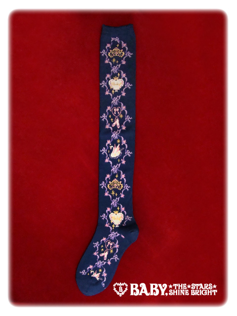
These are the socks for this series. These are quite heavily patterned but I like them! I also love the rich sock colour. My favourite is the swan!

This is the feathery headdress. Although I have taken a recent interest with feather accessories, I can't help but feel this one is too similar to the one released with the recent Alice and the Pirates series End of Immortal Eden. I suppose this one looks a bit less OTT than the Eden one, but I don't find it to be that original. However, seeing as this series is about ballerina imagery, this headdress does fit in with the theme. It reminds me of swan lake.

I think this is a very beautiful series and I am hoping this will be a success. Out of the 2 JSKs I would probably pick the first one (Odette) because I love the softer floatier design and I think the bodice shape is nicer. If I purchased it then without a single doubt, I would definitely go for the navy colour! This series has a real romantic fairy tale feel to it without looking too "little princess" or young. I certainly wouldn't mind owning this.

Monday, 20 February 2012

Items of Desire- Easy Fake Lashes

Although it absolutely pains me to say it, I am completely hopeless at applying fake lashes! I guess I always felt that I already had quite long natural lashes and a few coats of mascara was enough. But sometimes I would really like to put in a bit of extra effort and wear some falsies too. Every time I have attempted fake lashes I have failed miserably. I was daft enough to try individual ones first and they were so small and fiddly. I have also tried strip ones but I didn't feel like I was wearing them correctly.

So anything that makes applying lashes easily is a must for me.


And so, I am very curious about trying these false lashes. They have easy place strings to help apply them better.


I am unsure how you remove the red strings and I am a bit worried I may accidentally glue them on too, but I am still keen to try these. They make applying lashes look so easy!

I have often thought about giving eyelash extensions applied at a salon a go. They last about 2 weeks from what I have heard, and you have to go back to get them removed. But it seems a bit wasteful spending out money that way when these easy lashes could work out a lot cheaper.

I am hoping that with time, more lashes will come with these easy place strings. Anything that can save you a bit of time and effort has got to be a good thing.

Friday, 17 February 2012

Card Playing Kitty by Metamorphose

Today I will be having a look at one of the 2 new Meta prints. I hope to take a look at Thorny Rose at some point, but today I will be discussing Card Playing Kitty. This series has 2 dresses, a skirt, a cat ear hoody, 2 different pairs of socks, a head bows and a barrette.


This is the OP. The bodice is a decent shape and looks well fitted. Because of the style of print, the waist ties also blend in very well. The short sleeves are very cute. They could have maybe been a tiny bit more puffy. The sleeves also appear very well elasticated and are finished with a simple ruffle. This is a good idea, because the print is very busy and you don't want to overwhelm it with fussy details. The bodice has 3 small satin ribbon bows on the front. They are a good size. I also think it is good that they are black ribbons (apart from the off-white colourway, which has white ribbons) because they help tie in the small amounts of black that are in the print. So it helps balance the colours a bit better. The dress also comes with a detachable collar. The design of the collar is very basic, but it does suit the dress and it ties in well with the cuffs (see below). There is a panel of shirring on the back, which has nothing covering it. Luckily, because of the style of print, the shirring blends in a bit anyway. I am very pleased to see that the skirt shape is not like recent crazy Meta shapes! The shape is a bit rounder, which I think looks better, but it still flares out quite a lot. So it will hold loads of petticoat underneath, without looking too straight or triangular in appearance. The skirt is thankfully kept plain, but to stop it looking too boring, there is a ruffle at the bottom and another tier layered underneath. These bits are lined with thin lace which is pretty, but modest. This is ideal for the type of print.


The OP also comes with these cuffs. They would be a cute addition to any Alice themed outfit. In fact, I am a little disappointed that there appears to be no plans for these to be sold separately! Meta, you should totally do it!


This is the JSK, which handily has the apron outlined so you can see the shape!

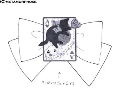
Just to show the dress better, this is what the JSK sketch looks like. 

The bodice looks a good shape and very well fitted. The straps are a bit thin and plain, and maybe could have been a little thicker. I think the fact that Meta needed to include an outline of where the apron sits is a bad sign. If anything, it shows that it blends in too well with the dress and it is not noticeable. Perhaps a solid coloured apron would have stood out a lot better and it would have provided a break in the busy print. However, I do think the heart pockets on the apron look very cute. Obviously, the apron is detachable if you dislike it. The bodice has 2 lines of vertical lace which conceal where the fabric panels end and makes it look neater. The neckline also has a little bit of fabric folded over to make it look like a collar. I think it helps make the neckline look tidier and also more interesting. It also stops the bodice looking too flat. The bodice also has some card suit buttons which is a cute touch. I could take or leave the ribbon at the base of one of the straps. I don't think the colour chosen for the ribbon bow matches as well. Maybe they should have done what they did with the OP and used black ribbon instead. The back has a panel of shirring which is concealed by a corset. It helps to keep it looking neat. The skirt flares out quite far, but thankfully keeps its very rounded shape. It is definitely an improvement. The skirt is tiered and is broken up halfway down by a line of ribbon. Luckily, it doesn't affect the silhouette too badly, nor does it look too OTT. The ribbon line has 2 bows on top of it, but it is not too distracting. If I am being very picky, the ribbon is a bit shiny. But overall, I think it has been presented well. The bottom hem is finished off with some thin lace.


This is the print close-up. The print comes in black, off-white, pink and sax blue. I understand why some people may be sick to death of Alice inspired prints, but I think this is definitely one of the better Alice prints out there. It is cluttered and things are flying about the print randomly, but doesn't that just help to capture the imagery of the story even more? Plus, we have the added cute cats. My favourite bit of the print is the ace of hearts (shown at the bottom of the picture) because I think it is clever how the tea is spilling out of the teapot and then it makes up the heart shape on the card. Definitely very creative! My favourite colour is black, but the sax blue is perfect for capturing that typical Alice look. I think that the off-white colours are unbalanced in places, especially on the OP with the bows and the collar.


Out of the 2 pairs of socks, I like this pair better. The cards running down them reminds me of the time I actually pinned a load of playing cards to my leg to wear with my Bodyline Alice skirt! I also love anything with a card suit theme because it is usually quite a versatile design to wear. However, I do think the cat at the bottom looks a bit strange. I think the shape of the cat is a bit odd.


And finally this is the barrette. Despite there not being any proper pictures of it at the time of posting, I like the idea of there being a cute cat playing card on it, just to continue the card theme. It is a bit different from your standard head bow.

I think Meta really needed to release a series like this after releasing quite a few weak series. Meta prints don't tend to cause a stir and I don't think this will be any exception. But I believe this sort of print is what Meta is good at and I am a fan of it! This wont be high on my list of priorities but I would be happy to own something from this series. I think I prefer the JSK, but I would leave the apron off. I like this print in the black colourway most of all. I would really like this series to be a hit. Whether it will be a hit or not, is hard to tell.

Wednesday, 15 February 2012

Toy Drops by Angelic Pretty

Today I will be looking at Toy Drop by Angelic Pretty. These items are already available on their website. This is quite a small series with just 2 dresses, a skirt (which is thankfully, a little longer in length than other recent releases but it is still probably a bit short) and a valletta.


This is the OP. The bodice is very short and puffy, but it looks cute and I think it has a nice shape. The belt part helps to bring it inwards to give the wearer a better shape. The belt does break up the print but with this style of print, I don't think that is a bad thing. The ribbon used for the belt and waist bow is a bit on the shiny side though. The waist bow is big, but because of the design on the rest of the dress, it doesn't look too out of place and it is the right sort of size. The bow has a good strong shape to it and stands up nicely, not looking at all floppy. At the back, the thin ribbon waist ties blend in well with the belt look on the front. The short sleeves are slightly puffy, which looks cute. They look very stretchy and are finished with a small bow. There are also neck ties, which look pretty.


The neckline has a line of lace topped with a small bow in the middle. I think the lace is a bit unnecessary and it looks a little strange having one little bit of wider lace when the lace on the rest of the dress is thinner.

The back has a panel of shirring which stretches all the way along the back. It has been left very exposed with nothing covering it, but because of the style of print, the shirring blends in well. The skirt shape reminds me of Meta designs. It is a bit straighter than usual but it flares out very widely. But with such a short bodice, you would not want the top part being very rounded anyway as it would not look very flattering. The skirt will hold a very generous amount of petticoat underneath. I think the tiers have been spaced out well and because of the style of print, the tiers do not 'disrupt' the print by breaking it up strangely halfway through the printed part. The tiers are lined with thin lace. Overall, I think the skirt design flows well. It is not too over-crowded and the tiers have been gathered well, giving a lovely floaty ruffle which does not disturb the print too much.


This is the JSK. The bodice looks well fitted but I think the very square neckline looks a little harsh, especially when compared to how delicate and feminine the rest of the dress looks. The JSK does not have a ribbon belt like the OP, but I don't feel the design loses very much by not having it there. The waist bow again looks very perky, with a good shape. The front just has 2 vertical lines of lace running up to the more detailed neckline.


Here is a close-up of the JSK's chest area. I am not a fan of the overall shape but I do love the cute star lace used! The lace contained inside the pink ruffle is a bit more simple and is detachable if you so desire. I actually think this dress looks better with the panel attached because without it, the dress looks bare, as if it is missing something. Plus the panel gives the dress  floaty softer feel. The pink ruffle part continues upwards and forms the straps on this dress, which has the star lace still running up along them. Although the straps are cute, they look a bit flimsy and a bit thin.

The back has a smaller panel of shirring, this time concealed by a ribbon corset. It looks a bit tidier. The skirt shape is a bit more like what I would expect from AP. It is rounder. It still flares out a lot and will hold a decent amount of petticoat. The skirt is laid out almost identically to the OP, but the JSK tiers looked very slightly lumpier in appearance. Despite this, I thought it still has a good overall shape. The bottom hem is finished off with thin lace and then underneath, it has a line of candy lace (like that found on other AP releases such as Candy Treat).


And here we have the print close-up. As you can see from the picture, the print comes in white, pink, red, blue and black. The red and blue colours are especially vibrant. The pink and white colourways would be good choices for those who like a softer look, but the print really "pops" on the blue and red. I think out of the colour options, my favourite is the blue. The black is a safe-house for those who find the red and blue too bold but still want the print to be displayed well. The print itself is quite cute. Some familiar figures and themes appear, such as the bunny and the bear. I think it is clever how all of the sweets have been shaped to spell out Angelic Pretty. I especially like the bunny and peppermint striped sweets. I can't help but think that this print reminds me of past prints released by Metamorphose. On first glance, it definitely looks more like something Meta would release, not Angelic Pretty. I think for me personally, the print is a bit too young and cutesy.


The valletta is relatively simple, but the shape is nice and it looks like the material is sturdy. You can just make out a tiny drop charm dangling from the bottom right. Whilst the valletta is cute, I think it would have been good if this series also had a head bow. It is sometimes nice to keep hair accessories a bit simpler, but I think with vallettas, one is not usually enough! Of course, that would mean spending out more if you wanted multiple vallettas and that usually works out more expensive than a head bow.

So this is a very small series and in all honesty, I can't see this series making a massive impact. I think it is a bit too similar to other AP candy prints and I can't see this one winning as many fans. Unusually for me, I think I prefer the OP over the JSK. Whilst I like the bolder colours, I reckon the white will be the most popular. I think the series could have done with more items in it. There is nothing wrong with doing a small series, but there could have been more options here. To be honest, I prefer Sugar Hearts and Candy Treat over this print. Toy Drops is cute, but not for me. That being said, I will be keeping my eye out for any jewellery released later on because I reckon that some Toy Drops jewellery would look very cute!

Monday, 13 February 2012

A Very Tough Day To Be A Lolita

I wasn't going to write about this but... it feels like this is an issue close to many a lolita's heart. I am of course, referring to upcoming documentary "Are All Men Pedophiles?"; a documentary which features a section about Japanese culture.

One of the things that has caused a lot of upset is that one of the posters features a lolita (or a model wearing lolita) wearing Angelic Pretty.


Although the documentary is apparently going to tackle both sides of the pedophilia debate, I can't help but feel this documentary could have negative consequences on the lolita community.

I find it difficult to put in to words how annoyed I am by this documentary. I feel the comments left on this online petition sum up my feelings really well-

http://www.change.org/petitions/jw-productions-and-director-jan-willem-breure-remove-the-promotional-poster-for-the-film-and-write-a-public-apology

Director Jan Willem Breure does not seem concerned about this upset this is causing. After being emailed, this was the response one girl got-

"The documentary does not offend Lolita nor does it compare it to pedophilia. Wild assumptions about what pedophilia is or isn't is why the documentary was made in the first place. The reason why we choose Lolita is because in the film we do a section about Japanese culture."


Well, I disagree. I know there are many lolitas who ARE offended by this documentary. And although it may not "compare it to pedophilia", to include lolita in such a documentary is harmful. Do we really want to be associated with this? 

There is probably not a lot we can do but if you feel strongly about this, then please do sign the petition in the link above. Voice your complaints as loud as possible and maybe people will realise that not everybody agrees with the director.

I am sorry if people disagree with me or this post. It just pains me that people might make assumptions after watching it. Yes, I am aware I may be being hypocritical by making this post before seeing the doc, but I reserve the right to voice my concern. I am just hoping this all blows over.

Saturday, 11 February 2012

A Valentine Thank You!

I got another Lolita Valentine today! I am going to assume the maker saw my Daily Lolita or blog entry because that was one of the photos I used! So a huge thank you!

http://loli-valentines.livejournal.com/115167.html#cutid1

I am number 8 today! I especially love how I got called a Cookie Girl!  :)

A massive thank you again!

Friday, 10 February 2012

Fox Cherry and TaobaoSpree review- Neutral

Today I will be reviewing my very first Taobao order! It came from a shop called Fox Cherry- http://foxcherry333.taobao.com/

If the name Fox Cherry sounds familiar, it is because there was a review of them on EGL. In fact, it was this review that made me go ahead and place an order. Fox Cherry make lolita inspired accessories (mainly hair stuff) and because it is Taobao, the prices are cheap. I ordered some things for myself and also some items for the Feb Ox Loli meet, which sadly, did not get here in time (more on that later)

The majority of this review relates to my experience using the Taobao shopping service Taobao Spree- http://www.taobaospree.com/

Communication


I was assigned Lucy, who was going to look after my Taobao order for me. I would love to say that Lucy was amazing but to be honest, I found the experience to be annoying. An example of this would be when Lucy attached the wrong spread sheet to my order. You fill in Taobao Spree's spreadsheet and then before they order, they send it back to double check to make sure they have the right order. We got quoted the right price but we got somebody else's order on the spreadsheet. Considering this was my very first Taobao order, this did not help my first-time nerves at all. It was hardly a massive mistake but it did not leave a good first impression. Of course, I also have to allow for China being 8 hours ahead of the UK, but despite this, I still found Lucy a bit too slow responding for my liking.

One of the biggest factors about my Taobao order was that I ordered on the 4th of January knowing fully well that Chinese New Year was coming up. And this was a risk that I had decided to take and obviously Taobao Spree was not in any way responsible for this. However, my order did come on Taobao Spree's last working day before they started their holiday. But unfortunately Lucy only gave me one hour to respond with my final payment and did I get that email in time? Nope! So I had to wait a fortnight for Taobao Spree to come back off their holidays before it got posted. Now, I cannot stress enough that this was my fault and NOT Taobao Spree's fault but I was a bit disappointed that I hadn't been given more time to pay before they went away. Whether this was because of the slowness of the Chinese post or whether Lucy was slow, I don't know. If you take just one bit of information from this review make sure it is this- NEVER order from Taobao right before Chinese New Year.

Ease Of Use


Taobao Spree's fees were relatively easy to work out because it was all set out on the spreadsheet. Before they order they double check with you if you want to go ahead, which gives you the opportunity to back out if you are unhappy. At first I found filling in the spreadsheet to order a bit daunting. Luckily, Taobao Spree have included Youtube videos (made by other people) on their website showing how to do it. I found the video very helpful and without it, I would have been confused.

Charges


Taobao Spree's charges were very reasonable. Even after all their fees were added on top, I only paid roughly £8-9 per item. This is still relatively cheap, especially considering how much re-sellers would probably charge.

Shipping


After the 2 week Chinese New Year break, my order was shipped by Taobao Spree on the 1st of February and it arrived on the 8th. I didn't have any nasty customs fees to pay so it came quite quickly.


My order was placed inside a bubble wrap envelope. It was very secure and not damaged at all.


Inside, every item was individually wrapped in plastic and then bundled in to a large plastic bag. The items were a bit squished together but nothing was damaged and it was all very secure.

Overall, I would like to give Taobao Spree a positive feedback rating. Despite Lucy's slip-up and the Chinese New Year fiasco, I don't think I have any solid complaints about Taobao Spree's service. The neutral feedback in the title of this post is actually for Fox Cherry.

I ordered 5 items- 3 rose corsage veils, a double pink rose hair comb and a pearl hairband with rose decoration.


These are the 3 headdresses. I got 2 in all-black and one in blue x black. When you order such cheap items you can always argue that you "get what you pay for". Actually, I was happy with the appearance of all of my items.


The reason why I am giving Fox Cherry a neutral feedback is because as soon as I opened the packages this very strong smell of cigarette smoke hit me. All of the items I ordered absolutely stank of smoke. For some reason, the rose veils were the worst affected. It is a good job I managed to get the smell out with some Febreeze spray. I also found that everything was covered in thin strands of glue and I picked a lot of this off before taking this photograph. The edges of the material were rough in places so I am concerned they may fray. However, the ribbon used does appear to be of good quality.


This pearl headband was the least affected by the smoke and glue. It was actually meant for the Ox meet raffle and after trying it on, I don't think it suits me. So I will be looking to sell this soon. I doubt I will get very much for it. Despite not being affected as badly, I am still going to give it a quick spray with Febreeze.


A close-up of the flower bit.


I have decided to keep the pink rose comb for now. It is actually very beautiful in person.


For some reason, I got given a free Fifi Lapin mirror. I am probably going to chuck it in with the pearl headband as a free gift when I sell that. But it was a nice gesture.

So overall, this has been a very mixed experience. Although I got these items cheaply, I still can't justify giving Fox Cherry a positive review, because I don't think I am being unreasonable when I expect the items to not smell of cigarette smoke. Plus it wasn't much fun trying to peel little trails of glue off the items. I am just trying to be as honest as possible, and in all honesty, I was not majorly impressed with the items I received. I don't know... do you think I have been too harsh? Let me know what you think.

But I would use Taobao Spree again. I think with a little practice and a bit of "getting used to" the service, I would become more confident. And I still think it is a better option than buying from re-sellers such as Qutieland, whose prices work out a lot higher. So yes, Taobao Spree does get a positive rating from me. I just wish I hadn't been so stupid as to order right before Chinese New Year.
Related Posts Plugin for WordPress, Blogger...