Wednesday, 29 June 2011

Themed lolita meets

I apologise if I have appeared a little quiet or distant recently. There is a very good reason why- I am hosting the July Oxfordshire Lolita meet! Originally I was meant to be doing a scavenger hunt around Oxford but it turns out that the date we settled on was the same day Alice Day is being held. Yes, it is that time of year again! Last years Alice Day was one of the first events I reported about on this blog.

So all the scavenger hunt plans were put aside and I started planning a meet based around all things Alice. There is going to be a picnic, we are watching a few of the performances and we may even make some Mad Hatter hats! Of course, the dress theme is going to be Alice in Wonderland. As a result, I have been spending a lot of time trying to plan the picnic and some Alice themed games to play.

Planning a meet around a theme has been very interesting. For some reason, I feel themed meets are different from the usual lolita meets. Here are a few of the many things I have had to consider-

Getting to know my theme- I have a confession to make- I have NEVER read Alice in Wonderland! Of course, I have heard the story and I know the characters which has been a huge help. The better you know the theme, the more confident you will feel when you are making plans.

Working out the key characters and themes- Usually with themed meets, especially those based around books, there are a few stand out moments in the story or certain characters that people remember more than others. These are the parts that people remember fondly. To take an example from my own upcoming meet- I have already based a game around the Cheshire Cat. I am also trying to think of ideas based around the tea party scene and we will be attending an event where you make Mad Hatter hats. I want people to take one look at my ideas and instantly recognise it from Alice in Wonderland. If I can include the main themes, I can always add some more subtle themes in afterwards.

Little details- As well as focusing on the main themes, I will be paying attention to little details. For my picnic I have been thinking about how I can turn it from a normal picnic and in to a themed picnic. So items such as the plates, napkins and cups will hopefully be themed too. Given the choice between plain napkins and Alice printed napkins, I know which one I would choose! I am also making Drink Me and Eat Me tags. It doesn't even have to be too expensive. Think about colours and shapes etc. Is there a specific colour that sticks out with your theme? Are there little pieces you can make yourself?

Dress code- Something that worries me about a themed lolita meet is making sure it still fits lolita. I have suggested an Alice dress code but for my own outfit, I have still tried to keep the usual lolita "rules" in place. When does an outfit stop being a themed lolita outfit and become a costume? It is up to you how far you go with the theme. It could be that you wear lolita and just wear a few themed accessories. Or you could go completely crazy about the theme and not worry about how it fits with lolita. To be honest, I want my fellow lolitas to be as creative as they want. The most important part of the entire meet is to have fun!

Don't overload yourself- There have been a few times where I have gotten a little stressed with all the planning. Break up all the planning in to manageable chunks, make lists and leave plenty of time. Never leave stuff to the last minute!

Problem solving- I am a bit worried that it will rain and the events will be cancelled. So I have been thinking of alternative ideas to do inside as well. I have also had to make sure that there is somebody on hand to carry all the games and stuff I intend to bring! (I feel sorry for my husband who is bound to end up carrying loads of stuff!). There will always be things you can't control or predict so try not to too upset if there are a few hitches.

Online inspiration- We are very lucky to live in a time where we can type something in to a search engine and come up with lots of search results. There are loads of party suggestions available and I have bookmarked a few websites that have been especially useful. Also, try asking your friends. They may come up with an idea that you hadn't thought of.

As the date of the meet slowly creeps up on me, I am hoping that we all have a good time. I also want to thank everybody who has been helping me come up with ideas and have offered to help. I have tried not to reveal too many details because I am hoping some of the meet will be full of lovely mini surprises. After the meet, expect a full blog post about it!


Monday, 27 June 2011

Waffle skirt for sale

I am trying to sell a few bits because I have lots of events going on this Summer and my Meta pre-order hopefully going through late July.

This week I am selling my Bodyline skirt with the waffle print and the matching head bow (that is sold with the dress).


The listing says that it is for UK buyers only but if you send me a question, I will consider posting to other countries too. If you are interested, please take a look! Thank you!

Friday, 24 June 2011

Men friendly house decorating

August 2008 will always be remembered as a momentous time of my life. I was 20, planning my wedding and after a few years of research, I was starting to think about making the jump between just admiring lolita to actually wearing it. But by far, the biggest event of that Summer was leaving home. Feeling a mixture of excitement and panic, I moved out of my mother's house and moved in with my fiance (now my husband!).

Although I had my own bedroom at my mum's house, I always felt that I never properly 'owned' that room. I chose the colour on the walls but usually, I had to ask permission to do anything and my mum did not always agree to my demands (I used to have these hideous floral curtains. My mum has no taste!). So all of a sudden, I had this entire house that I could decorate however I wanted.

If I had my own way and money was no issue, my house would probably look like the inside of an Angelic Pretty store.

I have never been overly keen on having lots of pink but I wanted loads of lace, flowers and it probably would have looked like this picture!

Back in the present, and somebody casually asks me online how James copes with "all that frilly stuff" I am in to. They go to say "But Luna, surely your lolita stuff takes over the entire house! Do you let James decide on your house decorating at all?". So I looked around my living room. Sure, a lot of my stuff was stuffed on the shelves but amongst my duck plushies and gothic lolita bibles, I could also see James' dragon lamp, his video games and the LARP dagger a friend gave him for his birthday.

You know what? I don't think James has ever argued with me about the decorating because we have always talked every decision through together. I don't have super kawaii decorations that make Angelic Pretty look bland but I still have my little girly bits here and there. The reason our living arrangement works, is because we are happy to compromise.

The walls- Most of the walls in our house have been kept fairly natural, which were the colours that were there when we moved in. We used to have this hideous pale yellow in the bedroom so we decided we would paint this room. In the end, we picked a pale lilac colour. Although lilac can look sugary and cute, James was happy with the colour. The only colour James refused to get was pink. Pink is a colour usually associated with girls and we thought purple was a bit more unisex. To help break up the delicate lilac, we also painted one wall a deep dark berry colour. The berry wall is strong and bold and therefore, does not look too feminine. We are both very happy with how the room looks.

Personal space- I think the most important thing is that we have our own little personal spaces. I consider my personal space to be my little corner by the sofa. I have my Kera magazines, notebooks, and personal bits right beside me within easy reach. It is crucial to have an area where you are comfortable and can relax and be yourself. I start feeling insecure when people sit on my spot on the sofa! Although we are a couple, we are also separate people and it is vital to respect this.

Storage- We have a very small place so space is always limited. We have attempted to utilise the space as best as we possibly can and use storage which saves space. I think part of the reason that James copes with my lolita, is because it is stored away so he is not tripping over my head bows in our house.

A few little pieces- Instead of decorating the place to look all princessy, I have a few smaller bits. So instead of completely covering the place with decoration, I have chosen a few choice bits. I chose all the fruit themed equipment in the kitchen because I love strawberries! It helps to liven up the kitchen but it does not look OTT at all.

Common interests- Instead of using lolita as a theme, we used our common interests to decorate. Both James and I love Japan so we got some Japanese themed art work for the living room!

Shopping- We always go shopping together so we can see each other's purchases. Every decision is shared, we assembled the furniture together and we decide together on the best way to divide the budget.

Our house may not look how I originally intended it to, but I still feel at home here. In fact, I am proud because the way our house looks shows that James and I have worked together and have not been selfish. In actual fact, our house probably looks better this way because I don't have to spend ages dusting thousands of ornaments and trinkets. Our house is a lot more practical and if we sell this place, it will sell better because it will appeal to a wider range of people.

If you want to move in with somebody who is not in to lolita, then meet each other halfway. You don't have to ditch the things you love. Everybody has their passions. One word- COMPROMISE!!!!

Wednesday, 22 June 2011

Bodyline expand their wig designs

Today I decided to check the international Bodyline website and there are loads of new wigs! These featured in this post, and more will be available soon but have already been listed on the international site. Some are just restocks of older designs but there are loads of new ones too.

I thought I would have a look at a couple of the new designs.

This wig is a longer version of a split colour wig that was already available. Bodyline have started to experiment with split wigs recently but before now there was only one shorter split wig available which only came in 1 colour. But that has all changed! Bodyline have given us different lengths like the one above.


A similar design, this time with curls. I thought that this wig looked a bit thin towards the bottom and could do with more thickness to it. In some places, the curls look flatter than other parts.


Bodyline clearly think that natural colours are fashionable right now. For me, this is a huge relief! Some lolitas shy away from the bright pastel coloured wigs. A lot of the colours have brown hues so they could do with adding a bit more variety. However, I think they have made a good start! I thought this wig could look very natural. The wig is multi-toned so the colour does not look as solid as it did before. Out of the new wigs, I thought this one looked the thickest. This is my favourite out of the new designs.


Bodyline have also attempted a hime princess style pouf design. I think it could have used a bit more pouf but it is a good first attempt. It might have been a good idea if Bodyline did this wig in 2 parts so users have more control over the styling.

I have been considering getting a wig so that I have something to throw on when I don't want to spend hours styling my own hair. After seeing Gothic Lolita Wigs and Bodyline wig designs in person, I am now leaning towards getting a Bodyline wig. I think that Bodyline's wigs have improved. Although their designs may be a little behind when it comes to following trends, the designs still look wearable. The prices appear reasonable with most costing $31-$37. Please keep this up Bodyline! (and please bring back DHL shipping too)

Monday, 20 June 2011

Baby's Unico in Bloomland

Today I shall be discussing the latest Baby print. It is called Unico in Bloomland. This is a fairly small series with 2 JSK dresses, a skirt, socks, a head bow and a matching blouse. As several other lolita bloggers have pointed out, unicorn prints have been surprisingly rare in lolita. Meta's Twinkle Journey with the unicorns was a hit last year and I am happy that unicorns have been used again by another big brand.

This is the first JSK of this series. The bodice looks reasonably well fitted. One of my main concerns with Baby/Alice and the Pirates recently has been the baggy loose fitting bodice areas so it is a relief that both the JSKs in this series have a better shape. The most interesting part of the bodice has got to be the inclusion of the scallop part. I don't think I have ever seen scalloping used this way before. It is sort of a fluffy cloud shape but it is very peculiar. It helps to make the bodice more 3D and layered but the design is so different, I am not sure that everybody will like it. Layered on top of the scallop area, is a line of pretty lace and this is finished with a double layered ribbon bow. I think the ribbon looks like one of the ribbons you find on a box of chocolates, but it has a nice structure to it and it adds a bit of extra interest. The bodice is then finished off with 2 thin vertical lines of lace which helps to break up a large area of the bodice. The straps are a little thin and despite a little lace, they look a bit plain. The waist part is finished with a simple bow which is a bit big.

Once again, the back part looks very low down compared to the front which makes it look a little uneven. The shirring panel looks like it is hanging off the dummy and I doubt tightening the corset ribbon will do very much. It looks messy compared to the front.

The skirt part has an average shape to it but looks as though it has the potential to puff out well. I would use a large petticoat for this dress to help show off the print better because the skirt has a lot of gathering, which obscures the print. I also think a large petticoat would help to display the scalloped part better. The skirt bottom is finished with a scalloped edge. I don't the scallops look too bad but I have seen better. In some of the close-up photos there is also a visible crease along the bottom hem (you can just about see it in the first photo). The bottom hem is then finished off with some lace which looks like it is good quality and helps to soften the scalloping.


This is the 2nd JSK. Again, the bodice looks like it fits well and this dress looks more fitted than the 1st dress. The waist straps also don't appear to alter the overall shape too much. The bodice part is very simple apart from the rose detail. The bodice has 2 lines of beautiful pearls and the rose corsage looks very pretty. If there were 2 rose corsage parts then that would probably be too OTT, but it does leave the end of the pearls a little exposed on the plain side. The neckline looks smart and is finished off with pretty lace. The straps are a decent width too and look more interesting than the straps on the first dress. Thankfully, the back part of the bodice is not as low down on this dress and looks more balanced. The shirring is hidden well by some ribbon corset detail. There is a large waist bow which has some lace running along its edges. It is definitely large enough to use as a head bow and I think the dress would look pretty with or without the bow being there. The skirt part has a good shape and I prefer this one to the first dress. The skirt is a lot simpler and is finished off with a gentle ruffle at the bottom. Overall, this dress looks more mature in an understated, but beautiful way. This is perfect to help balance out the very sweet print.


And here is the print close up. The colours available are ivory, pink, navy and black. This is the very purple looking navy x navy one! As expected, it is incredibly cute and sweet. My favourite in the unico with the butterfly tickling its nose (CUTE!!!!). It reminds me of Bambi but with unicorns instead of deer. The print has lots of pretty little details. The bows next to the flowers are very detailed. I especially like the crown shape used around the Baby the Stars Shine Bright text (top right of picture). The logo blends in so well. The flying dandelions at the top of the print are a nice touch too. My main concern is the colours occasionally look a little washed out and pale. But I like how Baby have used colours which are less bold when compared to Angelic Pretty colours. It is more dreamy.

For comparison, here is the Meta Twinkle Journey print. The Baby unicorns are more doe-eyed and, to use an anime/manga term, are chibi looking. Whilst Meta's print has a more fantasy theme, Baby has focused on the cute. Baby's colours are more dream like. Meta's print is more suited who those who like sweet but who don't like to over-do the cutesy theme whilst the Baby print will appeal to those who like the sweeter style. All we need now is for somebody to make a more gothic looking unicorn print (maybe a black unicorn contrasting against a white background) and a classic looking print. Then there will be a unicorn print for everybody!


These are the socks. I am pleased to say they feature my favourite unico from the print! I like the floral arrangement too. There are little gold coloured details too which is lovely.

So overall, I think this is going to be a strong and popular series! I think the 2nd JSK looks better, especially with the rose corsage and pearl details. As far as the colours go, I think the navy and black colours work best with this print because the bold colours contrast with the delicate print. Would I buy this? I would be a little concerned that the print is too sweet for me, but I probably would! This print has gotten me very excited because I hope it will spur on more brands to consider making unicorn prints! I am still championing the gothic unicorn print idea (hint hint).

Saturday, 18 June 2011

Love you Ox Lolis!!!

The Oxfordshire Lolitas have 5 Lolita Valentines this week! (and I know who made them, you awesome people!). Thank you for making the time to make the Valentines. I feel all warm and fuzzy inside! I am so lucky to have friends like you.

To see what I am going on about visit here-


The group is featured in 15,17,18,55 and 61. And Sammi got an individual one too (I am guessing from Beau!). I loved Sammi's outfit and I think that was well deserved!

LOVE YOU!!!!

Thursday, 16 June 2011

AatP's Melty Mermaid Princess

Today I will be discussing the latest series by Alice and the Pirates. This print is called Melty Mermaid Princess. The name is an interesting mix of Angelic Pretty print titles! This series has 2 dresses, a skirt, socks a round headdress and a necklace.

This is the print close-up shown in Bianca (off-white and blue). The other colours are ivory x brown (Ecru), navy x navy (Madonna) and black x purple (Noir). Whilst the print is beautiful, I can't help but think that the art work looks similar to that on the wall of my local fish and chip shop. Next time I am craving battered cod, I shall be looking around the shop for co-ordination inspiration for this print! Despite reminding me of a fast food joint (and a shower curtain too), the oval design is pretty and I especially like the oval with the ship in it. I love the little bubbles rising upwards. My main dislike is the use of text. I think it would look better without the writing that says Mermaid.


This is the OP. I thought the bodice was a little baggy and has loose material. The only way to make this dress smaller is by using the waist ties. This could make the dress appear a little shapeless and the material may hang off smaller girls. The bodice has a small bib design with some very ruffly lace. Usually I would dislike this use of lace but I think that on this dress it works. It looks frothy and bubbly which works well with the ocean theme. The neckline has a nice shape to it and has some pretty neck ties too. I thought the sleeves looked a little deflated and are a little too long. If I owned this, I would try to remove the lace finishing the sleeves. It looks too pointy and harsh. Maybe they should have used the same lace that they used on the bib. The sleeves are finished off with brightly coloured bows. They look tidy and well done. The waist bow is a little big but looks good on this dress. Or you could detach this to wear in your hair if you dislike round headdresses. The beads hanging from the bow are in 2 colours, which is a nice touch. There is no shirring, just a zip, but the zip is very well concealed. The skirt part looks like it creates a pretty shape and looks very spacious. I love the way the skirt has been constructed. There is a front bustle which only has 2 tiers so it does not look too fussy or attention grabbing. Then we have the print part which has more of the frothy looking lace running down the front. The lace helps to make the edge of the print look less harsh. The bottom hem is finished with another different type of lace. Thankfully, it looks better than the sleeve lace. The balance of frilly lace and simpler lace works well apart from the bits on the sleeve.


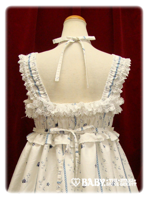
This is the JSK. The first thing I noticed was the overall shape of the dress. In my opinion, it looks dreadful. It is too harsh and it looks very straight. The way the skirt starts from the waist looks strange, resulting in a bulky and awkward look. It is not the typical lolita shape. I also think the tier at the bottom of the skirt looks flat and lifeless. The skirt also has lots of gathering which leaves the print bunched up. The bottom hem is finished with the same lace used on the OP. It is the only part of the skirt I like! At least the bodice on this dress looks more fitted than the OP. The top of the skirt is hidden by a ruffle on the bodice. I dislike the OTT lace. The bodice would benefit from a simpler design, so I think it would be better if it had the ruffle or the lace, but not both together. The corset part looks pretty and nicely spaced. The ribbon looks like it is good quality and wont fray. The straps look like they have a lot of stretch in them which is a good thing because...


... the back part looks very short. There is hardly any material on the back. This will not provide a great deal of support. If you have a large chest area, then invest in a good bra for this dress! The shirring has been left exposed but considering how narrow the area is, there is not a lot to hide anyway.


This series also has a round headdress. I think it would have been a good idea to include more than one head option. The rose looks pretty and the material in the background are like a continuation of the rose. The lace is maybe just a little too spiky against the softer edges.


This is the necklace. I can't decide if this looks classic or sweet. The gold outside rim is very classic but the glitter looks sweet. It would still be a nice addition to an outfit. I think the star fish looks cute!

So overall, the series is very hit and miss. I personally, would avoid the JSK. Thankfully the OP redeems AatP's reputation. Despite my bizarre comparisons to a fish joint, the print is lovely. I think the off-white and blue colour looks the prettiest. Would I buy from this series? Probably not. There have been a few other prints released which are similar to this one and I don't think this print stands out. However, I do think there needs to be more sailor lolita!
Related Posts Plugin for WordPress, Blogger...