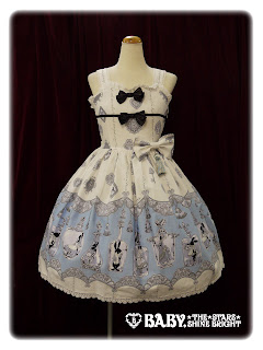
This is the tassel JSK. The bodice appears well fitted and it is a nice shape. The straps are a decent width for the dress and are lined with lace, so they don't look too plain. There is a waist bow, placed to one side. The bow itself is a nice shape and is very perky. It stands up quite well. I am a little unsure if I like the size and placement of the bow. I am also not a huge fan of the tassel hanging from this bow. I think it maybe looks a little plain having one single tassel hanging like this and perhaps two tassels would look better. Also, I don't think the tassel looks right when paired with the bow. The bow is quite sweet and maybe something a bit more classic looking would have suited the tassels better. Perhaps the tassel idea would have worked better dangling from the ends of a belt or perhaps underneath a rose corsage? As it is, I don't think the bow and tassel looks quite right. The bodice has a line of ribbon running across the chest area. I am always a bit wary of these kinds of details as one some wearers, it tends to sit on the chest awkwardly. I probably would have preferred the ribbon line to not be there. The ribbon itself looks good though with only a slight bit of shine to it. The ribbon line is topped with a ribbon bow. I don't think the bow here is really necessary, seeing as there is already a waist bow and one on the neckline. However, both the ribbon bows are a nice size and shape. They are spaced quite nicely too. The neckline is lined with lace, which gives it a nice, softer edge. Now, unfortunately I wasn't quick enough saving the pictures and I don't really remember what the back of this dress looks like. Judging by the measurements though, I am guessing it has a panel of shirring, which is great for size flexibility. The skirt has a beautiful, full and round shape to it. It is maybe a bit sweeter than we are used to seeing from AatP, but I think it suits the print. Also, some of the colours look a bit sweeter than your typical AatP release anyway. So I consider this more exaggerated skirt shape a bit of a bonus. The skirt flares out beautifully and will hold a decent amount of petti. The skirt is free from cluttering details and so, the print is displayed really well. The bottom hem is then finished off with some good quality lace. I thought it looked quite pretty at first, but then I saw the lace used on the other JSK and wished they had used it on this dress as well! Still, the lace doesn't look bad, I just think the other JSK's lace is prettier.
This is the Heart Belt JSK. The bodice is a nice shape and looks very well fitted. The straps are an okay width. This time the straps are kept free of lace, but I think with this particular dress, sharper edges looks better anyway. The waist has a belt, which looks very neat and tidy. It nips the waist in brilliantly. It has a very cute looking heart shaped buckle, which is a nice finishing touch.
The bodice has 2 lines of lace running vertically up the bodice, which do blend in a lot, but gives the bodice a bit of added texture and interest. There is also a line of buttons, which I think work well with the rest of the design. The thing that catches the eye with the bodice is the flaps of solid coloured material on the neckline. I like the idea of the solid colour flaps and they are a nice shape, but I think I would have preferred them to be a bit smaller. The flaps are lined very tidily with lace and it is very neatly done. What I didn't notice until I stared hard at this photo was that actually, the panels are covered with dot netting. It probably wont be that noticeable unless you are right up close to the dress. I kind of wonder what the texture is going to be like though. I have some Bodyline pieces with dot netting like this and whilst I liked the look, I wasn't too keen on how it felt.
The back has a panel of shirring which is concealed very neatly with a ribbon corset. The skirt is once again, a bit fuller than the average AatP dress but I still think it suits the series better to have it this way. The print is displayed beautifully and the skirt is kept free of cluttering details.
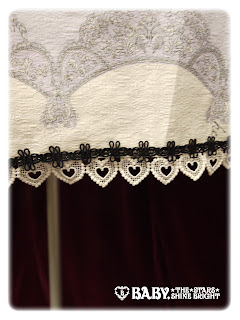
As I mentioned earlier, I really love the lace used on the bottom hem of this JSK! I think the heart shapes look so pretty. It also fits the theme of the print well.
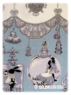
And here is part of the print close-up...
... and here is another part. This print is available in off-white, sax blue (no surprises there!), pink and black. I think out of the colour options I like the off-white and sax the best. I know sax blue and Alice prints has been done to death, but I really like the use of colour in the print on the sax version (as seen in the first of the two print close-up pictures in this post). As for the print itself, it has all your typical Alice themes in it, but it has been paired with lace and tassels, which is a bit different. I think the lace in the print looks beautiful. So much detail has gone in to it! The tassels are an interesting addition and I think they have been used and placed well within the print. I really love the use of glass bottles too, with the Alice characters inside the bottles. Everything looks so pretty! I especially love the rabbit. Then again, I may be a bit biased as I can never get enough of Alice in Wonderland prints, even if it has been done to death.
I am not a fan of the socks from this series. To me it just feels as though the "Drink Me" text has been slapped on. Apart from the text, I do think the socks are pretty. The bottle is drawn nicely and the bubble design is interesting. But then, the text on top looks so plain and ordinary. It looks a bit of of place to me. I think the text could have been done in a more interesting font and placed differently.
So I do think this is a very lovely series. I know some people will be rolling their eyes at yet another Alice themed print, but I think this is definitely one of the better Alice prints out there. Would I buy it? Possibly. I wouldn't call it a "must-have" print, but I wouldn't mind owning it. If it was me, I would go for the heart belt JSK in sax blue. I think this could be a lovely addition for anybody who collects Alice themed lolita. I will be avoiding the socks though!


I love that print :D
ReplyDeleteNot so keen on the socks though, the lettering is a bit garish.
Agreed! It's a lovely print. Shame about those ugly socks.
Delete