Thursday, 19 November 2015

Taobao Haul November 2015- Picture Heavy

It's time for another Taobao haul review! I ordered through Taobao Ring again. I am still not 100% convinced I like them as much as Taobao Spree, but this time I was a bit happier with Ring's service. Although perhaps that is because I didn't order anything too fragile this time. I have had to leave a few bits out of this review, because they are Christmas presents. I am hopeful that their recipients are going to like them.


Last time I had a big issue with the packaging by Taobao Ring where things were packed in to a box that was far too small for my order and as a result, 2 hats got a bit squashed. The rim of my strawberry hat is still a bit warped now, even though I have been trying to mold it back in to shape. Anyway, I had a bit of a similar experience with this new order. Everything was safe inside but I could tell Taobao Ring had over-stuffed the box again. I could see where the box was bulging outwards, trying to keep its contents in. Luckily Taobao Ring used a lot of tape. I was also a bit surprised to find a random nappy bag inside my box, which was a bit bizarre! I thought maybe it was scented and Taobao Ring were trying to keep my order nicely scented or something, but it was just a plain bog-standard nappy bag. So that was a little strange. I suppose I should be grateful it hadn't been used!


First up is this necklace which I got from here. The constellation is meant to be my star sign Cancer. I did look up the constellation and I can confirm I did get the correct star sign. The necklace arrived in perfect condition with no scratches. The design is quite clear. The only thing that surprised me was that the necklace does not have a clasp to do it up. I would expect this if the necklace chain was super long, but I wouldn't say this necklace had that long a chain. I am able to put the necklace on, which is the main thing. I guess I will just need to remember to put this on before any wigs or bulky hair accessories.
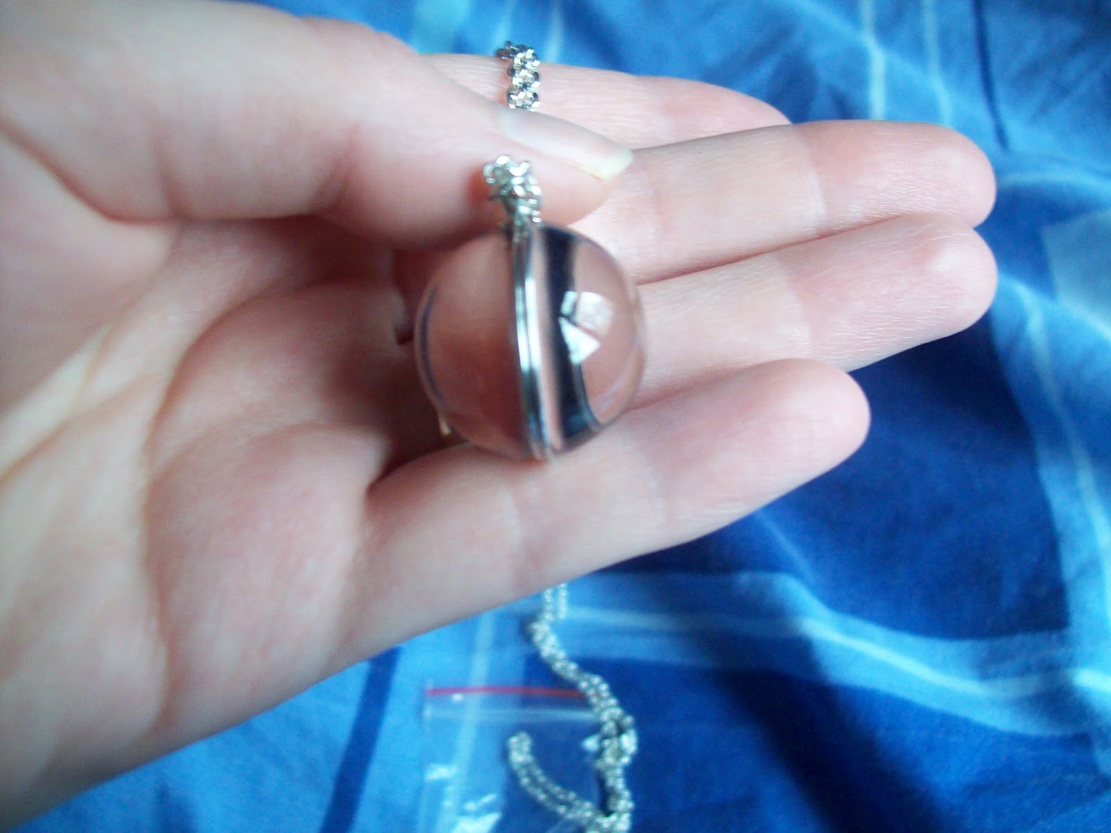


I thought I would show a side view of the necklace. I think the charm is quite a good size.


Next up is this clip that I got from KiraKira. I have tried to order this clip previously, but they said it was out of stock, even though they hadn't removed it from their store or done the usual thing of upping the price to a really high number. Thankfully, this time they did indeed have the clip. I ordered the dark blue, which for some reason is called purple on the listing. The bow is nicely shaped and the charm is really cute. I like the overall size of the clip as well.


The back has a hair clip, but not a badge clip. I think it is a shame, because I would have quite liked the option to wear this as a brooch as well. Perhaps KiraKira didn't feel there was enough room on the back for a 2-way clip, which I guess I can understand. I absolutely love the ribbon chosen for the clip. They could have used just bog-standard plain ribbon, but they have gone for ribbon which has an interesting pattern to it.


I especially love the golden shimmery effect on some of the ribbon. That was an unexpected surprise! A bit of an effort has been made to seal the ends of the ribbons too.


Here are the wrist cuffs I ordered from Ciciwork/SweetDreamer/CutieCreator/WhateverTheyAreCalledThisWeek. My first impression was "these cuffs are huge!" and I actually had to go get a pair of Bodyline wrist cuffs (which are also known for being massive) and compare sizes. These cuffs completely dwarfed the Bodyline ones, which should give you some idea of just how big they are. I am considering removing the chiffon layer. 


I absolutely love the charms. The ribbon and lace is of a decent quality too. However, I do feel it is a bit odd using rose patterned ribbon with a starry themed pair of cuffs. The materials also felt soft and felt pleasant to wear.


See what I mean about them being massive? The elastic has a good amount of stretch for wrist cuffs. I was a bit disappointed by the overall shape of the cuffs when worn. Wrist cuffs usually tend to flare out more and have a more rounded shape. These cuffs were quite tube-like with hardly any flare to them at all. 


Here is a close up of the lace. I think the lace could have been narrower too, but I do feel the cuffs will look a lot better without the added bulk of the chiffon layer. The stitching on the chiffon was generally quite neat, but it did look a bit untidy in a few spots.


Next up is this ducky t-shirt I got from here. Anybody who knows me well will tell you that I love ducks. I didn't have the easiest of times trying to find the right size. The size chart was an image, so Google Translate didn't work. I looked up how to read the size chart and then prayed I got the right size. Thankfully, I did get the right size. 


The colour is a lovely, vibrant yellow in person. The details of the duck face are crisp too. I think the duck face needs to be a bit smaller though and more towards the centre.


And here it is worn. I usually prefer my t-shirts a bit more figure hugging and fitted but I am just glad I didn't accidentally order a massive tent of a t-shirt. I was quite happy with the thickness of the t-shirt until I realised you can actually see my underwear slightly (sorry for pointing that out!). This photo was taken without a flash, so I am feeling a bit paranoid about how bad it will show up with flash! Photography issues aside, it is a decent enough t-shirt. I will be very careful with my choice of underwear when I wear it though.


I got this turtleneck from a store I have ordered jumpers from before, so I already had a rough idea of what to expect quality-wise. This new turtleneck is actually thicker than the jumpers I ordered previously. So hopefully I will be able to wear it in colder weather compared to the other jumpers.


The chest details were neat and the lace was of a reasonable quality. The cuffs and bottom of the jumper are a bit basic in design, but this jumper is for my everyday wardrobe anyway, so this doesn't bother me. When I tried it on I found the material a bit clingy. Although the material is stretchy, I wouldn't say this was a very plus-sized friendly jumper. The arms were a great length and reached my wrists with ease. It was very comfortable. I will definitely consider ordering some more for my everyday wardrobe in the future.


Next up is this bolero. The colour is a bit darker than I was expecting but I actually quite like it. The materials could have been a little bit softer but to be fair, this is actually meant to be a jacket rather than a bolero. I found the sizing chart reasonably easy to work out because it wasn't a picture. This meant Google Translate could translate the sizes. I was really pleased by the sizing and I found my bolero fitted quite well. The arms were a little bit long for me though.


The ruffles are done so neatly. They are so well gathered and the shape is really pretty. 


The only thing I am not too happy about is the ribbon used to tie the bolero. It is quite cheap ribbon and it is very basic looking. I also found out the edges of the ribbon hadn't been sealed, although I am capable of fixing this myself.


The stitching was so neat and tidy. I turned the whole bolero inside out and I couldn't find any messy bits at all. I was also surprised to see the bolero is lined. The lining is soft and it feels so pleasant when worn.


The arms are very long in length. As a result, I find that when I bend my arms the material wrinkles up quite a lot. 
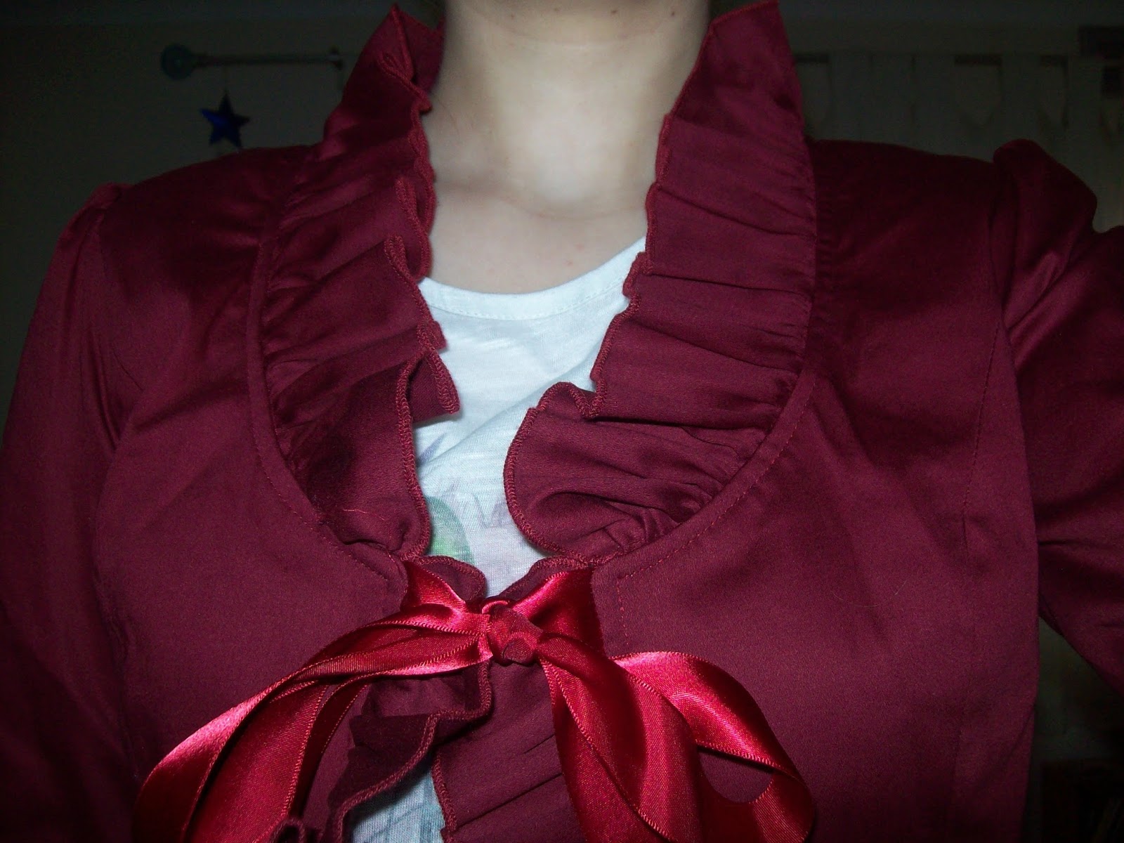


The ruffles sit really nicely when worn. I think here you can see how cheap the ribbon looks and I am tempted to replace it. I feel the ribbon colour could have matched better if it was a bit darker too. 


And finally, here is my favourite item from this order. I got this blouse from here. Your eyes are not deceiving you- it really is that cheap. When I placed the order it worked out at about £9, but can a cheap £9 blouse from Taobao really be that decent? Yes, it can! I can tell that some of the materials are a bit cheaper. The chiffon is definitely not as soft as some of my brand chiffon blouses. However, it still feels nice to touch. I found the sizing to be really good and my blouse fits me really well.


The lace looks pretty good for a £9 blouse. It is a decent quality and has a nice design. The pearl buttons on the front are pretty too. The button holes could have been a little bit bigger though. I had a little bit of trouble doing some of the buttons up.


The back has a ribbon corset to help tighten it up. The ribbon is very cheap and thin. When I put the blouse on and pulled the ribbon though, it held really well. 


The stitching was really good. I searched the whole blouse and this was the only little messy bit I could find. It didn't take long for the blouse to reach Taobao Ring, so I was wondering how much care had been taken in making it. I was really pleased when I got the blouse.


And here is how it looks worn. The bodice is a little long in length, but I don't see this as an issue. The arms were a decent length and I think they look really good. This blouse has been a real revelation and I cannot recommend this blouse enough if you are on a budget, or even if you are not on a tight budget. I will be keeping an eye on this Taobao store in the future!

This has generally been quite a positive order. I think the only disappointment has been the SweetDreamer wrist cuffs. Everything else was definitely good value for money. I still can't get over how good the blouse is. The blouse is definitely in my top 5 items I have ever ordered from Taobao. Do go and check them out! Now all I need to do is wait and see how well the Christmas presents go down. Fingers crossed!


Monday, 16 November 2015

Another Brand Print Double

Today is another brand print double because it's that time of the year when my favourite brands seem to love releasing a lot of stuff in a short period of time! So scroll down further to see Labyrinth Collection Room by Baby.

First up today though is Alice and the Mechanical Wonder Time Travel by Alice and the Pirates. This series includes 3 dresses (one non-print), a skirt, 2 hair accessories, tights, a tote bag, jacket, pants and a bag.


Here we have JSK I. The bodice seems well fitted, although the bodice shape is a bit basic. I don't like how plain the square neckline looks. The straps are very wide and I feel they need to be a little bit narrower. They also don't have any lace or trims along them so they look too simple. In fact, the only real detail on the entire bodice is a small line of lace with ribbon threaded though it, which runs along the neckline. Even this detail looks as though it has been stuck on the dress with little thought put in to it. There is a waist bow, which helps to liven up the dress a little bit, but it looks too big for the dress. It also feels a bit odd having such a cute looking bow on a very plain dress. The waist bow is detachable and unfortunately, I think I would detach it. The back has a panel of shirring, which has been very neatly topped with a ribbon corset. The stock photos show the skirt has a fair amount of volume to it and it flares outwards okay. I feel the skirt shape could have been a little more rounded though. The skirt design is kept simple, so the print is displayed beautifully. The bottom hem is then finished off with a line of the ribbon threaded lace. At least it matches up with the lace on the bodice. Every now and then, there is a small ribbon bow, but they don't make much of an impact.


Next up is JSK II. The bodice is very well fitted but I find the shape a little bizarre. It is certainly different! The round part that makes up the straps and neckline has been done neatly and I feel the width of the straps suits the dress really well. I am still not 100% sold on the look of this though. The outside of the 'circle' is lined very neatly with thin lace. What I really like about the neckline though, is the chains and the gear charm in the centre. The chains are neatly spaced out and dangle perfectly from their metal hoops. It is also good that the gear charm reflects the steampunk nature of the print. It is a lovely subtle nod to steampunk without overdoing it. There is a waist bow, which looks a reasonably good size. The shape seems okay and it sits nicely on the dress with no obvious signs of drooping. Although the charm in the centre of the waist bow is pretty, I don't feel it is needed. This waist bow is also detachable, but I think in this instance I would leave it on. The back has a panel of shirring which has again been topped neatly with a ribbon corset. The straps end on the back really smoothly next to the sides of the shirring panel and it all looks quite neat. The stock photos show the skirt has plenty of volume and it flares outwards well. There is the potential to create a really nice A-line shape. The skirt is kept simple, so the print is displayed really well. The bottom hem is then finished off neatly with a line of very thin lace. I think this dress has a better balance of steampunk and sweeter lolita elements compared to the other dress.


And here is what some of the print looks like. Apologies for the poor picture. This series comes in sax blue, khaki, brown and black. The colour choices are certainly suitable for the steampunk theme. The sax blue version worked out a lot better than I was expecting. As for the print itself, it is a very interesting take on the Alice in Wonderland theme we see frequently in lolita. I applaud AatP for coming up with something fairly original. I love how the card suits all have these mechanical gears and swirls to them. The characters such as the white rabbit fit quite well within the print as well. I think it is because there is a limited number of colours in the print. The golden colour is bold on the sax blue and brown colour ways, and I like the way it stands out. The gears in the background are kept nice and subtle too. The non-border part of the print has a really lovely Alice themed print to it and when you look up close you can see just how detailed it is. But at the same time the non-border part is muted enough that it doesn't distract too much from the bold border print.

I am actually quite surprised by how much I like the print, seeing as steampunk is not really my thing. I think it is a really interesting idea and it is well executed. The dress designs however, are a bit lacking. JSK I is just too basic in design. Would I buy this series? Possibly, but I wont be going out of my way to get it. My top choice would be JSK II in either sax blue or khaki. I am having a hard time deciding which is the best colour. I do feel a bit let down by the dress designs though.

Next up today is Labyrinth Collection Room by Baby the Stars Shine Bright. This series includes 5 dresses (one non-print), a skirt, 4 hair accessories, a blouse and tights.


First up is the Arete JSK. The bodice material seems a little bit baggy and it seems to lack any real shape to it. The overall shape is a bit basic. I really dislike the 'straps' on this dress. To be honest, this is an OP, not a JSK. I suppose it could be worn as either though. The sleeves are a strange shape and I feel it will make the wearer's shoulders look super wide. The sleeves are lined with lace, but the lace is a bit too wide and it just sort of hangs limply from the sleeves. The lace lining the inside of the neckline is a bit better and sits quite nicely. I don't think it is the best choice of lace for this area though. The waist area has a band of fabric, which is lined with lace on either side. The lace is quite subtle and sits quite nicely. I don't really feel the waist details do much to emphasise or flatter the waist area, but it doesn't look too bad. There is a waist bow, which is a bit on the large side. I think the size works reasonably well with this dress though. The bow has an interesting shape and it holds its shape well. This bow is detachable and after looking at this dress for a while I am unsure if I would keep it attached or not. Along the neckline, which would usually be where the base of JSK straps would be, there are 2 ribbon bows. If this dress had normal, thin JSK straps then these bows would have looked really pretty, but with the really wide sleeves they just don't work. The ribbon has a really pretty design to it, so it is a real shame. The back of the dress has a panel of shirring, which has been neatly topped with a ribbon corset. The stock photos show the skirt has a reasonable amount of volume, considering this series has quite a classic looking print. I think it could have looked better if it flared outwards a bit more. With the right petticoat, the skirt could have a really nice shape. The main part of the skirt is kept simple and the print is displayed beautifully. The bottom hem is then finished off with a thin line of gold braid, some ribbon bows (which look a bit droopy and need to be placed a bit further apart) and 2 layers of wide lace. The lace is layered well and I like the lace used for the top layer. The bottom layer underneath looks a bit cheap though. It is a good job this ugly lace is partially hidden by the nicer lace on top of it!


This is the Mireille JSK. The bodice material looks a little bit baggy. The shape of the bodice is simple, but all the lace helps to liven them up a bit. I think the straps are a decent width and look quite supportive. The straps are lined with 2 lines of lace on the outsides. This lace has been layered neatly and it creates a pretty shape. I am not so fond of the choice of lace though, and I feel that having this lace going along the neckline as well is a bit too OTT. I would have kept it just to the straps and had a thinner, more subtle line of lace along the neckline. There is a waist bow, which I think is too big. The shape of the bow is simple but well formed and it doesn't seem to droop much. The waist bow on this dress doesn't seem to be detachable, which is a shame, because I feel the dress would look so much better without it. The bodice has a line of lace running across the chest area, which helps to split up the different parts of the print quite nicely. I do wonder how bust-friendly this design is though. The bodice also features 2 ribbon bows. The ribbon has such a pretty design to it. I love the sheer bits and the golden lines on the ribbon. The bows are a good shape and size. I do feel that these 2 ribbon bows are enough bows and they would have looked fine without the waist bow being there. The back has a panel of shirring, which has been topped neatly with a ribbon corset. The stock photos show that the skirt has a good length to it and it has a decent amount of volume. There is plenty of flare to create a nice classic shape. The main skirt shows off the print quite well, although I don't feel the print has been lined up neatly enough along the sides. The sides feature a bit of gathering at the bottom, which I don't feel has been done that neatly. I don't think the shape of the bottom hem looks that great and I think that gathering could have been done better. These gathered bits are topped with ribbon bows, which match up nicely with the chest bows. The bottom hem is then finished off with a wide tassel trim and some lace underneath, which evens out the bottom hem. I really don't like how the tassel trim looks and once again I really dislike the choice of lace. 


Here we have the Ample JSK. The bodice looks well fitted and the shape is simple, but pretty. The straps seem a suitable width for the dress. There is lace running along the outsides of the straps, which has been nicely gathered and creates a cute shape. The bodice and the skirt features some solid coloured material overlaid the rest of the bodice and when you look closely at it, you can see it has a pretty rose pattern to it. The edges of the solid coloured material are lined with lace, but I personally feel it looks a bit messy. I think a thinner lace would have looked neater. The middle bit of the bodice is topped with many ribbon bows. Whilst the bows are pretty, I think there are too many of them and they are not that well spaced out. The additional bow on the neckline is too big and has an awkward shape. I don't feel this is needed at all and luckily it is detachable. The chest area features some layers of lace, which I feel look very messy. Overall, the printed area of the bodice is far too crowded. This dress only uses the busy, floral part of the print and when this is teamed with so much lace and lots of bows it all feels a bit overwhelming. The back features a panel of shirring, which has been topped well with a ribbon corset. The stock photos show that the skirt has a lot of volume and it flares outwards well. The rounded shape is cute. However, I do think it could have been longer in length. I also feel it is important to get the right petticoat to make sure the solid over-skirt sits okay on top. I am still not convinced I like the shape of the over-skirt. In some of the photos it looks okay, but in others it looks a bit bumpy and creates a strange silhouette. The over-skirt is also topped with even more ribbon bows. The print is only really visible in the middle front of the skirt but considering the dress only uses the floral bit of the print, it doesn't feel as though we are really missing that much. The bottom hem is then finished off with 2 lines of lace. I don't like the way the lace sticks out at a funny angle and once again, I really dislike the choice of lace.


And here is the OP. The bodice is well fitted and the overall bodice shape is quite pretty. However, I am really disliking the mini off-the-shoulder sleeves using the printed fabric layered over the solid coloured sleeves. If those printed sleeves were not there then the OP would look so much better. I just feel it makes the upper arm area look awkward and too bulky, especially with the ribbon bows topping these printed sleeves. It also makes it look as though the sleeves have fallen off the shoulders, which I don't think is a great look. The solid coloured parts however, are really nicely shaped. I like how the bell shaped part of the sleeves flares out and the lace used is really pretty. I don't even mind there being ribbon bows at the elbow area, even though this dress has a ridiculous amount of bows on it. I like the way the solid coloured fabric and the printed fabric are set out on the bodice. The triangle of solid coloured material on the bodice has been done neatly and I like the shape of the solid coloured fabric around the shoulder area too. It has been neatly lined with lace and I love all the thin lines of gold braid too. But there are too many ribbon bows. Maybe it would have looked better if some of the bows were a bit smaller or something, but as it is, the bows are too overpowering. I know some people really love the more OTT Baby dresses, but in my opinion it looks too fussy. The back offers no shirring, so size flexibility is quite limited. The back of the dress looks quite neat and tidy. It amuses me how simple the dress looks from the back in comparison to the front. The stock photos show the skirt has plenty of volume and it flares outwards quite well. There is plenty of room for petticoat underneath and I feel there is the potential to create a really pretty shape. The skirt, like the bodice, is loaded with detail. From the back, you can see the print quite well but the front  is all about that open-front design  and all the detail going on with the solid coloured parts underneath. I personally think this OP should have just stuck with the floral part of the print, like the Ample JSK did. The details on this dress are far too distracting for this sort of print. The solid coloured part features 2 over-stitched ruffles, which I don't think sit that nicely on the dress. The bottom of the solid coloured fabric is then gathered, which I feel could have also been done neater. And of course, this has been topped with even more ribbon bows! The bottom hem is then finished off with 2 layers of wide lace. 


And once again, I apologise for the poor picture of the print (sigh). This series comes in ivory, pink, bright green and brown. The colours look quite good with the print, but I dislike the use of pink lace on the pink version. I am not fond of the colour of the pink lace. As for the print itself, I am really unsure about whether I like it or not. I love all the little ornaments and sewing boxes. These objects have some really cute details to them. I am not sure I like the way the print has been set out in to squares though. Whilst I like the floral background, I don't think I like it paired with the rest of the print. The floral looks a bit too busy and it is quite a contrast with the less busy room part of the print. There are some really lovely parts to this print, but I don't think they have been used and put together in the best possible way.

So overall, I am feeling a bit overwhelmed by the dress designs and I am not really a fan of the print either. I absolutely despise the OP. I am grateful that some of the dress designs are a little bit more simple, so there is at least some options for those who don't really go for the whole OTT classic look. So I can confidently say this is not a series I would like to buy. If I did, I would go for the Mireille JSK in ivory. I would probably want to remove that waist bow though. I am sure there are many lolitas who are going to absolutely love this series but I personally am glad that my bank account is safe for now.

Thursday, 12 November 2015

Mini Catch-up in Reading!

Over the past weekend I was finally able to have a catch-up with Shalisa and Sammi. After being ill for weeks I was finally free to venture in to the outside world again! Unfortunately, this weekend it decided to absolutely chuck it down with rain. But I was not going to let that stop me from seeing my friends.


What do I do when the weather gets too bad? I wear a lot of black! I did have a more interesting outfit planned, but it involved light colours, which don't go well with rain water and cars driving through puddles. With the bad weather, it didn't seem like we would be venturing outside much, so a simpler outfit was really the best option. I wore Magical Moonlight by Metamorphose. It felt strange wearing this dress without a more Halloween related theme. 


We very sadly lost Shalisa's umbrella! Shalisa was telling us it was her favourite umbrella too. This destructive damage was caused by one strong gust of wind. The shop that Shalisa's Sugar Trampoline stuff gets stocked in were having a mini store party, so Shalisa was able to dump the remains of the umbrella in the skip. I also lost an umbrella, but it was a cheap one I wasn't really attached to thankfully. I was more concerned about getting wet!


After a bit of mingling at the store party, we eventually made it to the safety of the Outlook pub. This was the view of the river from our table. It looked better in person. We had lots of ducks and geese swimming by.


As we were feeling a bit down, we all went for massive burgers! This was Sammi's Big Porky burger. I went for a 'dirty burger' which has chili con carne in it. It tasted amazing but we were so full afterwards.


Here's a little group picture of us. Alas, my poor curly hair was already destroyed by the weather (apologies for moaning so much today!). 


We decided to order some cocktails but to be honest, the strawberry woo woo we had was incredibly disappointing. It tasted of syrup and little else. We also got a ridiculous amount of ice with it, so we only got one small glass each out of it. At least now we know for next time- this pub is great for food but terrible for drinks.


And so, to make up for the poor cocktails we headed to the Purple Turtle! This place used to be a bit of a grotty dive bar but it has been refurbished now and it is so much nicer inside. We really wanted to sit on this uber cool sofa but I dithered for too long and then it got sat on by this random guy. We really weren't having the best of luck! At least we got a picture of the sofa. 


The cocktails here are so much nicer! There was a 2-for-1 offer on the cocktails, so the 3 of us split the last remaining cocktail. It was really weird fishbowling with just the one cocktail! I think we will definitely be coming back here in the near future.

But despite the weather, we did manage to have a good long catch-up. The 3 of us and James can talk for hours. The photoshoot meet felt like such a long time ago. I suppose time does seem to go slower when you are ill and you are just so desperate to get better. Fingers crossed we get a bit of Autumn sunshine for next time!

Monday, 9 November 2015

Mixed Brand Print Double

 Today I am looking at 2 different series. Scroll down further to see my thoughts on Meta's Angelic Heaven.

But first up today is Horror Garden by Angelic Pretty. This series includes 2 dresses, a skirt, a vest, 2 blouses, tights, 2 hair accessories, a bag and a few pieces of jewellery.


Here is the JSK. The bodice material looks a little bit loose and baggy but the shape is very interesting. I am a bit disappointed by the messy looking waist area though. There is this weird little flap of material and that definitely could have been done a lot neater. The straps seem a decent width and look fairly supportive. There is an added star studded strap on the back of the dress, which should add a little extra support as well. I love the bat shape collar topping the straps and neckline. The collar is so well shaped with neat lines. It makes the bodice look a whole lot more interesting too. The bodice features a line of star buttons along a fake opening, giving it the look of a vest. The buttons are well spaced out. I like the star button design, but I wonder if they are maybe a bit too cute for the theme of the dress. The collar is finished off with a velvet bow, which is an okay shape and size. I also feel this bow is a bit too cute though, so I am glad it is detachable. The low back is fully shirred, which is great for size flexibility but isn't that attractive to look at. The stock photos show the skirt is very full and rounded. It flares out well and will hold plenty of petticoat. The print is bold enough to show up underneath the organza overlay quite well. However, I can't say I am that fond of the way the organza has been done. Something about it looks a bit messy in the stock photos. The bottom hems of the dress and the tulle are both finished off very neatly. 


Next up is the OP. The bodice looks well fitted and the shape is quite pretty. The sleeves seem a decent length and I like that they are made from organza. It gives them an interesting appearance. However, I am not too keen on the bat-shaped part of the cuffs. It is an interesting idea, but I don't think it works that well. The star shaped buttons on the cuffs look a bit too sweet and there is too many of them as well. There is a large waist bow, but despite its size it seems to suit the style of the dress. I like the shape of the bow and think it is well formed. I actually like the bat shaped tails on the bow, maybe because it looks more subtle than the cuffs. The bow sits nicely on the dress too. The dress features a white coloured yoke. I love the shape of the edges of the yoke and I think the details around the edges of the yoke have been set out neatly. The black braid offers a nice pop of colour which contrasts well with the white part. The lace along the edge sits nicely on the dress and has a suitable cross design too. The yoke itself is set out neatly with some tidy pleats and a line of star shaped buttons. However, I feel the bat shaped collar pushes things too far. If it had a different colour underneath, the bat shape of the collar would have stood out better. I also feel the collar is too big and the velvet bow dangling from it is too droopy. There are plenty of other little hints at the bat theme on the rest of the dress, so I would of kept the pretty yoke and lose the bat collar. The back of the dress offers no shirring, so size flexibility is limited. The back looks very tidy and I adore the shape of the waist ties with another subtle hint of a bat wing shape. The stock photos show the skirt is very full and it flares out beautifully. I love the full, rounded shape. The skirt is set out in the exact same way as the skirt on the JSK, although I feel the organza looks a bit neater on the OP for some reason.


And here we can see the print. As you can see, this print comes in black, ivory and wine (although with the organza overlay, the black on the ivory version looks more grey). These are pretty standard colour choices for a series like this. Black and wine look amazing paired with gold, and ivory and black is quite a typical choice for a gothic looking series. As for the print itself, I like all the different bits of the print but I am a little unsure I like them all together. The coffins are beautiful and I love all the decoration around the edge of the coffins. The crosses inside the coffins are heavily detailed too. The gates are well drawn too, but I don't know if I like the gates and the coffins together. The crosses floating in the background are pretty but I think they could do with being a bit smaller. 

I can see why this series would appeal to a lot of lolitas but to be honest, I am not amazed by it myself. There are details I love about this series, but there are other parts which I think are a little too OTT. So this is not a series I would go for myself. If I did, I would choose the black JSK. I do really like the bat collar though, and I am glad a separate vest released features this bat collar. I would probably be more interested in getting the vest than either of the dresses. And maybe next year AP should consider releasing their Halloween print a bit before Halloween, rather than the on actual day itself. That way more people would get the chance to wear the dress on Halloween.

Next up today is Angelic Heaven by Metamorphose. This series includes 2 dresses, a cape, 2 hair accessories, wrist cuffs, tights, socks and a scarf.


Here we have the Ribbon Shirred JSK. The bodice looks well fitted. I generally quite like the bodice shape, but I dislike the very square neckline. I think this neckline needs to be a bit softer and less harsh lines. The straps look a little on the thin side and I think they could have been just the tiniest bit wider. There is a line of gold braid lining the insides of the straps and the neckline, which looks very neat. There is then another line along the outside of the straps which then cuts across the chest about the inch below the neckline. This is also lined with lace. Although the braid and lace have been used neatly and the lace has a pretty design, I don't think I like the way it cuts across the bodice like this. I can't quite put my finger on why I don't like it though. I would have preferred the lace to continue along the outside of the straps and then taper off. There is a large waist bow. It is a bit big in size, but I don't think it looks too out of place on this dress. The bow has a pretty shape and it sits nicely on the dress. I like the lace on the ends of the bow tails, as it matches nicely with the use of the same lace elsewhere on the dress. I would lose the gold bijou and wing charm in the centre of the waist bow though, as they blend in to the background too much anyway. I didn't even realise the bow had a charm at first. The empty space on the bodice is broken up by 2 smaller bows. These bows look very cute and are a good size. I would have moved both bows down just slightly though. I think that would make the spacing look a bit better. The back is fully shirred, so it means there is a wider size range, but the shirring is very exposed. It doesn't look too appealing. The stock photos show the skirt has plenty of flare and volume. There is lots of room for petticoat underneath. If the stock photos are any indication, there is lots of potential to create a really pretty, full shape. The skirt design is kept very simple, so the print is displayed beautifully. The bottom hem is then finished off neatly with the same lace used on the rest of the dress, which is a nice bit of continuity.


This is the Clerical Dress. The bodice looks well fitted but I am not overly keen on the bodice shape, especially teamed with that collar. There is a small waist bow, which is a good size and sits well on the dress. I like the ribbon used for the waist bow, but not on this particular dress. It is too sheer and I feel the waist bow needs to be a bit bolder in design. As you can see in the picture above of the white colour way, the waist bow blends in to the background quite a lot and it is a bit too delicate looking paired with the bold print. The rest of the bodice is really plain in design, but most of it is taken up by the collar anyway. I really hate the shape of the collar. It looks really unappealing to me. Also, I didn't realise at first that there is in fact a set of regular JSK straps underneath the collar. If you look at this dress from the back, you can see these straps poking out where there is a gap between the collar and the back of the main dress. It looks really messy. I just feel the collar is too big and plain in design. It feels like an odd contrast having this really basic looking collar with the extravagant looking print. The back has a panel of shirring, although it's a bit difficult to tell from the site's pictures whether or not this shirring panel is topped with a ribbon corset or anything. I think the large, plain collar grabs the attention more than the shirring anyway! The stock photos show the skirt has lots of volume and it flares outwards plenty too. I prefer the shape of the skirt on the other JSK though. The skirt is kept simple in design, so the print is displayed really well. The bottom hem is then finished off neatly with a line of lace.


And finally, here we can see one bit of the print close up...


... and another part. This series comes in white, black and blue. The colours are good choices for the style of print. I do kind of wish the blue was more of a navy blue though. However, I do admit that the gold in the print really 'pops' on the bright blue that Meta have chosen. As for the print itself, it looks pretty, but I feel it could have been better. I like the cherubs in the print, but some of the details look a bit blurry and the edges don't seem that crisp. The gold swirls are a bit more promising and I like how there are roses and crowns within the gold details. I am not overly keen on the little boxes containing the brand logo and it feels like they are just there to fill in the empty spaced. When I initially saw this print I really liked it, but as time has gone on I have found more to dislike about it.

So overall, I am a little underwhelmed by this series. I do feel the print could have been drawn better. There are similar prints to this which have a bit more of the 'wow' factor to them. I also feel the Clerical Dress design looks messy. I can see what Meta were aiming for, but I don't feel they have quite pulled it off. So this is not a series I will be buying. If I did, I would be choosing the Ribbon Shirring JSK in black. If the blue had been a navy blue I would have gone for that colour instead. After a couple of quite good series from Meta, this one feels a bit disappointing in my opinion.


Thursday, 5 November 2015

How I Would Wear It Now- Bodyline Gingham Strawberry JSK

I thought I would try doing another How I Would Wear It Now post using a piece I used to own. Today's dress is one that I sold earlier this year when I sadly had to downsize my wardrobe a little bit after the rail inside collapsed (on Christmas Day, no less!). I have since done a bit of reinforcement to the rail and added an additional rail and of all the stuff I sold, I miss this dress the most. This gingham strawberry dress was my very first Bodyline piece and I felt that I had "unfinished business" with this dress because I felt there were more outfits I could have made with it. However, I hadn't worn this dress in such a long time that I felt that it had to go. I never really wore an outfit with this dress that I thought was too bad, like I have with previous How I Would Wear It Now pieces but it doesn't stop me thinking of new outfits I could have made with it.


So this is possibly how I would consider wearing this dress if I still had it. It feels a bit weird posting a Summery outfit when we are well in to Autumn but despite being a big Fall fan, I have strangely been missing Summer! I guess being cooped up inside with poor health for the past few weeks and the darker, shorter days have made me crave a little piece of Summer. This outfit definitely reflects Summer, with no blouse and just a bolero to cover up. I couldn't decide on a pair of shoes because I couldn't remember if the pink shoes were the right shade for the dress. I love looking up strawberry accessories because berries have always been a favourite theme of mine, even if I do get a bit sick of the constant barrage of strawberry prints the brands put out each Spring! I would wear my hair in low, fluffy pigtails and use the mini pink bows to tie them to add an extra bit of pink.

Since selling this dress I have obtained 2 new strawberry prints and I still have another strawberry print, so perhaps I will be wearing something similar to this collage in the future! So I am trying not to feel too sad that I no longer have this dress. I just hope the person who brought it loves it as much as I did a few years ago.

Related Posts Plugin for WordPress, Blogger...