Showing posts with label Crown Label. Show all posts

Monday, 4 November 2013

Bubble Bath by Crown Label (Metamorphose)

Today I am looking at Bubble Bath by Crown Label. This series includes 4 dresses, 2 skirts, a blouse, 3 hair accessories, bloomers, socks, a bag and wrist cuffs.


This is the OP. The bodice looks well fitted and the shape is interesting. The organdie sleeves give a soft, floaty feel. I think the sleeves look cute but I personally would have liked the sleeves to have been a bit puffier. The waist bow is quite big and I feel they could have gotten away with a much smaller bow or maybe no bow at all. Or perhaps even an organdie bow? The waist bow also has quite a basic shape to it, although it looks quite perky and sits well on the dress. The bodice has a row of buttons going up the front centre with the buttons alternating with some cute, small bows. The bows and buttons are spaced out well, although the buttons used are a bit boring. Either side of the buttons, there is a organdie ruffle, which compliments the sleeves and works quite well. At first I thought the collar on this dress was a bit too big, but after seeing it worn by a model on Meta's website I don't think it looks too bulky. I like how the collar is finished with an organdie ruffle around the edge to soften it. I wouldn't have bothered with the small bows on the collar though, as they don't really add much to the design and just add unnecessary bulk. The back hasn't got shirring, so is quite plain. The collar looks nice from the back as well. The waist ties are quite wide though, and look very bulky. The photos show the skirt has a subtle, slightly rounded shape to it. It is quite roomy with lots of room for a decent amount of petticoat. The skirt is relatively clutter free, so the print is displayed reasonably well. Just underneath the print there is an organdie ruffle which gives the bottom a lovely, frothy feel. It is very suitable, given the print theme. The bottom hem is then finished off with a simple ruffle.


This is the A-line pinafore JSK. The bodice looks fairly well fitted, although I am not sure what is going on with the neckline. If it is meant to be a heart shaped neckline then it could have been shaped a lot nicer. The straps are a good width for the style of dress but are a bit basic looking. I am really hating the heart cut-out on the bodice. Something about it just doesn't feel quite right and you would also have to pick the top you wear underneath quite carefully. There is also a random flower shape button underneath the cut-out which looks very out of place. The thin organdie ruffles running down the dress are quite figure flattering though. The back is fully shirred, which gives good size flexibility but doesn't look that attractive. The skirt has got the typical shape you would expect from an A-line dress, although in some photos the silhouette looked a bit bumpy. I was very interested to see that Meta have ventured in to doing pockets (something which I love about Angelic Pretty dresses!). However, I am a little disappointed by the scalloped flaps covering the 2 pockets on this dress. I don't think they match the rest of the dress and hidden pockets would have been nicer instead of having random flaps sticking out. The top of the border part of the print has a small organdie ruffle which blends in quite nicely. I like the bows on top of the organdie ruffle but think they could do with being a bit smaller. The print is displayed reasonably well. The bottom hem is then finished off with some very cute bow themed lace.


This is the Pinafore JSK. The bodice material looked just a teeny bit loose in some of the photos and the square shape is quite plain and boxy looking. The shoulder straps are a decent width for the dress but again, they are kept plain and look a bit dull. However, my main frustration with this dress is that folded over neckline which doubles up as a second pair of off-the shoulder straps. It just looks very awkward! The Meta website listing also has photos of the dress worn by a model, and it doesn't look any better. It looks too complicated and wouldn't suit everybody. I also worry it would make the wearer's arms feel restricted. The great news is that this part of the dress is detachable! The waist has a wide organdie belt which doesn't look too appealing in the photo I have used (it looks a lot better in the other photos). When tied neatly it nips in the waist fairly well, but when it isn't tied well it can add too much bulk to the waist area. After seeing the pictures, I think it looks best tied to one side rather than in the centre. The bodice has a line of pretty lace in a semi circle shape, sort of mimicking a yoke. In the middle there are 3 well-spaced buttons, and again I find the buttons to be a bit boring. However, they do help liven up what would otherwise be a very plain bodice. The back has a panel of shirring which is concealed tidily by a ribbon corset. The photos show the potential to create a very rounded shape with the skirt. It doesn't look too OTT though. The skirt also has a decent amount of fullness to it and will hold a lot of petticoat. The skirt is kept clutter free and the print is displayed well. The bottom hem is finished off with a simple ruffle.


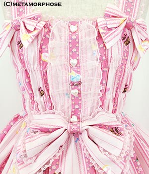
This is the Shirring Pinafore JSK. As you would expect from the name, the bodice is fully shirred and doesn't look as attractive. However, Meta have decided to put an organdie top over the dress (which is obviously detachable) which actually helps to conceal the shirring reasonably well! The organdie top part is quite OTT with 2 large bows on the front and lots of small ribbon bows dotted all over the top. Whilst for some people this may be OTT, I personally have grown to quite like it and think it is a massive improvement to the fully shirred bodice. The straps are a good width for the style of dress and have an organdie ruffle going along them, which softens them and makes them look a lot more interesting. It also fits in better with the style of the rest of the dress. If you remove the organdie top, underneath the front centre has a random flat part which is topped with 3 small bows and has an organdie ruffle on either side. The bows are quite cute and spaced neatly. The organdie ruffles match up with the straps really well. As the dress is fully shirred that means the back is shirred too. The skirt has a subtle, slightly rounded shape to it. The stock photos show that there is the potential for the skirt to flare outwards quite far and the skirt has a decent length for a high-waisted dress too. Despite the organdie top reaching the border print, the print is still displayed quite well. The bottom hem is then finished off with a simple ruffle.


And here we can see the print. This print is available in cream, sax blue and lavender. All 3 colours work well with the print (the cream seems yellow to me) but my favourite is the lavender. As for the print, parts of it look kind of familiar... It is like they have taken bits and pieces of their March of the Duck series but have updated it to suit more current trends. There is the tiled background and the ducks (although this time around they are not the main focus of the print) but this time around there are pastel colours and the addition of cats. The cats are drawn very well and look pretty cute. As a duck fan, I wish there were more ducks in the print though! The cats appear to be having a lot of fun, frolicking in the bathroom scenery. All the bottles and soaps add extra detail. The bubbles help to fill in any empty spaces quite well. Overall, it is a very cute print. In my eyes it isn't as good as March of the Duck though!


Meta have finally caught on to the sheer detail trend we have been seeing from other Japanese brands. They give an outfit a soft, delicate feel. I think this blouse Meta have released is a good match for the Bubble Bath series. It maybe looks a bit basic compared to similar blouse designs from other brands, but I think it is a step in the right direction. I would be very interested to see how it looks worn before considering buying it though.

So overall, I think this is a very cute series. I don't think it is going to be a best seller, but it is still a decent effort. Although some dress designs are stronger than others, there is hopefully something here to suit a wide range of tastes. Would I buy this series? Possibly, but it wont be going on my wishlist. Surprisingly, my favourite dress is the Shirred Pinafore one and I can't stand the look of full shirring! Sadly this series doesn't seem to be selling that well so far, but at least there is a chance that in the future Meta may sell it at a reduced price. I would certainly be tempted.

Thursday, 14 February 2013

Fancy Bunny by Crown Label

Today I will be taking a look at Fancy Bunny by Crown Label. This series includes 4 dresses, 2 skirts, 2 blouses, a hoody, a head bow, a hat and 2 different hair comb designs.

Unfortunately, I am having troubles getting pictures of the OP, but I will still give my verdict on the other dresses.


This is the shirring pinafore JSK. The bodice looks like it will fit well, but with all the shirring it doesn't have the most attractive shape. It looks a bit bumpy. The waist bow is a bit on the big side. Also, the waist bow looks a bit droopy. It looks very sad and could do with being a bit smaller and stiffer. The straps are a decent width. They are lined with thin lace, so they don't look as boring and the edges are softened nicely. I like the 2 bows at the base of both the straps. They are a much better shape and the size is suitable for the area. In fact, the waist bow isn't really needed, as the strap bows could work well enough on their own.


The bodice has some tulle lace running up it. I don't think it looks that pretty. I think it is the overall shape of the tulle. There is also something about it that looks a bit fussy and messy. The bodice also has a line of cute heart shaped buttons. It probably would have looked better without the tulle both sides of the buttons. Overall, I think the bodice looks really untidy.

The back has even more shirring, so the dress is fully shirred the whole way around the dress. Whilst size flexibility is a good thing, I think the shirring here looks very casual and it's not the prettiest design. The skirt is very triangular in shape and could maybe do with being a bit rounder. It looks like it will hold a decent amount of petticoat though. The skirt is kept free of detail and so, the print is displayed very well. The bottom hem is then finished with some nice lace.


This is the halter neck pinafore JSK. It is hard to tell where the bodice ends and the skirt begins on this dress. It has such a peculiar shape. But the top part of the bodice does look well fitted. The straps are very interesting. They are outer set of straps are topped with a ruffle, which is a bit different from your usual standard straps. I don't like how it looks with the halter neck straps though, as it is a bit crowded. However, the halter neck straps are detachable. This dress comes with many detachable bow brooches which is a bonus, as it means you have more control over how you wear the dress. The smaller bows are very cute and have a nice sturdy shape to them. The bigger bow seen in the picture, attached to the neckline, also has a nice shape to it. I think it looks good placed on the neckline and sits nicely here. Or you could use it as an emergency head bow. The neckline is lined with lace, which gives it a softer appearance.


This dress also comes with a detachable bow with a pom pom attached to it. From the picture we can see that Meta suggests wearing it like a bunny tail. Whilst it is an interesting idea, I think it looks a bit silly! The back has a panel of shirring, which is well concealed by a ribbon corset.

The skirt shape is hideous though. Looking at the overall silhouette, the dress looks lumpy and bumpy. It's not flattering at all. The skirt starts too low. It seems to look worse when the skirt is fully puffed outwards. It's just awful. There is not a single thing I like about the dress shape and I would never wear it. The bottom hem is finished neatly with some okay lace.


This is the cross over back pinafore JSK. The bodice is an okay shape, although the material looks a bit baggy in places. The belt is a nice idea, but would probably look better on the actual waist, rather than being slightly dropped. Also, I would have liked the belt to be a solid colour. I think having the stripes in the print going in different directions looks a bit strange. But the buckle is very cute. The bows are again, detachable. I would probably space them out a bit wider apart than Meta have in the stock photos, as the lower part of the bodice looks a bit plain. The bows are a cute shape and very perky. I do also like the flexibility with them being detachable. The neckline is lined nicely with thin lace, which is not too distracting but gives a softer appearance. The straps are a nice width, but I am not sure the design really suits the dress. As the name suggests, the straps cross over at the back. The back has a panel of shirring, which has been left exposed with nothing covering it. It looks a bit messy and could have maybe done with ribbon covering it. The skirt is very short. It almost looks like a salopette. But despite being short, the skirt does have a nice shape to it, especially when compared to the other JSKs in this series. The skirt flares out well and the print is displayed beautifully. The bottom hem is then finished off with some nice lace.


And finally, the print close up. This print is available in pink, black, yellow and green. For me, the black and pink are the better colours for this print. The yellow is not the nicest shade and I am unsure the shade of green is a good match for this particular print. The print itself is quite cute, although it feels like some things have just been randomly chucked together. I don't quite understand what the bunny has to do with the rest of the print but it is cute. I love all the little cosmetics and the dresses in the background have been drawn well. However, as far as cosmetic prints go, this is not one of the best designs available. Other brands have done cosmetic prints better and even other Meta prints (such as perfume bottle) are more desirable than this one. I do like the stripy background with the tiny flowers though. Overall, this print is not for me.

So whilst this is a cute print, I don't think it is anything spectacular. The dress designs are a bit questionable. I just hope they look better when actually worn. I don't think I would buy from this series. It not my kind of thing at all. It's a shame, because Meta had been releasing some pretty awesome stuff lately. Let's hope we see more of these better Meta pieces soon!


Monday, 9 April 2012

Strawberry Crown by Crown Label (Metamorphose)

Today I will be looking at Strawberry Crown by Crown Label. This series includes 3 dresses and an apron style skirt. Yes, here we have another fruit themed print! You always seem to get massive amounts of fruit prints released at the same time.


This is the OP. The bodice is nicely fitted. I wish the waist was a little bit lower though. I also think the sleeves would look a bit nicer if they were slightly puffier. The waist bow is unfortunately large, and Meta have said that this is not detachable, which is a shame. Not only is it protuberant, the lace also makes it look very OTT. The rest of the bodice is fairly simple, and the little details here look cute. I like the 3 red buttons, although I think Meta missed a trick by not using strawberry shaped buttons. The neckline on this dress is a bit too high for my tastes.


There is this pretty lace detailing going along the sleeves, which I think works well with the rest of the lace on the dress. I am not a fan of OPs, but I do appreciate a bit of detailing on the sleeves, provided it doesn't look too bulky. I dislike the use of ribbons here though.

The back has a large and very exposed panel of shirring, which looks a bit basic. The skirt part has a slightly odd shape to it, although this is possibly down to the way that the skirt is split up in to 2 parts. Also, because the waist on this dress is high, I think Meta had to make the skirt very long so it will hit the knee. The top of the skirt has 2 lines of lace which have ribbon threaded through them. It looks very cute. These bits of lace end when they meet a horizontal line of lace. I think the way the skirt is spaced out would look nicer if the horizontal line of lace was a bit lower down. The bottom hem is finished off with some lace that compliments the lace on the rest of the dress.


This is the high waist pinafore JSK. The bodice is a good shape. It will fit well because the shirring makes this dress more flexible. The waist bow is still big, but it looks a lot better than the OP's waist bow and this time, the bow is detachable. I think this bow looks better because the edges are not covered with fussy lace and the overall shape is more appealing. Despite its size, the bow is very perky and doesn't droop. The base of the straps is decorated with 2 more bows, but these are kept simple, so they blend in well with the dress.


I really dislike the use of shirring on the front of this dress. I appreciate some people need a bit of extra shirring, but I think the shirring panel on the front has been done very messily.


Here is a back view of this dress. The bustle back sticks out quite a lot, so might not be suited to those whose bodies are bottom heavy. The tiers are quite wide and there was probably enough room to add another tier in the bustle part. From the front, the skirt shape is very flared, although the gathering right at the bottom gives the skirt a puffy appearance. If the bottom ruffle wasn't as gathered, the overall skirt shape might have flowed a bit nicer. The bottom hem is finished off with some good quality lace, but the lace is a bit boring.


This is the pinafore JSK. The bodice looks very nicely fitted and the waist is tied in nicely by the ribbon belt. The ribbon for the belt is a bit shiny, but it blends in. The bodice part is plain, some will say it is too plain, but I like it. It makes your attention is drawn to the print and you are not distracted by an overload of detail. The bodice has one simple line of lace running horizontally across it. The lace looks good, but I do think some more interesting looking lace would have been a nice touch, without spoiling the simplicity of the dress. The straps are a nice width and are complimented well by the small cute bows. The back has a panel of shirring and this time it has been concealed by a ribbon corset, which I think looks a lot better. The skirt shape is very rounded, almost a little too round, but it displays the print so well. Therefore, I really like it. The bottom hem is finished off with more of the same lace. Yes, this dress is a lot simpler compared to the other 2 dresses in this series, but I think this is a case of "less is more".


And here is the print close-up. I have always felt that Meta are really good at doing strawberry prints, and I don't see this print as any exception. The strawberries look good enough to eat, although I don't like the inclusion of the white crown and bow placed on top of them. I like the way the strawberries are positioned because they are not in a straight line and that makes it look a bit more natural. The striped part helps the strawberries stand out. The ribbon and bows also look cute. The print comes in black, pink and green. I like how Meta released this print in green because that is one of the things that distinguishes Meta from the other big lolita brands. They use different colours, and I think the green is the best colour way for this series.

Overall, I do like this series. However, there is no denying that this series looks an awful lot like Strawberry Cream, which Meta released some time ago. They even used the same green on this older set.


Strawberry Cream was popular, so maybe Meta was trying to capture that old success again with Strawberry Crown. The main differences is that Strawberry Crown has stripes in it and Strawberry Cream has cakes and pink bows. Strawberry Crown will probably be too similar for some people, but if you struggled to find Strawberry Cream, then maybe this series could be a compromise. I actually think the strawberries look more realistic on Strawberry Crown. Sorry if this last paragraph confused anybody- the names are too similar!

I can actually see this series doing well, especially compared to other recent Meta sets. It is not exactly original, but I don't blame Meta for trying to capture some of the old magic. I would definitely go for the pinafore JSK in green. However, although I do like this print, I don't think I love it enough to buy it. Well, at least not enough to buy it at full retail price. This is one of those dresses that I can picture picking up if I saw it going cheap in a second hand shop. I do hope that this series will sell well though.


Friday, 18 March 2011

A dream come true!

Tuesday the 15th of March 2011 will now forever be imprinted in my memory. It was a very special day for me. I have been having a lot of personal problems recently and I have been having a hard time with my health too. So I have been feeling pretty miserable. However, there was a break in the gloom when my new skirt arrived-

I finally got March of the Duck! For ages it has been my dream print and now I own it! March of the Duck definitely has its lovers and haters (I am a lover of course!) but I have always been obsessed with ducks. I preferred March of the Duck to the duck print that Emily Temple Cute did. I was also happy to get my dream print in my preferred colour choice of white. I really dislike the blue version. The square part of the pattern reminded me of bathroom tiles. I felt it looked a lot better on the white version. I already know that some of my friends are keen to see what this print really looks like in person.


And here are the infamous ducks!


The lining is very soft. This Meta skirt did not come with the stiff layer on lining which is on my Old Emblem skirt. March of the Ducks is a Crown Label series so maybe the Crown Label ones don't have this extra layer.

I never noticed this before but the Meta bunny and bear appear on the print and the swan logo features on some of the balloons.


Polka dots! And a close-up of the lace.


Of course, I got the matching head bow too. This bow is actually titled ever so slightly to the side so it is a side head bow! I like the little pearls which helps to add interest to what could have potentially been a very dull bow.

I intend to show some worn pictures soon but I am still feeling a little ill and tired. I just quickly tried the skirt on and the fully shirred waist was very forgiving. However, I might be wearing this to the Oxfordshire lolita meet next Saturday so hopefully I will have some more photos soon. My poor Bodyline waffle skirt will have to wait for its first public outing!

Question is... now that I have my dream print, what will my next dream purchase be? I need to recover my finances first! My wishlist is VERY long but here are a few that I would really like-

Angelic Pretty- Milky Chan, Rose Toilette, Starry Night Theatre
Baby- Bunny Milk and Snow Strawberry, Twinkle Dreaming Princess
Meta- Nostalgic Chess, Feather cross Summer special 2008, apple print
AaTP- Midsummer Night's Dream, Masquerade Theatre
Innocent World- Felicia Crown


Wednesday, 16 March 2011

Tales of the Wood by Crown Label (meta)

Today I am looking at Tales of the Wood by Meta's offshoot Crown Label. This series comprises of 3 dresses, 2 skirts (1 long, 1 short), a headbow, bags and socks. This series will be up for pre-order soon but the socks are already available in their online store.

First up is this one-piece. With such a busy print it is good that Meta kept the dress details simple. Well, the details are not that simple but they blend in with the dress. The bodice is relatively simple with 2 simple lines of lace. All the lace used here is quite thin. It is obvious Meta want you to focus on the print more than anything else. I think the use of ribbon threaded lace on the neckline works well with the shape of this bodice. The neck straps are quite cute. I would lose the 2 bows on the straps. The back is finished with some corset detail. The ribbon hides the shirring quite well. It looks quite neat and they have matched the ribbon colour well. The waist bow is nice and simple too. I didn't even notice there was a waist bow at first. My main complaint with the bodice is the buttons. They are the same colour as the apples in the print so it tricks the eye in to thinking some of the buttons have been misplaced. Maybe they should have used buttons which matched the main dress colour instead. The skirt part has an interesting ribbon part running vertically and then a horizontal ruffle. Usually I dislike this sort of detail but I quite like it on this particular dress. The skirt part has a lot of volume which is always good with a higher waist. The bottom hem is finished off with ribbon which is a bit different. Although some people may dislike this bottom hem detail, I like how it finishes off the dress more simply. I imagine it must have been a challenge to balance out the print details with the dress details. Overall, I don't think this dress is too bad.


And then there is the high waisted pinafore JSK. This is probably my least favourite dress in this series. The front and back of the bodice on this dress are pretty much the same. So there are 2 panels of shirring and 2 corset parts. I thought this dress looked a bit messier. The waist bow has been kept simple again but this time it is larger. If it was me, I would move the waist bow a bit higher up to hide some of that corset. I also thought the straps look a little strange. However, my number one complaint with this dress has got to be the use of ribbon on the skirt part. It is highly noticeable and it causes a harsh brake in the skirt. It could just be the camera, but I also don't like how shiny this ribbon is. The ribbon is a bit too "Mad Meta Experiment" for me (I should definitely trade mark that phrase!). The finish off the skirt Meta has 2 simple bows and the bottom hem has some pretty lace with bows on it. If I wanted a dress from this series I certainly wont be picking this one.


And then there is the pinafore JSK. To show the details better I have included the draft picture-


All the little details around the bodice appear to be small ruffles. Although there are a lot of ruffles, the size means it doesn't look too frilly. In fact, I think this is quite pretty. The straps are a decent size but on the model they point outwards a bit. The straps look nicer in the draft picture but I think this is only a small problem. The ribbon theme is continued on this dress with a ribbon belt. It is not exactly risky, but I think this is the best use of ribbon in this series. The ribbon on this dress does not pull your attention away from the print. With the black dress it is hard to tell how neat the back part looks. In the black colour, the corset in the back blends in nicely. The skirt part has a lovely bell shape to it. It is not as wide as the other 2 dresses but it has a nice rounded shape. The bottom hem on this dress is similar to the 2nd dress but there is a ruffle in place of the lace. This is by far my favourite dress in this series.


And finally, the print close-up. I was thinking about the best way to describe this print. Imagine Innocent World and Meta having a love child, but Meta has the more dominant genes. This is Meta taking inspiration from IW and doing their own spin on it. It is a very interesting print. If I had to choose between Meta and Innocent World, I would choose Innocent World. However, this print is still very pretty, albeit slightly more cutesy. I am a bit undecided on the stripy part. Also, there are parts of the print which look brighter than other bits. Some bits look a tiny bit washed out.

This series is a bit hit and miss. I would possibly buy the last dress but I would not go out of my way to get hold of it. To be honest, I think if I could get a similar print from Innocent World (and fit it!) I would rather buy an IW dress. But if you have always wanted a sweeter IW inspired print, this series could be right for you. I think this series will sell well but to be honest, I don't think IW have anything to worry about.

Wednesday, 19 January 2011

Sweets Street by Metamorphose (Crown Label)

Metamorphose have announced their latest Crown Label series- Sweets Street. This series has 3 dresses, 2 skirts, socks and 3 different head pieces.

So here is the first dress. The neckline is very different. It is meant to be this shape but at first I thought the material was too heavy and the neckline was being stretched out of shape. The lace looks neat and tidy, it is certainly an improvement on Meta's last series Royal Rose. The bodice on this dress has a fake bolero sort of shape. I think this detail is good. However if you have a large chest area, this shape is only going to make it look even bigger, especially with the bow there too. Meta are saying the bow is not detachable too. The sleeves are puffy and the waist on this dress is high. It looks fairly casual. I quite like the overall shape of the dress but it is not going to flatter everybody. It will probably swamp some people but the vertical lines in the print help to balance this.


The second dress is basic looking. The bodice on this dress is more fitted. I was surprised when I read how much this dress can stretch. The shirring on the back looked well hidden too. I don't like the 2 small bows above the waist bow but I think this dress needs them to add a bit of interest. The skirt part looks very spacious. The frill at the bottom is very pretty and I like how it contrasts with the brighter pink at the bottom of the print. My main criticism here is the line running around the mid-length of the skirt. It looks like it is too high up and also makes it look as though the skirt has been split in to 2 pieces. It doesn't help that there are vertical lines in the print and the lines become misaligned. The first dress has this design too but I feel it looks worse on this second dress.


Then we have the final dress. I do wish that brands would stop making these sort of bib shapes covered with ruffles of lace like this dress has. I dislike it a lot. The good news is that the bib is detachable. There are also 3 very cramped bows on the front of the bodice. It doesn't really need all 3 bows. The bows are a good size so 1 would have been enough, or maybe 2 bows at a push. The shape of the bodice looks like it will fit well and it is great that there is at least one dress which is not high waisted so there is some variety. Once again, it looks like there is a lot of room in the skirt. This time the skirt looks more rounded. There is also some gathering which adds interest. The bottom looks reasonably neat.


Here is one of the print close-ups. I would love it if just the top bit of the print with the tartan and the lines was made in to a dress without the French cafe scene. It would make a lovely simple dress. But the details shown here look fine. It is a bit tedious having yet another poodle and cafe theme (I am also beginning to think that lolita brands need to focus on another country because French themes are everywhere). At first it looks fairly simple but there are lots of hidden details. My favourite part is the little bush which is growing candy bows! I also like the large cupcake under the Eiffel Tower (which you can see in the third dress picture). As far as the colours go, I think the pink colour makes the print look like a picnic blanket. Out of the brown and the black, I prefer the black.

This time I have not included any pictures of the headpieces. There is a large head bow, a headband with 2 small bows and a round headdress. There are currently no photo samples of the round headdress on the site but by looking at the other 2, they are mainly made up of the check material. Hardly any of the bottom part of the print features on the large bow. The headband with the small bows only has the check part on it. It is worth checking out because it could make a nice basic piece.

I was a bit underwhelmed by this set. In my opinion, the first dress is the best and the second dress is my least favourite. There is nothing about this set that stands out as something I would really want. Also, it reminds me of some previous prints Meta have done. There are currently other similar prints that I would choose over this series but I do like the use of check print. I would like to get the headband but that is probably it.
Related Posts Plugin for WordPress, Blogger...