Thursday, 11 February 2016

Oxfordshire Lolitas 5th Anniversary Meet

The Oxfordshire Lolitas community is 5 years old! To celebrate, some of us met up for our usual anniversary meet in Oxford.


I apologise for the hall way photo of my outfit. The weather was absolutely atrocious! I wanted to get a photo before my hair curls fell out and I got the general windswept look. Bad weather seems to be a tradition for the anniversary meets. Out of all of the 5 anniversary meets, only 1 of them has had anything even remotely close to resembling okay weather. I wore my Queen's Coach JSK. I got the red JSK shortly after getting the black skirt. It is such a gorgeous print and I have always loved this red JSK. I did initially have a bit of trouble putting an outfit together, as the reds on the dress are a bit different to all the other reds in my wardrobe. It is almost a purple colour. In the end, I added an additional shade of red (although it does appear a tiny bit on the dress) and made sure to use plenty of it to balance it out. Although you can't tell in the photo, the under-skirt is the same colour as my hair accessory! This wasn't my initial outfit idea but the weather sort of spoiled my plans, as I found myself needing to use my Bodyline boots for the wet weather. At least I have another outfit planned for this dress I guess!


We ended up at the Slug and Lettuce after having a vote on where to go on the event page. The venue was surprisingly nice, with fancy chairs, mirrors and chandeliers. Some of the staff were really fun to talk to as well! I ordered a chicken skewer thing and some chips. The salad that came with it was very colourful and had quite a nice combination of fruit and veg in it. My only complaint is I could of done with some more chicken.


I am really pleased to say that I won Best Classic in the vote! I was so happy that people voted for me and liked my outfit. This year I got some pre-made rosettes off Taobao and then customised them by covering the centre part and adding the embroidery. As much as I love making rosettes, I sometimes get a bit fed up of them. And the less said about the year I managed to set my finger on fire, the better! The Taobao rosettes only came in 3 colours and I was really pleased that I won a rosette that matched my outfit so perfectly!


We attempted to get a group shot, but it was a little difficult to do with the way the table was laid out. Oh well, James tried his best! It was lovely to see a mix of regulars and also some newcomers.


After discovering that the cocktails were buy one, get on free a lot of us got stuck right in! This is my Porn Star Martini, which tasted absolutely amazing. I love anything with passion fruit in and if I see it on a menu it is almost certainly what I am going to order. I also had a passion fruit daiquiri, but the alcohol was a little bit strong tasting in that one. I loved how the Porn Star cocktail had a piece of passion fruit floating in it and an extra shot of prosecco too.


After having food we had our usual raffle. Here are the prizes I won. Sammi made the most adorable doughnut brooches and I knew I had to get one. It doesn't match a single thing in my wardrobe, but it is so cute! Sammi is so good at crafting, as is Shalisa, but I wasn't quick enough to get a Sugar Trampoline bow. I am glad I got the doughnut at least.


And this year there was also an additional quiz, which Shalisa ended up winning. I felt that I had to share Sammi's answer sheet though, because I don't think I will ever forget the answers she put! For the last part of the quiz I had a load of Baby print names and people had to fill in the gaps. So for "Memories of my First Soiree" became "Memories of my First Wet Dream" (ahem!) and the answers just got even more silly from there. I also think "Princess Chicken's Tea Salon" deserves a special mention. I don't think any of these print names will be appearing on Baby's site any time soon!

After taking some solo shots on the fancy chairs, we headed off to do our own thing. Hayley went on a venture to H&M to get hold of some Pusheen pants and then some of us headed over to the Mitre for a bit of a relaxed end to the day. I ordered a chocolate brownie (it is still nowhere near as good as the fudge cake at the Outlook, but I wanted something warm) and then braved the dodgy weather on the way home. 

So overall I think the actual meet itself went okay. The activities seemed to go down well and I know a few of us really enjoyed the alcohol! I had a good time, although it felt so good to take off my outfit at the end of the day and just crash on the sofa. Here is hoping for some fun lolita adventures in the upcoming year!


Monday, 8 February 2016

Steam Invitation by Metamorphose

Today I shall be taking a look at Steam Invitation by Metamorphose. This series includes 3 dresses, 3 skirts, a gauze skirt, a blouse, 2 hair accessories, a leather corset, tights, socks, a necklace and a ring.


First up is the Zipper JSK. The bodice looks well fitted, but I am a bit wary of the shape. The scoop neckline goes very low down. My experience of this style of dress is that the straps tend to slip off your shoulders. Low scoop necklines do not suit everybody either, although it is a good excuse to break out a blouse with a decorative chest area. The straps look a decent width. The outsides and insides of the straps and also the neckline are lined neatly with a very thin line of lace. There is also an additional line of gold braid running about a centimetre inside the neckline. This stops the straps from looking too plain, but also doesn't look too fussy and fits the overall theme of the dress. There is a waist bow, which seems a reasonable size for this particular dress. It is a bit simple in design, but I don't feel a really frilly, lacy bow would work as well. There are some suitable steampunk themed charms dangling from it though, which are pretty cool. The bow seems to sit quite well on the dress and it holds its shape well. This bow is detachable and I think I like the look of the dress with it detached, even though the bow looks okay. The bodice features a strap with an ornate looking buckle. The buckle is really pretty and I really think it livens up the bodice. The buckle can be opened, but I am not really sure why the wearer would want to do that. At least the option is there, I guess! The back has a panel of shirring, which has been neatly topped with a ribbon corset. I am not a fan of the way the straps cross at the back though, as I don't feel it really adds anything to the design. The stock photos show that the skirt has a lot of volume and it flares outwards loads. I think the skirt looks a little too triangular in shape in some of the stock photos though, so that is something to watch out for. As the name would suggest, the skirt does indeed feature zips, which can be unzipped to open up the skirt. I am not convinced about this feature. You would then have to pay extra for a decent under-skirt to wear underneath and fill out the panels. Also, the print looks a bit bunched up when the zips are undone, although the print is still displayed quite well at the sides. It has the potential to look good, but it could also go horribly wrong. The bottom hem is then finished off with a thin line of lace, which is a nice continuation of the neckline lace.


Here we have the Ribbon JSK. Judging by the stock photos, the bodice doesn't look too well fitted and the material is a bit baggy in places. The bodice shape also feels a little bit plain. I think a softer neckline shape could have looked good and it wouldn't have affected the overall look of the dress too much. The straps seem a suitable width. Like the other JSK, this dress has a line of braid just inside the neckline, but there is no lace along the straps or neckline. I feel that lace would have helped soften the lines of the bodice and would have made the neckline area a bit more interesting. There is a waist bow, which I think is a bit too big and the design of the bow is also a bit too simple. I also don't understand why there is a random jewel in the middle of the bow because it doesn't really fit in with the overall feel of the series. The waist bow is detachable, and I definitely would detach it. The bodice features an additional 2 bows and a further bow on the neckline too. These bows, especially the neckline bow, look a bit more detailed an interesting in comparison to the waist bow. I love the way the tails of the neckline bow have been folded and it gives this a bow a really good shape. However, I do think the other 2 bows are a bit too cutesy looking and I wouldn't have bothered with them. The back is fully shirred, which means the dress has plenty of size flexibility and stretch, but it also means the shirring is very exposed and makes the back look unattractive. The stock photos show that the skirt has plenty of volume and it flares outwards excellently. It would appear the skirt has a good amount of length to it too. There is more than enough room for petticoat and there is plenty of potential to create a really pretty shape. The skirt is kept simple in design, so the print is displayed beautifully. The bottom hem is then finished off with a simple ruffle, which I think is the right amount of detail to finish off this particular dress.


This is the OP. The bodice seems well fitted, but there is something about the overall shape of the bodice which I don't think looks quite right. I think it might be the shoulder area? I think the neckline is too wide. Also the join where the main dress fabric meets the chiffon sleeves needs to be on the actual shoulder, rather than slightly off the shoulder. The chiffon sleeves are beautiful though. I love the slight bell shape and the delicate ruffles. The ribbons on the chiffon sleeves are perhaps a bit too much though. I also would have preferred it if the dress didn't have that little ruffled panel inside the neckline too. The neckline has a beautiful shape to it and is neatly lined with gold braid, and I think the ruffle inside the neckline spoils it a bit. The waist line is topped with a chiffon ruffle, which I feel looks a bit messy and is really not needed. The dress silhouette would look a lot smoother without that waist ruffle being there. There are 3 lines of ribbon going across the bodice, which are then topped with bows. I am not overly fond of the shape of these bows. I also think it is a bit odd having a gear charm dangling from the top bow, but the other 2 bows have those gemstones. Personally, I would have made the bows a bit smaller in size and I wouldn't have had the gemstones on the bottom 2 bows. The back has a generous panel of shirring, but it is not covered up. Seeing as it is not fully shirred, there is room for a ribbon corset, which would have been a bit neater. The stock photos show that the skirt is very full with a lovely rounded shape to it. It flares outwards generously too. The skirt is kept simple in design, so the print is displayed excellently. The bottom hem is then finished off neatly with a chiffon ruffle, which balances out the chiffon elsewhere on the dress.


And finally, here is one part of the print close up...


... and another part. This series comes in beige, bordeaux and blue. The bordeaux and blue versions look very rich and I am glad that Meta didn't just stick to standard steampunk style colours. The beige version offers something a bit more standard. As for the print itself, all of the parts of the print are drawn well, but it feels a bit cluttered. The objects in the border part of the print are floating around with not much sense of purpose. If I were to judge each item in the print individually, I am a big fan of the hot air balloons, owls and the train. It is just a shame that the print lacks organisation. I really wish that the hot air balloons were a bigger feature in the print. I think a steampunk themed hot air balloon print could have looked amazing. But as far as this print is concerned, I like it but I wouldn't say I was amazed by it.

So overall, there are some interesting ideas in this series but in my personal opinion it doesn't quite come together. Some of the ideas, like the buckle on the Zipper JSK are interesting. Other ideas, such as the random gems stuck on some of the bows, don't seem to make much sense or really fit in with the overall theme of the series. There are a couple of things I would tweak about each dress design. The print is nice, but it could have been better. So I don't think this is a series that will be making it in to my wardrobe. My top choice would probably be the Zipper JSK in blue, although I would worry about the straps falling down. Maybe one of the skirts would be a safer option. 


Thursday, 4 February 2016

Quick Catch Up in Reading!

Over the weekend I got the chance to catch up with Sammi and Shalisa in Reading again. Technically, the purpose of my trip was to get some elastic to fix those Fuwaboom over-skirts I got from Taobao, but it was the perfect excuse to see my friends at the same time. Alas, I have come to the decision that the over-skirts may be beyond fixable but at least I was able to have a good time! In the future I am just going to pin the over-skirts in place or I may even bin them.


I wore a simple outfit with Bodyline's Love Jewelry skirt. I haven't worn this skirt since Sammi's wedding so it seemed a good time to wear it. Recently, I discovered these Secret Shop tights were actually a good match for the skirt and I have no idea why I didn't think to pair them together before! I added rose clips to my wrist cuffs to add a further touch of pink. Lately I have been having a bit of a rethink about the best way to share my outfits. Some of you may have noticed I have stopped posting on Lookbook and that is because I have gotten fed up with the attitude of some of the Lookbook users. Some people on there are lovely though! I am still posting my outfits on Tumblr but my Tumblr is quite small.


We took a few group shots by the riverside because in the centre of Reading there isn't a great deal of places you can take good photos. And even in these photos I had the sun in my eyes! Don't be fooled by the sunshine though- it was freezing cold! Shalisa and Sammi looked amazing. I have always liked Shalisa in Meta's Vintage Poodle (I don't think I could wear it as well as she does!) and Sammi's AP skirt is such a great solid coloured piece.


These are the evil pigeons that came very close to ruining the picture Shalisa took of me with her new Instax camera! One second later, and the picture would of been of me cowering as these pigeons fly past!


Shalisa's Christmas gifts finally arrived so she was able to give them to us. I am so thrilled to finally have a pair of crochet strawberry wrist cuffs! I have been meaning to get a pair for years because I own quite a few strawberry prints and they are a big theme in my wardrobe. Shalisa also got me a pair of red bows from her shop Sugar Trampoline. I desperately needed some simple red bows and the ones Shalisa makes are so versatile and easy to wear.


We went to the Outlook for food. I purposely ate a salad so I could justify pigging out on a slice of their chocolate fudge cake! I am of the opinion that the Outlook's cake is a lot better than the one that the Mitre in Oxford does. It makes me yearn for more adventures in Reading. I also got myself a virgin mojito, which was quite pleasant. We had a bad experience with their strawberry woo woo, but the non-alcoholic cocktails are a lot better.


Later on we headed to the Purple Turtle for some actual alcohol. I almost didn't get served! Maybe I don't look my actual age, but I find it hard to believe I don't at least look the legal drinking age of 18! I am now scrambling to get a replacement ID card as quickly as possible. Because of how the offers are done we ended up with a spare Love Potion 69 cocktail, so we fishbowled it. I didn't try this cocktail last time and out of all the cocktails I have had here, this is the nicest. It is hard to describe the taste though. It is very tropical, but also a bit peachy and the Malibu adds a touch of coconut too.


And here is a shot of the successful Instax picture! I love how it turned out and I am excited to see all the fun pictures Shalisa is going to take. I really loved the group shot we took as well. 


It would great to have the chance to see my friends before the upcoming Oxfordshire anniversary meet. I am hosting yet again, so I am feeling a bit nervous right now. I just want everything to run without a hitch! At least I got to have some relaxing casual fun beforehand. The Instax photo is a lovely souvenir from a fun day as well. I will be posting about the anniversary meet very soon. Fingers crossed it is a success!


Monday, 1 February 2016

Be My Valentine by Baby the Stars Shine Bright

Today's print discussion is going to be about Be My Valentine by Baby the Stars Shine Bright. Or to give it its full title- Be My Valentine ~ Bless from Juno and the Aria of Birds ~. This series includes 8 dresses (1 has a completely different floral print, 3 are non-print), a skirt, 5 hair accessories, 3 blouses, a bag, a necklace, tights, a lace gilet and lace peplum.


First up is the Princess JSK. The bodice seems well fitted and the shape is interesting. I do worry that the thin straps look a bit flimsy though. The lace lining the outsides of the straps is pretty though, and has been well shaped. There is a large waist bow, which I feel really lets the dress down. It is too big in size and the style of the bow is too basic in comparison to the other dress details. The bow is also very floppy and appears to droop considerably. I am so glad this bow is detachable, because the dress looks a whole lot better with it detached. The centre of the bodice has a line frothy looking lace running up it, which is then topped with 2 large ribbon bows and a load of pearly buttons. The ribbon bows are a bit big, but I think they look a bit better balanced when the waist bow is detached. I am not too keen on the pearl buttons though. The buttons themselves have a pretty design, but they don't seem that well spread out and the buttons seem to be loosely sewn on, with not much care put in to them. The neckline is lined with some wide lace. I think the choice of lace is pretty, but it could have been better shaped where the lace ends. The back has a panel of shirring, which has been topped neatly with a ribbon corset. The stock photos show that the skirt has a decent amount of volume and it should hold a reasonable amount of petticoat. The shape in the stock photos is pretty, without being too OTT. The skirt features an open front design, but the opening is not that wide and the print is still displayed quite well. I love that the edges of the main dress fabric have been lined with a ruffle, giving a soft, romantic effect. My only wish is that the ribbon bows topping this ruffle were not there, or were perhaps at least spread a bit further apart. I think the bows make this area of the dress look a little too cluttered. The opening at the front reveals some beautiful, delicate layers which sit well on top of each other and are well spaced out. The bottom is then finished off with a further ruffle, which helps even things out nicely. 


Here we have the Ribbon JSK. The bodice seems well fitted and the overall bodice shape is beautiful. I adore the neckline on this dress! The lace lining the inside of the neckline and the straps is pretty too, and it sits nicely. There is a thin line of trim about an inch inside of the neckline, which really helps to define the bold shape as well. The straps are a suitable width and look very supportive. The waist area is topped with 2 ribbon bows. I think the bows themselves look very cute and they are a nice size, although the ribbon used is a bit shiny. I don't like how close together they have been placed in the stock photos, but thankfully they are detachable, so they can be positioned however you like them. Personally, I feel the dress looks a bit too plain without the waist bows. The bodice has a couple of lines of lace running vertically up it. The lace is nicely laid out, but I don't like the choice of lace used for the line running up the centre of the bodice. I think a more delicate looking lace would have been a better choice. The chest area is topped with a bow, which is an okay size. The shape is very clearly defined, although once again the bow design looks a bit too simple. At least this bow holds its shape a bit better and doesn't seem to sag at all. This bow is detachable, and I think I probably would detach it. The back has a panel of shirring, which has been topped neatly with a ribbon corset. If the stock photos are anything to go by, then I find the skirt a bit disappointing. There seems to be a bit of volume, but the skirt looks a bit shapeless and dull. I think it needs to flare out a bit more. Fingers crossed it looks better in person. The skirt is very simple in design, so the print is displayed excellently, although compared to the bodice the skirt looks a bit too plain. The bottom hem is then finished off neatly with a simple tulle ruffle.


Next up is the Frill JSK. The bodice looks like a shapeless tube with no real defined shape to it. It's really boring and I can't imagine it being that well fitted either. The straps are a bit thin, although I don't think bulky straps would suit the style of the dress. They are lined really neatly with a tulle ruffle on the outsides. The tulle is well gathered and adds a bit of interest to the straps. There is a tulle waist bow, which I really loathe. The size of the bow looks wrong and the design is too basic. Due to the type of material, it just looks like a saggy mess. The bow hasn't even tied that neatly and it looks cheap. This waist bow is detachable, and if I owned this dress detaching that bow would be the first thing I would do. The bodice has several tulle ruffles running vertically up it. These are quite neatly set out and well spaced out. It gives the bodice and interesting texture and makes it look more exciting too. There is a line of pearl buttons in the centre, which are well spaced out, but seem to have been sewn on without much care or attention. In the stock photos, the buttons are facing all different directions. Although the lace lining the neckline has a pretty design, I don't feel it looks right here. It looks a bit too wild and messy. Perhaps some thinner lace would have made it look a bit tidier. The back of the dress has a panel of shirring which has been topped with a ribbon corset once again. I approve greatly that all the dresses have had this so far! The stock photos show the skirt has a fair amount of volume, but nothing too OTT. In the photos of Misako wearing this dress, the skirt has a pretty and full shape, so it is possible to create a great shape. The skirt is kept quite simple in design, so the print is displayed beautifully. The bottom hem is then finished off with a double tulle ruffle. The tulle has been well gathered, giving these 2 ruffles plenty of shape, so they don't just hang lifelessly.


This is the OP. The bodice seems to have a nice shape overall, although the material looks a bit baggy in places. The arms seem to have a decent amount of length to them and I love the shape. I really love the use of chiffon for the sleeves as it gives a soft appearance. I am a little unsure about the cuffs though, as they look quite solid and stiff paired with the floaty, delicate chiffon. The cuffs are nicely set out though, with a neat design and lovely lace too. However, I don't feel the bows are a needed on the cuffs, as they make the cuffs look a bit fussy. The waist area features 2 detachable ribbon bows, exactly like the ones on the Ribbon JSK. I don't think these ribbon bows work quite as well on this OP as they do on the JSK, but at least they are detachable. The bodice features 2 lines of lace, which helps to break up the empty space on the bodice. I am glad the bodice details have been kept subtle, because it means the lacy collar is the main focus of attention. The lace collar is so pretty. It has a lovely shape to it and the lace seems to be of a reasonable quality. I like the rose pattern lace that lines the edge of the lace collar. The lace collar is topped with a detachable little lace jabot, which has a ribbon bow on it. Although I feel the ribbon bow on the jabot is a bit too big, I prefer the dress with the jabot attached. It makes the collar look a bit less flat. The back offers no shirring, so size flexibility is a bit limited. The waist ties on this dress are really thin too, so I don't know how good they will be at helping to pull the dress in a bit, if needed. The stock photos show that the skirt appears to have a good length to it. It doesn't look like the most voluminous of skirts, but I don't think you would want to use too much poof with this style of dress anyway. The skirt flares out nicely enough. The only issue I have with the skirt shape is that it looks like the ruffles at the bottom have been stitched a bit too tightly, causing a slight balloon effect with the skirt material near the bottom. The skirt is kept simple in design, so the print is displayed really well. The chiffon ruffles at the bottom are beautiful and sit well on top of each other. However, they have been over-stitched and I generally prefer these things to be under-stitched. The ruffles are then topped with 2 ribbon bows, which don't look too distracting. 


And finally, here is the print. This series comes in ivory, pink, lavender and sax blue. All the colours are very light and pastel, but I think it goes with the sweet, romantic and delicate look of the print. As for the print itself, I think the bird cages are absolutely gorgeous. I may be a bit biased though, as I usually love bird cage prints! The birds and valentines inside the cages are cute too. I like the ribbons in the print and the way the lines of ribbon are broken up by the occasional bow to make them a bit more interesting. The lace doilies are pretty too, with some really intricate patterns. I was a bit unsure about the text in the background at first, but when you look at the actual dresses, the text part seems quite subtle. Funnily enough, this print looks almost identical to a Valentines card I gave my husband one year, so Baby are definitely spot on with the Valentines theme!

So overall, I think this is a really pretty series and I really love the print. I've got to be honest though- R Series recently released a series called The Emperor's Nightingale which looks really similar to this print, and I do wonder which print I actually prefer. The dress designs for Baby's series are interesting, but I really wish I could pair together the skirt of the Princess JSK with the bodice of the Ribbon JSK. I think that would have made such a beautiful dress! Would I buy this series? Possibly, but the R Series release is making my decision really difficult. My top choice would be the Princess JSK in pink or lavender. I really wish I could see this series in person before making a decision about whether to buy it or not.

Thursday, 28 January 2016

The Hybrid Lolita

When you start out as a lolita, chances are you were told to stick to the 'rules' and were given clear cut guidelines about the 3 main styles of lolita- sweet, classic and gothic. When somebody is a  new lolita, I feel the 'rules' are important to help give some structure and guide you when you are making your first purchases. Even though the 3 main styles have many sub-styles (such as country, sailor or pirate) chances are, you were advised to stick to one of the main 3 styles to begin with.

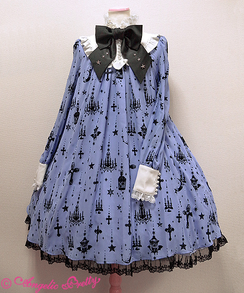
As time went on, I realised not everything is so clear cut after all. Actually, the 3 mains styles can sometimes blend with each other. Take the Holy Lantern series from Angelic Pretty as an example...


If you were to show this to one person they may tell you that as this dress has crosses and darker elements to it, it is probably gothic lolita. Show it to somebody else and they will tell you that it is still sweet lolita. Maybe somebody else would tell you this dress fits the creepy cute style (Is creepy cute still a thing? I have not heard that term in ages...). Which person is right? Well, in some respects, all of these people would be right. This is just one example of a piece which doesn't neatly fit in to the confines of one style. But maybe that is okay.

This is not anything remotely new to lolita fashion. Innocent World may be known as a classic brand, but there has always been some more cutesy sweet elements to their pieces in comparison to other classic lolita brands, like Juliette et Justine for example. A lot of sweet brand Baby's pieces are bordering on classic. This new style of what I call 'hybrid lolita' has definitely become more prevalent in recent years. The Japanese brands are pushing the boundaries more than ever. Of course, it makes tagging outfits on Tumblr a bit more difficult but apart from that, I see no harm in the styles blending.

I personally am a big fan of blending sweet and classic lolita together and I would go so far as to say that some of my outfits could be labelled as being "Sweet-Classic Lolita". It is not sweet or classic- it is both. There are some benefits to blending the styles together. Recently, I have noticed I am a little more self-conscious about wearing sweet lolita. Sweet Lolita is still a style I wear frequently but I feel like I have my own limitations with how cute I am willing to push an outfit. Maybe it is because I started off being an average age for a lolita, but I would now be considered a mature lolita. I am by no means the oldest of lolitas, but I would probably say I am at the age where I fit in to the older lolitas age-group. I have noticed I don't feel as comfortable wearing sweet as I did when I started out in the fashion. I even sold some of my sweeter dresses because I felt too insecure wearing them.

But by introducing what would be considered more classic lolita elements in to my sweet outfits, I am finding that I am still happy to wear sweet lolita. I am relieved about this because even though I do wear more classic now anyway, I still have a place in my heart for sweet lolita. I guess by introducing the more classic elements, I am in effect making my sweet outfits more mature and perhaps a bit more suitable for my age. Yes, people still think I am younger than I actually am, but I still feel more comfortable in my hybrid of sweet and classic than I do in just standard sweet. It also works the other way around. Sometimes when wearing classic lolita I will add a few cuter elements in or maybe a sweeter colour.

It is also quite a lot of fun being able to blend accessories in combinations that you would not usually expect to work together. If you take away the usual boundaries on what style something fits in to, I think there is the potential to come up with loads of new ideas. Even though crosses are typically seen as a gothic lolita staple, I think crosses look amazing in some classic lolita outfits too. Flowers are a good example of a theme which works well across all the 3 main styles of lolita. The colour combinations are also more varied. Who says that classic lolita should always be muted colours? Why should sweet lolita always be sugary pastel coloured? If something works and looks great, then does it really matter if it doesn't fit neatly in to one style?

There are certain situations where labeling outfits can prove useful, but I don't feel it is always necessary. If something looks amazing, does it really matter if it doesn't fit neatly in to one category? At the end of the day, lolita is a fashion, and a big part of fashion in general is adapting it to make it work for you and having fun experimenting.

Monday, 25 January 2016

Twinkle Sky by Angelic Pretty

Today's print is Twinkle Sky by Angelic Pretty. This series includes 2 dresses, a skirt, 2 head bows, tights and a parasol.


This is the OP. Firstly, I would like to say that I am not that fond of the choice of fabric throughout this series. The main dress fabric looks super shiny and maybe even gives off the impression of being a bit cheap. Also, it looks like the sort of fabric that would wrinkle easily. Back to the OP, the bodice seems well fitted, although I feel the shape is a bit basic. The length of the sleeves seems decent. I think the arms have a good amount of puff to them, but the cuff part could have been shorter. Maybe the wrist area could have just been gathered and then had some lace instead of the large cuffs. There is just something about the cuff shape which doesn't seem to look cute enough for this particular dress, in my opinion. There is a waist bow, which is a cute shape and size, but is made of very shiny ribbon. It sits nicely on the dress too. This bow is detachable but to be honest, the dress is already so shiny that I don't feel a shiny waist bow is really going to hurt at this point, so I would leave it attached. The bodice details are really neatly set out. I like the pleats, as they give the bodice a bit of extra texture and depth. The ribbon corset in the middle is nicely spaced out and I like the thin lines of gold lace too, as the colour of the lace helps to break up the bodice. My least favourite bit of the bodice is the collar. Usually, this would be a really pretty collar, but I don't think it works on this specific dress. I think the shiny fabric used is partly responsible, but I also feel a round collar shape would have looked cuter than a square shaped collar here. On a more positive note, I like the use of gold lace on the collar and the lace lining the collar is pretty too. The back of the dress offers no shirring, so size flexibility is pretty limited. The stock photos show that the skirt is very full with plenty of volume. The skirt flares out well and I love the rounded shape. There is more than enough room for petticoat underneath this skirt. The skirt is kept simple in design, so the print is displayed really well (if you can even see the print). The bottom hem is then finished off with a line of AP logo lace, which is layered over a chiffon ruffle. Although the lace does feature stars, I was a bit surprised that AP didn't go for a more obvious star themed lace. Despite the lace and chiffon ruffle being layered well on top of each other, I don't really feel the chiffon ruffle is needed either.


Here we have the JSK. The bodice looks well fitted, but the shape of the bodice looks really plain. I dislike the really straight neckline and think something a bit more heart shaped would have been more flattering. Even the thin line of lace along the neckline does nothing to soften the harsh shape. The straps are quite thin, and don't look that supportive, but I don't think wider straps would have suited this style of dress. I like that the straps are lined with lace on the outsides, but I am not overly wowed by the choice of lace used here. The lace is of a good quality, I just don't like its appearance and I don't feel it suits this dress. There is a waist bow, which is once again super shiny, but everything about this series seems to be shiny. The shape of the bow is cute and I don't even mind the long tails going down the skirt like that. It sits nicely on the dress too. The bodice details are pretty much identical to those on the OP, and they are set out in the exact same neat way. Everything is nicely spaced out and well balanced. The back is fully shirred, so there is lots of size flexibility, but it isn't too attractive to look at. The stock photos show that the skirt has loads of volume and it flares out a lot too. My only concern is that it looks as though the ruffles at the bottom are giving the skirt a bit of an odd shape at the bottom. Hopefully it looks better in person than it does in the stock photos. The skirt is kept simple in design, so the print is displayed beautifully. The bottom hem is then finished off with a very thin line of lace and 2 ruffles. I feel very undecided about whether I like the way the ruffles have been done or not.


And here we can see what the print looks like. This series comes in ivory, blue, wine, navy blue and black. They are mostly pretty standard choices for a starry themed print, although the wine colour is a bit unusual. I can't decide if I like that colour or not. I would be more inclined to play it safe with one of the blues or the black version. As for the print itself, there isn't really anything amazing about it. The constellations are good, but they look very basic. This print just looks like a poor version of AP's Cosmic print, which at least had writing and moons on it to make it more interesting. The grid on this print does not really add anything to the design either, and just gives the print a tiled appearance. But I think the worst thing about this print is that you can't even see it that clearly in the first place. If you look at any picture of this series online, the print is barely visible. It makes me wonder, what is the point?

I am struggling to find anything really positive to say about this series. As far as I am concerned, the print is awful and the choice of fabrics for the dresses is terrible too. The dress designs are underwhelming too. So I think it is safe to say that I will not be buying this series. If you want a decent constellation print, go for Cosmic. If I absolutely had to choose a dress, I would go for the JSK in navy. However, I do think the parasol released as part of this series was pretty decent looking, so that is something worth checking out. As for the rest of this series, something tells me it will be lingering on AP's website for a while.

Thursday, 21 January 2016

Lolita Desu Review- Positive

Today I shall be reviewing an order I placed with Lolita Desu, who are a second hand Japanese fashion store. To tell the truth, I actually put in 2 orders with Lolita Desu quite close together. The order I am reviewing today is the 2nd of the 2 orders I placed. The only difference between the 2 orders was that with the first order I requested Airmail and the second order was shipped by EMS. I didn't take photos of the 1st order because I was initially not planning to to a Lolita Desu review. Anyway, the first order went through really easily and the Airmail was actually really quick. I only went with EMS for this second order because it wasn't a great deal more expensive and I have more experience with using EMS. I received the same high level of care with both orders, so here I shall share with you my review of my 2nd order!


Ordering Process and communication

The Lolita Desu website is quite clearly set out and easy to navigate. You can search by categories such as 'lolita', but I prefer to see specific brand categories using the links near the bottom of the page instead, as I feel that gives me a fuller picture of what is available. The cart system was really simple and I was able to place my order with no issues at all. I got all of the emails quickly. I can't comment too much on the communication, because I had no problems at all and didn't really need to contact Lolita Desu at all.

Shipping

For this order I used EMS, which I felt was reasonably priced in comparison to similar websites. My order was shipped out the next working day and it arrived super quick. The whole process was really quick. Both Airmail and EMS come with tracking, although when I ordered using Airmail I did find I had trouble using the tracking when it got to the UK (apparently Royal Mail had a fault with their tracking page, so it was out of Lolita Desu's control anyway).


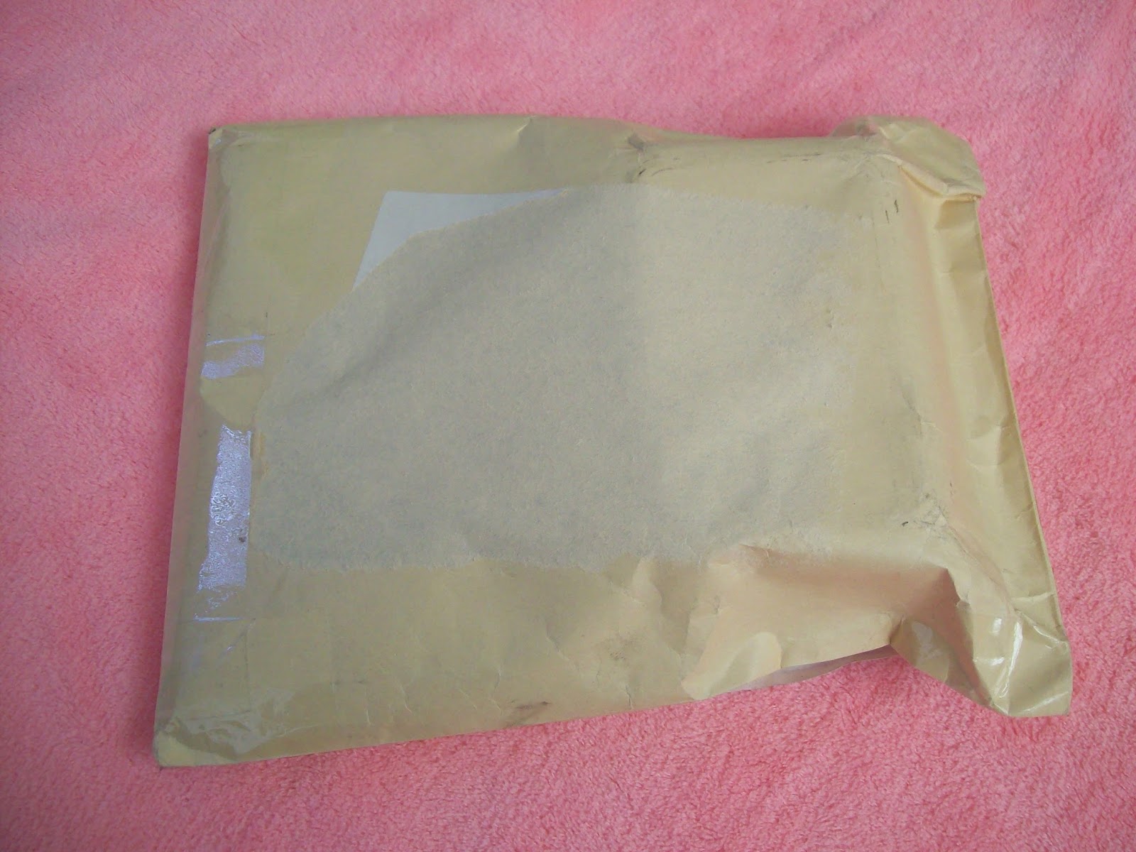
This is how my order arrived. It was shipped in a simple envelope. I would have preferred a bubble envelope for a bit of extra padding, but when I opened up the package I saw why Lolita Desu hadn't bothered with bubble wrap.


Instead of a bubble envelope, my necklace arrived in a tupperware container! I don't think I have ever seen this before! And on the inside the container was padded out with sweets. So the necklace was quite safely padded and I also got loads of free sweets. I thought when I saw the candy in the picture above, that was it, so it was a surprise to get even more free candy inside! My other order had free candy in it too. Some of the candy was really yummy, but I wasn't sure about the tomato flavoured sweet!


And here is the necklace I ordered. I have been looking for a suitable crown necklace for ages, and this Angelic Pretty one is exactly what I was looking for. On the website, the item condition was ranked as B but after a thorough examination, I can't see a single thing wrong with it. I suppose A rank is reserved for brand new items though.


I thought I would take a few little close up shots of the necklace. I love the design so much.


So all I can do is heap praise on Lolita Desu for providing a great service with no hassle at all. The site was a pleasure to browse and I like that there is a reward system too. I already have about $10 worth of points saved after placing 2 really small orders. The orders were really safely packaged too, albeit a bit strangely! I would definitely recommend Lolita Desu to other lolitas and I will be ordering again in the future.


Related Posts Plugin for WordPress, Blogger...