Friday, 31 August 2012

Loreal BB Cream Review

Despite giving the Garnier BB cream a very average review, I haven't completely given up on Western versions of BB cream. After some disastrous results using the Maybelline Dream Fresh BB cream (Do not go there! It is mega greasy!), I stumbled across one by Loreal. Loreal Nude Magique BB Cream is a fairly new one on the market, but I had heard online that this one was good. I also heard that this BB cream is supposed to be the closest that the West have gotten to making an Asian style BB cream. So I had high expectations when I decided to give this a go.

Once again, I am not a make-up expert so I am just writing this as best I can. I have also cropped out some of my face because my skin still thinks I am a teenager and I don't want to put my whole make-up free face on the net! 


Here is the BB cream in question! This BB cream only comes in 2 colours, so I went for the lighter of the two. At first I was a little disappointed to see only 2 different shades, but apparently it has smart pigment capsules in it. So I figured that maybe the colour was a bit flexible and would adapt. 


My skin before putting anything on it.


Apologies for the blurry photo! This is what the product looks like. As you can see, it is white! Just like your standard Asian BB cream would be. So I rubbed it on the back of my hand and the colour built up nicely. The product felt like a moisturiser at first, but then felt like liquid foundation.


My face with just the BB cream on. You should know that this was my second attempt at using this BB cream. The first time I applied too much and I ended up looking very orange! So this time around I used a lot less and it was much better! It did look a bit dark for my skin, but not too noticeable. Considering how pale my skin is, this is understandable and I would consider mixing a tiny bit of moisturiser to lighten it a little bit. It felt very light on my skin, as if I wasn't wearing anything. You can still see my skin flaws a bit, but they were less obvious than they were before. I was very pleased to see that my skin looked dewy, but not greasy. It was definitely the sort of texture I would have wanted, so I was impressed. After reading the back of the tube, I do feel that the product description was quite accurate and not deceiving. 


This is me with full make-up. I found that I needed to use a lot less concealer than usual and that my make-up seemed to blend in a lot better. Everything generally felt easier to apply. I was also very pleased that my make-up did not budge at all for quite some time. When I went to bed I found myself having to scrub my face a fair bit just to make sure I got it all off! So I would say that it is pretty durable. I have oily skin but found that I needed to re-apply powder a lot less.

Considering this costs £9.99 for a 30ml tube, I do think it was worth it. It is definitely the best Western BB cream I have tried so far. I would definitely buy this again. I am gradually becoming more positive towards BB cream. I still need to get that Missha BB cream I want, just so I have an Asian one to compare it to. But I do think the Loreal BB cream is a strong contender. It is definitely the best western one I have tried.

Wednesday, 29 August 2012

Cinema Doll by Angelic Pretty

Today I will be taking a look at Cinema Doll by Angelic Pretty. And once again, I am so behind on everything that this series has already been released! This series includes 2 dresses, a skirt, a blouse, a cutsew, a cardigan, a head bow, a headdress, 2 pairs of socks and some accessories. So much stuff! You can tell that AP were expecting this series to be popular!


This is the OP. The bodice is a really good shape and nicely fitted. I also like how the black thin lines of lace running up the bodice are quite flattering for the figure. The sleeves are a pretty shape too. The slight puffiness is cute. The sleeve edges are decorated well with pretty pearl buttons, which are very fitting for the overall theme of the dress. I also like how all the details like lace etc. are done in black, as it really stands out, but at the same time it doesn't look cheap.


Here we can see a close-up of the chest. I think the overall shape of the area looks very grown up and suits the dress. I really love the wide lace running in an oval around the edge. Not only is this lace full of detail, it looks very retro, as if it has come right out of the 1920's or 1940's. The lace along the neckline is pretty and I like how it doesn't take away attention from the other lace. I am a little unsure about the velvet ribbon used for the tiny bow. Whilst it looks cute, I think it is very obvious that the texture of the fabric is different. I do like the polka dot tulle panel and the use of circle trim. I think the trim mimics jewellery such as beads, and so it ties in well with the print.


I dislike the way the back has been done on this dress. I don't think the way the ribbon has been used really adds anything to the design. In fact, it looks a bit awkward. Also, when you tighten the ribbon, it makes the back look very weird. The dress material sort of clumps together strangely, as seen below the ribbon and lace part in the photo. Perhaps the ribbon should have been left off of this design or even better, a panel of shirring with a ribbon corset to make adjusting the size a lot easier.

The skirt has that typical full AP shape to it. It is brilliant for holding a lot of petticoat underneath and creating a really flared out look. I think this pretty fuller shape is especially good for the theme of the dress. If I was wearing this dress, I would wear as much petticoat as possible! The skirt is clutter free and so the print is displayed beautifully. The bottom hem is finished off with more polka dot tulle. I think the lace used on the bottom of the JSK is nicer, but I also think it is good to tie in with the tulle used on the chest of this dress.


This is the JSK. The bodice is very well fitted. The waist area looks so small and that just emphasises the skirt area more, which I think gives the whole dress a lovely shape. The straps are a bit thin, but I don't think this style of dress would suit bulkier straps. I like how the thin lace used up the bodice gives the dress a defined panel sort of look. This is also used along the straps and helps to tie everything together. I love the waist bow because the solid colour suits the rest of the dress. It is also a good size and shape for the dress.


The chest on this dress is laid out in a similar way to the OP. Although I have just noticed that the lace around the edge is in the shape of a smiley face! Cannot unsee! I think the lace used has a messier appearance compared to the OP and it looks too fussy. I do however, like the way that there are pearls attached to the soft tulle panel. It is like a 3D version of the quilted part of the print (see the print picture below). I also think the bow dotted with pearls is cuter than the velvet one on the OP. I actually quite like the bodice area of the JSK, but if I am being honest I think the dress design could have easily worked without the lace and tulle panel part.

The back of the JSK is thankfully a bit more traditional design-wise. It has a panel of shirring which is concealed by a ribbon corset. The ribbon is velvet and black, so it does stand out, but it matches the contrasting black details used throughout the dress. The skirt shape is again rounded and full. I actually think the JSK skirt shape looks a bit better than the OP. The skirt will hold lots of petticoat. Once again, I think it would be really awesome to use lots of petticoats to really puff the dress out. The skirt is clutter free and the print is displayed beautifully. The bottom hem is finished with some really gorgeous bow themed lace.


And here we can see the print and what colours it comes in. I am having real trouble deciding which colour I like best. I feel the ivory suits the retro theme the best, but at the same time the pink and lavender work so well with the print. But the black (which I think is more grey) is a more unusual colour option for lolita. So for now, I will just say that I like all 4 colours! A lot of people have compared this print to Fantastic Dolly and I can see where they are coming from. The themes in the print are not new, but for some reason this print still feels fresh and exciting. I admire how much detail has gone in to drawing the lace. The items in the print have also been drawn beautifully. I really love the perfume bottle and the cat is so cute! I also love the main part of the print with its pearls and quilted appearance. It is a really interesting choice.


I am absolutely loving this pair of socks. Whilst the other pair of socks for this series are very cute, I think that they are a bit more 'standard lolita' looking. Whereas these socks are a bit more different than usual. I think they have a wonderful retro feel, but I also think they are a bit more mature looking. This length of the socks is not to everybody's taste but I would be more than willing to give these a fair chance. I like them because they are bold and stand out.

So overall, I think this is a very strong series. I can understand why it is so popular. It is very close, but I think I would choose the JSK over the OP. I do however, think the front of the bodice on the OP looks better than that on the JSK. I still can't decide which colour I would go for though! I have to confess that I actually like Cinema Doll a lot more than Fantastic Dolly. I think Cinema Doll has the potential to reach a similar level of popularity. Why do I like Cinema Doll more? I guess it is because of the choice of colours and the more mature look. I don't normally go for retro prints but I wouldn't mind owning this series.

Monday, 27 August 2012

Sorry, no post today.

Alas, I had a bit of a packed weekend and today I have friends over. Things will be back to normal on Wednesday. I am very sorry!

Friday, 24 August 2012

Vampire Prelude by AatP

I am still horribly behind with these discussions! Well, today I will be giving my verdict on Vampire Prelude by Alice and the Pirates. This series includes 2 dresses, a skirt, a blouse, socks, a necklace, a bonnet and a rose hair comb. 


This is the OP. The bodice looks fairly well fitted. I especially like the neckline shape, which is interesting in design. I also like how it is defined by the solid-coloured edge, as it seems to suit the dress. It ties in well with the use of solid colour on other areas of the dress, such as the waist bow edges and sleeves. I like how the sleeves are very rounded and slightly puffy. However, I also think that in some photos it makes the shoulder area look quite wide. The waist bow is a bit on the large side. Despite there not being a lot of other detail on the bodice, I feel the waist bow is a bit too fussy, almost a bit awkward. The rose placed in the middle is a nice idea, but I am unsure it works on this particular bow. I think the bow is too big, and the lace around the edge only emphasises the size. Thankfully, it is detachable. I would have preferred a thin solid coloured belt to match the neckline edge, but without adding too much bulk.


But I do like the charm detail along the neckline. The cross suits the gothic theme of the print really well and the pearls add a bit of interest. It also makes the mainly plain bodice a bit interesting, especially if you choose to detach the waist bow.


The back has a panel of shirring. It is concealed with contrasting ribbon, which does grab the attention, but it does fit in with the edging on other dress areas. I am not a fan of the bustle on this dress. It looks a bit droopy in places. I also think that if you look at the edges of the bustle, it is a very strange shape. It probably could have done with being a bit wider and with the edges being a bit more rounded.

The skirt shape is a very pretty bell. It would suit a more subdued gothic style, but could flare out quite well if you wanted a more puffed out look. The skirt is free from clutter and so the print is displayed quite well. the bottom hem is finished with beautiful rose lace.


This is the JSK. The bodice is really well fitted. It looks very shapely, as if it will cling a fair bit. The straps are very thin and I don't think they are really needed. I think with the shape of the bodice, it would suit a strapless look. The straps just don't add anything to the design. There is braided looking lace running along the neckline and then down either side of a thin ribbon corset. I think it looks really pretty, but I think the waist need something there to hide where the details end. Just something really small to stop the sudden halt where the braid lace ends. The ribbon corset on the front is very narrow. At first, I was unsure about it, but because thin ribbon has been used it doesn't look too bunched together. I have actually grown to like the design now. The neckline is finished off with pretty rose lace, which stops the edge looking too harsh. But I do think the lace used here is a bit different in colour compared to the lace used on the bottom hem (that could just be the lighting). The back has a panel of shirring concealed by a ribbon corset. The ribbon is the same colour as the ribbon on the front, so it does stand out a bit. However, I do think the back on this dress has been done very neatly. I think it looks better than the OP. The skirt is a nice subtle bell shape, but I think it could have been better. It does look as though it would hold a decent amount of petticoat, probably more suited to an A-Line petti. The skirt is again clutter free, so the print is displayed well. The bottom hem is finished off with pretty lace, which looks of good quality.


And here is part of the print close-up. The print comes in ivory, purple, red and black. For me, the stand out colour here is the black because the red roses really 'pop' against the dark background. The ivory colour also works really well with the bright roses, but for me the black colour is my favourite. Although the other 2 colours are also pretty, they don't appeal to me quite as much. As for the print itself, there is nothing about this design that stands out as being new. These are all themes that have appeared in AatP prints before and I can think of a couple of prints that are similar to this one. However, sometimes you just have to go with a style that you know has previously done quite well. To be fair, the design is pretty. As you may have guessed, I adore the roses. They are drawn really well and the colour is so vibrant. The gate design is beautiful. I thought the placement of the windows and tables were a bit strange, as they are floating in the middle of a gate! But they are drawn very well and there is a lot of detail. I especially liked the table and mirror.


As much as I want to like the necklace, a part of me thinks that the charm dangling beneath the main rose looks a bit strange. There is something about it that doesn't look very natural. When I first looked at this series and initially saw the smaller photo, I thought it had a tassle dangling under it! It is pretty, it just doesn't look right to me.

So overall, I do think this series could be a good one, but it is not to my personal tastes. I am a fan of AatP but this doesn't appeal as much. I do think that the black colourway is gorgeous though. I would probably go for the JSK over the OP, but I would try to wear it strapless. I can see fans of AatP's previous vampire prints going mad for this, so I reckon it has the potential to sell well.

Wednesday, 22 August 2012

Lockshop Hime Wig in Brown

I was so distracted by my holiday that I totally forgot to mention that I got my first wig back in July! I would like to quickly add that I don't intend to become one of those lolitas who think that wigs are an essential part of a lolita outfit. My reason for ordering it was because my own hair styling skills suck! I want something I can wear when I fancy a change.

I decided to go for Lockshop because I had heard and seen some horror stories about a well known lolita wig company, and one of the girls in the Oxford group had a Lockshop wig. So I kind of had an idea about quality before I went ahead and purchased my wig. I went for the Hime style wig because I thought that it looked pretty and you could control how big the bump was. So how styled the wig looked was up to you.

Please bear in mind, that I am writing this review from memory!

Ordering Process

The Lockshop website is very clearly set out and I found ordering the wig very easy. The wig combs were sold out, but I managed to get all the other bits I want. I was frequently emailed with updates. I was also able to track the progress of my order, so I was never in doubt as to where my wig was and how the order was going. 

Shipping

I can't remember exact times, but I do remember that the wig arrived very quickly. I know it didn't have to travel too far to England, but I was still very impressed with the speed. The shipping cost seemed very reasonable for the speed and came.


The wig came in a big cardboard box. The box was sealed very tightly, so it didn't come open at all. The items inside were wrapped in tissue paper. There was a bit of room for the items to move about in the box, but the items arrived in perfect condition. I suppose wigs are not going to get that damaged moving around in the box anyway! The most important thing was that it was well sealed.


Lockshop wigs come with a long list of care instructions, which I think is a great touch. Not everybody who orders from Lockshop is going to be an experienced wig user, so to have a bit of help is useful.


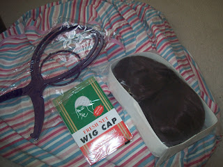
Like most wig shops, I got given a free wig cap. Yay! As you can see, the wig was quite well packed. I also got a wig stand to make styling a bit easier.


Apologies for the lighting on this photo. This photo was taken a few days after it was styled, so it looks a bit flatter than it was. As you may have guessed from the way it is packed, the wig doesn't initially come out looking ready to wear! The Lockshop website has a guide on styling the hime bump but I found it a bit too basic. So I got Michelle to come over and she had a go at styling it for me whilst I watched how to do it. It definitely looks a lot better now than it first did. Being a novice wig user, I don't really know a lot about fibre quality. All I know is that the wig does feel soft to me and in real life, the wig doesn't look very shiny. I really dislike very shiny wigs! Brushing gave it a nice softer look, just like on the website. I think it looks a bit nicer that way, as it is a bit more natural looking. That was my main aim with buying this wig- I wanted it to look a bit more special than my real hair, but at the same time I didn't want some OTT looking wig. I don't think styles like the twin pigtail wigs suit me anyway. I was initially unsure about the colour, but it has grown on me. I have been told it suits me though!

Sorry, but I don't have any pictures of me wearing the wig right now! I have worn it a bit but to be honest, the weather here in the UK is hot and humid right now. The last thing I want to do is put a hot wig on my head! I will make sure to have pictures of it soon though, so do keep an eye out.

I feel very pleased with my wig and I would use Lockshop again. Ordering the wig was a very positive experience. It is definitely going to make things a lot easier for me.


Monday, 20 August 2012

August 2012 Ox Loli Meet- Swap Meet!

Yesterday was the August Ox Loli meet! It was very hot and humid, but I managed to drag myself out the house and in to the heat. We had another swap meet this time. I missed the one held last year, so it was great to go this time. 

After we had dinner, we decided to go to Christ Church to sit down and do our swapping. It was a really great way to spend a lazy Summer afternoon. The meet was quite casual, but I think it was better that way. I certainly enjoyed the chilled atmosphere. We had some very interesting chat including one which has totally changed my view of Totoro (look up 'dark totoro' theory on google!). Well, it didn't totally change my opinion of the film, but it was really interesting to see how different people interpret the story.


Whilst we were swapping our stuff, we could hear this random Asian style music coming from somewhere. We had no idea where from or why they were playing! It provided nice background noise. Eventually Niamh decided she wanted to find this guy. It turns out he had been playing to the cows. For the record, the cows really loved it! They were swishing their tails about a lot. People kept stopping to listen to him play. I don't know what the instrument is. It sounded like a flute, but it was a stringed instrument. I didn't get a good enough picture of the instrument itself.


We walked along the river for a bit and we found some deer! You probably can't see them very clearly in the photo but they are in the background. They are a little above the boat. They probably saw us coming and legged it!


That all too familiar bridge again! We have taken so many photos here. It is a really peaceful place. Left to right we have Rachel in Bodyline, Raine in AP, Niamh (I forgot where the yukata was from), Sammi in AP, Nicola in Bodyline, Roxy (who wore her awesome Holly Tea Time tights) and me in AP.


If you abandon your picnic it shall be stolen by geese!


Okay, I wouldn't call this proper twinning, but Sammi and I decided to both wear Sugar Hearts! My Sugar Hearts bag finally arrived this week, after a long, stressful transaction with a new seller (long story). I think Sammi looked better than me to be honest! I literally just shoved together items I thought matched it best whilst trying to balance the colours. I left everything to the last minute once again!


Here is my outfit. Please excuse my face. The heat was getting to me a little bit! I went for a fairly casual look due to the heat. I was meant to wear a wig but there was no way I was getting a sweaty head! I basically took my Sugar Hearts skirt, head bow, bracelet and bag but I opted for solid colour pink socks. I do own the SH socks in white but I felt that the socks would be too much white for this outfit. I am hoping to buy the pink or lavender socks very soon. I am wearing a pink blouse and purple shoes.


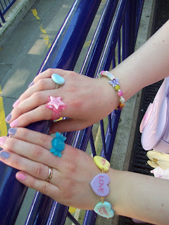
My accessories! The SH bracelet is quickly becoming a favourite of mine.


Chocomint necklace and a random purple bow clip. The bow is a hair accessory but I decided to pin it casually to my top.


Here is what I got from the swapping! I didn't bring a massive amount to be swapped as I was struggling to part with things. So I got rid of a few accessories and gained a cutsew and lots of bows. I have decided I want more cutsews! That is something to work on in the future.

Well, I definitely had a great day! I am really happy with the new items I have gained and I also enjoyed seeing some of the Oxford group again. And after some very unpredictable weather, it made a nice change to not have to be prepared for every eventuality!

Friday, 17 August 2012

Alice Bruges by BABY

I am getting very behind on all of these posts again... Well today I am looking at Alice Bruges by Baby the Stars Shine Bright. This series includes 2 dresses, a skirt, a blouse, various hair accessories, wrist cuffs and socks.


This is the OP. The bodice has a good shape, but it is very basic. There is a lot of gathering in the bodice, which stops the material looking too flat or dull. Without that gathering, I think this bodice would look way too plain. The sleeves have a nice, slightly puffy appearance and it suits the overall shape quite well. The neck ties are cute.


I like the idea of using lace-looking ribbon to make a belt as it helps to nip the waist in. But are 2 of these really necessary? I think it looks a bit awkward. I would have just used the bottom lace belt and not bothered at all with the top one. The lace ribbon is also used to make a bow on the neckline. The ribbon lace used is nice enough, but all the details appear to blend together. I just think it is all very dull.

The back is very plain with no shirring. This means the sizing is not that flexible, which is a bit disappointing. The skirt has a nice bell shape to it and it looks as though it will hold a decent amount of petti. I really hate the horizontal line of lace which runs a little bit below the lace. It doesn't really add anything to the design. The print is displayed well. The bottom hem is finished off with cute lace. I like the little bows on the lace.


And this is the JSK. The main part of the bodice is an okay shape, although possibly a bit plain. I really dislike the straps on this dress. The very thin spaghetti strap style makes the dress look very casual. When you remove the skirt, the bodice shape just looks too basic.


 Thankfully, the detailing on the bodice is a bit better than that used on the OP. It has just one line of lace ribbon around the waist, and this looks quite smart. It gives the waist a nice finish. Thankfully, the neckline is also a bit more interesting on the JSK. The material is soft and frilly. It looks a bit more dressy.

The shirring runs the whole way across the back. It does give more size flexibility, but the shirring is very exposed and open. I think this could have been done a bit neater without sacrificing the size flexibility too much. The skirt has a really pretty bell shape to it. The shape is very rounded and plump, but without looking too OTT. It will also probably hold a decent amount of petticoat. The skirt is kept clutter free and the print is displayed beautifully. The bottom hem is finished off well with a line of soft material (chiffon?) and gives the bottom a softer edge.


Here is a part of the print close-up. The print comes in pink, sax blue and navy. The reason I have chosen to show the navy version for this is because I think the other 2 colours look way too pale. The colours look so washed out and in the stock photos, you can't really see the print that well. I feel this print needs a bit more boldness to it to really show off the print details. I just hope it will look better in person. As for the print itself, it is your typical fairy tale fare. The swans are pretty. It took me a while to work out there was a girl sat on the left swan! The girl and the house are drawn well. But overall, I find it all a bit dull. There is nothing that really stands out about that part of the print. My favourite part of the print is the lace parts floating on top and the lace border before it gets to the main part of the print. The lace is so well drawn with lots of detail to it. I also like the use of swans right at the very bottom. The lace part could have had a lot of potential, so it is a shame it has been used with such an average looking fairy tale print.


Something which I am yet to try is see-through socks. The see-through socks in this series are probably my favourite item. They are generic enough to wear with a variety of other prints, especially other Baby prints. I think it would be fun to experiment with layering over solid coloured tights. They also have a more dainty and soft look, which is quite appealing.

To be honest, I find this whole series a bit underwhelming. I even felt a bit bored when I was doing this post because I was struggling to get excited about it. It is just so plain. I think when you look at brand, you have a certain level of expectation, and this series disappoints me. My personal issue with it is that everything- the ribbon, the print, etc- is all really soft and as a result, the details all blur together. The series is cute enough, I just don't see it as a must-have purchase.


Wednesday, 15 August 2012

Tutuanna Socks

I was browsing Ebay a few days back when I decided to purchase some ankle socks. I found some I liked, ordered them and thought nothing of it. Then when they arrived, I was pleasantly surprised to see the socks were in fact from Tutuanna! I have been meaning to give their socks a go and now I had unintentionally got a pair!

Sadly, because I got these off Ebay I can't really review the Tutuanna website or ordering process. But I thought I would take a look at the socks anyway. The Tutuanna shop can be found here- http://www.tutuanna.jp/shop/e/etop/#/event/top/sort/sd/currentPage/1 Tutuanna has a lot of cute casual wear, but I was mainly interested in the socks. It is not a lolita shop, but from time to time I do find cute stuff on there which could be loli-able. The trouble is, you do sometimes have to trawl through a lot of stuff you don't want to find the good stuff. 


These are the ankle socks I got. As you can see, they are quite simple in design and topped off with lace.


The material feels really soft. I thought the quality was really good. The socks are one-size and they fitted my UK 5.5 feet perfectly. I imagine they would stretch a bit further, definitely to a UK 6. They sit quite nicely just above my ankles too. The lace looks a bit droopy in these pictures. I reckon it will look better when wearing a pair of shoes.

Slightly off-topic, but you may have noticed I am wearing my Bodyline tights from the post I made the other day (with a pair of solid-coloured peach tights worn underneath). In case anybody was wondering what they looked like worn, hopefully these pictures give a slightly better insight!


Another photo, slightly more closer up. There were quite a few colour options available on Ebay but I went for Snow White, which is slightly off-white, but still quite bright.


A shot of the lace. So it is not the best lace quality I have seen, but it is also not that bad. I think it suits these socks really well. It is very pretty and gives the socks a really girly appearance. 


The Tutuanna label included washing instructions in English. I think they have made the directions very clear.

So maybe one day I will actually order from the Tutuanna website. I am very pleased with my new socks. I would definitely try Tutuanna socks again in the future.

Monday, 13 August 2012

Meta's 10th Anniversary Set

On August the 9th 2002, Metamorphose started up their official site in English. Wow... has it really been that long? Time sure flies! To celebrate this milestone, Meta are offering a special set.

Details can be found here- http://www.metamorphose.gr.jp/english/_gogo_lolita/news/m-metamornews260.htm


I am currently putting money aside for future spending, so I can't really join in. But given the price and the items you get, I do think this could be worth doing. For 10,000yen you get a fully shirred skirt, a blouse, drawers and an original print tote bag. And I think that even after adding shipping (and potentially customs fees if you are unlucky) there is still the chance to make a profit on items if you don't like what you get.

If the example pictures are anything to go by, then I am not too fussed with the choice of skirts on offer. My favourite would be the deer print one (which I have totally forgotten the proper name of!) and I would be happy to get it, but what are the odds that you would get that particular skirt? I would probably be disappointed if I got one of the other ones! Blouses are always a good basic item to get in these packs, although one of the example ones has massive bell sleeves on it. I get a bit bored seeing drawers in happy packs and I would have preferred a pair of socks. Then again, drawers always come in handy.

Possibly my favourite part of this set is the chance to get a tote bag of past popular series. Out of the 8 bags on show, I would hope to get my hands on Twinkle Journey (a very popular choice!), Jewel Butterfly or Royal Rose. Yes, tote bags are easy to make, but it is another item to collect! Meta tote bags tend to be quite spacious. I can carry a fair bit in my March of the Duck tote, without it feeling as though the bag is about to break or anything. It is a nice alternative to the normal lolita purses, which are cute, but not always practical when you have a long day of frilly fun ahead of you.

It sounds really strange but despite not being overwhelmed by the items featured, I would like to buy it. I think the low price makes it worth going for, so it doesn't really feel that risky.

If you are interested, I would get in there quickly. By the sounds of it, this set is only available until the 17th.

Friday, 10 August 2012

Bodyline Order August 2012 Review

It feels like ages since I last ordered from Bodyline! I decided to do a small order this month. Once again, I wont be reviewing the Bodyline ordering process because I have done that quite a few times in the past.

Shipment

I placed my order on the 5th of August (after the Bodyline website had been down for a couple of days again!) and my tracking number came through quite quickly. It arrived yesterday, on the 9th, so it took just 4 days to get here. That seems to be a bit quicker than usual, although I did use their EMS shipping.


My order was placed in this shipping bag, which was thick and tough. There were no holes in the bag at all and no sign of any damage. So it was shipped to me quite safely. I was a bit worried because I ordered some shoes and I thought the other smaller items might get bashed. The shoes were packed in typical Bodyline style- tissue paper stuffed in the toes with those tube things to keep the shoes in shape, then wrapped up separately in a single layer of tissue paper. So not very secure at all. But this is something I have come to expect now and if this is something that concerns you, be careful what you order with your shoes. I still have not managed to get hold of one of those Bodyline shoe boxes, which I know exist!


I ordered shoes 251 in dark pink. I already own this style of shoe in white and red, so I already knew I would be comfortable with these shoes. The shoes fit well and the design is simple, but cute. I went for dark pink because I think some pink lolita shoes look so pale, that you can barely see the colour on them. So I was really pleased with the colour of these. When Bodyline started doing dark pink shoes I was worried they would be a hot pink kind of colour, but these shoes are a nice deep baby pink shade. It reminds me of Angelic Pretty.


My main reason for my order was to get some rose barettes. These are all ACC258. I got 2 cream, 2 orange and I was meant to get 2 red, but only got 1. But it looks as though Bodyline only had one of the red ones in stock, as they have now sold out. Again, I knew exactly what to expect as I had already ordered one of these clips for a meet prize a while back. But one thing I wasn't expecting was how deep the red clip was in colour. It looks a bit lighter on the website. 


The back has both a clip and a pin, just like the popular 2-way clips do. This is brilliant, as it makes them easier to wear in different ways. The roses look exactly the same as they do on the website (apart from the colour of the red version). The lace is okay. I thought the deep beige colour of the lace was a bit dull but to be honest, I didn't really buy these clips for the lace. I just liked the roses. 


Finally, I got tights LEG159 which are under the punk section of the website. I was just curious to see what they would be like. As I opened the pack, I was a little concerned about how long they will last. The material feels very cheap and flimsy. They are also very thin. It wouldn't take much to get a large snag in these and I am actually a bit paranoid about wearing them for long periods. I tried them on briefly. They are one-size but I wouldn't recommend these to anybody over 5'4'' in height because even I struggled to get them up the whole way. It didn't help that I thought they could ladder at any second. I also wouldn't recommend these tights if you are plus-sized. Actually, I don't think I would recommend these tights to anybody at all! They are cheaply made and are not worth bothering with. I will be going to Primark for tights like this next time.


Just in case you were wondering about the pattern, this is what they look like when I put my hand inside them. I had problems lining up the pattern on my legs!

So Bodyline's service was very quick and easy, although they are still having the odd website problem here and there. It is just a case of waiting until the website comes back up again. I am very happy with the items I ordered, apart from the tights. The rose clips are beautiful for the price you pay and I am glad to have another pair of my favourite style of Bodyline shoes! 

Wednesday, 8 August 2012

Chocolate Rosette by Angelic Pretty

Yes, I am fully aware I am discussing a print which has already come out and sold out, but my print discussions are all over the place because of my holiday! Anyway, we have hit chocolate lolita print season everybody! Unsurprisingly, AP is the main brand releasing all that chocolatey goodness. So today I will be talking about Chocolate Rosette by Angelic Pretty. This series has 1 dress, a salopette, a skirt, a head bow, a beret, 2 socks, tops and lots of different accessories.


This is the JSK. The bodice looks a good shape and well-fitted. The waist is given the illusion of a belt with the use of the horizontal stripes (it has waist ties at the back) and it helps to define the waist a bit. I also think it gives the dress a very neat and smart appearance. At first I thought the small waist bow was an odd shape. It is very pointy and angular; not the typical bow we are used to seeing. But actually, I have grown to like the bow because it suits the dress. The print is not overly sweet, despite being a chocolate print by AP and a more cutesy style of bow would ruin the overall design. Most of the bodice is quite simple, with just some gold trim running vertically up the bodice. I love the subtle use of gold on the dress because it is a nice finishing touch, but it is not over-powering. I adore the neckline on this dress! The pleats topped with more gold trim really mimic the rosette theme. It all works so well together! The neckline is topped with a detachable thin ribbon bow, which is a lovely finishing touch. There is also the detachable rosette with fancy AP style design, which I adore. The straps are a good width and make good use of the stripy print. They are finished off with gold trim too, so they don't look too plain. The back has a panel of shirring which is concealed really well by a ribbon corset. It is lined by gold trim too, so everything has a neat edge to it. The skirt shape is a bit straight considering this AP, but it really suits this series. It is nice to see AP doing a more classic-friendly style now and again. It does look as though the skirt part will flare out quite well and hold a decent amount of petticoat too. The skirt is clutter free and the print is displayed beautifully. The bottom hem is finished off with more pleats. Overall, I found it very difficult to find any obvious faults with this dress. Everything just works together.


I don't normally look at salopettes on here (I don't think I will suit them!) but I may as well take a quick look.  The first thing I noticed about this dress was the way that the lines in the print are used. Unlike the JSK, the lines in the print go at all sorts of angles. I love how the top part has the diagonal lines. It is also nice to have the horizontal stripes along the waist bit as it helps to break up the top part from the skirt. The rosette on the waist is a bit simpler in design compared to the JSK one, but this is a good idea as you want less bulk when it is placed near the waist like this. I do wonder if the waist on this salopette is going to be a bit too low for some wearers. It is placed very low and I really hope it wont sit too awkwardly. The large bow on the neckline is very cute, and maybe appeals a bit more to the regular AP fan, as it is sweeter in design than the JSK. The straps are a nice width and I absolutely love the gold buttons used with the crown design on them.


The salopette also has this cute crown lace. I am not too keen on the way it has been used (I think the JSK pleats are far more awesome!) but the lace itself is so pretty. This is definitely one of my favourite AP laces.


And here is the print! As you can see, it comes in ivory, red, brown and navy. Judging from what I have seen online, navy is by far the most popular colour. I have to agree with that! I think it is because I like the slightly more unusual colour combination. I wouldn't have thought to put navy and blue together in this way. I like the stripe pattern as well. It reminds me of school uniforms, albeit a very cute uniform (I wish my school uniform had looked like this!). I really love all the emblems and rosettes. I can see a lot of work has gone in to this print. The rosettes have been drawn so carefully. But my favourite bit is the shield shaped emblem! The chocolate crowns and the bows add a hint of sweet to the print, but it is not overpowering. The classic and sweet elements are balanced well. I am impressed!


I decided to pick out my favourite bit of jewellery from this series, and this is the ring I have selected. I love the melty chocolate look. It reminds me a lot of some jewellery that Q-Pot brought out. But what I really like is how versatile the ring is. You could team it with pretty much any chocolate print and it should work. The majority of jewellery for this series comes in ivory, brown and gold. I personally like the gold best because I think it adds a more sophisticated touch. I think as well that there is already a lot of brown in the print and gold makes a nice change. I love almost all the of the jewellery released as part of this series. The only piece I have doubts about is the chocolate crown ring and necklace because I think the crown looks too chubby. Also, it is a bit too cutesy when compared next to the rest of the series.

Overall, I am very pleased with this series. It doesn't surprise me one bit to see how quickly it sold out (annoyingly, this series came out on my birthday so I didn't get the chance to even attempt to buy it!). As you may have guessed, I would definitely buy from this series. I love the JSK. I am surprised that AP didn't release more dresses, but I do like the heavy focus on matching accessories for this series. The jewellery and matching pieces would work with so many different items. I am really looking forward to seeing some great outfits using this series!
Related Posts Plugin for WordPress, Blogger...