Monday, 9 October 2017

Queen Chocolate by Angelic Pretty

Today I am looking at Queen Chocolate by Angelic Pretty. This series includes 2 dresses, 2 hair accessories, a blouse, tights and a rosette.


First is the OP. The bodice looks well fitted and the shape is very cute. I really like how the dress has been made to look like a JSK with a blouse underneath. The arms are nice and puffy, with gathered cuffs. It is a lovely contrast to the more fitted bodice. The cuffs feature the chocolate part of the print as well, which is a nice touch. It is a nice bit of continuity but also looks very smart. I like the small ruffle on the cuffs too. There is a waist bow, which I feel is a bit big. But its large size does sort of suit the dress and I am impressed that a big bow like this is able to hold its shape this well. It sits well on the dress and looks very perky. The bodice features some emblem themed gold buttons. Whilst this is a nice idea, it feels a bit too bunched together and cramped. Maybe if the waist bow sat a bit lower and the 'neckline' was a bit higher up the buttons would have a bit more room to properly spread out. The fake halter-neck 'neckline' is well shaped and lined very neatly with a thin line of lace. I like its size too. There is another bow here, but given how large the waist bow is, I think this bow could do with being smaller. The 'blouse' part features several lines of lace, which sit neatly. This lace is of good quality and I love the added texture it gives to the chest area. The collar doesn't look too stiff or uncomfortable. There is also a line of gold buttons and this time they are well spaced out. These buttons are a very simple round design though, which seems in contrast to the emblem buttons lower down. There is also a detachable stripy bow. Although the bow is a cute size and shape, I don't think the use of stripy ribbon works here. There is not enough usage of stripes on the dress to warrant it being there. A solid coloured bow would have made more sense in my opinion. So I think I would definitely detach this bow. The back offers no shirring, so size flexibility is very limited. I am impressed with how neatly AP have lined up the print along the zip line in the stock photos though. The stock photos show that the skirt is plump with volume and it flares outwards brilliantly. I really love the full, rounded shape created here. The skirt is kept quite simple, so the print is displayed wonderfully. There are a couple of stripy bows at the bottom, which I still feel look very out of place. Bows aside, I love the cake themed lace lining the bottom hem.


Here we have the JSK. The bodice again looks very well fitted and I think the bodice shape looks quite smart. It is very mature looking with a slight military feel. The straps looks a suitable width and very supportive. I like how the straps feature a 'lapel', which continues down the bodice, giving the bodice a look of a tuxedo jacket. These 'lapels' are lined very neatly with lace, although I think a less 'frilly' lace choice or maybe even braid could have worked better. I am also not convinced I like the positioning of the buttons on the 'lapels'. I do wonder if they could have gone on the middle part of the bodice instead, as they make the 'lapels' look a bit fussy. There is a waist bow, which I think is the perfect size for the dress. It sits well and there are no signs of sagging. There is also a small solid coloured peplum at the waistline. I was initially a bit unsure about this peplum, but I think it makes a nice break in the OTT print. It does help to define the waist a little bit and I also feel it balances out the 'lapels' on the bodice. This peplum is decorated with some lovely lace, although I think the buttons overload the peplum slightly. The back has a panel of shirring, which is topped neatly with a ribbon corset. The stock photos show that once again the skirt is very full and has lots of flare. It will hold a lot of petticoat. The skirt is kept simple, so the print is displayed beautifully. Once again we have some stripy bows on the bottom hem. I think the stripes make even less sense on the JSK, because at least the OP has the other bow to help balance it out. The bottom hem is then finished off neatly with the cake themed lace.


Finally, we have the print. This series comes in ivory, pink, mint and red. Although the other 3 colours are quite typical for a chocolate print, I think the red colour is the real star of this series. It offers something a bit more unusual, but it also looks quite bold and mature. For some reason, the print feels a bit less busy on the red colour as well. As for the print itself, it is like Chess Chocolate and Wonder Queen had a lovechild. There is nothing particularly new or exciting about this print. The diamonds are set out neatly and the hearts are lovely. I like the piping around the edge of the hearts. The royal themes inside the hearts are well drawn too. But when you look at the print on the dresses, it just feels far too OTT. I think for me, the part of the print I dislike is the wide vertical bars of chocolate. I personally think this print would be nicer if it just had the diamond part of the print and didn't bother with the hearts or wide stripes of chocolate at all. It would look a lot less cluttered with just the diamond part, but still very bold and striking.

It is well known that Angelic Pretty chocolate prints are usually very popular. Therefore, it is very telling that all of the dresses for this series are still available a week after being released. I think it is because the print looks too cluttered and overall, the designs are very OTT and overwhelming. I also feel that AP have gotten a bit too repetitive with their chocolate prints lately. So it is safe to say that I would not buy this series. My top choice would be the JSK in either red or possibly the ivory. Sadly, I think this series is a bit too try-hard. If it had been simpler, I think this series would have sold out quickly.

Thursday, 5 October 2017

Artist Inspired Outfits

So this post is actually a couple of months old, but I completely forgot to post it at the time. I hope you all enjoy it!

Taobao brands love to throw the odd curve ball now and then. It usually gets given a lot of 'ha ha' reactions when it gets posted to Lolita Updates on Facebook and you will get a few who love it enough to actually go ahead and buy it.


My initial reaction to seeing Vincent Van Goat by Cherry Bomb was to laugh. The idea of an artist depicted as a goat seemed like such a bizarre thing to put on a lolita dress! And yet, I find it weirdly endearing. It could certainly be worked in to a serious lolita outfit without looking too comical. It also reminded me of the Juliette et Justine painting dresses, but this dress is a much different take on art inspired lolita.

As I saw this dapper goat dressed as Vincent van Gogh I wondered to myself how various different artists would look if they were to wear lolita. So just for fun I have created outfit collages inspired by different artists. This is how I imagine the artists themselves would want to wear lolita.

Degas


I couldn't do this post without including my absolute favourite artist (there is a new exhibition in London on his work soon and I am very excited!). As he painted a lot of ballerinas, that was the obvious direction to go in here. I initially was going to do an outfit with the Emily Temple Cute Toe Shoes JSK, but I didn't feel the available colours truly reflected Degas. His colours are more soft and muted. So I decided to choose a dress that is soft and floaty with a lot of movement to represent the dancers. Therefore, I went with this Juliette et Justine chiffon dress. The rest was relatively simple. A lot of the ballerinas in his works feature floral hair pieces, but nothing too big (they have to be suitable for dancing in, after all). The tights may not be very practical, but I thought plain tights were a bit too bare.

Klimt


I will be honest here- I have never been a fan of Klimt, but I happened to stumble across the dress in this collage at random. When I saw it I instantly thought of the backgrounds of a lot of Klimt pieces. His work features a lot of black and gold. There is also a lot of swirls and trees. I tried to imagine what his muse from The Kiss would wear. For a Klimt outfit I think an up do is best for the hair and maybe some coral lipstick.

Roy Lichtenstein


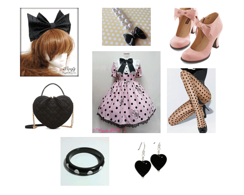
The first of two Pop Art artists I am looking at today. Lichtenstein's works feature loads of polka dots. Dolly Dot felt like the most obvious dress choice. I tried to keep the retro and kitsch vibe going throughout the outfit. I think the key thing here is bold, yet simple. And lots and lots of dots!

L. S. Lowry


I included Lowry because I studied him when I was in primary school! For those of you who don't know his work, he is from Manchester and he painted a lot of industrial scenes. The figures in his paintings were also known for wearing clogs, hence the inclusion of them. He used a lot of muted, neutral tones and browns. As business men in suits feature a fair bit, it seemed fitting to include a bowler hat and bow tie! I was going to include a briefcase as well, but I was unable to find one that matched well enough. Hopefully you get the general gist of what I was aiming for!

Monet


I remember when Baby's Labyrinth print first came out that I instantly thought of Monet when I saw it. It features a scene by water and the details are a little bit blurry ( which I feel reflected his short-sightedness in later life). This outfit was inspired by what I felt a young maiden walking through his paintings would be likely to wear. I imagined a massive floppy bergere hat, a parasol to protect them from the sun and extravagant sleeves. Also, I finally found a pair of sax blue shoes which are not tea parties, so that was a personal achievement as well!

Warhol


Finally, I decided to do an outfit for Andy Warhol. I think Warhol would have leaned more towards Otome. You can't really have a Warhol outfit without a cool beret and thin turtleneck. The look is very 60's art scene. Whilst fruit-wise Warhol is probably better connected to bananas, alas this is not a theme which appears in Japanese fashion very much! So I took the safer option of going for cherries. The dress features fruit cans, which is a small nod to Warhol's famous soup can work.

So that is what I came up with. I tried to do artists which were a bit different to the typical painting dresses we are used to seeing in the fashion. My favourite is the Warhol outfit (I bet you all thought I was going to pick Degas!). Maybe it is because the Warhol outfit could be worn casually and I could see myself actually browsing a gallery whilst wearing it. From time to time you will see smaller indie brands release dresses with famous paintings on them. I purposely didn't go a Van Gogh outfit because a dress with his Starry Starry Night already exists. These are a bit different from your typical Juliette et Justine painting dresses too. But at least there are many different options out there if you wish to pay homage to your favourite artist.

Monday, 2 October 2017

Twilight Gymnasium and the Seven Wonders by Alice and the Pirates

Today I am looking at Twilight Gymnasium by Alice and the Pirates. This series includes 3 dresses, a skirt, a beret and socks.


First is JSK I. The bodice looks well fitted. Although the shape is simple, the bodice looks really smart. It is a sharp design and seems to fit the 'feel' of the print. The straps are a decent width and very supportive. There is a belt, which nips in the waist line perfectly. I do think the buckle used on the belt is a bit basic though. The bodice features 6 buttons placed neatly in lines. Maybe the buttons could have been spaced a bit further apart though? The neckline features folded down flaps which are decorated with a line of ribbon and a ribbon bow in the middle. This is a really smart looking design. I do think the flaps could have been a bit smaller in size, but the shape is lovely. The back offers a panel of shirring, which is topped neatly with a ribbon corset. The stock photos show that the skirt has a fair bit of volume and flares outwards a lot. It should be possible to create a lovely, mature A-line shape to fit with the bodice. The skirt is kept very simple, so the print is displayed wonderfully. The bottom hem is left plain, which is a little bit disappointing. At the very least they could have added a thin line of ribbon to finish the dress off nicely. That would have matched the neckline details too.


This is JSK II. The bodice seems a little bit loosely fitted and the shape is far too simple in my opinion. The straps are a good width. I think the use of clips and buckles on the straps is interesting. It certainly livens them up a bit. The waistline has a band defined by 2 lines of braid. This does help to define the waist, but not as much as the proper belt on JSK I. The bodice features a yoke, which is a simple semi-circle shape. It features pleats inside and a row of pleats lining the edge, which give a bit of added texture and depth. There is also a row of buttons and a bow on the yoke. It makes it look more detailed and interesting. The buttons work well, but I am not convinced by the bow. I just feel the bow is a bit too cute looking. The back is fully shirred, so there is a lot of size flexibility but it also means the shirring is left exposed. The stock photos show that the skirt is very full and flares outwards plenty. It should be possible to create a great shape. The skirt is again kept simple, so the print is displayed excellently. The bottom hem is finished off with a line of pleats, which I think works brilliantly. This would have been a good way to finish off JSK I without looking too cutesy. It is definitely an improvement on a completely bare bottom hem.


Here we have the OP. The bodice seems quite well fitted but I am unsure about the shape. Something about the shoulder area looks very wide and a bit frumpy looking. I worry it wouldn't be too flattering. Even in the model photos the OP made the shoulder area look quite bulky. I think it the top printed part of the sleeves which throws things off. The arms are a generous length though and I like the smart buttons on the cuffs. Judging by the listing, it looks as though the solid part of the sleeves is not detachable. I like the dress with the full length arms anyway, but it would have been nice to have the option to wear this dress with shorter sleeves too. The bodice features a sailor style collar and a modesty panel going across the chest. This is set out very neatly and I think it looks very smart. I like the sharp lines of braid, which emphasises the lines. The modesty panel is emblazoned with the AatP logo, which mimics a school logo. It is very fitting! There is also a bow finishing off the collar. It is a bit sweet looking, but I think AatP just about gets away with it. The AatP logo charm is a nice touch too. My only complaint is the ribbon used for the bow looks very shiny. The back offers no shirring, so size flexibility is very limited. I think the print lines up well along the zip though, and the collar is a tidy shape at the back. The stock photos show that the skirt has a load of volume and it flares out really well. It should hold plenty of petticoat. The skirt is once again kept simple, so the print is displayed beautifully. Sadly, the bottom hem is kept bare again, which is a bit of a disappointment.


Finally, here is one part of the print...


... and another part. This series comes in bordeaux, navy, green and black. These are very mature colours and are quite typical choices for school uniforms. Therefore all the colours look very suitable for the print. I am curious to know how a lighter colour option would have looked though. As for the print, it is very smartly set out. The building is well drawn and does remind me of a fancy school building. It is a bit too posh looking compared to the schools I went to, but I would have loved to be on a campus like this! I like how the building is covered with leaves as well, adding an extra point of interest. The school children are good as well, but I think they could do with a bit more definition to their features. I like how you can see inside the buildings. It would have been easy for them to just add a bit of sheen to the glass, but showing what is behind the glass adds depth.

So overall this is a nicely set out series. The print is nice enough. I am not sure if this is the sort of series that many would go out of their way to get hold of though. It is lovely, but nothing special. So I would not buy this series personally. If I did, my choice would be JSK I in navy. Out of all the dress designs I think that one is the most interesting and fits the school uniform vibe nicely enough. I think I prefer solid coloured school themed dresses over this print though.

Thursday, 28 September 2017

Brand Inspired Decor

Work was a bit slow for a couple of days, so to break my boredom I decided to have a bit of a play around and make some brand inspired bedrooms. I don't really have the option to decorate a room based around a brand so I am having to live vicariously through other people's Pinterest boards. Oh well, it was fun doing a bit of window shopping and I enjoyed putting these 'looks' together. Could we maybe pretend that all of the colours match up? These collages are meant more as mood boards rather than finalised room designs. It is really difficult to get things like colour right when you are looking through a laptop monitor! As for further inspiration, I guess I would suggest checking out your local charity shops and maybe checking out antique markets. Sometimes you can find some cute kitsch stuff from a few decades ago which could fit the aesthetic. Touring places such as stately homes can be inspiring if you are a classic lolita. There has been a rise in adults adopting 'childish' (their words, not mine...) culture as well, and you can find some really cute articles which may offer inspiration.

Alice and the Pirates


There were lots of different ways I could have gone with the AatP room, but I remember an old interview (I think it is in one of the English GLBs) where the designer was talking about her inspiration for setting up the brand. I love the idea of Alice from Alice in Wonderland going on adventures beyond Wonderland. So this collage is very piratey. I didn't feel the pirate colours truly reflected the whole AatP 'feel' so I added in some dark red as well. 


Angelic Pretty


Pink, pink and... more pink! My inspiration for this collage came from the actual Angelic Pretty stores in Japan, which are very pink! I also decided to go for a cute, retro look. When I saw the stripy bow shaped cushion, I instantly thought of AP. This being AP, I decided to add a touch of Paris to things as well. Looking at the finished collage, I suppose this is more late 2010 era AP rather than present day AP. Maybe I should try giving that a go... I could see that being a massive challenge though!


Baby the Stars Shine Bright


There is still a touch of the pink, but in more muted tones than AP. I wanted to do something a bit 'dreamy' and soft looking. So I went for light, delicate layers. A lot of my inspiration here came from the print Twinkle Dreaming Princess, which features clouds and bedroom furniture. It just seemed like the ideal print for this collage. Please excuse the rabbit jars, which are not really the right colour. I added them because I thought I couldn't do a BTSSB room without at least acknowledging Usakumya-chan. I love my little Usa pochette, but I know some lolitas out there have massive Usakumya collections. Having a gathering of them piled in one corner of the room is definitely how I envisage a BTSSB room!

Innocent World


This has a more classic, European look. It is well known that the IW designer is a massive Europe lover and her travels have inspired several IW prints. I felt it was only right to acknowledge some of the more popular aspects of Innocent World. So the collage features a deer wall decor to represent Lotta, Fleur de Lis details which crop up in a lot of IW prints, a crown chandelier which is a nod to Grazia Crown and a cherub tray to represent that cherub IW print whose name I can't think of right now. There is also some florals thrown in, because IW do release a lot of floral prints.

Moi Meme Moitie


Out of all the collages, this one was the easiest to do! There are so many pages dedicated to gothic decor, that I was really spoiled for choice. So I tried to go for styles which reflected Moitie. Can you imagine Mana doing a photoshoot in this room? That was my main objective! I feel the bed frame and screen have a similar style to popular MMM gate prints, such as Iron Gate. Obviously, there had to be some vivid blue in there too! The coffin shelving unit is a nod to the old Moitie physical stores, where the changing rooms were shaped like coffins. It is a shame the lining is not blue though!

So this post was really just for fun, but I hope you have all enjoyed it. You may have noticed I didn't do one for Metamorphose... I did try to do one, but it was so all over the place and nothing really complimented anything else. They are so diverse style-wise that it would be hard to do a Meta room without focusing solely on one particular print, which really wouldn't reflect on the brand as a whole. I had a leopard print chaise longe saved and everything! 

Monday, 25 September 2017

Holiday Collection by Angelic Pretty

Today I am looking at Holiday Collection by Angelic Pretty. This series includes 2 dresses, a skirt, 3 hair accessories, a blouse and socks.


First is the OP. Considering the fabric choice, the bodice looks quite shapely and well fitted. The arms have a suitable level of puffiness to them and I really like the fitted cuffs. The cuffs are neatly decorated with emblem themed buttons, braid and some crown themed lace. Although I personally think the lace is too wide, I do appreciate how wonderful the crown lace looks. It is so apt for the overall theme as well. There is a ribbon belt, which helps to define the waist a little bit. I like that the ribbon chosen is matte, but if I am being honest the ribbon looks like bog-standard ribbon you would find in any craft store. For a brand release, the belt just doesn't feel that special. The bodice has a large square shaped yoke. I think this looks a little flat and boring. Some pleats could have been nice here. I do like the braid and lace lining the edge though, as it keeps it looking smart. There is also 2 small star charms with a chain dangling between them. I really dislike this detail and I don't think it is necessary at all. It doesn't really add anything to the design and it gets a bit 'lost' with all the other bodice details going on around it. There is also a ribbon bow topping the yoke. I like that the AP ribbon matches the brand name at the bottom of the print. The bow shape is simple, but well constructed and a decent size. The only thing I dislike about this bow is the teddy charm in the middle. I find it a bit too 'cutesy' looking. This bow id detachable, but I feel the dress looks far too plain with it removed, so I would leave it on. The back offers no shirring, so size flexibility is very limited. I am impressed with how well the print has been lined up along the zip line in the stock photos though. Fingers crossed it is this well executed on every dress. The stock photos show that the skirt has a decent amount of volume and it flares outwards plenty. I think there is a lot of potential to create a fantastic shape. The skirt is kept simple in design, so the print is displayed excellently. The bottom hem is then finished off neatly with a line of the crown themed lace.


Next we have the JSK. The bodice material is a bit loose and baggy and I am not completely sold on the bodice shape either. I think the neckline shape could have been a bit softer and that overall, the bodice looks too 'square' in shape. The straps are a little on the thin side, but the style of the straps fits well with the rest of the dress. They are lined with the crown lace on the outsides. I like how this lace has been gathered and shaped, making it look a bit more interesting. This dress also has a ribbon belt and my feelings about it are exactly the same as the belt on the OP. The bodice features lines of metallic lace running vertically upwards. This helps to break up the empty space without looking too OTT. The neckline features a 'collar' which has an unusual shape. I quite like it though! The shape is further emphasized by the neat lines of braid and lace lining it. The neckline is then topped off with a bow identical to the one on the OP. I know there is a teddy bear in the print, but I still dislike that charm on the bow. This bow is again detachable but I would leave it attached. Out of the 2 dress designs though, I think the JSK pulls off the bow-less look better than the OP. The back is fully shirred, which means loads of size flexibility but also that the shirring is left exposed. However, because of the style of print, the shirring sort of blends in a bit and isn't as noticeable. The stock photos show that the skirt is very full and flares outwards wonderfully. It should hold plenty of petticoat to create a full, sweet shape. The skirt is again kept simple in design, so the print is displayed beautifully. The bottom hem is then finished off neatly with a line of the crown lace.


Finally, this is the print. This series comes in ivory, red, green and grey. I think the ivory, red and green colours look very traditional. The grey is a bit more unusual and I am a bit unsure about it. I do wonder if black would have been better, as black would have been bolder (or at least easier to co-ordinate). As for the print itself, I really like how you could get away with wearing this for a Christmas themed outfit, but it is not specifically a Christmas print. Tartan is very popular around Christmas time but with the exception of the pile of presents, the print is generic enough to be worn outside of the holiday period. I really love the tartan and I think the frames are well set out and decently positioned. The frames themselves are very intricate with fun designs. The items inside the frames have been drawn well. I don't really have anything negative to say about the print at all. I think it has been really well executed.

So this series has proven that the old days of the AP bloodbath are not gone forever (this series sold out a lot quicker in comparison to a lot of other recent AP releases) and I can see why this particular print has done so well. Although I would change a couple of things about the dress designs, these changes are only minor and overall the dress designs are very strong. Would I buy this series? Possibly. I wont be adding this to my wishlist but that is not to say that I wouldn't consider it if the price was right. My top choice would be the JSK in green. I think the fact that I would even be considering getting a series with a strong hint of Christmas is a sign that I think AP have done very well!

Thursday, 21 September 2017

September 2017 Haul- Unexpected Dream Item Edition

Today I have another haul to share with you all, which is mostly accessory based with a bit of artwork thrown in for good measure. This was not meant to be a 'Big Spending' month for me, especially after DMC, but fate decided to chuck a wishlist item in my direction. I also really like Halloween, which as you will see below heavily influenced my spending.


First is a pair of postcards I got from Polyrillustration on Etsy. I have a bad habit of buying anything remotely bird themed lately, but these are no ordinary birds! They have been drawn by a lolita called Elizabeth and their wings feature a lace pattern. So I guess you could say they have been slightly lolitafied! But I wanted to include these in my haul post because I really think Elizabeth is talented and as an added bonus, she is really lovely! Please go and check out her Etsy.


As well as an envelope covered in the most amazing bird stickers (which I have cut out and kept, even though they are no longer sticky) Elizabeth wrote me a thank you note. Apparently I am her very first customer! I really loved the bird drawing she did for the note. I would be interested to see where she takes her art in the future. Perhaps she could offer to draw customer's birds? (hint hint...)


Next is a Spooktacular haul from H&M. I went looking for Larme-able stuff, and ended up raiding the kid's section. Aside from the moon and star clips, everything came from the kid's section. I have to admit that so far this Autumn I have not been impressed with the very slow trickle of Halloween merchandise available here in the UK. It is not really that big a holiday over here and I was sad that H&M relegated Halloween to the kid's section. 


But I was very glad I took a chance and went to check the kid's bit out (I do this every time I go to H&M) because these accessories are so adorable! I absolutely love the bat clip. All the clips are quite firmly glued on. I am also pleased to say that the chokers stretch enough for an adult to comfortably wear them. The skeleton hands do indeed glow in the dark, but they are not that vibrant. I mainly got these for their spooky vibe. Also, these hand clips are quite popular in Japanese fashion but they can be very expensive. So being able to get them on the high street was a big bonus.


I also got these fluffy scrunchies because I thought they looked cute, but also because I could incorporate them in to my larme wardrobe. Despite being in the kid's section, they have a reasonable amount of stretch to them. My only complaint is I had to buy 2 lots so I could have matching colours if I did twin tails. Who am I kidding, I would have brought them in both colours anyway!


Finally, I got both the necklace and bracelet from Baby's Twinkle Constellation series! You may have seen me use this necklace in a load of outfit collages on here, and now I actually own it! These have both been on my wishlist ever since the series first came out, but they very rarely crop up on the second hand market. Then Closet Child Harajuku got both of them. I had to use a shopping service for the necklace, so I used Muuh Tokyo SS. She replied super quick and within minutes we had arranged for her to go to Closet Child the following day and pick up the necklace for me. I was sent photographic proof of the necklace and receipt. The necklace was also very well packed. I would wholeheartedly recommend her service if you need a speedy shopping service.


Both the bracelet and the necklace were in like new condition. The design which I have coveted for so many years was definitely worth it. The rounded star shape is so cute. It does remind me of candy, as do the frosted beads. The star chains interwoven in to the design are a nice touch as well. I did notice that the star charms were a little stiff and don't have much movement to them, but this is only a minor complaint. The necklace has lots of space on the chain to adjust the length, but the bracelet is firmly one size only. I did find this meant the bracelet slipped quite far down my arm. I suppose because of the bracelet design it would have been difficult to make it adjustable without compromising on appearance. But overall, I am super happy to finally tick these off my wishlist. I don't have that many items left to go now, which is exciting! I do wonder how (or if) my wardrobe will expand after I get everything else.

So those are my new items! Despite the necklace really taking me by surprise and screwing up my socialising funds for this month, I don't regret getting it at all. It is a really cool design and now I am probably going to bore you all by wearing it constantly! The other items were all cheap and well worth the money. I really like it when you find little surprises on the high street. Primark, didn't have the fluffy bag I wanted, but otherwise my shopping trip left me satisfied. There is more stuff on the way to me in the mail so hopefully there will be another haul post in the near future.

Monday, 18 September 2017

Rose Palace by Metamorphose

Today I am looking at Rose Palace by Metamorphose. This series includes 3 dresses (the OP was not available at time of writing, so I will add it later if it comes out before publishing), a blouse, tights, a hair clip, a lace peplum and several corsets. EDIT- Okay, the OP has now come out but I will admit I completely forgot about adding it to the post. Sorry!


First is the Ribbon JSK. The bodice seems fairly well fitted. I think the shape of the bodice is simple, but elegant. The only thing about the shape I am unsure about is the very square neckline. The straps look a decent width and quite supportive. They are lined with a line of gold braid (which also goes along the neckline) and some pretty lace on the outsides. The way the lace has been shaped and gathered makes it look quite frilly, and I did wonder if perhaps it looked a little too cute looking for the gothic print? The waist line is topped with 2 bows made of the main dress fabric and a line of lace. I don't feel the lace sits particularly well on the waistline and it gets a bit 'lost' underneath the bows anyway. The bows are a lovely shape and I like the detailing on them, like the gold braid and lace. However, I think the bows are a bit big in size and are placed a bit too close together. The bodice has a chiffon ruffle topped with gold braid going up the middle. I don't think this detail works that well. I think it is the gold braid which makes this detail look odd and Meta should have just had the chiffon ruffle by itself. Some thin lines of lace could have subtly broken up the empty areas on the sides of the bodice without drawing attention away from the bigger features. There is a big bow on the neckline. This bow has a simple shape, but it has been well formed and works well. I love the cross cameo in the middle! None of the bows on the bodice appear to be detachable, which is a shame because it would definitely be great to be able to re-position the waist bows. The back is fully shirred which means loads of size flexibility, but also that the shirring is left exposed with nothing covering it. The stock photos show that the skirt has a decent amount of volume. It flares outwards well too and I think there is loads of potential to create a fantastic shape. The skirt is kept simple, so the print is displayed beautifully. The bottom hem is then finished off neatly with a line of Meta logo themed lace layered on top of a chiffon ruffle.


Next we have the High Waist JSK. The bodice material looks quite loose and baggy. I think this is because of the way the material has been gathered and is deliberate. I am quite underwhelmed about the bodice shape though. It is so square and basic. The straps also look a bit thin, although the do suit the style of the bodice. Wide straps would probably not suit this dress. The straps are topped with gold braid and a chiffon ruffle. These same details also appear along the neckline. I like how this makes the area look a lot softer and romantic, but without looking too cute. It also goes well with the use of chiffon at the bottom of the dress. The waist has a solid coloured panel, which sort of looks a bit like a belt. It is good how it helps to break up the printed dress material and does define the waist a little bit. This is topped with a waist bow. I think the bow is a good size, but I am not a fan of the bow shape. I feel as though it is lacking something. Maybe some lace and a more intricate shape could have helped to liven it up. But there is a gorgeous cross charm dangling from the middle and despite its size, it holds its shape well. It is a shame that the charm doesn't stand out more. This waist bow is detachable but given how plain the bodice is, I would leave it on, even though I don't like it that much. Or maybe I would consider moving it to the neckline instead? The back is fully shirred again, so there is lots of size flexibility but the shirring is still left exposed. The skirt looks full of volume and it flares outwards a lot. I like how the skirt is a bit longer in length, to help compensate for the high waist design. The skirt is again kept simple in design, so the print is displayed excellently. The bottom hem is then finished off with 2 wide chiffon ruffles and some small ribbon bows. I like the ruffles but think they could have done with being just a little less wide. The bows are a lovely finishing touch, despite being a little bit shiny.


Finally, this is the print. This series comes in black, dark blue and lavender. I think all 3 colours look beautiful. It is difficult to pick a favourite! As for the print, I am pleased to see Meta going a bit gothic again. Although these window prints are quite overdone (it is not even new ground for Meta) this offering has been well executed. The lines are neat and the way the print is set out is very tidy. The churches inside the windows are heavily detailed as well. The roses offer a refreshing pop of colour. In fact, I think the border part of the print could have done with a few more roses. The brand name features in a strip at the bottom, but this is kept nicely understated. I suppose people's feelings towards this series will depend on how you feel about originality, but this print does measure up well next to similar prints.

So if you are a fan of these kind of prints, then this is a decent series to add to your collection. The print is lovely, but there are a few small changes I would make to the dress designs. I think the colour choices are what makes this series. The black is quite a classic colour for the print, but the navy blue and lavender offer something a bit more unusual. Would I buy this series? Possibly, but it wont be going on my wishlist. My top choice would be the Ribbon JSK in lavender. I look forward to seeing some fantastic gothic outfits with this series

Related Posts Plugin for WordPress, Blogger...